7 rules for creating beautiful interfaces
Recently, we have completed a design course from trydesignlab.com at I Love IP . And this is one of the most important articles that the mentor advised us in the process of learning. That is why we decided to translate it. You can see all our works from courses on VKontakte by tag # design101 @ iloveip .
Introduction
First, the main thing. This guide is not for everyone. This guide is primarily for:
- developers who want to be able to make good interfaces for themselves, if they suddenly press;
- UX designers who know that good UX design sells better in beautiful UI packaging.
If you went to art school or consider yourself a good interface designer, then most likely this guide will seem a) boring, b) wrong, or even c) annoying. This is normal. Just close this tab and move on.
In the meantime, let me tell you what you find in this article.
')
I used to be a UX designer without any graphic design skills. I loved to just design interfaces, but I soon realized that there are a lot of reasons to learn how to do it also beautifully:
- My portfolio looked awful and barely reflected my workflow and thought.
- The clients I worked with would be more willing to pay those who can draw more than rectangles and arrows.
- Did I want to join a startup at an early stage? Then it is better for me to master these skills now.
I have always found an excuse:
I do not understand anything in aesthetics. I graduated from the engineering faculty. I should not make things beautiful .
In the end, I learned design just like any other skill: by cold, hard analysis, shamelessly copying what works. I spent 10 hours on the project, and took the money in just an hour. The remaining 9 I studied. Desperately searching for something on Google, Pinterest and Dribbble that you can copy.
These “rules” are the lessons that I learned for myself during this time.
So, I turn to the bore: if I now get something in the design of interfaces, it is because I analyzed a lot, and not just appeared from nowhere with intuitive knowledge about balance and beauty .
There is no theory in this article. Only pure practice. Here you will not find anything about the golden section or the theory of color. Just what I learned myself.
There are judo. Judo has been developing for hundreds of years based on Japanese traditions in martial art and philosophy. If you take judo lessons, you will not only fight, but you will hear a lot about harmony and energy movement.
And there is Krav Maga, who was invented by the Jews in the fight against the Nazis on the streets of Czechoslovakia in the 1930s. There is no art . In Krav Magi lessons, you will learn to poke in the eyes with a pen.
This article is a Krav Maga for screens.
rules
Here they are:
- Light falls from above .
- First black and white .
- Increase the white space .
- Learn how to overlay text on pictures .
- Learn how to select and embed text .
- Use only good fonts .
- Steal as an artist .
Let's get down to business.
Rule number 1: Light falls from above.
Shadows best help the brain to understand which interface element we are looking at .Perhaps this is the most important non-obvious rule that needs to be learned in the design of interfaces: light falls from above . In life, light most often falls from the sky or from above. If not, then it looks weird .
When the light falls from above, it illuminates the upper part and casts a shadow on the lower one. The top will be lighter, and the bottom is darker.
Usually we do not particularly notice the shadow on the lower eyelids, but if they are illuminated, then a girl looks like a demon.

The same is true in interface design. As at the bottom of each facial feature, and at the bottom of almost any interface element there is a shadow. Our screens are flat, but we make every effort to make any element on it look three-dimensional .

Take the buttons. Even in this relatively “flat” button there are a lot of details associated with the light.
- In the unpressed state (top), it has a dark bottom edge . After all, there is no sunlight falling.
- The upper part of the unpressed button is slightly lighter than the lower one. This is because it mimics a slightly curved surface. Like, to see the sunlight, you would need to direct the mirror upwards, so the curved surface reflects more of the sunlight.
- The unpressed button slightly casts a shadow - it can be seen enlarged.
- The pushed button on top is darker than the bottom. Because it is located at the level of the screen, and less sunlight falls on it. In real life, the pressed buttons are also darker, because we block the light with a hand.
This is just a button, but it already has 4 small effects of light. This is the main lesson. And now we will apply it to everything .

Here are a couple of settings from iOS 6 - “Do Not Disturb” and “Notifications”. It is a bit old, but it can teach us a lot.
- The upper part of the inset control panel casts a small shadow.
- The opening for the “On” slider is even deeper.
- It has a concave shape, so the lower part reflects more light than the top.
- The icons, on the contrary, are convex. See the bright area at the top of the icons? It is a surface perpendicular to sunlight, therefore, it absorbs and reflects it.
- The divider ( divider notch ) has a shadow where sunlight does not fall, and vice versa.
Here is another example from my old work.

Elements that are usually concave :
- text entry fields
- pressed buttons
- slider openings
- radio buttons (inactive),
- checkboxes.
Elements that usually have a convex shape:
- buttons (unpressed),
- the sliders themselves
- controllers dropdown menus
- cards,
- the button itself is the selected radio button,
- popup windows.
Now that you know, you'll notice it everywhere.
But what about the design in the style of flat?
iOS 7 has done a lot of noise thanks to its “flat design”. It is literally flat . There are no indentations or protrusions in it — only lines and solid-colored figures.
I like everything, I like clean and simple design , but I do not think that this trend is for a long time. Light three-dimensional effects in the interfaces look too natural to completely abandon them.
Most likely, in the near future we will see semi-flat interfaces (it is in them that I recommend that you develop professionally). The same clean and simple, but with small shadows, suggesting that you can click or click.

While I am writing this article, Google released Material design. This is a single visual language for all products of the company, which, in its essence, tries to imitate the physical world.
This illustration from the Material design manual shows how to convey different depths using different shadows.

It is in this direction that the design will develop. Using subtle tips to convey information. The key word here is subtle .
This is not to say that it does not imitate the physical world, but at the same time it does not look like the web design of 2006. There are no textures, gradients or reflections. I think the future is “semi-flat” design. A flat design is just part of the story.
Rule number 2: First black and white
Creating a design in a black and white palette, before adding color, you can simplify the most complex visual elements as much as possible and focus on the layout and layout .Nowadays, many UX designers are passionate about the “mobile first” approach. This means designing pages and interactions for mobile devices up to large retina screens.
This kind of constraint is beautiful. It clears the mind . You start with a more complex problem (a convenient application on a small screen), and then you adapt the solution to a problem easier (a convenient application on a large screen).
Here's another similar restriction: make a black and white design first. Start with a more complex problem - make a beautiful and convenient application without the help of color. Add color at the very least, and then only with a specific purpose .
This is the only way to create a “clean” and “simple” interface. And the abundance of flowers in different places, on the contrary, it is very easy to spoil. The black and white design makes you focus on distance, size and layout. This is the basis of good design.

There are situations when this approach is not very useful. A design with a certain strong orientation - “sporty”, “bright”, “cartoon” - needs a designer who has a good command of color. But most applications need only a “clean and simple” design. Making design for the rest is much more difficult.

Step 2: How to add color
The simplest thing is to add only one color.
One color on a black and white website simply and effectively attracts the eye.

You can go even further and add two colors or several shades of the same tone.
Color codes in practice - what is hue ?
In most cases, the web uses HEX codes for RGB colors. For us, they are absolutely useless. RGB is poorly suited for color matching. It is better to use HSB (almost the same as HSV or HSL).
HSB is better than RGB, because this model is closer to how we perceive color, and we can predict how changes in HSB values will affect color.
If this is your first time hearing about this, then here’s a good guide to HSB colors .


By changing the saturation and brightness of the same tone, you can create a palette of many colors - dark, light, for the background, highlight and attract attention. However, they will not ruffle in the eyes.
Using several shades of one or two primary colors is the best way to emphasize or drown individual elements in a design without spoiling it .

A few more color notes
Color is the hardest part of graphic design. And although most of the articles about color are not far and are unlikely to help you in your work, there are some very useful tools:
- Never use black . This article is that pure black is almost never found in real life. Increasing the saturation of gray shades, especially dark, you add vitality to your design. In addition, rich gray tones are closest to real life, which in itself is good.
- Adobe Color CC . A great tool to find the right color, change it or create a palette.
- Search in dribbble by color . Another great way to find what works with a particular color. For example, if you have already found one color, look at what colors combine with the best designers in the world.
Rule number 3: Increase the white space.
To make the interface look beautiful, let it breathe.In Rule No. 2, I said that a black and white palette makes designers think about the layout and layout of elements before adding color, which is good. Now it's time to talk about the layout itself.
If you have ever written an HTML page from scratch, you are most likely familiar with how HTML looks by default.
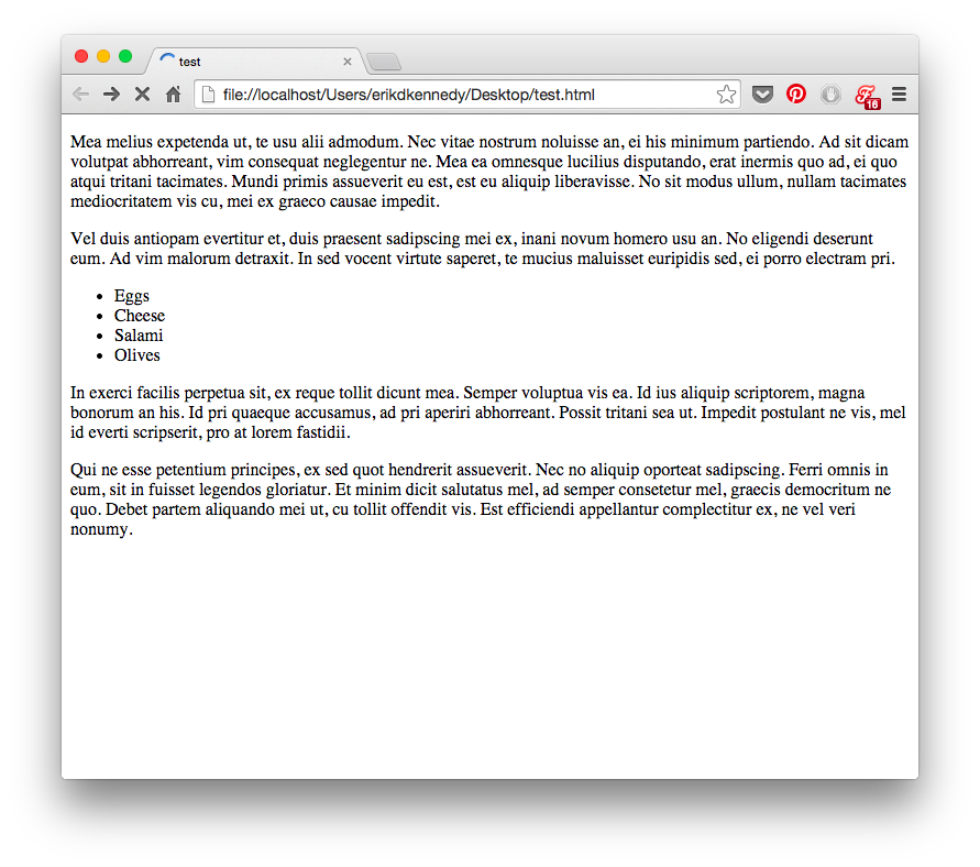
In short, everything is brought down to the top of the screen. The font is small, there is no space between the lines. There is a bit more space between paragraphs, and they are stretched across the whole screen no matter how many pixels it is, 100 or 10,000.
In terms of aesthetics, it looks awful. If you want the interface to look beautiful, you need to add a lot of white space .
Sometimes even too much.
White space, HTML and CSS
If you, like me, are used to formatting in CSS, where there is no white space by default , then it's time to unlearn this terrible habit. Start thinking that the white space is primary. At the very beginning there is only it, and you reduce it by adding elements to the site.
Sounds like zen? I think that's why people keep sketching.
Starting from scratch means starting exactly white space . Think of indents and margins from the start. All you draw is your conscious decision to reduce white space.
If you start with a pile of unformatted HTML, then you’ll be thinking of white space last.
Here is the concept of a music player from Piotr Kwiatkowski .
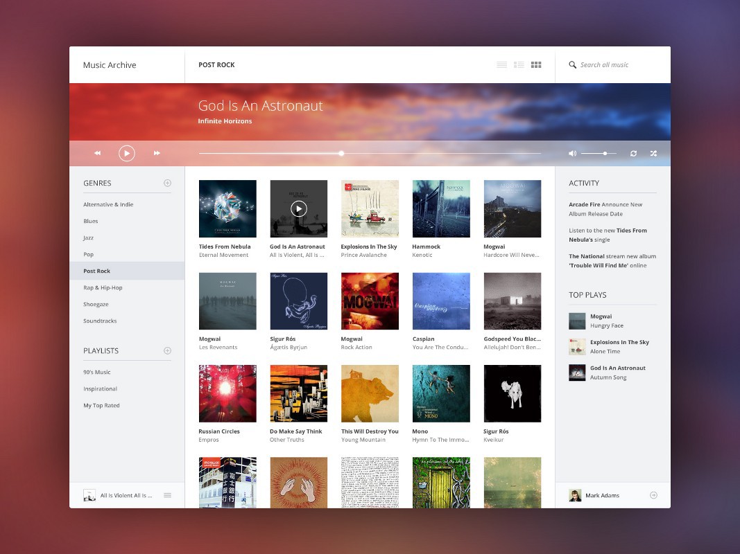
Pay attention to the menu on the left.

The vertical space between the links in the menu is twice the size of the text itself. This is a font size of 12px, with the same indents above and below.
Or look at the list headers. Between the word “PLAYLISTS” and its underlining the distance is 15px. This is more than the height of the capital letter of the font ! I am already silent about 25px between the lists themselves.

In the upper right corner is also enough space. The text “Search all music” occupies 20% of the height of the navigation bar. The icons have similar proportions.
Peter deliberately added a lot of white space here, and it paid off in full. Although this is just a concept, in terms of design, this interface could compete with the best music players that are currently available.
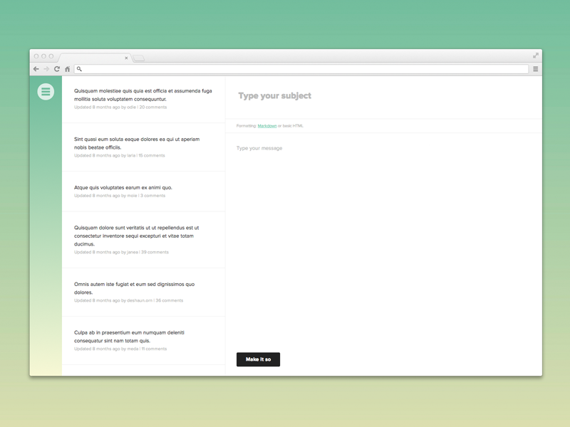
Even interfaces such as forums can look beautiful and simple thanks to the white space.
Or Wikipedia.
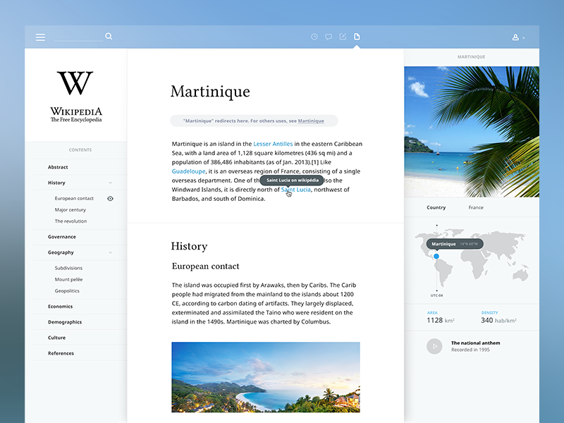
Of course, you can bet that this redesign lacks functionality. But this is a good place to start.
Add white space between the lines.
Add white space between elements.
Add white space between groups of elements.
Analyze what works and what doesn't .
In the next part, I will talk about the other 4 rules of beautiful interfaces:
- How to overlay text on pictures.
- How to highlight and embed text.
- Use only good fonts.
- Steal like an artist
Source: https://habr.com/ru/post/261857/
All Articles