Grid for responsive design
We collected the most frequent topics related to the grid in an adaptive design in order to “sharpen” the term as such and systematize practical knowledge: how to adjust the grid in a design layout, what parameters to make calculations, which features of an adaptive environment to consider and which details to draw Attention.
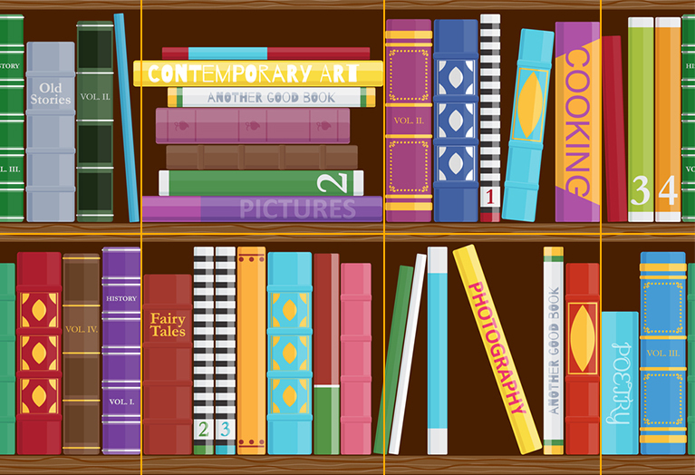
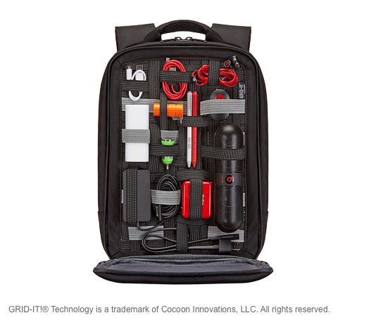
The task of the grid is not only to maintain aesthetics, but also to maintain control over the development process, to make the process itself flexible for both the designer and the developer. A grid is like a well-packed backpack that you give to the developer so that he can use it with the convenience and understanding of your project vision.
')
Before you create a grid, you need to "explore the working field" - make a draft page layout, find the limitations and critical areas that will definitely manifest themselves at the stage of detailed design. This helps to reduce the abstract understanding of the task to specific goals. After that, you can begin to adjust the working grid in the layout. To do this, you need to create a structure of three types of grids - basic , columnar and designer .
Base mesh
The base mesh is close in properties and purpose to graph paper. It is needed to create a comfortable environment that will allow you to move small parts of the layout without thinking and not worrying that all the distances between the elements are equal, uniform.
The grid spacing depends on such atomic indivisible particles as a radio button, checkbox, base font and line height, the minimum distance between visible content blocks, for example, between photos in the gallery or product cards.
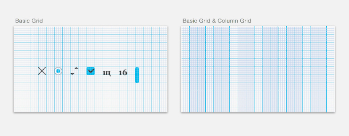
The base mesh should be combined with the column. The default Photoshop settings offer the designer a grid in increments of 10 px, which corresponds to the displacement of the object by the shift hot key, but does not correspond to either the font size or the logic for constructing columns and indents. 10 px is an integer, but no more than that. In the settings of the grids for mobile platforms, 4 or 8 px can be considered a good step. Here the grid step should fit exactly in the height of the main text line and not be too small.
Column grid
For landing pages, sites with a card structure, a portfolio and galleries, the rubber adaptation works well. For large aggregators and klassifaydov with a large number of forms, input fields and small controls, rubber scaling creates difficulties. It is difficult to control and often deforms elements, destroys the structure: key data from the first scroll (for example, advertising) is lost, elements slide to the next line, the integrity of text blocks is destroyed, forms become excessively wide, the user is forced to scroll the page for too long.
In adaptive design, it is necessary to preserve the layout structure and accuracy of information presentation for all resolutions, therefore layouts should be done for all control points. At the same time, the grid columns remain static and are added as the screen width increases, and the elements change their position, obeying the column rhythm and the transition points, breakpoints . For such, you can take 640, 768, 960, 1024, 1280 and 1440. And for each screen resolution, respectively, there will be a different number of columns.
How many columns to choose for the grid?
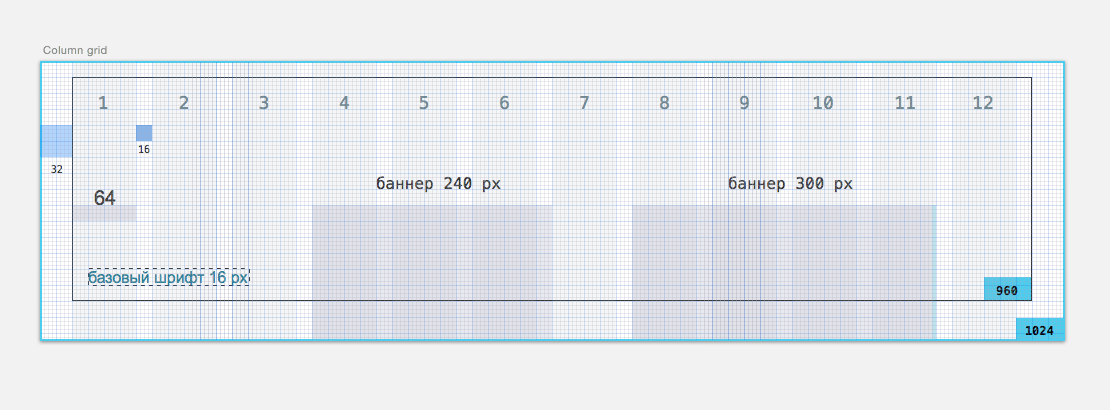
The column grid is responsible for the horizontal rhythm, and in order for it to arise, you need to select the ratio of the column width and indent, which will allow you to easily change the position of larger blocks. This is possible when several columns are placed in a large block, for example 3-4. The indent in this case is an air field in which elements should not be placed. This is important in the sense that indenting is not another guideline by which elements can be aligned.
Accordingly, when choosing the number of columns you need to keep in mind how many rectangular modules will be used on the page. For example, there will be a gallery of six photos with text descriptions, two large graphics and three paragraphs of text. Then the number of columns should be a multiple of 2, 3 and 6. The number 12 will do. A division of the working area of 960 px into 12 columns with a width of indents of 10, 12, 16, 15 and 20 px will give a width of columns of 60, 64, 65, 68 , 70 px. This will result in several grid options, for example a 12-column grid with a column width of 64 px and a padding of 16 px.
Why is the number of 12 columns usual? All modern monitors work in resolutions starting from at least 1024 × 768. Splitting a 960 px workspace into 12 columns is most suitable because it is well divided into columns and indents multiple of 2. Based on this, you can choose the number of columns for other resolutions — 10 columns for 768 px, 16 columns for 1280 px, and 20 columns for 1440 px and more. In fact, the columns are added or reduced for each resolution.
If you start from the task of building a grid for banner advertising, then you need to find the optimal indent width and column, based on the division of the banner widths of 300 and 240 px. Of all the division options, the appropriate (coincident) sizes will be 10, 12, 15, 20. Banner advertising, as such, passes through most of the sites, almost like a public transport strip, and we can have little influence on it. But it is possible to calculate differently and allow the banner to slightly go beyond the limits of one column along the right edge, but then the grid itself will be built on other modules (for example, on product cards or video clips). In this case, it should be at the design stage of the layout to think over where on the page there will be a fixed position of the banners, and what elements should accompany these banners in order to create a module that obeys the grid.
Designer Mesh
The designer needs to create a layout that will take into account not only banner ads, but other equally important elements and types of content: vertical movie posters, square music covers, large photos, videos, articles of ten pieces in one row, and so on. Layout can consist of two narrow columns on the sides and one wide in the center. Maybe from the same columns with wide indents, or it may even consist of "floating" columns (when there are two, when there are five), but so that it becomes visible due to the repetition of the layout of materials and the attachment of "smaller to larger".
A small quote from the advice about the anchor objects of Artem Gorbunov
Rectangle - the basic figure of modular layout.
Good strong mesh is built on rectangular modules. The composition was a success, if everything you drew can be cut around by proportional rectangles, and they fit on the page without overlapping each other and obeying the horizontal and vertical rhythms.
What exactly does this mean in practice? An example from the physical world is a modular grid in a wall with holes Kerf Wall , on which you can arrange the drawers and shelves in any order. You can even hang on a great wall - the main thing is that the objects do not interfere with each other, otherwise they will fall down. The same with strong mesh.
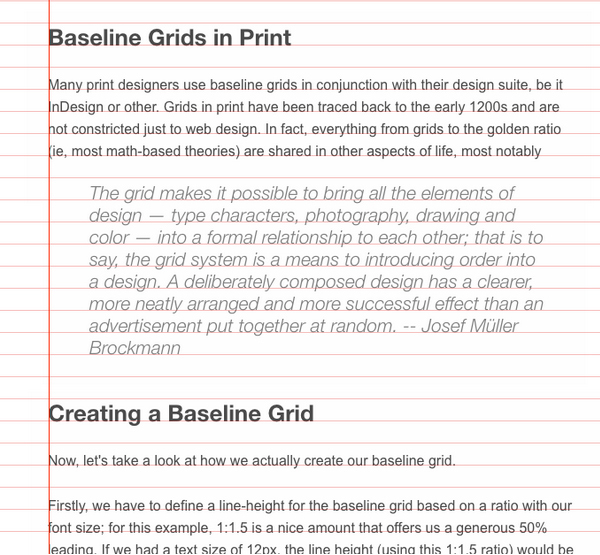
Separately about the baseline grid (baselinegrid)
Historically, InDesign users are familiar with the concept of vertical rhythm. In the settings, they could set the row height for the horizontal grid and work on it. But for a designer, a vertical rhythm is an “optical concept”, for the calculation of which there are no exact parameters, since it is created by painstaking study of each text block, lines and indents. In web design, all these subtleties are hard to implement. It is not enough just to tighten the leading of all the fonts to the same height of the line - this will lead to the fact that in large paragraphs the lines will stick together, and in small paragraphs they will disperse.
To create a vertical rhythm using CSS, developers use the optically comfortable height of the line of the base font and leading of all texts, a multiple of this height. The text is subject to such a vertical rhythm, looks good on a page with one article, where there is a lot of air and not so much noticeable stuck text lines of a larger font size.
An example of a vertical rhythm on WebTuts + :
On the contrary, it is not the best way to apply a vertical rhythm to all the texts on the page, when there are a lot of texts of different sizes. A typical example is the Vertical Rhythm Calculator tool.
In the advice on working with line spacing in blocks with different text sizes, Artem Gorbunov says that the baseline grid is rather harmful, and that it is better to adjust the height of the text line and indents manually. The length of the text should be selected depending on the format (module, plate, text block). If the lines in the text block are short, then the leading can be made smaller. If the text block is wide enough and the lines in it are long, then leading should be done more, otherwise the text will lose readability.
The line height should be selected according to the ratios inside each paragraph of the text: the length of the line depends on the length of the string, the indent length depends on the heading and all depend on the outer left and right margins, which should be more than the inner spaces of the Internal and External Rule and the Proximity Theory .
There are many frameworks, CSS grids, and many of them offer to create line heights about one and a half times larger than the font size and enter all the remaining lines of text into the resulting line. For example UnitGridSystem . Some propose to determine the interval number and set intrilyazh for all texts a multiple of this number. But in this case, some of the fonts will have to be abandoned. As a compromise fit the tool Grilover . It differs from others in that it does not just adjust the height of the base line of the font, but also compensates for the sticking / spreading of lines by the Scale factor parameter.
Using the grid when transferring layouts to layout
It is useful to transfer the grid to make-up designers as a separate specification. You can not only attach an additional jipeg with a grid to the main jipeg, but prescribe basic dimensions on it - for example, pitch, indent, column width, font sizes. Then the consistency of your layout and layout will become more accurate, and control over development and synchronization will increase on both sides. Just as in mobile interfaces there are independent pixels (dp), so in the web these are rem units. You can create markup in pixels or write key elements and distances to rem. Conveniently when the step of your grid and rem is a multiple of the same number. For example, if the grid spacing is 8 px, the base font is 16 px and rem is 16 px, then the element sizes and distances at multiplicity 4 will become the grid and have an integer value in rem. This allows you to immediately see the distances between the elements in steps on the grid. Such integral values without long calculations can be obtained clearly if you use Rem Calculator .
Useful links:
About the pattern of text recognition and vertical rhythm on Smash Magazine
More about the grid on teehan + lax
Grilover and Typecast
Articles and examples of grids on The Grid System
An example of a search for a composition for a designer grid using modules is the Gridfier .
Source: https://habr.com/ru/post/261679/
All Articles