Mobile app design: why we work in @ 1x
In a previous article, our colleagues described the requirements for the transfer of the project from designers to mobile application developers . We, as the design department at Rambler Digital Solutions, must comply with these requirements.
This time I would like to talk about some nuance of application design development that makes life easier for us - about the resolution of design layouts and about the pros and cons of choosing one or another of the original resolution .
')
What we use
Sketch and plugins:
Adobe Photoshop and Size Marks script from Roman Shamina.
Note that we use Photoshop for design of mobile applications less and less - we are actively introducing Sketch in our work and promoting it among developers so that in case of difficulties we can look at the right size or resource in the source without distracting the designer from important design matters.
Despite the fact that the description below is heavily tied to Sketch, it is possible to apply the techniques in Photoshop, although this is somewhat more complicated.
About layout permissions
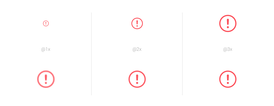
So, as we know, iOS currently has the following resource image permissions: @ 1x, @ 2x and @ 3x; and Android: mdpi (1x), hdpi (1,5x), xhdpi (2x), xxhdpi (3x), xxxhdpi (4x) are the main ones, we will not take into account the ldpi and tvdpi.
As is known from the guidelines, 1x and mdpi are basic resolutions on a device with a pixel-to-point ratio of 1 to 1. You can read more about this here .
If we consider the form factor of the phones, then for ease of computing the dimensions, as well as the subsequent preparation of the specification, it is easier to take the following layout resolutions:
iOS
- 320x480 (iPhone 4 / 4s)
- 320x568 (iPhone 5 / 5c / 5s)
- 375x667 (iPhone 6)
- 414x736 (iPhone 6 Plus).
Android has 360x640 (of course, there are lower resolutions and slightly larger ones, but following the guidelines this will be the reference for Android L). We will not consider tablets now, but we will remember them.
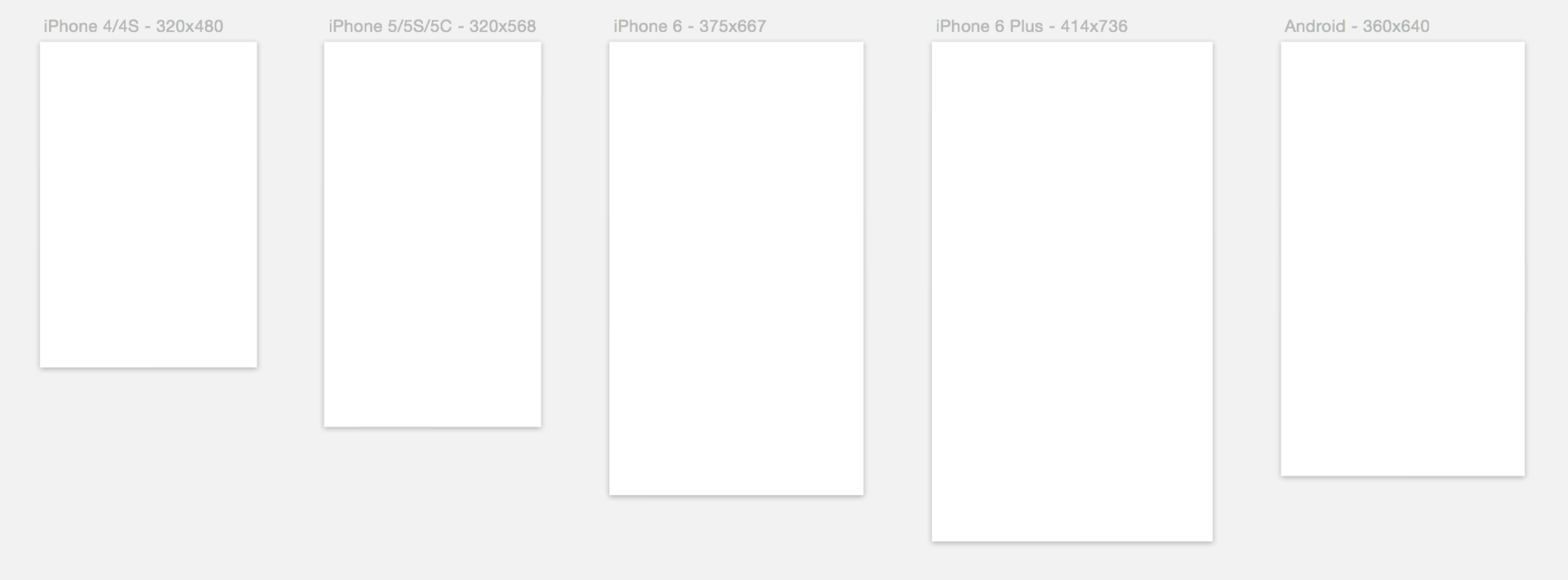
For basic resolutions, we choose 320x568 for iOS (@ 1x) and 360x640 for Android (mdpi), since there are now the largest number of devices with these form factors.
So why exactly @ 1x and mdpi?
Design and Render
At the design and design stages, the @ 1x and mdpi selected by us provide an opportunity to quickly “wrap up” a prototype of the standard Sketch elements and not think about the evenness of the element sizes and indents, since all of them will only increase if we want to see larger resolutions.
In addition, this does not prevent us from looking at the layouts on devices using the Sketsh Preview plugin (works in conjunction with the Skala and Skala Preview applications), the plugin has settings that allow you to increase the layout to the resolution you need to view, and on iOS devices , and on Android.
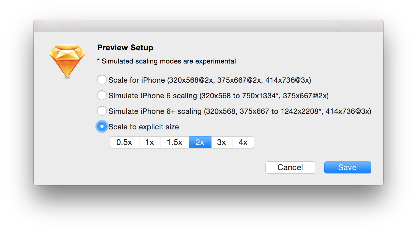
Sketch Preview Plugin Settings
The main requirement is the multiplicity of the resolution of the device to the resolution of the source, for example, our source is iOS 320x568, you can normally watch it only on iPhone 5 / 5s / 5c, and the source Android 360x640 we look at Nexus 5 with a resolution of 3 times more than 1080x1920 (xxhdpi) .
The only thing for someone significant, the downside is the desire to see single-pixel separators at high resolutions. This means that if we want to see on the screen of the iPhone 5 a line 1px thick, then in the layout it should be 0.5px. Since creating a 0.5px line in the layout is not cool, the solution to this problem may be different: create a 2px transparent line in place of the separator with an internal shadow with a value of 0.5. If this is an Android layout, then 0.33-0.35 (for viewing on Nexus 5).
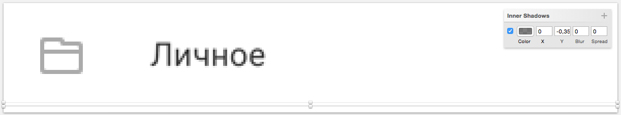
An example of the separator 0.35 installed using the inner shadow in the Android application
But in most cases we just stop at 1px delimiters in the layout, and in the specification for developers we write this moment in words.
Export
The smallest resolutions chosen by us make it easy to export resources from Sketch using the built-in export for iOS and using the Sketch plugin Android Assets for Android, which also decomposes everything into the necessary folders.
Since we chose the smallest resolution, we can not worry about the “soap” (distortion and fuzziness) in the resources for iOS, initially we draw all the elements with a pixel grid (very rarely without) and get clear icons in @ 2x and @ 3x. Obviously, there will be an advantage if an iPad-version of the application appears in the project, as in this case we will need the resources developed @ 1x.
An example of slicing for iOS from @ 1x (the top line is the normal size of the icons, the bottom one is an enlarged one, for detailed viewing)
In the case of Android, our choice of mdpi gives an excellent result in xhdpi / xxhdpi / xxxhdpi and, possibly, “soap” in hdpi.
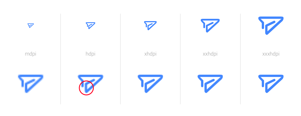
An example of automatic slicing for Android from mdpi
An obvious solution to the problem is to work out hdpi resources with your hands, or strong parity in mdpi (as you can see in the picture with the top line of the airplane, it turned out that the line in the circled area is not).
Note: Always and everywhere it is better to recheck the automatic export of resources.
Specification
Developers are asked to give them the specification in pt and dp, for iOS and Android, respectively. Here the resolutions we chose also help us, we don’t need to think and divide the sizes into some numbers and so on ...
Enough with the help of lite measure or just measure to arrange the desired size. Here you can argue that the plugin is able to recalculate the dimensions of those that are in the right, but not many know about it, and indeed not many know that the dimensions must be given in pt and dp.
Note: The author had an old version of the Sketch Measure plug-in, a fairly new one was changed.
This method can help if the developer wants to look at some size in the source, he will not have to pull the designer or something to consider again.
Here you can also recall Photoshop and the Size Marks script, which, with our resolutions, will give you the dimensions you need to develop (but only in px, unfortunately).
Sample Size Marks script
Thinking of others
The important point, in our opinion, is the transfer of the project from one designer to another. If a new designer gets an xxhdpi project (and he is not used to it or a newbie at all), then he will need a lot of time to study and understand the source, as well as a constant recalculation with division into 3 (which is not as easy as it seems). If he receives an mdpi project, he can easily relate it to the guidelines and will most likely start solving the problem.
In the case of iOS and the transfer of layouts in @ 2x, the situation is a bit simpler, since even the humanities can divide by 2. But sometimes there are source codes in @ 2x for iPhone 6, and again instead of working, recounts and reflections begin.
Lyrics
Some designers choose xxhdpi at the initial point, and this is understandable, but only when using Photoshop and wanting to constantly look at the layout on the device, since Photoshop cannot scale the image itself while viewing.
But since not every screen needs to be checked, it is quite possible to work in mdpi - just increase the source code and look at the device.
Guided by the above considerations, our design team of mobile applications has chosen the way of working with @ 1x and mdpi layouts.
Small survey
Source: https://habr.com/ru/post/261527/
All Articles