HP StormRunner Load. A practical guide. Part III
Hi Habr! Today we bring to your attention the third part of a series of articles on the HP StormRunner Load. Previous parts: I and II .

In this part we will talk about the analysis of the results.
ROLE: Performance Analyst
During the execution of our load test, you can see what is happening on the four graphs. If you have access to real web application servers, you can install special monitors on these machines to measure their work in more detail.
')
A stress test is very similar to a stress test in cardiology. In this case, the patient is on the treadmill, which can accelerate and slow down to mimic stress. Electronic sensors mounted on the patient, measure his heart rate, temperature and respiration. Monitors installed on a web server have a similar purpose.
After testing is over, it's time to analyze the results and see what kind of problems were identified.
Thanks for attention!
In this part we will talk about the analysis of the results.
Results analysis
ROLE: Performance Analyst
During the execution of our load test, you can see what is happening on the four graphs. If you have access to real web application servers, you can install special monitors on these machines to measure their work in more detail.
')
A stress test is very similar to a stress test in cardiology. In this case, the patient is on the treadmill, which can accelerate and slow down to mimic stress. Electronic sensors mounted on the patient, measure his heart rate, temperature and respiration. Monitors installed on a web server have a similar purpose.
After testing is over, it's time to analyze the results and see what kind of problems were identified.
Checking results
- Take a look at the results of your load test. Are there any serious problems? It is likely that you saw some errors related to the network timeout or the lack of SLA levels. There is nothing unusual about them, but this may mean that there is room for improvement in server performance.

- If there are any script errors, select the Script Errors section on your screen and check the messages.
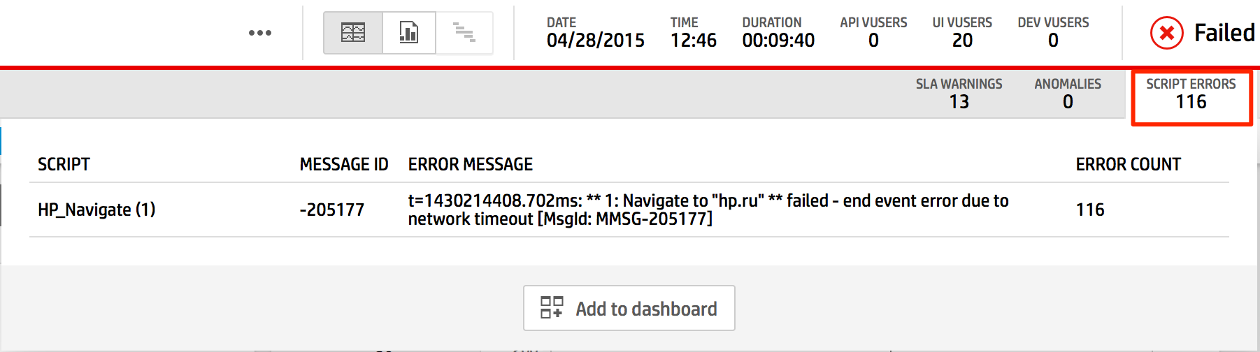
- If there are any anomalies, select the Anomalies section on your screen and check the messages.
- If there are any SLA errors, select the SLA Warnings section on your screen and check the messages.

Configure data graphs
- Charts
Take a look at the results. The Running Vusers chart shows how the number of virtual users has increased and decreased.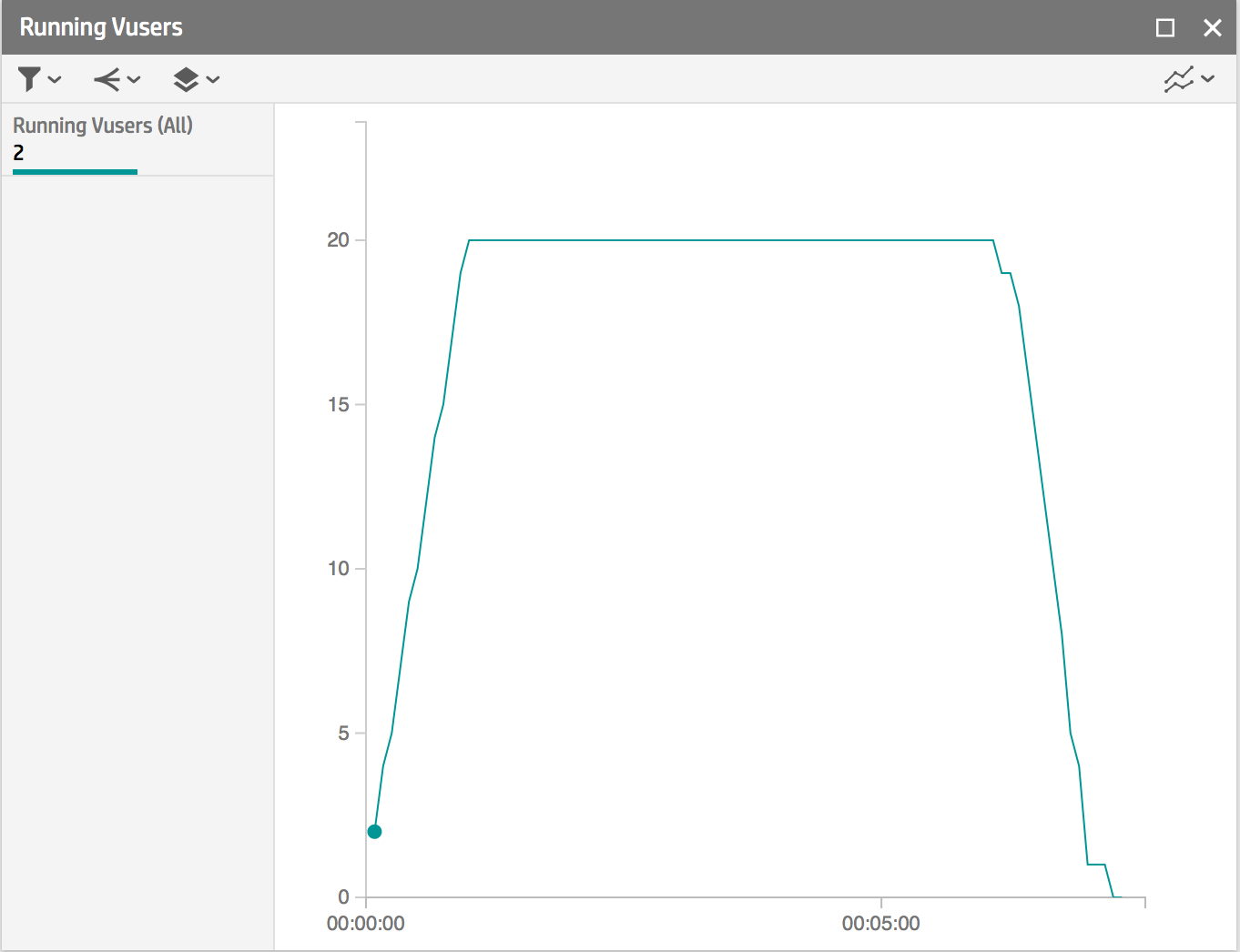
The activity reflected in the Hits per Second graph (Number of hits per second) should approximately correspond to the activity of virtual users.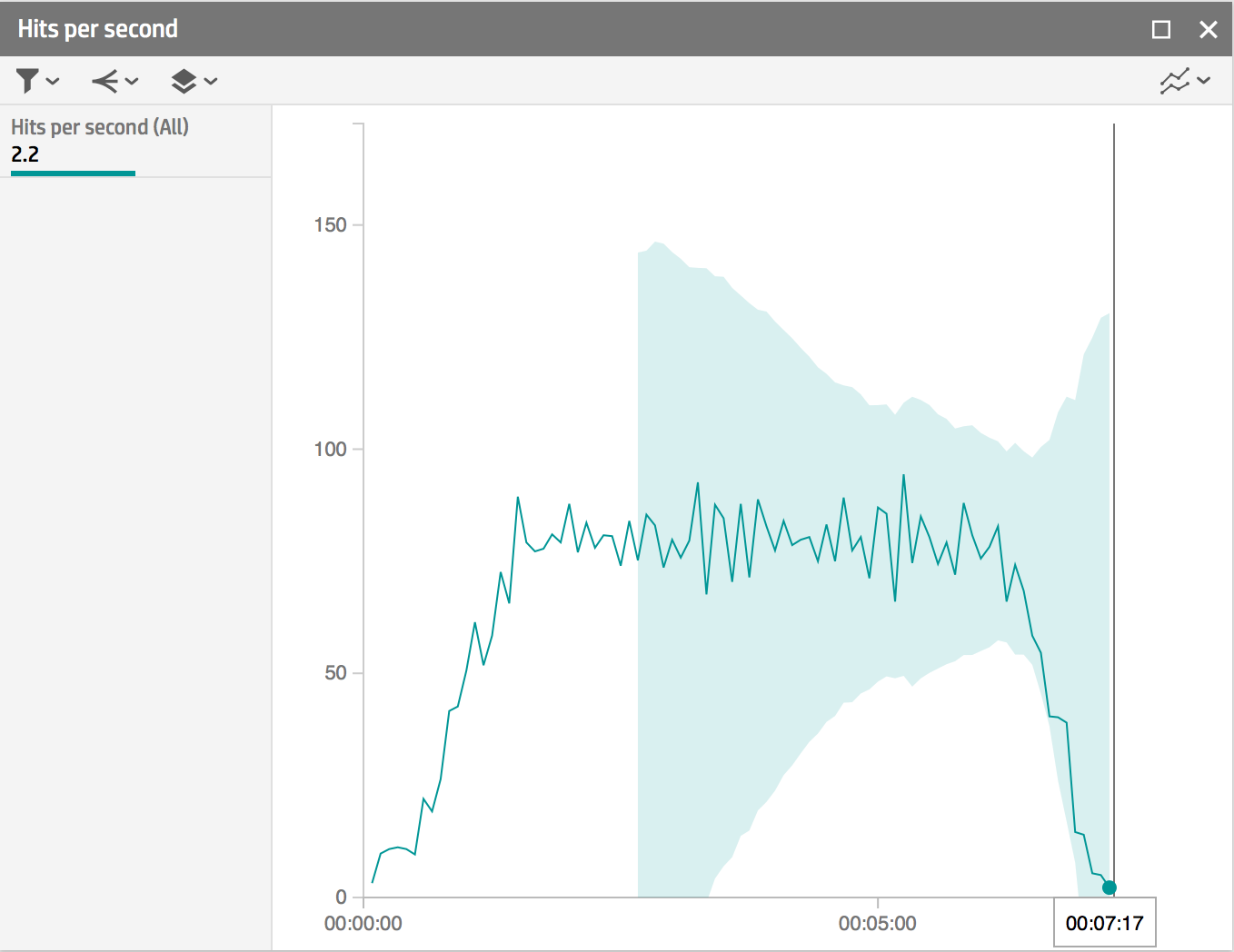
- Correlations and test runs. Hover the mouse over the Hits per Second graph, click the Merge button.

Select the Running Vusers schedule:
You should have something like this: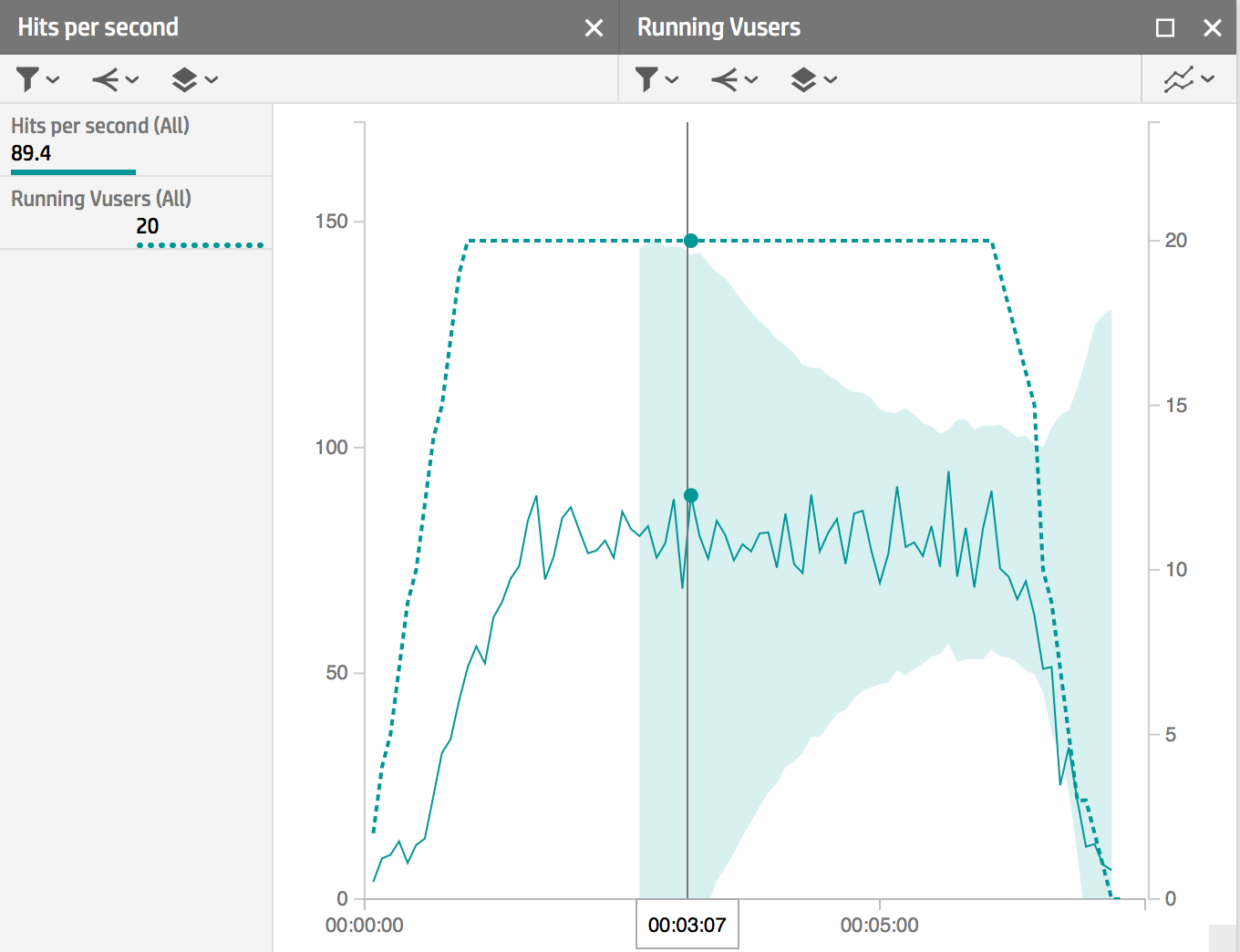
Combining graphs is a great way to see correlations. In the above example, we see that as users were added, the number of hits per second increased. You can also compare two measurement results — the current and the test run — in one widget to visually compare them.
To specify a test run (that is, a run that you are satisfied with and are going to compare other runs), go to the Load Tests section and select a test. On the Runs tab, click the switch to mark the run as a control, or “benchmark.”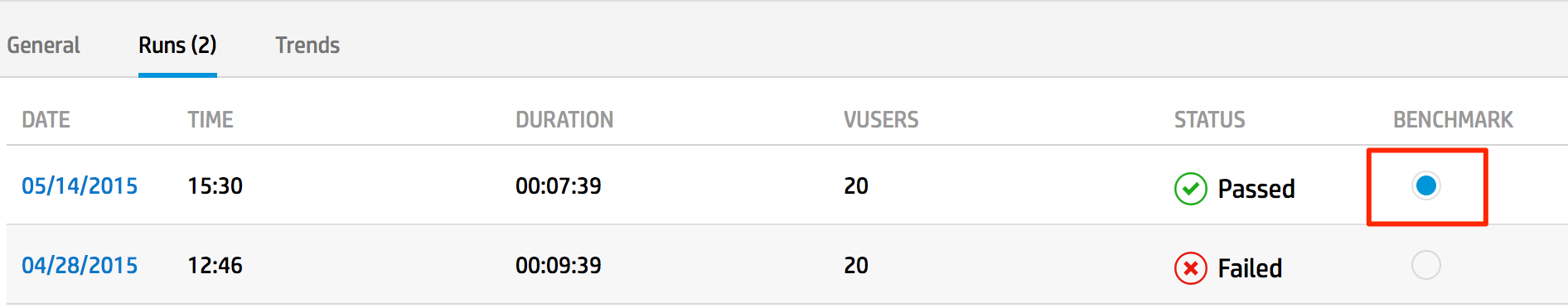
In the dashboard, select a chart, such as Running Vusers. In the widget header, click the Compare with Benchmark button.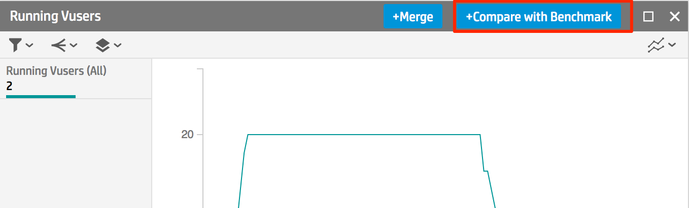
You will see a graph of the current test superimposed with a test launch schedule: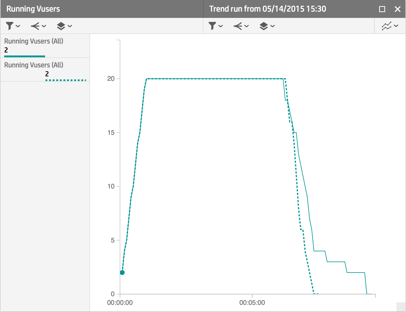
- Separation
Hover over the Hits per second chart. This is a split function.
Select a location by location.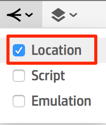
The resulting graph should look something like this, with individual curves displaying data from different regions: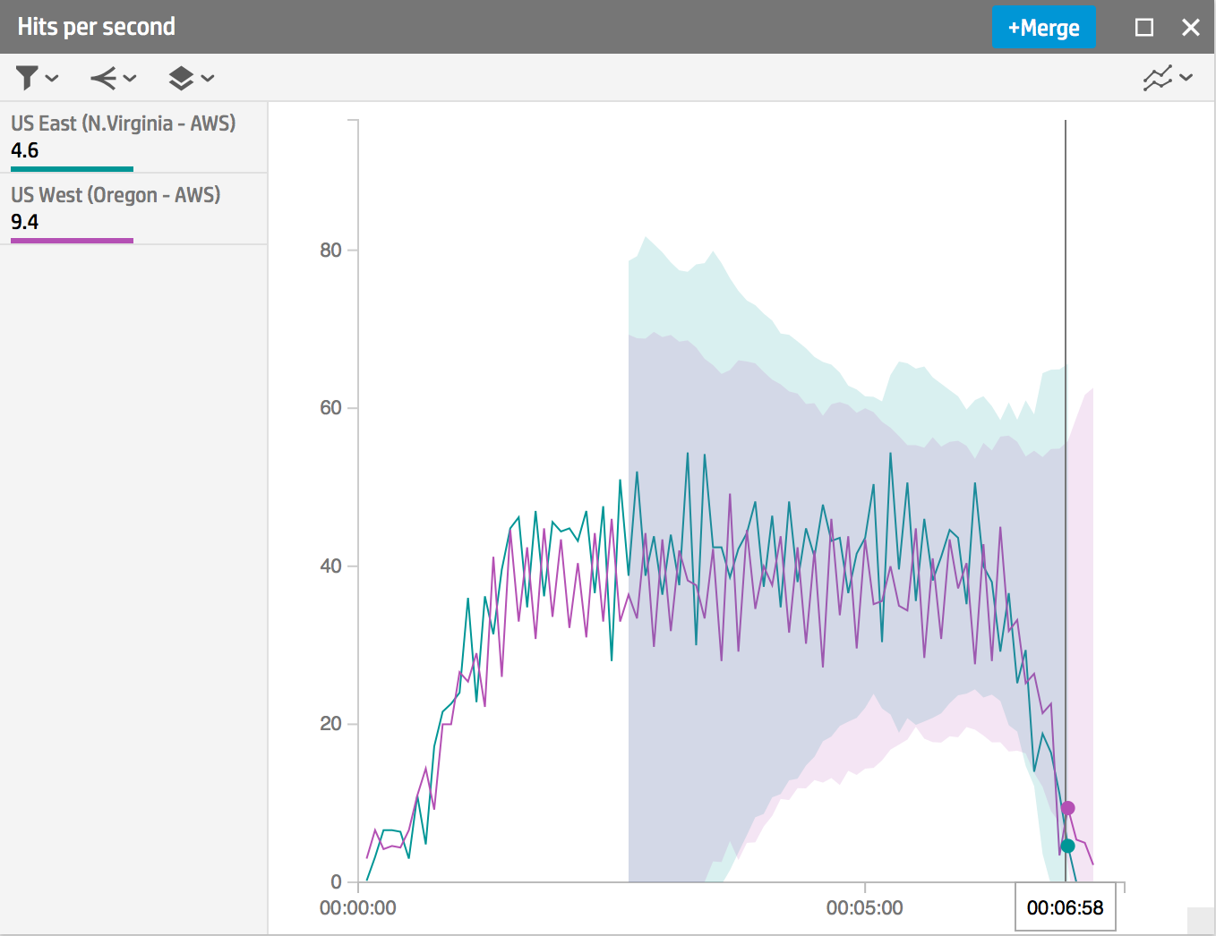
You can experiment with graphs, correlations, and overlays / separations yourself.
Thanks for attention!
Source: https://habr.com/ru/post/261091/
All Articles