Visualization of results in R: first steps
In one of the previous posts we have already written about the central concept in statistics - the p-level of significance. And while disputes about the interpretation of p-value do not abate in the scientific community, much of the research is done using p-value to determine the significance of the differences obtained in the study. Today we will talk about the most creative stage of data processing - how to visualize significant differences.
Visualization of the results is an integral part of the conducted research, for example, publication of an article or presentation of a report, etc. At the same time, the correct image of the differences obtained is not only an aesthetic question (although, of course, effective visualization will at least attract the attention of listeners!), But also purely statistical. I have always liked the approach according to which the schedule should contain an exhaustive report on the work done: which groups compared, by which variable, were statistically significant differences detected, etc.
Let's look at one of the most popular types of graphs - comparing averages - and find out how they can be built in R literally in a few lines of code. We use the mtcars data embedded in R, providing information on various technical characteristics of 32 vehicles. Compare the average fuel consumption of cars with automatic and manual gearbox.
The results of the t-test:
Statistically significant differences were found, it remains to visualize the result. Let's start with the champion's schedule in the “how not to display a comparison of average values” category.
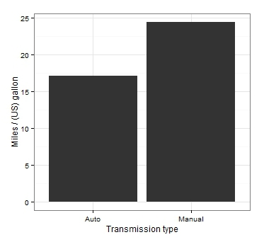
Even if we accept the fact that the averages are displayed in bars, the main drawback of this kind of graph is the lack of measures on it to vary our data. Looking at this graph, it is not at all clear whether significant differences were obtained. And the only conclusion we can make: the right column is above the left!
')
Let's improve the original version as follows: display the average values in dots and add confidence intervals:

So much better! First, non-overlapping confidence intervals confirm our conclusion about statistically significant differences. Secondly, for the attentive observer, this chart also provides additional information about the details of our data: it is easy to see that the confidence interval for the average fuel consumption in the group with a manual gearbox is much wider. In our case, this is explained by the different values of the standard deviation in the groups (in principle, this information cannot be obtained by looking at the bar graph).
Let us now consider a more interesting variant with the use of analysis of variance and comparison of several groups. Let's use one more data embedded in R - ToothGrowth. The data allow us to investigate the growth of teeth in guinea pigs, depending on the dosage of vitamin C and the type of food consumed. Apply the analysis of variance:
Analysis results:
We see that the influence of each factor separately, and their interaction turned out to be significant. This is definitely the case when it is very difficult to draw any conclusions without visualization.
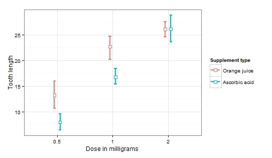
Now it is easy to notice an increase in the average length of teeth with increasing dosage (significant factor dosage). At the same time, the influence of the type of products disappears with increasing dosage (significant factor of the type of product and the interaction of factors).
Thus, putting confidence intervals on the graph not only allows us to assess how statistically significant the differences obtained are, but also makes it possible to get an idea of the nature of variability within the compared groups. Below is a small reminder of the ratio of the distance between the confidence intervals and the approximate p-value.

To date, there are many tools for data analysis and visualization of results, some of them allow you to apply a fairly wide range of statistical methods without having any programming experience (for example, SPSS ). Also quite common for data analysis is the Python programming language.
Not so long ago, an online course on introducing statistics on basic data analysis methods was completed on the Stepic platform. In our new three-week online course from the Institute of Bioinformatics, students will learn the basics of programming in R.
In the first week, we will learn to manipulate data and learn the basic syntax of the language. The second and third weeks of the course are devoted to the application of basic statistical tests and visualization of results. The course is in Russian and absolutely free for everyone! Sign up: Analyzing data in R
Week 1
Week 2
Week 3
See you on the course!
Visualization of the results is an integral part of the conducted research, for example, publication of an article or presentation of a report, etc. At the same time, the correct image of the differences obtained is not only an aesthetic question (although, of course, effective visualization will at least attract the attention of listeners!), But also purely statistical. I have always liked the approach according to which the schedule should contain an exhaustive report on the work done: which groups compared, by which variable, were statistically significant differences detected, etc.
Comparison of average values in R
Let's look at one of the most popular types of graphs - comparing averages - and find out how they can be built in R literally in a few lines of code. We use the mtcars data embedded in R, providing information on various technical characteristics of 32 vehicles. Compare the average fuel consumption of cars with automatic and manual gearbox.
 mtcars $ am <- factor (mtcars $ am, labels = c ("Auto", "Manual")) # make the gearbox type a factor
 t.test (mpg ~ am, mtcars)
The results of the t-test:
 t = -3.7671, df = 18.332, p-value = 0.001374
 alternative hypothesis: true difference
 95 percent confidence interval:
  -11.280194 -3.209684
 sample estimates:
 mean in group 0 mean in group 1
        17.14737 24.39231
Statistically significant differences were found, it remains to visualize the result. Let's start with the champion's schedule in the “how not to display a comparison of average values” category.
What actually is wrong here?
Even if we accept the fact that the averages are displayed in bars, the main drawback of this kind of graph is the lack of measures on it to vary our data. Looking at this graph, it is not at all clear whether significant differences were obtained. And the only conclusion we can make: the right column is above the left!
')
Let's improve the original version as follows: display the average values in dots and add confidence intervals:
 library (ggplot2)
 ggplot (mtcars, aes (am, mpg)) +
   stat_summary (fun.data = mean_cl_boot, geom = "errorbar", width = 0.1, size = 1) +
   stat_summary (fun.y = mean, geom = "point", size = 6, shape = 22, fill = "white") +
   theme_bw () +
   xlab ("Transmission type") +
   ylab ("Miles / (US) gallon")
So much better! First, non-overlapping confidence intervals confirm our conclusion about statistically significant differences. Secondly, for the attentive observer, this chart also provides additional information about the details of our data: it is easy to see that the confidence interval for the average fuel consumption in the group with a manual gearbox is much wider. In our case, this is explained by the different values of the standard deviation in the groups (in principle, this information cannot be obtained by looking at the bar graph).
Dispersion analysis and comparison of several groups
Let us now consider a more interesting variant with the use of analysis of variance and comparison of several groups. Let's use one more data embedded in R - ToothGrowth. The data allow us to investigate the growth of teeth in guinea pigs, depending on the dosage of vitamin C and the type of food consumed. Apply the analysis of variance:
fit <- aov (len ~ dose * supp, ToothGrowth)
Analysis results:
             Df Sum Sq Mean Sq F value Pr (> F)
 dose 1 2224.3 2224.3 133.415 <2e-16 ***
 supp 1 205.3 205.3 12.317 0.000894 ***
 dose: supp 1 88.9 88.9 5.333 0.024631 *
 Residuals 56 933.6 16.7
We see that the influence of each factor separately, and their interaction turned out to be significant. This is definitely the case when it is very difficult to draw any conclusions without visualization.
 ggplot (ToothGrowth, aes (factor (dose), len, col = supp)) +
   stat_summary (fun.data = mean_cl_boot, geom = "errorbar", width = 0.1, size = 1, position = position_dodge (0.2)) +
   stat_summary (fun.y = mean, geom = "point", size = 3, shape = 22, fill = "white", position = position_dodge (0.2)) +
   theme_bw () +
   xlab ("Dose in milligrams") +
   ylab ("Tooth lenght") +
   scale_color_discrete (name = "Supplement type", labels = c ("Orange juice", "Ascorbic acid"))
Now it is easy to notice an increase in the average length of teeth with increasing dosage (significant factor dosage). At the same time, the influence of the type of products disappears with increasing dosage (significant factor of the type of product and the interaction of factors).
Thus, putting confidence intervals on the graph not only allows us to assess how statistically significant the differences obtained are, but also makes it possible to get an idea of the nature of variability within the compared groups. Below is a small reminder of the ratio of the distance between the confidence intervals and the approximate p-value.
Why is it R?
To date, there are many tools for data analysis and visualization of results, some of them allow you to apply a fairly wide range of statistical methods without having any programming experience (for example, SPSS ). Also quite common for data analysis is the Python programming language.
If you start to master data analysis:
- R is a very simple and intuitive programming language. Having studied the basics of working in R, you will greatly simplify and speed up the solution of your problems.
- Working in R provides valuable experience and helps in learning more complex programming languages.
- Of course, visualization! We have considered in this article only the most basic version of graphs, but even it looks many times nicer than visualization in data analysis programs with a graphical interface.
If you already have data analysis experience:
- In R thousands of packages and libraries, providing the opportunity to apply, perhaps, absolutely any statistical methods. Implement regression analysis with random effects in R will allow a special library lme4. Using Python, for example, is much more difficult to do!
- There are a lot of libraries in R, which are written directly by researchers and scientists for solving highly specialized problems from various scientific fields. For example, bioconductor - provides tools for analyzing data in bioinformatics. The grt library will help to process experimental data in the field of computational models in cognitive science! Special libraries will help to process the results of EEG, FMRI or research that captures the movement of a person’s eyes with the help of an eytreker.
- And, in the end, R allows you to quickly solve a wide range of tasks online.
Online course on R in Russian: three weeks of data analysis
Not so long ago, an online course on introducing statistics on basic data analysis methods was completed on the Stepic platform. In our new three-week online course from the Institute of Bioinformatics, students will learn the basics of programming in R.
In the first week, we will learn to manipulate data and learn the basic syntax of the language. The second and third weeks of the course are devoted to the application of basic statistical tests and visualization of results. The course is in Russian and absolutely free for everyone! Sign up: Analyzing data in R
Course program
Week 1
- Variables
- Work with data frame
- Descriptive statistics
- Descriptive statistics. Charts
- Saving results
Week 2
- Nominative data analysis
- Comparison of two groups
- Application of analysis of variance
- Creating your own functions
Week 3
- Correlation and simple linear regression
- Multiple linear regression
- Model Diagnostics
- Binomial regression
- Export analysis results from R
See you on the course!
Source: https://habr.com/ru/post/260981/
All Articles