How I painted the design of the application for the contest Mail.Ru Group

In this article I will try to consider all aspects of the design of a mobile proposal that I had to face. Together with me you will go all the way - from deciding to participate in the competition to writing this publication.
Instead of intro
For several years I regularly read Habr, constantly find useful and interesting information here. These are mostly weekends when you can slowly and thoughtfully read the digest of interesting materials.
')
On one of these days, I came across a note “Competition for designers from Mail.Ru Mail” . I usually do not take part in such contests, but here is a completely different story. The task seemed to me non-standard and from that very interesting. It hooked me from a professional point of view. Will I be able to solve the task or, at worst, develop and propose concepts that will be used in the finished application?
With these thoughts, I set to work.
Problem analysis
I am deeply convinced that before you start solving any problem, you need to study it in detail. Therefore, the first thing I installed on the phone was a lot of different email clients and started analyzing them. As it turned out, some postal services offer a solution to the existing problem, to one degree or another. But none of them can boast of convenience, simplicity and functionality. Yes, and to the full, no service solves this problem.
Formulation of the problem
It would seem, and so everything is clear, there is a task - it is necessary to find a solution. Yes, but now it will be about the tasks that I set for myself. Namely - it is necessary to draw up a plan for which the work will be carried out.
Concept
Development of the concept of the application. This is perhaps the most difficult and longest stage. Here I have to take into account and think through literally all the moments and nuances. This work is done exclusively in the head and on a piece of paper. Learn more about what I came up with this, you will learn later in the process of reading the article.
Separate application or new menu item?
This is one of the most important, but at the same time, quick questions. I unequivocally determined that this should be an additional menu item in the main mail application. Since the essence of the task is to make a convenient service for working with attachments and other important letters, then why force a person to install another application? In addition, the downsides can be attributed to the fact that advertising and informing users about the new application will require additional budget and time. In my case, the user after the upgrade receives an additional convenient service with which he can immediately start working.
Design
Draw a new one or use a ready style? Oddly enough (for me personally), but many designs choose the first. I can explain this only by the fact that they want to show their professional skills, etc. Although it may matter in the additional points that the organizers promised.
But I went the other way and chose the second option. There are many explanations for this:
- The existing style was developed by a team of professionals and they did it obviously not "by eye". Each design decision has its own explanation. At least I believe it;
- The existing style fully corresponds to the “fashion trend”;
- It is convenient and well perceived;
- A lot of users have already got used to it, so why torment them with another interface change?
- Changing the style of the main e-mail client can and should entail redesign and other service applications. And this again is an additional cost.
Next, you need to make a list of layouts, which will include all new screens, as well as those that will undergo changes.
- Main menu of the application
- All attachments
- Submenu of all attachments
- Search, he is the selection of investments
- Calendar in the selection
- Changing the elements of selection
- List of letters
- Mail List Submenu
Layouts
Here we come to the most interesting part of the article, in which we will analyze what I painted there. To warm up, let's start with the first layout, the main menu of the application.

On the left is a screenshot of the current version of the application, on the right is my layout
In my personal opinion, the menu is the only thing that I would change in the existing application, outside the task that was set, besides adding a new item, of course. Apparently this is already a professional deformation.
Since the application provides for the possibility of using several mail services within one application, I found it necessary to leave not just a small line above the menu, but to create a small informative block. Often people use several accounts: for work, personal, registration, old, new, etc. And now they do not need to peer into a small strip with the address of the mail, now almost instantly you can determine the active mail, not only by the avatar, but the name / surname field.
The second point that I corrected is more serious for me personally - the shifted screen of the list of letters (anything). In order to return to it, we have a very small space in the form of a narrow strip, although at the same time, the menu items allow us to make it wider, which I did.
I also removed some of the menu items, which I consider to be little popular, and which can be accessed from the email list screen. If the company has an analyst, using these sections from the main menu, and it says the opposite - naturally, these items can be easily returned to the menu.

Here is the main section, which is designed to solve part of the problem associated with attachments. Here we get from the main menu. Here we will examine in detail literally every line of “what, why, why, and how”
The entire list is divided into lines by file type. Each line has the following elements:
- The icon is a visual indicator of the type of file (s);
- The main title - reports the name of the file, its extension. Or reports the number of files of one type from one letter;
- Subtitle - the subject of the letter in which the file is located;
- Date - the date of receipt (sending) of the letter with the attachment;
- Avatar and the name of the sender or recipient;
- Checkbox - indicates the file belongs to the letter, which was noted by you as important.
All these elements were placed by me in accordance with the uniform style of the application, in order of their priority. So, in the first place is the name of the file with the extension. Further, if a person does not remember the name of the file (about the search a little later), he most likely remembers either the name of the correspondence, or with whom it was conducted. A small avatar was added for the purpose of simplifying the search by the author, and is also a kind of beacon that eliminates the need to read the names in each row of the list. A check mark will also give a bright signal.
Next, we analyze the situation: in your mailbox there is a letter in which 50 photos are attached. To display each photo in the general list of the section is a
Focus on line 5. From the long file name - we cut out only the middle, in order to always see its extension. After all, one type of files, say “Audio”, can be attributed to many formats: mp3, wav, etc.
An additional menu of each item, called “swipe to the left,” contains a standard set of functions, with one special feature. Before the user receives a link to the file, in order to share, he will be asked to save the file to the cloud.

On this screen, the user gets the already familiar functionality of the subcategory selection.

The screen that the user sees by clicking on the search field in the main section "All attachments". Let us dwell on it and understand the presented functionality.
The user can perform a standard text search and an advanced search option. Or make a selection of the specified parameters. All parameters are optional, but their use will help to find the “forgotten” attachment.
Let's see what happens when a person clicks on a date picker:

The field in which the prompt will be located will be highlighted that it is necessary for him to choose a date not earlier than which a letter was received with the desired attachment, and he will also see a second field for which you can choose a second date, not later than which the letter was received. Simply put, the user selects the period in which the letter was received, if he does not remember the exact date.
Also, he (naturally, smoothly and beautifully) will unfold the date selection calendar. Standard, convenient scrolling of the calendar (right-left), when you click on the selected date, the calendar collapses, the selected value is substituted into the field.

On this screen, we can see the selected values, file type, date, and a checked item with a flag. Please note that the second date icon is inactive, otherwise it also becomes colored.
At this stage, work with attachments is over. And it's time to do the second part of the task, namely, useful letters without attachments.

It is unlikely that on this model you will see some kind of revolutionary solution for systematizing useful letters. But this solution in my opinion is the most rational, without a global change in the interface of the email client
In short, these are small bright icons that should give an intuitive user to understand with what useful content a letter. Unfortunately, I do not have statistics, analysts, by the type of useful letters that users of the service receive. But I draw attention to the fact that you should be very careful about the creation of these icons. It is very important that they are, precisely, intuitive to the ordinary user. You should also select each icon with your unique color, otherwise the entire effect will be lost, and the element will simply clutter up the list of letters.

Since there can be a lot of such types of useful letters, it is impossible to place them in the main screen, it will hide too much useful work space. Or they simply can not be displayed in the whole list. Therefore, I considered the most logical solution in this situation to be adding new sections to where they are most awaited.
Testing
I can not touch on one very important point. When designing mobile applications it is very important to test not only the final product (application), but also the design. A matter of a few minutes, simply load the layouts into the device and expand to full screen.
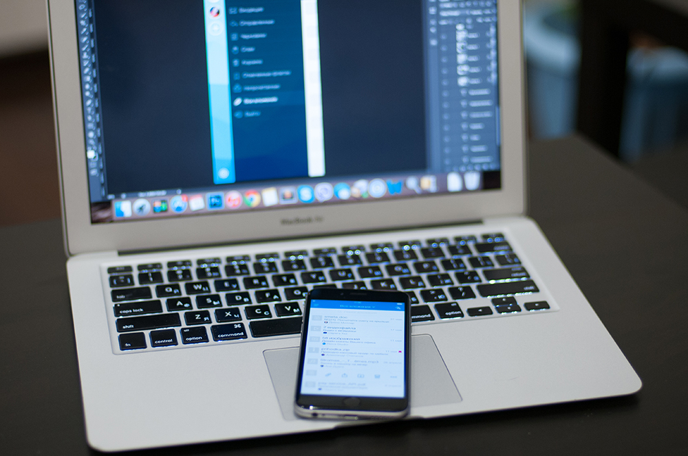
The fact is that a design designed for mobile devices is perceived completely differently on the desktop screen. No matter how beautiful mocap you put (the photo above is mine), you will never understand how it will look in a working application. After all, only on a real smartphone, you can truly appreciate the size of the elements, the distance between them and convenience in general.
Instead of completion
I hope I managed to take you through the whole process of creating a design, bring all thoughts and ideas.
I will finish the article with my little motto. The main thing - to love what you do, because you can not do a good job that you do not like.
Thanks for attention.
Source: https://habr.com/ru/post/260895/
All Articles