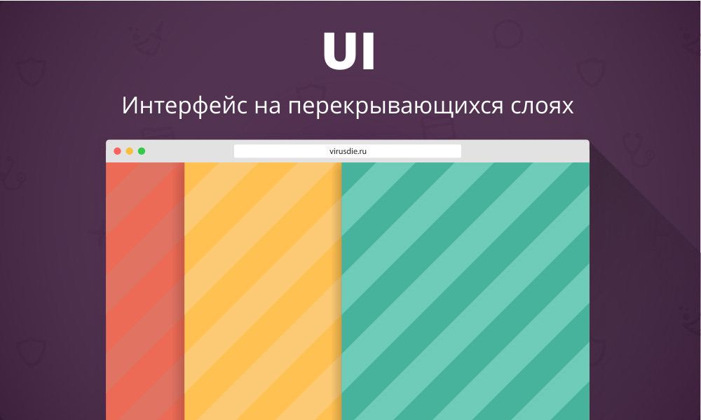
Interface charms on partially overlapping layers
Today I will tell how and why we built the interface of the Virusday service on overlapping layers, how it affected the UX and how we formulated the principle “Looks like an app. Works like an app.
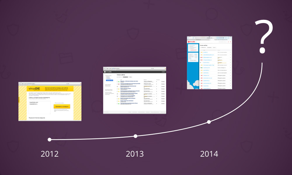
During the time that has elapsed since 2012, we have several times upgraded both the service itself and its interface. However, everything once has to say goodbye and move on. The moment came when neither the architecture nor the interface of the service already responded to our requests. We had to turn a simple antivirus for sites into something more - into a whole set of related and convenient tools for treating and protecting sites. Only one solution was brewing - to make a new service from scratch. Architecture, technology, scripts, interfaces - everything had to be completely new. Our main goal was to achieve the maximum level of comfort for the user when working with a new service.
')
The main task of our department was to create the most convenient and understandable UI. So, in the spring of 2014, we started work on a completely new service interface and I will tell you how it all happened.
The last thing we wanted to do was something ordinary, something that everyone had already seen, had become accustomed to, and in the first place it concerned the UI. It was the concept of a graphical interface that we invented and the scenarios of user interaction with it that largely determined the architecture of the new Virusdai service.
Despite the fact that the interface was supposed to work in the browser, it simply had to be as fast as the application, understandable, enjoyable and functional, and most importantly, how no one would expect to see it. We even came up with the principle that most accurately characterizes our expectations from the new UI and from the service as a whole: “Looks like an app. Works like an app. So we started designing a new interface.
After we have understood the entire functionality of the future service, the main problem gradually began to emerge. It was planned that the user will work with each of their sites, selecting it from the list. However, it was not clear how to show a person the most complete picture of the site status and at the same time provide tools for working with it. Tools could be invoked under different scenarios, but working with them required the simultaneous display of several other tools, and each time a different set of them. The work of a person with one tool could change the content in others, and it was necessary to display changes instantly.

In addition, we wanted the user to always see a list of their sites and the selected resource in it. This was important because of the possible updating of the status of any site from the list at the time of working with another. In addition, our desire to organize comfortable work with the tools has not disappeared anywhere. This means that it would be good to be able to go to work from one site to another without doing any unnecessary actions.

Got a question. How does all this web of scenarios and tools, complemented by our desires to show a healthy person? We wanted all changes to be displayed instantly in all related tools. The effect of each user action would be clear to him. For example, when adding a file to the exclusion list, this file should have disappeared from the report, but immediately appeared in the exclusion list. Or the file infection marker disappeared in the file manager as soon as this file was cured. To the fullest extent, we decided to use Node.JS + Socket.IO and nothing could stop the implementation of the plan.
Another problem that was associated with the problem of overlapping scenarios was the problem of organizing clear and easy navigation.
The abundance of data and tools could easily confuse the user. We did not want a person to get lost in the interface and visually break away from working with the site, but at the same time it was important for us to give him the necessary and sufficient amount of information. The user should always know where he is in relation to the list of sites, as well as always be able to switch between tools as quickly and clearly as possible.
We did not want to use standard navigation methods, and they were not suitable in this case.
Here we began to recall which of the well-known techniques can push us to the solution of the problem. The starting point for us was the interface myMail, the Control Center of iOS, and the side menus of Windows 8. It turned out to be possible to apply a similar principle to solving our problem, having improved it beforehand, and this is what we did.
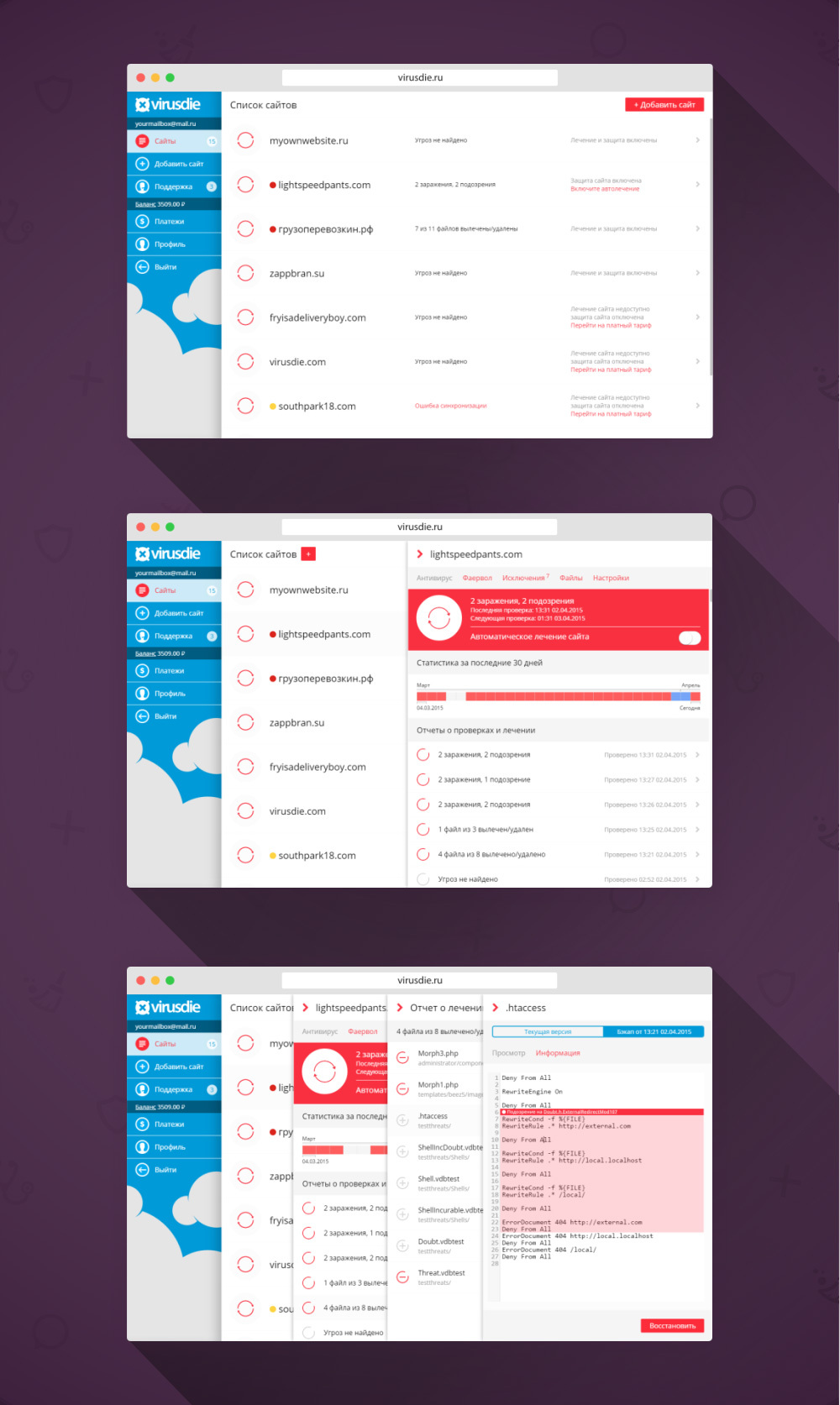
We decided to put each tool (antivirus, inspection reports, firewall, file manager, file editor, exclusion list, and site settings) on its own layer. Now, when calling a tool from any layer, we could no longer hide the current partition, but simply place a new one on top of it. However, if everything was so simple we would not write about this post. We decided that the bottom layer should not completely overlap with the new one. So a person will always see all the tools and sections caused by him, down to the lowest level, and he will not need any additional navigation. He will always know how to get here.
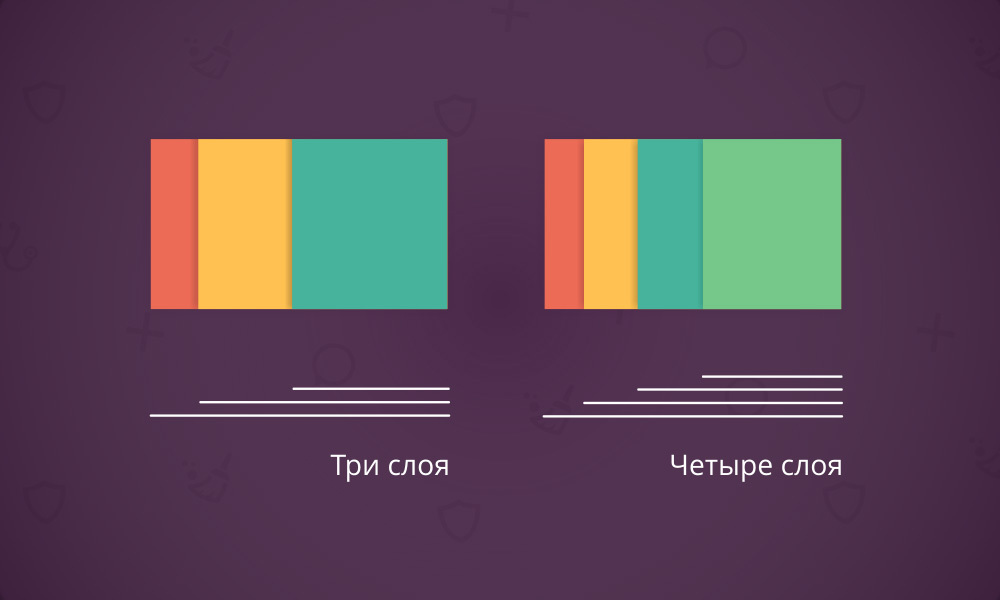
We made the layers “leaving” from right to left and we decided to keep each of them right down to the bottommost one active. It helps to navigate the interface quickly without the need to hide the upper layers. To remove layers, forcing them to “leave” to the right, it was now possible to click on the lower layer. When clicking all the higher layers also turned to the right.
It only remained to optimize the scenarios so that the number of active layers on the screen was not too large. A large number of them would not only lead to an excessive amount of data on the screen and would make navigation difficult. But most importantly, some tools could not be displayed fully. It would simply be inconvenient to work with them. Just imagine a 200px wide file editor — not much can be parsed or edited.

Each new layer moving over the current one shifts the bottom one slightly to the left. This leaves more space for the tool or the upper layer section.
Since we decided to give the user an interface in which he can accurately determine his position at any moment and see the change of all data in real time, it would be unforgivable to bungle with elements dependent on the presence of extended layers on the screen.
For example, the button for adding a new site to the list is located in the upper right-hand corner of the page, but it will not be visible if a person goes to work with the site and an additional layer comes to the right.
We began to shift the button on the bottom layer to the left edge while moving a new layer to the right, simultaneously reducing its size and simplifying it. So the user does not lose the navigation element from the view and always knows where to find it, although the position of the element changes.
We also tried to get rid of almost all the buttons “Save” or “Apply”. Now, when switching switches, new settings are applied instantly. Let this trifle, but from such trifles and convenience is added.
Having done all this work and put together a similar interface, we have already tested it for its convenience. Thanks to Node.JS + Socket.IO and overlapping layers, working with the service now felt like working with a fast application installed on the end device. Navigation has become more convenient and clearer than traditional ones; the transition to tools does not cause any confusion. All actions are expected and logical. In short, the result is fully consistent with the principle “Looks like an app. Works like an app.
This is the approach we used to create the interface of the new Virusday .
During the time that has elapsed since 2012, we have several times upgraded both the service itself and its interface. However, everything once has to say goodbye and move on. The moment came when neither the architecture nor the interface of the service already responded to our requests. We had to turn a simple antivirus for sites into something more - into a whole set of related and convenient tools for treating and protecting sites. Only one solution was brewing - to make a new service from scratch. Architecture, technology, scripts, interfaces - everything had to be completely new. Our main goal was to achieve the maximum level of comfort for the user when working with a new service.
')
The main task of our department was to create the most convenient and understandable UI. So, in the spring of 2014, we started work on a completely new service interface and I will tell you how it all happened.
Throw away the old and make everything new
The last thing we wanted to do was something ordinary, something that everyone had already seen, had become accustomed to, and in the first place it concerned the UI. It was the concept of a graphical interface that we invented and the scenarios of user interaction with it that largely determined the architecture of the new Virusdai service.
Despite the fact that the interface was supposed to work in the browser, it simply had to be as fast as the application, understandable, enjoyable and functional, and most importantly, how no one would expect to see it. We even came up with the principle that most accurately characterizes our expectations from the new UI and from the service as a whole: “Looks like an app. Works like an app. So we started designing a new interface.
Cross Scripting Problem
After we have understood the entire functionality of the future service, the main problem gradually began to emerge. It was planned that the user will work with each of their sites, selecting it from the list. However, it was not clear how to show a person the most complete picture of the site status and at the same time provide tools for working with it. Tools could be invoked under different scenarios, but working with them required the simultaneous display of several other tools, and each time a different set of them. The work of a person with one tool could change the content in others, and it was necessary to display changes instantly.
In addition, we wanted the user to always see a list of their sites and the selected resource in it. This was important because of the possible updating of the status of any site from the list at the time of working with another. In addition, our desire to organize comfortable work with the tools has not disappeared anywhere. This means that it would be good to be able to go to work from one site to another without doing any unnecessary actions.
Got a question. How does all this web of scenarios and tools, complemented by our desires to show a healthy person? We wanted all changes to be displayed instantly in all related tools. The effect of each user action would be clear to him. For example, when adding a file to the exclusion list, this file should have disappeared from the report, but immediately appeared in the exclusion list. Or the file infection marker disappeared in the file manager as soon as this file was cured. To the fullest extent, we decided to use Node.JS + Socket.IO and nothing could stop the implementation of the plan.
Navigation problem
Another problem that was associated with the problem of overlapping scenarios was the problem of organizing clear and easy navigation.
The abundance of data and tools could easily confuse the user. We did not want a person to get lost in the interface and visually break away from working with the site, but at the same time it was important for us to give him the necessary and sufficient amount of information. The user should always know where he is in relation to the list of sites, as well as always be able to switch between tools as quickly and clearly as possible.
We did not want to use standard navigation methods, and they were not suitable in this case.
Apply partially overlapping layers
Here we began to recall which of the well-known techniques can push us to the solution of the problem. The starting point for us was the interface myMail, the Control Center of iOS, and the side menus of Windows 8. It turned out to be possible to apply a similar principle to solving our problem, having improved it beforehand, and this is what we did.
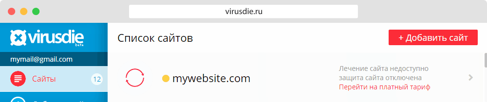
We decided to put each tool (antivirus, inspection reports, firewall, file manager, file editor, exclusion list, and site settings) on its own layer. Now, when calling a tool from any layer, we could no longer hide the current partition, but simply place a new one on top of it. However, if everything was so simple we would not write about this post. We decided that the bottom layer should not completely overlap with the new one. So a person will always see all the tools and sections caused by him, down to the lowest level, and he will not need any additional navigation. He will always know how to get here.
We made the layers “leaving” from right to left and we decided to keep each of them right down to the bottommost one active. It helps to navigate the interface quickly without the need to hide the upper layers. To remove layers, forcing them to “leave” to the right, it was now possible to click on the lower layer. When clicking all the higher layers also turned to the right.
It only remained to optimize the scenarios so that the number of active layers on the screen was not too large. A large number of them would not only lead to an excessive amount of data on the screen and would make navigation difficult. But most importantly, some tools could not be displayed fully. It would simply be inconvenient to work with them. Just imagine a 200px wide file editor — not much can be parsed or edited.
Each new layer moving over the current one shifts the bottom one slightly to the left. This leaves more space for the tool or the upper layer section.
Ready interface
Since we decided to give the user an interface in which he can accurately determine his position at any moment and see the change of all data in real time, it would be unforgivable to bungle with elements dependent on the presence of extended layers on the screen.
For example, the button for adding a new site to the list is located in the upper right-hand corner of the page, but it will not be visible if a person goes to work with the site and an additional layer comes to the right.
We began to shift the button on the bottom layer to the left edge while moving a new layer to the right, simultaneously reducing its size and simplifying it. So the user does not lose the navigation element from the view and always knows where to find it, although the position of the element changes.
We also tried to get rid of almost all the buttons “Save” or “Apply”. Now, when switching switches, new settings are applied instantly. Let this trifle, but from such trifles and convenience is added.
Finally
Having done all this work and put together a similar interface, we have already tested it for its convenience. Thanks to Node.JS + Socket.IO and overlapping layers, working with the service now felt like working with a fast application installed on the end device. Navigation has become more convenient and clearer than traditional ones; the transition to tools does not cause any confusion. All actions are expected and logical. In short, the result is fully consistent with the principle “Looks like an app. Works like an app.
This is the approach we used to create the interface of the new Virusday .
Source: https://habr.com/ru/post/260421/
All Articles