Buying in the online store: work on the bugs
The process of buying on the Internet is deceptive - once having tried to buy goods online, buyers realize all the advantages of a remote purchase. It's so great to have a shop always at hand: order food, tickets, choose household appliances and much more, being anywhere and at any time. Pleasant sensations from a comfortable purchase in combination with the worked out marketing activity of the online store force the customer to return again and again. This is confirmed by statistics : in 2014, the Russian online shopping market grew by 35% to 560 billion rubles, while the number of customers grew by 37% to 25.4 million people. In total, the Russians made 195 million purchases on the Internet and spent 41% more on them than in 2013 - 645 billion rubles. The average bill, taking into account the cost of delivery was 3 300 rubles.
However, often the buying process causes negative emotions associated, for example, with the unfriendly interface of the whole chain of actions, the inability to choose the desired payment method, the lack of special offers ...

')
During a joint study of MasterCard and UsabilityLab , the usability of the online shopping process, the main mistakes made at each stage were identified. Any such mistake is the risk of losing the customer or diverting his attention to third-party pages and services. The price of an error is obvious - loss of profit. It is worth noting that the awareness of errors in the design and improvement of pages occurs fairly quickly. The study started at the end of 2013 - during this period, some payment systems made significant changes to their pages and improved usability. This can be seen by comparing examples from this post and reviewing modern solutions offered to users on large sites.
Let us divide the results by the stages of purchase and consider what was done wrong and what risks were caused by one or other incorrect parameters.
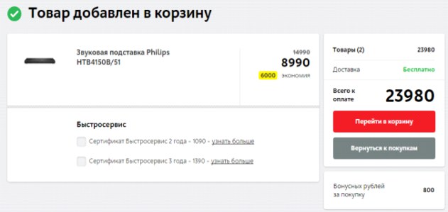
In the process of adding goods to the cart may be a large number of errors. Meanwhile, work with the basket is an important stage of buying on the Internet, where the buyer not only collects the composition of the order, but also postpones the goods for further scrutiny and making the final purchase decision.
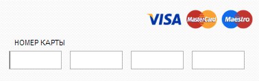
Additional pages that appear when adding a product to the cart cause a feeling of wasting time and taking extra steps. This is especially unjustified on the pages of mobile sites, when the page load takes some time. So, for example, on the M.Video website, the step of adding to the cart is implemented by an extra step - from the page it is impossible to go straight to checkout. This behavior of the purchase page goes beyond the usual behavior of the buyer and may lead to the cancellation of the purchase decision.
Another common mistake is the unobvious change in the status of the add product button to the cart after clicking. During the survey, respondents noticed that when adding to the cart, the add button practically does not change - thus, the completeness of the buyer’s action is not obvious. So, on Foodpanda site, the feedback that the item is added to the cart is displayed in the upper right part of the page, which may be invisible to the user, since the button name on the item card itself does not change and there is no feedback that the item is added cart This leads to the fact that the user clicks on the button again and adds several items to the cart without noticing it.
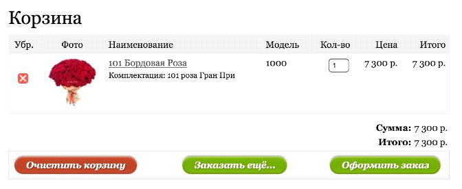
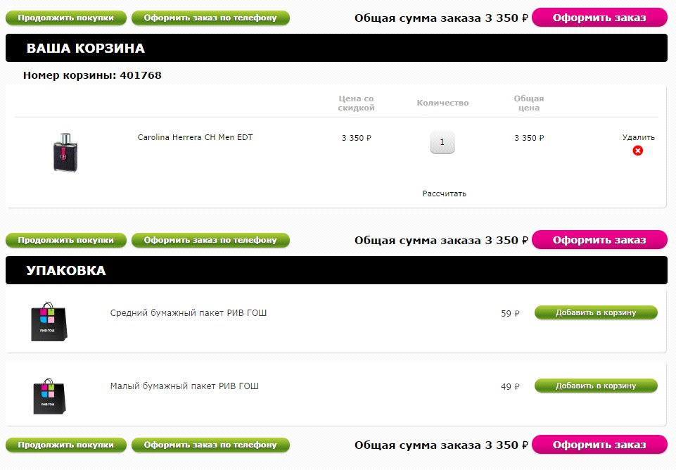
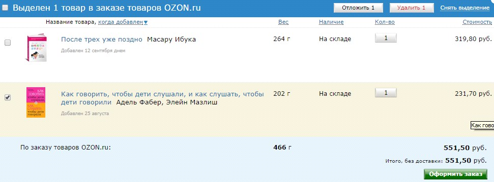
Many buyers add goods to the cart instead of postponing, and then, already reviewing the cart and looking through the detailed characteristics of the product, they make a decision about the purchase. Many online stores do not consider such a model of behavior and put into the basket the goods with a mean description or without it at all. Thus, in the RivGosh store, it is possible to judge whether the user chose the product correctly, he can only by price - the photo is not clickable, neither the characteristics, nor the brief description, nor the link to the description in the basket. If the buyer does not remember the price, he will have to go back to the catalog and find out whether he put the correct product in the basket.
Often it happens that the product is missing, but it remains active to the order in the catalog. In the M.Video store, the buyer finds out that the goods are not available late - at the end of the ordering process, and in RivGosh - after authorization and selection of the delivery method. As a result of this late information, the user may become annoyed and disloyal to the online store.
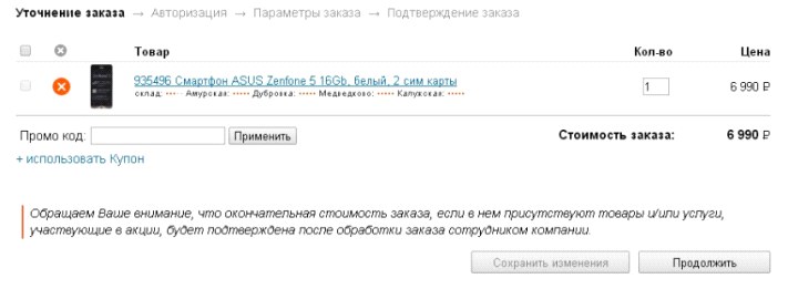
The button to continue ordering on some sites is invisible, or merges in design (shape, size, color and font) with other buttons. So, in Citylink, the button is not highlighted at all, while in Buket.ru and RivGosh, the buttons with different actions do not differ from each other; without reading the text on the button, it is impossible to determine which action will take place after pressing. In addition, on the site RivGosh there are two similar buttons, the name of which is unclear, they perform the same actions or different. Meanwhile, the button to continue ordering should be readable, visible and unambiguous.
When choosing certain types of consumer goods (cosmetics, clothing, shoes, etc.) , the possibility of returning to the product catalog is extremely important. Some online stores lack or hardly notice the button (or link) to return to the catalog for selecting goods. For example, in Lamoda, a similar link is placed in the unobvious bottom menu bar.
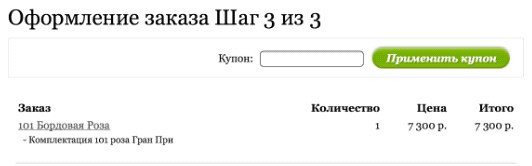
It is better if the buyer finds out in the basket about the terms of payment and delivery. However, Enter on the shopping cart page does not have information that the purchase delivery may be paid. It is also important to be wary of using the promotional code or discount basket. On the one hand, the user who knows the promotional code must know where to enter the information. But on the other hand, a user who is not aware of the discount and has seen the input field of the promotional code will fix the attention on the bonus and may go in search of a coupon to other sites, and this is extremely undesirable behavior. It is also important where the discount entry field is located - the buyer who knows about the discount, but did not meet the input field during the entire checkout process, may terminate the purchase. In Buket.ru, the discount input field is on the last step of ordering, in Utkonos and Lamoda shops it is quite invisible, in Enter the field is noticeable and attracts attention. Another mistake is the unclear name of the coupon entry field . For example, Foodpanda has a field called Voucher, which is at odds with the usual names for the types of discounts. By the way, none of the sites tested provided information on how to get a discount or bonus.

Another critical error is the incorrect behavior of the shopping cart after registration. It happens that after registration as a result of a technical failure, the product disappears from the basket and has to be searched again. And if it is not very critical for ordering single goods, then for grocery stores with a large number of items in the order is very important.
Removing goods from the cart in some online stores is not obvious: in order to remove Ozon, you must first mark the goods with a hint, and then click on the activated button at the top of the list. Foodpanda deletes items by resetting the quantity of goods. Thus, the buyer in the course of changing the composition of the order commits many unnecessary actions.
User data obtained during registration form the online store's customer base — the target audience for further marketing activities, such as mailings, promotions, and so on ... However, in pursuit of customer data, shops forget about the convenience of buying: they request data that is not significant for purchase, fields, do not talk about the benefits of authorization and so on ...
For example, the Ticketland ticketing service without authorization does not even allow adding tickets to the basket, the authorization pop-up window does not provide a link to the registration and the user is forced to interrupt the purchase process to complete the registration on the site. In addition, the registration process requires confirmation of all data by codes sent to e-mail and SMS. In one of the tests, the SMS arrived to the respondent 40 minutes after the request, respectively, it was impossible to complete the purchase before that.

It seems logical to allow the buyer to make the first order without registration , because it is not known whether he will return to this online store again. Almost on all tested sites, the possibility of ordering without registration was provided, but not at all it was noticeable and highlighted on the page. On the Holodilnik store website there is a possibility to order goods without registration, but it is located at the very bottom of the page under the registration form, most users do not notice it. Buying a product without registering on the Sportmaster website seems an inactive option due to the fact that it is made in gray font on a gray background.
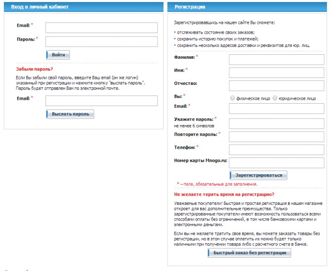
In exchange for providing contact information, many stores are ready to give certain bonuses and benefits. That is why the options for unregistered users are often deliberately limited in order to stimulate the client to leave their contact details. It is no coincidence that respondents indicated that they think that in this way the site of the store intentionally forces them to register. Most often, the restriction applies to various forms of prepayment (by credit card, electronic money). For example, on the Holodilnik store website, payment by credit card and electronic wallets is impossible without registration. Respondents noted the inconvenience of such a decision and returned to the previous steps for registration. The Citilink store website also restricts payment methods for unregistered users, and at the stage of selecting the authorization method, there is no information on restrictions. Such restrictions affect customer loyalty to the online store and therefore undesirable in the implementation of the card purchase.
Another situation related to authorization is the lack of implementation of some features . In the current case, the user may assume that such opportunities (for example, authorization options) are missing or do not understand how to use them. On the website of the Ticketland service, you can log in via social networks and register by e-mail address. On the page that appears after adding tickets to the cart, registration options via social networks are not presented.
On some sites where authorization gives advantages to customers, there is no information about these advantages or their description has a fuzzy structure and is poorly visualized. So, on the Holodilnik website, the benefits of registration are described in several places on the page with small, poorly structured text.
Another mistake is to describe the shortcomings of working without authorization, and not the advantages that registration gives the buyer. For example, on the Aeroexpress website, users are faced with a choice: authorize or refuse authorization. The message describes the shortcomings of the lack of registration ("buying without authorization, you can not use ..."). Double denial and poorly structured information in the wording of the advantages of registration lead to the fact that most users skip the message without reading it to the end.
On the same Aeroexpress website, registration is not built into the order process. Immediately after the registration is completed, the purchase of previously selected tickets does not continue - the user is in the unauthorized zone, he needs to go to the site separately using the newly created login and password. This is another important error online store. After the registration is completed, the user must remain automatically authorized on the site , he should be given the opportunity to continue ordering.
During registration, it is often necessary to confirm contact details , such as a mobile phone number. If there is such a need, the stage should be consistently integrated into the registration process . However, some stores violate these rules and force the user to return to another stage. For example, on the Utkonos store website you need to confirm the phone number entered during registration. At the same time, after registration, you need to go back to the basket page, where at the very bottom of the page there is a phone number confirmation function.
After completion of registration in some online stores, the contents of the basket are not saved and the buyer has to refill the basket. Such a decision on the site caused a sharply negative reaction from the survey respondents. An example of this behavior of an ordering system is the Aeroexpress website, where after completing registration, the user needs to log in and then re-select the parameters of the desired ticket. This significantly increases the time of ticket purchase and negatively affects the satisfaction with the service.
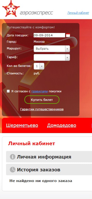
Some sites offer the user to come up with a login to log in, while optimally making the login an email address or phone number. When registering on the Aeroexpress website, you need to separately enter a phone number, email address and login. At the same time, users who wanted to register on the site entered their email address and then copied it into the login field. In principle, this is not the most critical error, but it is difficult for users to memorize a large number of logins to log in to various services. It is always more convenient when the main identifier is an e-mail address or phone number, which most people remember by heart.
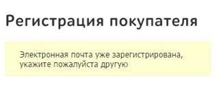
Another non-trivial situation for a user arises on sites where an attempt to re-register for the same mail causes unexpected difficulties. For example, with this action, the Utkonos error is displayed at the store, and in Citylink, it allows such registration, but it requires you to fill in 11 fields.
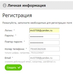
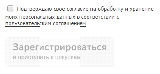
The error closely related to registration is the absence of a warning to the user about how his contact details will be used. On some sites, the option to subscribe to the newsletter is hidden in the agreement on the processing of personal data and is not highlighted in a separate paragraph. In M.Video, the consent to the newsletter is hidden in the terms of the agreement on personal data and is a mandatory item to continue ordering. Similarly, it is impossible to complete registration on the website of the Utkonos store without agreeing to a subscription to mailings hidden in the agreement.
Modern online trading provides many payment options, among which the user must choose the most convenient one. However, at this stage, online stores make mistakes that can lead the user to confusion and distract from the main process of making a purchase.
Errors begin with the name of the payment method, which is sometimes ambiguous. For example, in the list of payment methods, when you subscribe to the Vedomosti edition, there is a “credit card” item. The survey respondent was not sure that he could make a payment with a debit card, despite the fact that the phrase “credit card” had become the well-established name of any plastic bank card.
Another mistake in usability is the lack of a structure of the list of possible payment methods (prepayment, upon receipt of goods and on credit), for example, from the Messenger shop. The absence of such a division somewhat increases the time of purchase by searching for and choosing a payment method.

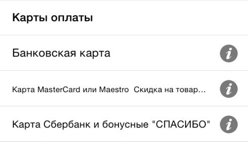
Not the most serious, but very unpleasant mistakes in the design of the payment stage include the lack of visual cues in the form of pictograms and logos of payment services. For example, in the Ozon application, there are no visual cues in the list of payment methods. Reading the list from top to bottom, users may not notice that special conditions apply to MasterCard cards and Sberbank cards. In addition, small text is undesirable in the description of the available service options.
A more serious mistake that can not only confuse the buyer, but also interrupt the purchase process - this is the lack of notification of a change in the amount of payment when choosing one of the methods. In case the method implies a discount, a warning about a price change is less critical. For example, respondents to testing on the M.Video store site noticed that when choosing a card payment, the order amount decreased, but did not understand why. The answer was simple: the store offers a discount for prepaid cards, but does not provide information about this. But in the case of an increase in the amount of the order, it is critical to report this as early as possible , otherwise the purchase may not take place. An unfortunate example is the Zara store application, when paying in which some methods increase the order amount, but nothing is reported about the commission at the stage of choosing the payment method.
In some stores, at the stage of choosing a payment method, it is necessary to simultaneously select a bank card payment system .This step increases the time of checkout and overloads the list of payment methods. The stage can be optimized by automatically determining the type of card, because by the first digit of its number you can determine the payment system. Such a problem was encountered in Steam and Zara applications. In the Steam application, the choice is also complicated due to the small text in the list and the lack of logos of payment systems.
The ability to deliver to your home or conveniently located pickup point is one of the key benefits of online trading. When choosing delivery options, the buyer takes into account important parameters for him: time, time, cost, proximity to the points of issue.
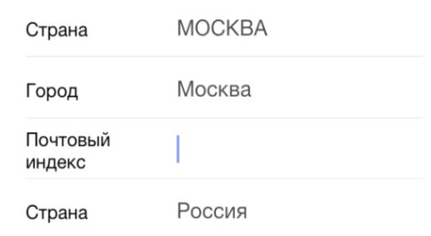
Unnecessary fields when filling out the form - one of the unpleasant shortcomings in the form of choice of delivery. For example, Zara is required to enter the index - the respondents had the feeling that the order would be sent to the post office.
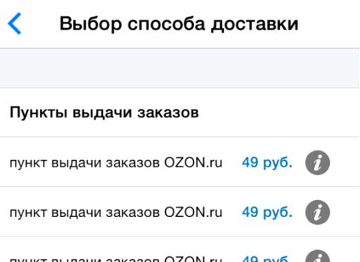
Another drawback is that there is no geographical location or address of the points of issue of goods.Not all sites had the ability to search for a pickup point on a map. And in the application of the Ozon store, for example, the possible items are represented by a regular list with the same names. The differences between them are not clear, the buyer has to click on the “Information” icon several times to find out where a particular item is located.
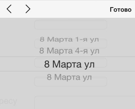
Non-standard input address - an error that delivers significant inconvenience to the buyer.Practically on all sites tested during the research, it was possible to enter the address in the input field and continue ordering. And it is impossible to do this on the Citilink store website: when entering a street name in a non-standard format, the field is marked as mistakenly filled in and the order cannot be continued. The same street names on the list can also confuse users and make them doubt that they are doing everything right. On the Citilink store website, choosing a delivery street is often offered from two identical options.
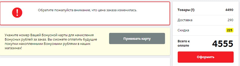
An even more critical error associated with the additional expenses of the buyer is the absence of an indication of the estimated cost of delivery when choosing a type.For example, on the site of the Enter store, when choosing a delivery method, information is not indicated that delivery is charged. In a real situation, this could lead to a refusal to purchase or to commit unnecessary actions to choose a different delivery method.

On the website of the M.Video store a notification that the price of the order has changed, appears only after the choice of the delivery method. During the study, no respondent complained of a sudden price change, since the changes were only due to its decrease due to the discount. However, all respondents said that they could not understand why this happened and why they were given a discount. Thus, a change in the price to a higher or lower side does not go unnoticed by the buyer and it is important to inform him about it on time and easily.
In some situations, the goods are received by the wrong person who placed the order. If, upon delivery of the goods, the courier can request an identity document from the recipient, information about this should be present on the page. Since the names of the beneficiary and the payer can differ only with prepayments, the input field for the name of the beneficiary should appear only after choosing the payment method . But not all online stores take this nuance into account. For example, on the Ulmart store site after switching to payment, it is possible to enter information about the payer. However, this form appears after the transition to payment, and therefore is associated by users with the beginning of entering card details.
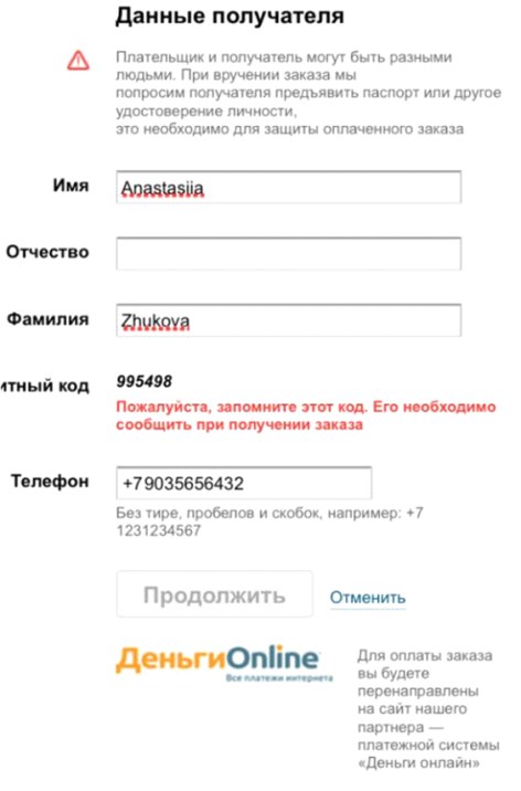
Almost all respondents began to enter information from their bank card in this field, while not understanding where to get information about the payer’s patronymic and why it is impossible to proceed with payment without entering data.
After the buyer has formed an order, he must check all the parameters on the order confirmation page and give his consent to the transition to payment. The order confirmation page must be consistent with the chosen methods of delivery, payment and receipt of goods. If the content of the page does not match the previously selected data, the user may have doubts that he entered all the data correctly. For example, the Ulmart store website on the order confirmation page provides information on how to get the goods in the store, despite the fact that the user has chosen delivery.
Another mistake - the inability to edit the order.So, on the Citilink store website on the confirmation page there is no possibility to change the order parameters. The only way to do this is to follow the link in the navigation chain at the top of the screen, which may not be obvious to users.
On the Utkonos store website, on the order confirmation page, you can only change the number of items in the cart and phone number. For all other changes you need to return to the previous steps of the order.
This is an extremely inconvenient behavior of the site page, as the user leaves the stage immediately close to the payment. Any departure of the user to the previous page or to another menu item causes the risk that the purchase will remain unfinished.
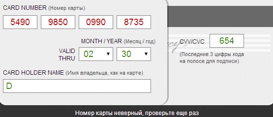
From the point of view of the buyer, this is quite a stressful stage, when it is necessary to enter the details of a bank card as carefully as possible. In addition, this stage is special because of the alternate transfer of the user's attention from the virtual form on the monitor to the physical bank card. When entering data on mobile devices, the probability of an error increases, and the correction of the entered data causes difficulties and annoyance of users. Obviously, this should be the most thorough purchase stage in terms of usability.
At this stage, it is important to divide the input data into blocks corresponding to the size of the data from the card.For example, divide the 16-digit card number into 4 blocks of 4 digits with the same logic as is done on the front of a physical bank card. In the Steam application under test, the card number is not divided into blocks, which is why respondents had to spend more time checking and entering data.

Not all cards with which you can make payments on the Internet contain 16 numbers in the number. Some processing services start accepting Maestro cards for payment, but the format of entry and entry of the card number remains 16-digit, which may confuse users, since the number on the card does not match the format in the input fields on the site. For example, with the liters service, the liters service has a 16-character input field, regardless of the type of card selected.
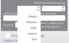
It is important to preserve the similarity with all the real details entered from the card. For example, on the Aeroexpress mobile site, the month selection list suggests month names, not their order number. And on the page for entering the details of another payment provider both the sequence number and the name of the month are indicated, which may also complicate the search. The format for entering the year on the Aeroexpress website also does not correspond to that prescribed on the map. Such discrepancies require the buyer to make additional efforts to convert the month to a numerical value, increasing the likelihood of incorrect data entry.
Another mistake of the designed data entry forms is the separate fields for entering the name and surname of the card user.Users are accustomed to the same field to fill in the name, and, starting to enter it into the form, usually specify the name and surname simultaneously. Also, users usually read only the name of the current field, without looking at and paying attention to subsequent fields. Therefore, when users encounter the fact that the first and last names are presented in different input fields, they have to delete or copy the last name from the “Name” field and re-enter it in another field.

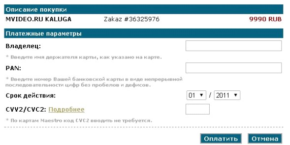
All the listed errors are reduced to another important error, the correction of which could solve a number of the above problems: the virtual map view does not match the map view.In those cases when the card was not presented on the page, respondents had questions about where to look for the card's security code and in what format to enter data in other fields. For example, such a problem was often encountered when filling in the details on the M.Video store website. The input fields on the page are not in the order in which they appear on the map. Clues about the location of information on the map are incomprehensible and their search requires extra effort.
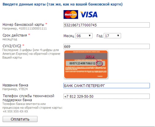
Entering information from a bank card should not be interrupted by entering additional information.However, this rule is violated. On the one hand, a large number of fields to fill out creates a sense of reliability of the payment service, but on the other, it forces the user to search for the necessary information. A similar example of a failed decision is the ChronoPay payment form. Users spend more time filling out card details when it is necessary to constantly switch from entering information on the card (not in the order in which it appears on the card) to additional information (for example, entering an email address).
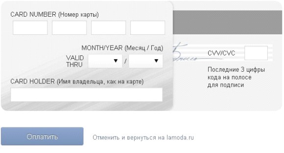
Even with the correct sequence of location of the card details field, many respondents skipped and did not fill in some form fields, because they did not notice them. This is due to the fact that the location of additional input fields does not fall on the path of the user's gaze.For example, on the Lamoda website, the entry field for the card's security code is not noticeable on the page, as when filling in the fields, the user's gaze moves downwards to the payment confirmation button, which is highlighted on the page and attracts attention. As a result, some respondents filled out a form without specifying a code.
Working on the design of the payment page, it should be understood that the majority of users do not see the difference between the store site and the payment page. Therefore, users are surprised and annoyed when there is a demand on the payment page to fill in the fields that he has previously filled out. For example, on the payment page of the Uniteller service, you need to enter the phone number and e-mail address, which were previously entered by the user during the ordering process.
Paradoxically, to make a payment, it is necessary to fill in all three fields: the card number, its validity period and the security code. So, for example, on the ChronoPay payment page out of 12 fields on the page for payment, only 3 are needed. All respondents on this page noted an excessive number of form fields and its poor structure.
It is undesirable to use low-frequency and technical terms in the names of form fields and prompts. For example, on the site of one of the stores used the abbreviation PAN, unfamiliar to a wide range of users.

Most payment pages still use the CVV / CVC name. Information on where to look for it and how it looks is present only in the form of a hint to the name of the field, and in Steam and Zara applications there is no hint about where the security code of the card is located.

Filling tips are usually located next to the input field. This is not the best implementation, but the most unfortunate way to design hints to form fields is footnotes to the footer of the page . First, they create the feeling that some form fields are mandatory, since the asterisk (asterisk) is a familiar indicator of a required field. Secondly, the footnote causes a sense of hidden conditions among users.
After clicking on the "Pay" button, the user goes to the third-party service page. It is bad if the contents of the basket are not displayed in the new field. Most often, it is almost impossible to determine the store where a purchase is made by the type of the payment page - this is also a significant mistake that can cause the user to doubt the correctness of the actions or to cause suspicion.
However, often information on the composition of the order is not presented on the page, even when the user does not make the transition to a third-party site, but remains in the online store. For example, it is impossible to check the ticket parameters on the Aeroexpress website before making a payment, since information about it is not listed on the payment page .

At the time of paymentshould be able to return to the store site. The Utkonos store website has the opportunity to return to the store site without payment, but the return link name scares users because it implies "canceling" the order.

Of the minor, but nonetheless, significant shortcomings - the absence of the usual attributes of the user payment page. On ivi.ru there is no secure connection icon (lock) - and the respondents noticed this.
On the websites of many stores, especially those selling electronic goods, there is no additional authentication via SMS, while no information on the sites of stores that no additional code is required is not presented. At the same time, experienced users who were guided by the logos of payment systems and tags (MasterCard Secure Code, Verified by Visa) were perplexed by the fact that the payment did not request a one-time password. Liters website provides information on payment system certificates, however, a one-time password request does not occur, which surprised the respondents.

In most of the tested services, validation of data filling is performed after the form is submitted, but must be at the time of entry and next to the entry field or directly in the field itself.In this case, an erroneously filled field must be visually highlighted.
When an error occurs, users expect to be able to correct it by checking the data entered in the field. But often after sending the payment form, all data in it is erased, and the user has to re-enter the bank card details ... Error messages should display the reason and give instructions on correcting the incorrect filling.
If error feedback is provided imprecisely, ambiguously, or missing, the user may find it difficult to solve the problem. For example, in Steam and Aeroexpress applications, possible actions are suggested (contact Steam support and repeat payment later), but they are useless in a specific test case, since there is no money on the card.

The message that the payment failed, does not describe the causes of the problems.
On the pages of some banks is difficult to distinguish important information due to visual noise and poor location of blocks. For example, on the page of one of the banks in the screenshot below, a non-standard one-time password input page is used, while the layout of information is unsuccessful, the text is small, important blocks on the page are not highlighted.

On the pages of some banks, the cancel and confirm operation buttons are close to each other and are almost indistinguishable ; it is easy for the user to make a mistake and press the wrong button.
Users, especially without the online payment experience, may not immediately understand what is happening on the page until they see the SMS message from the bank. For example, on the one-time password entry page of one of the banks there is no information that a password will be sent to the phone to confirm the operation. Instructions on exactly where to look for the "activation code" is hidden behind the link "What is it?". Inexperienced users spend extra time searching for information about further actions and are not always sure that they understand everything correctly. Such tension of the buyer in the process of payment does not benefit the online store - the buyer can close an incomprehensible window and refuse to buy.
On some pages of a one-time password, there are terms that may not be understandable to most users . It is worth avoiding such formulations as “authentication”, “dynamic password” and the like.
In messages to a mobile phone sent by most banks, the code is located at the end of the text.

On most smartphones, only the first few words are displayed in the notification line , users have to open a message separately and look for a one-time code in it. This significantly increases the time to search the code.
This page is an important source of information, because the user has already made a payment and is now ready to once again pay attention to the contents of the order. However, stores often do not saturate this page with data, indicating only the general parameters of the order. For example, on the Enter store website after registration there is information only about the number and amount of the order. Moreover, if the purchase was made without registration, then check its composition and the specified contact information is possible only in a letter by e-mail.
On the page of gratitude for the purchase, it is advisable to indicate further actions of users based on the parameters of the order and delivery. For example, on the Ulmart store page it is indicated what actions need to be taken to receive the goods, but they do not correspond to the delivery method chosen by the user.
All stores tested during the survey, after placing the order, sent a confirmation letter. However, in many letters, information about the receipt of the goods was not indicated. For example, in the letter that arrives at the post office after purchase on the site of the Sportmaster store, information about the recipient, delivery address and payment method is not specified. Also, the letter is not adapted to the method of receiving goods selected by the user. It provides information about what will happen when choosing a pickup, although the user has chosen delivery.

Cancellation of the order is also an important step that must be carried out correctly and confirmed by the store. For example, in the Utkonos store after canceling a payment, an order is formed, but the user is not warned about this and learns about the executed order from the courier.

As you can see, on the websites of large online stores there are a lot of mistakes and blunders that make the purchase uncomfortable, and sometimes even violate the logic of the buyer’s usual actions. Despite all the convenience and attractiveness, the process of buying goods online is a stressful situation for the buyer: during the online purchase, the user decides to give his money without touching the product and not being able to receive it at that very moment. Therefore, it is extremely important to minimize any inconvenience and inaccuracy so that the buyer has no doubts about the trust of the service and the correctness of their actions.
Look at the purchase page on your site, try to make an order yourself and ask your colleagues. Surely you will see some problems that previously seemed not so obvious, but nevertheless had a certain impact on the conversion of the purchase page. Work on the bugs - the result will not take long.
 View Study (PDF, 15MB, 203 pages)
Thank you for your attention, to be continued
However, often the buying process causes negative emotions associated, for example, with the unfriendly interface of the whole chain of actions, the inability to choose the desired payment method, the lack of special offers ...
')
During a joint study of MasterCard and UsabilityLab , the usability of the online shopping process, the main mistakes made at each stage were identified. Any such mistake is the risk of losing the customer or diverting his attention to third-party pages and services. The price of an error is obvious - loss of profit. It is worth noting that the awareness of errors in the design and improvement of pages occurs fairly quickly. The study started at the end of 2013 - during this period, some payment systems made significant changes to their pages and improved usability. This can be seen by comparing examples from this post and reviewing modern solutions offered to users on large sites.
Let us divide the results by the stages of purchase and consider what was done wrong and what risks were caused by one or other incorrect parameters.
Basket - product selection
In the process of adding goods to the cart may be a large number of errors. Meanwhile, work with the basket is an important stage of buying on the Internet, where the buyer not only collects the composition of the order, but also postpones the goods for further scrutiny and making the final purchase decision.
Additional pages that appear when adding a product to the cart cause a feeling of wasting time and taking extra steps. This is especially unjustified on the pages of mobile sites, when the page load takes some time. So, for example, on the M.Video website, the step of adding to the cart is implemented by an extra step - from the page it is impossible to go straight to checkout. This behavior of the purchase page goes beyond the usual behavior of the buyer and may lead to the cancellation of the purchase decision.
Another common mistake is the unobvious change in the status of the add product button to the cart after clicking. During the survey, respondents noticed that when adding to the cart, the add button practically does not change - thus, the completeness of the buyer’s action is not obvious. So, on Foodpanda site, the feedback that the item is added to the cart is displayed in the upper right part of the page, which may be invisible to the user, since the button name on the item card itself does not change and there is no feedback that the item is added cart This leads to the fact that the user clicks on the button again and adds several items to the cart without noticing it.
Many buyers add goods to the cart instead of postponing, and then, already reviewing the cart and looking through the detailed characteristics of the product, they make a decision about the purchase. Many online stores do not consider such a model of behavior and put into the basket the goods with a mean description or without it at all. Thus, in the RivGosh store, it is possible to judge whether the user chose the product correctly, he can only by price - the photo is not clickable, neither the characteristics, nor the brief description, nor the link to the description in the basket. If the buyer does not remember the price, he will have to go back to the catalog and find out whether he put the correct product in the basket.
Often it happens that the product is missing, but it remains active to the order in the catalog. In the M.Video store, the buyer finds out that the goods are not available late - at the end of the ordering process, and in RivGosh - after authorization and selection of the delivery method. As a result of this late information, the user may become annoyed and disloyal to the online store.
The button to continue ordering on some sites is invisible, or merges in design (shape, size, color and font) with other buttons. So, in Citylink, the button is not highlighted at all, while in Buket.ru and RivGosh, the buttons with different actions do not differ from each other; without reading the text on the button, it is impossible to determine which action will take place after pressing. In addition, on the site RivGosh there are two similar buttons, the name of which is unclear, they perform the same actions or different. Meanwhile, the button to continue ordering should be readable, visible and unambiguous.
When choosing certain types of consumer goods (cosmetics, clothing, shoes, etc.) , the possibility of returning to the product catalog is extremely important. Some online stores lack or hardly notice the button (or link) to return to the catalog for selecting goods. For example, in Lamoda, a similar link is placed in the unobvious bottom menu bar.
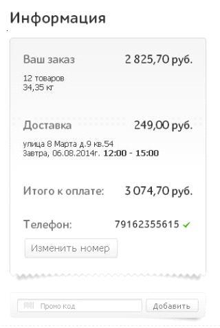
It is better if the buyer finds out in the basket about the terms of payment and delivery. However, Enter on the shopping cart page does not have information that the purchase delivery may be paid. It is also important to be wary of using the promotional code or discount basket. On the one hand, the user who knows the promotional code must know where to enter the information. But on the other hand, a user who is not aware of the discount and has seen the input field of the promotional code will fix the attention on the bonus and may go in search of a coupon to other sites, and this is extremely undesirable behavior. It is also important where the discount entry field is located - the buyer who knows about the discount, but did not meet the input field during the entire checkout process, may terminate the purchase. In Buket.ru, the discount input field is on the last step of ordering, in Utkonos and Lamoda shops it is quite invisible, in Enter the field is noticeable and attracts attention. Another mistake is the unclear name of the coupon entry field . For example, Foodpanda has a field called Voucher, which is at odds with the usual names for the types of discounts. By the way, none of the sites tested provided information on how to get a discount or bonus.
Another critical error is the incorrect behavior of the shopping cart after registration. It happens that after registration as a result of a technical failure, the product disappears from the basket and has to be searched again. And if it is not very critical for ordering single goods, then for grocery stores with a large number of items in the order is very important.
Removing goods from the cart in some online stores is not obvious: in order to remove Ozon, you must first mark the goods with a hint, and then click on the activated button at the top of the list. Foodpanda deletes items by resetting the quantity of goods. Thus, the buyer in the course of changing the composition of the order commits many unnecessary actions.
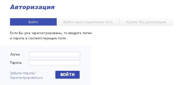
Authorization - to know the buyer in person
User data obtained during registration form the online store's customer base — the target audience for further marketing activities, such as mailings, promotions, and so on ... However, in pursuit of customer data, shops forget about the convenience of buying: they request data that is not significant for purchase, fields, do not talk about the benefits of authorization and so on ...
For example, the Ticketland ticketing service without authorization does not even allow adding tickets to the basket, the authorization pop-up window does not provide a link to the registration and the user is forced to interrupt the purchase process to complete the registration on the site. In addition, the registration process requires confirmation of all data by codes sent to e-mail and SMS. In one of the tests, the SMS arrived to the respondent 40 minutes after the request, respectively, it was impossible to complete the purchase before that.
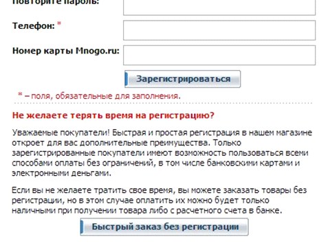
It seems logical to allow the buyer to make the first order without registration , because it is not known whether he will return to this online store again. Almost on all tested sites, the possibility of ordering without registration was provided, but not at all it was noticeable and highlighted on the page. On the Holodilnik store website there is a possibility to order goods without registration, but it is located at the very bottom of the page under the registration form, most users do not notice it. Buying a product without registering on the Sportmaster website seems an inactive option due to the fact that it is made in gray font on a gray background.
In exchange for providing contact information, many stores are ready to give certain bonuses and benefits. That is why the options for unregistered users are often deliberately limited in order to stimulate the client to leave their contact details. It is no coincidence that respondents indicated that they think that in this way the site of the store intentionally forces them to register. Most often, the restriction applies to various forms of prepayment (by credit card, electronic money). For example, on the Holodilnik store website, payment by credit card and electronic wallets is impossible without registration. Respondents noted the inconvenience of such a decision and returned to the previous steps for registration. The Citilink store website also restricts payment methods for unregistered users, and at the stage of selecting the authorization method, there is no information on restrictions. Such restrictions affect customer loyalty to the online store and therefore undesirable in the implementation of the card purchase.
Another situation related to authorization is the lack of implementation of some features . In the current case, the user may assume that such opportunities (for example, authorization options) are missing or do not understand how to use them. On the website of the Ticketland service, you can log in via social networks and register by e-mail address. On the page that appears after adding tickets to the cart, registration options via social networks are not presented.
On some sites where authorization gives advantages to customers, there is no information about these advantages or their description has a fuzzy structure and is poorly visualized. So, on the Holodilnik website, the benefits of registration are described in several places on the page with small, poorly structured text.
Another mistake is to describe the shortcomings of working without authorization, and not the advantages that registration gives the buyer. For example, on the Aeroexpress website, users are faced with a choice: authorize or refuse authorization. The message describes the shortcomings of the lack of registration ("buying without authorization, you can not use ..."). Double denial and poorly structured information in the wording of the advantages of registration lead to the fact that most users skip the message without reading it to the end.
On the same Aeroexpress website, registration is not built into the order process. Immediately after the registration is completed, the purchase of previously selected tickets does not continue - the user is in the unauthorized zone, he needs to go to the site separately using the newly created login and password. This is another important error online store. After the registration is completed, the user must remain automatically authorized on the site , he should be given the opportunity to continue ordering.
During registration, it is often necessary to confirm contact details , such as a mobile phone number. If there is such a need, the stage should be consistently integrated into the registration process . However, some stores violate these rules and force the user to return to another stage. For example, on the Utkonos store website you need to confirm the phone number entered during registration. At the same time, after registration, you need to go back to the basket page, where at the very bottom of the page there is a phone number confirmation function.
After completion of registration in some online stores, the contents of the basket are not saved and the buyer has to refill the basket. Such a decision on the site caused a sharply negative reaction from the survey respondents. An example of this behavior of an ordering system is the Aeroexpress website, where after completing registration, the user needs to log in and then re-select the parameters of the desired ticket. This significantly increases the time of ticket purchase and negatively affects the satisfaction with the service.
Some sites offer the user to come up with a login to log in, while optimally making the login an email address or phone number. When registering on the Aeroexpress website, you need to separately enter a phone number, email address and login. At the same time, users who wanted to register on the site entered their email address and then copied it into the login field. In principle, this is not the most critical error, but it is difficult for users to memorize a large number of logins to log in to various services. It is always more convenient when the main identifier is an e-mail address or phone number, which most people remember by heart.
Another non-trivial situation for a user arises on sites where an attempt to re-register for the same mail causes unexpected difficulties. For example, with this action, the Utkonos error is displayed at the store, and in Citylink, it allows such registration, but it requires you to fill in 11 fields.
The error closely related to registration is the absence of a warning to the user about how his contact details will be used. On some sites, the option to subscribe to the newsletter is hidden in the agreement on the processing of personal data and is not highlighted in a separate paragraph. In M.Video, the consent to the newsletter is hidden in the terms of the agreement on personal data and is a mandatory item to continue ordering. Similarly, it is impossible to complete registration on the website of the Utkonos store without agreeing to a subscription to mailings hidden in the agreement.
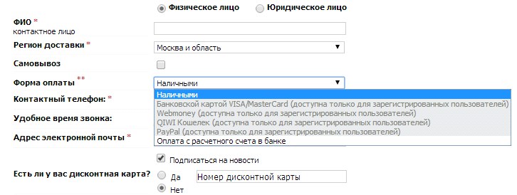
Choice of payment method - available options
Modern online trading provides many payment options, among which the user must choose the most convenient one. However, at this stage, online stores make mistakes that can lead the user to confusion and distract from the main process of making a purchase.
Errors begin with the name of the payment method, which is sometimes ambiguous. For example, in the list of payment methods, when you subscribe to the Vedomosti edition, there is a “credit card” item. The survey respondent was not sure that he could make a payment with a debit card, despite the fact that the phrase “credit card” had become the well-established name of any plastic bank card.
Another mistake in usability is the lack of a structure of the list of possible payment methods (prepayment, upon receipt of goods and on credit), for example, from the Messenger shop. The absence of such a division somewhat increases the time of purchase by searching for and choosing a payment method.
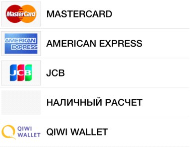
Not the most serious, but very unpleasant mistakes in the design of the payment stage include the lack of visual cues in the form of pictograms and logos of payment services. For example, in the Ozon application, there are no visual cues in the list of payment methods. Reading the list from top to bottom, users may not notice that special conditions apply to MasterCard cards and Sberbank cards. In addition, small text is undesirable in the description of the available service options.
A more serious mistake that can not only confuse the buyer, but also interrupt the purchase process - this is the lack of notification of a change in the amount of payment when choosing one of the methods. In case the method implies a discount, a warning about a price change is less critical. For example, respondents to testing on the M.Video store site noticed that when choosing a card payment, the order amount decreased, but did not understand why. The answer was simple: the store offers a discount for prepaid cards, but does not provide information about this. But in the case of an increase in the amount of the order, it is critical to report this as early as possible , otherwise the purchase may not take place. An unfortunate example is the Zara store application, when paying in which some methods increase the order amount, but nothing is reported about the commission at the stage of choosing the payment method.
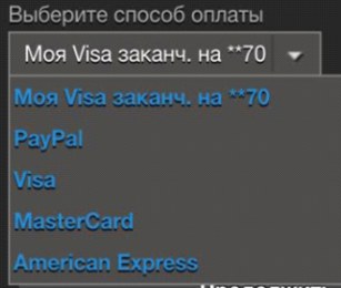
In some stores, at the stage of choosing a payment method, it is necessary to simultaneously select a bank card payment system .This step increases the time of checkout and overloads the list of payment methods. The stage can be optimized by automatically determining the type of card, because by the first digit of its number you can determine the payment system. Such a problem was encountered in Steam and Zara applications. In the Steam application, the choice is also complicated due to the small text in the list and the lack of logos of payment systems.
The choice of delivery methods - honestly about the right
The ability to deliver to your home or conveniently located pickup point is one of the key benefits of online trading. When choosing delivery options, the buyer takes into account important parameters for him: time, time, cost, proximity to the points of issue.
Unnecessary fields when filling out the form - one of the unpleasant shortcomings in the form of choice of delivery. For example, Zara is required to enter the index - the respondents had the feeling that the order would be sent to the post office.
Another drawback is that there is no geographical location or address of the points of issue of goods.Not all sites had the ability to search for a pickup point on a map. And in the application of the Ozon store, for example, the possible items are represented by a regular list with the same names. The differences between them are not clear, the buyer has to click on the “Information” icon several times to find out where a particular item is located.
Non-standard input address - an error that delivers significant inconvenience to the buyer.Practically on all sites tested during the research, it was possible to enter the address in the input field and continue ordering. And it is impossible to do this on the Citilink store website: when entering a street name in a non-standard format, the field is marked as mistakenly filled in and the order cannot be continued. The same street names on the list can also confuse users and make them doubt that they are doing everything right. On the Citilink store website, choosing a delivery street is often offered from two identical options.
An even more critical error associated with the additional expenses of the buyer is the absence of an indication of the estimated cost of delivery when choosing a type.For example, on the site of the Enter store, when choosing a delivery method, information is not indicated that delivery is charged. In a real situation, this could lead to a refusal to purchase or to commit unnecessary actions to choose a different delivery method.
On the website of the M.Video store a notification that the price of the order has changed, appears only after the choice of the delivery method. During the study, no respondent complained of a sudden price change, since the changes were only due to its decrease due to the discount. However, all respondents said that they could not understand why this happened and why they were given a discount. Thus, a change in the price to a higher or lower side does not go unnoticed by the buyer and it is important to inform him about it on time and easily.
In some situations, the goods are received by the wrong person who placed the order. If, upon delivery of the goods, the courier can request an identity document from the recipient, information about this should be present on the page. Since the names of the beneficiary and the payer can differ only with prepayments, the input field for the name of the beneficiary should appear only after choosing the payment method . But not all online stores take this nuance into account. For example, on the Ulmart store site after switching to payment, it is possible to enter information about the payer. However, this form appears after the transition to payment, and therefore is associated by users with the beginning of entering card details.
Almost all respondents began to enter information from their bank card in this field, while not understanding where to get information about the payer’s patronymic and why it is impossible to proceed with payment without entering data.
Order confirmation - that's right
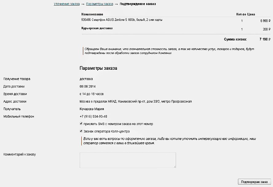
After the buyer has formed an order, he must check all the parameters on the order confirmation page and give his consent to the transition to payment. The order confirmation page must be consistent with the chosen methods of delivery, payment and receipt of goods. If the content of the page does not match the previously selected data, the user may have doubts that he entered all the data correctly. For example, the Ulmart store website on the order confirmation page provides information on how to get the goods in the store, despite the fact that the user has chosen delivery.
Another mistake - the inability to edit the order.So, on the Citilink store website on the confirmation page there is no possibility to change the order parameters. The only way to do this is to follow the link in the navigation chain at the top of the screen, which may not be obvious to users.
On the Utkonos store website, on the order confirmation page, you can only change the number of items in the cart and phone number. For all other changes you need to return to the previous steps of the order.
This is an extremely inconvenient behavior of the site page, as the user leaves the stage immediately close to the payment. Any departure of the user to the previous page or to another menu item causes the risk that the purchase will remain unfinished.
Enter card details and payment - without the right to make a mistake
From the point of view of the buyer, this is quite a stressful stage, when it is necessary to enter the details of a bank card as carefully as possible. In addition, this stage is special because of the alternate transfer of the user's attention from the virtual form on the monitor to the physical bank card. When entering data on mobile devices, the probability of an error increases, and the correction of the entered data causes difficulties and annoyance of users. Obviously, this should be the most thorough purchase stage in terms of usability.
At this stage, it is important to divide the input data into blocks corresponding to the size of the data from the card.For example, divide the 16-digit card number into 4 blocks of 4 digits with the same logic as is done on the front of a physical bank card. In the Steam application under test, the card number is not divided into blocks, which is why respondents had to spend more time checking and entering data.
Not all cards with which you can make payments on the Internet contain 16 numbers in the number. Some processing services start accepting Maestro cards for payment, but the format of entry and entry of the card number remains 16-digit, which may confuse users, since the number on the card does not match the format in the input fields on the site. For example, with the liters service, the liters service has a 16-character input field, regardless of the type of card selected.
It is important to preserve the similarity with all the real details entered from the card. For example, on the Aeroexpress mobile site, the month selection list suggests month names, not their order number. And on the page for entering the details of another payment provider both the sequence number and the name of the month are indicated, which may also complicate the search. The format for entering the year on the Aeroexpress website also does not correspond to that prescribed on the map. Such discrepancies require the buyer to make additional efforts to convert the month to a numerical value, increasing the likelihood of incorrect data entry.
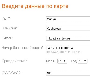
Another mistake of the designed data entry forms is the separate fields for entering the name and surname of the card user.Users are accustomed to the same field to fill in the name, and, starting to enter it into the form, usually specify the name and surname simultaneously. Also, users usually read only the name of the current field, without looking at and paying attention to subsequent fields. Therefore, when users encounter the fact that the first and last names are presented in different input fields, they have to delete or copy the last name from the “Name” field and re-enter it in another field.
All the listed errors are reduced to another important error, the correction of which could solve a number of the above problems: the virtual map view does not match the map view.In those cases when the card was not presented on the page, respondents had questions about where to look for the card's security code and in what format to enter data in other fields. For example, such a problem was often encountered when filling in the details on the M.Video store website. The input fields on the page are not in the order in which they appear on the map. Clues about the location of information on the map are incomprehensible and their search requires extra effort.
Entering information from a bank card should not be interrupted by entering additional information.However, this rule is violated. On the one hand, a large number of fields to fill out creates a sense of reliability of the payment service, but on the other, it forces the user to search for the necessary information. A similar example of a failed decision is the ChronoPay payment form. Users spend more time filling out card details when it is necessary to constantly switch from entering information on the card (not in the order in which it appears on the card) to additional information (for example, entering an email address).
Even with the correct sequence of location of the card details field, many respondents skipped and did not fill in some form fields, because they did not notice them. This is due to the fact that the location of additional input fields does not fall on the path of the user's gaze.For example, on the Lamoda website, the entry field for the card's security code is not noticeable on the page, as when filling in the fields, the user's gaze moves downwards to the payment confirmation button, which is highlighted on the page and attracts attention. As a result, some respondents filled out a form without specifying a code.
Working on the design of the payment page, it should be understood that the majority of users do not see the difference between the store site and the payment page. Therefore, users are surprised and annoyed when there is a demand on the payment page to fill in the fields that he has previously filled out. For example, on the payment page of the Uniteller service, you need to enter the phone number and e-mail address, which were previously entered by the user during the ordering process.
Paradoxically, to make a payment, it is necessary to fill in all three fields: the card number, its validity period and the security code. So, for example, on the ChronoPay payment page out of 12 fields on the page for payment, only 3 are needed. All respondents on this page noted an excessive number of form fields and its poor structure.
It is undesirable to use low-frequency and technical terms in the names of form fields and prompts. For example, on the site of one of the stores used the abbreviation PAN, unfamiliar to a wide range of users.
Most payment pages still use the CVV / CVC name. Information on where to look for it and how it looks is present only in the form of a hint to the name of the field, and in Steam and Zara applications there is no hint about where the security code of the card is located.
Filling tips are usually located next to the input field. This is not the best implementation, but the most unfortunate way to design hints to form fields is footnotes to the footer of the page . First, they create the feeling that some form fields are mandatory, since the asterisk (asterisk) is a familiar indicator of a required field. Secondly, the footnote causes a sense of hidden conditions among users.
After clicking on the "Pay" button, the user goes to the third-party service page. It is bad if the contents of the basket are not displayed in the new field. Most often, it is almost impossible to determine the store where a purchase is made by the type of the payment page - this is also a significant mistake that can cause the user to doubt the correctness of the actions or to cause suspicion.
However, often information on the composition of the order is not presented on the page, even when the user does not make the transition to a third-party site, but remains in the online store. For example, it is impossible to check the ticket parameters on the Aeroexpress website before making a payment, since information about it is not listed on the payment page .
At the time of paymentshould be able to return to the store site. The Utkonos store website has the opportunity to return to the store site without payment, but the return link name scares users because it implies "canceling" the order.
Of the minor, but nonetheless, significant shortcomings - the absence of the usual attributes of the user payment page. On ivi.ru there is no secure connection icon (lock) - and the respondents noticed this.
On the websites of many stores, especially those selling electronic goods, there is no additional authentication via SMS, while no information on the sites of stores that no additional code is required is not presented. At the same time, experienced users who were guided by the logos of payment systems and tags (MasterCard Secure Code, Verified by Visa) were perplexed by the fact that the payment did not request a one-time password. Liters website provides information on payment system certificates, however, a one-time password request does not occur, which surprised the respondents.
In most of the tested services, validation of data filling is performed after the form is submitted, but must be at the time of entry and next to the entry field or directly in the field itself.In this case, an erroneously filled field must be visually highlighted.
When an error occurs, users expect to be able to correct it by checking the data entered in the field. But often after sending the payment form, all data in it is erased, and the user has to re-enter the bank card details ... Error messages should display the reason and give instructions on correcting the incorrect filling.
If error feedback is provided imprecisely, ambiguously, or missing, the user may find it difficult to solve the problem. For example, in Steam and Aeroexpress applications, possible actions are suggested (contact Steam support and repeat payment later), but they are useless in a specific test case, since there is no money on the card.
The message that the payment failed, does not describe the causes of the problems.
The acquiring bank's gateway page is another third-party page
On the pages of some banks is difficult to distinguish important information due to visual noise and poor location of blocks. For example, on the page of one of the banks in the screenshot below, a non-standard one-time password input page is used, while the layout of information is unsuccessful, the text is small, important blocks on the page are not highlighted.
On the pages of some banks, the cancel and confirm operation buttons are close to each other and are almost indistinguishable ; it is easy for the user to make a mistake and press the wrong button.
Users, especially without the online payment experience, may not immediately understand what is happening on the page until they see the SMS message from the bank. For example, on the one-time password entry page of one of the banks there is no information that a password will be sent to the phone to confirm the operation. Instructions on exactly where to look for the "activation code" is hidden behind the link "What is it?". Inexperienced users spend extra time searching for information about further actions and are not always sure that they understand everything correctly. Such tension of the buyer in the process of payment does not benefit the online store - the buyer can close an incomprehensible window and refuse to buy.
On some pages of a one-time password, there are terms that may not be understandable to most users . It is worth avoiding such formulations as “authentication”, “dynamic password” and the like.
In messages to a mobile phone sent by most banks, the code is located at the end of the text.
On most smartphones, only the first few words are displayed in the notification line , users have to open a message separately and look for a one-time code in it. This significantly increases the time to search the code.
Thank you for your purchase page - more than thanks
This page is an important source of information, because the user has already made a payment and is now ready to once again pay attention to the contents of the order. However, stores often do not saturate this page with data, indicating only the general parameters of the order. For example, on the Enter store website after registration there is information only about the number and amount of the order. Moreover, if the purchase was made without registration, then check its composition and the specified contact information is possible only in a letter by e-mail.
On the page of gratitude for the purchase, it is advisable to indicate further actions of users based on the parameters of the order and delivery. For example, on the Ulmart store page it is indicated what actions need to be taken to receive the goods, but they do not correspond to the delivery method chosen by the user.
All stores tested during the survey, after placing the order, sent a confirmation letter. However, in many letters, information about the receipt of the goods was not indicated. For example, in the letter that arrives at the post office after purchase on the site of the Sportmaster store, information about the recipient, delivery address and payment method is not specified. Also, the letter is not adapted to the method of receiving goods selected by the user. It provides information about what will happen when choosing a pickup, although the user has chosen delivery.
Cancellation of the order is also an important step that must be carried out correctly and confirmed by the store. For example, in the Utkonos store after canceling a payment, an order is formed, but the user is not warned about this and learns about the executed order from the courier.
As you can see, on the websites of large online stores there are a lot of mistakes and blunders that make the purchase uncomfortable, and sometimes even violate the logic of the buyer’s usual actions. Despite all the convenience and attractiveness, the process of buying goods online is a stressful situation for the buyer: during the online purchase, the user decides to give his money without touching the product and not being able to receive it at that very moment. Therefore, it is extremely important to minimize any inconvenience and inaccuracy so that the buyer has no doubts about the trust of the service and the correctness of their actions.
Look at the purchase page on your site, try to make an order yourself and ask your colleagues. Surely you will see some problems that previously seemed not so obvious, but nevertheless had a certain impact on the conversion of the purchase page. Work on the bugs - the result will not take long.
View Study (PDF, 15MB, 203 pages)Thank you for your attention, to be continued
Source: https://habr.com/ru/post/260301/
All Articles