Mobile app design. How to achieve optimal results?
Much has been written about the design of mobile applications. Nevertheless, in this area there are a huge number of nuances. Some are not known to all, others are quickly forgotten. In this post we will try to describe several techniques for working with the design of the application, which can be called effective and proven.
Ideally, the mobile app should work at the speed of thought. Moreover, the interface of the application should be clear even to the beginner.
1. Rules that always work
It is worth highlighting the five main factors that are important in the design of interaction with the application.
')
Targeted orientation . You create a design for a specific user. There is now a large amount of data on the Web about various categories of users, and many materials — studies, reviews — are available for free. Studying this information will help you create an application that fully meets the needs of the target audience.
Usability Your application should be user-friendly and intuitive. For example, if you want to specify a link to go to a third-party resource, then draw it in the usual way - using the underlined blue text. Convenience and practicality - this is the first step towards making your program desired by the user.
Opportunity ( affinity ) and symbolism. Affordance is a function. For simplicity, we again use the technique with a link. So, blue underlined text indicates that clicking on it will take the user to some address. Such symbols should be used in such a way that the user does not reflect on what this or that interface element can mean. Practicality and rationality are our everything.
Learnability Ideally, the user should easily guess how to work with the program. Here come to the aid of familiar and familiar layout of the application. They should help a person get used to the program without any problems.
Feedback and response time . The application response should give the user an idea of whether the task has been completed or not. This may be a normal beep or something more complex — for example, a modal window. Make sure that the feedback of the application complies with the provisions established by the Nielsen Norman Group.
As Andrew Maier correctly noted in his article , these five rules should be the basis for the design of any type of interaction.
2. Know your users
The first step in creating a goal-oriented interface is to study your audience. Display size is not the only limitation when developing a mobile application. Users also form requirements for the interface and need to take them into account.

In this issue there is a clear tactic consisting of three positions:
Personas : helps to understand what will prompt the user to perform a particular action within the application. These are formal, theoretical models of real users.
User Scenarios : provides modeling of various situations, helps to predict user actions. This allows you to develop an interface that is best suited for the modeled users and the tasks they want to perform.
Experience maps : all possible conditions for individual interaction are studied here. The scheme will help to describe each step of the user who will be performed with a high probability at a certain stage of work with the application. Such a scheme will help to understand the emotions and circumstances that lead to the execution of each action.
The easiest way to accomplish these points can be, for example, remote usability testing using a service like UserTesting , which helps to study user behavior in natural conditions. To study this question even better (for example, to take into account gestures and even body position), it is worthwhile to work with real users (at least five people).
Excellent advice on this issue gives Jeff Sauros (Jeff Sauros).
3. Content and user behavior
This item allows you to simultaneously develop the application and study the possible behavior of users. The ideal option is a sketch, which examines the interaction of users with content. And there is nothing stupid about this - the work of a person with the contents of the program can be illustrated on paper. This will help to understand how the users inside the application will behave.
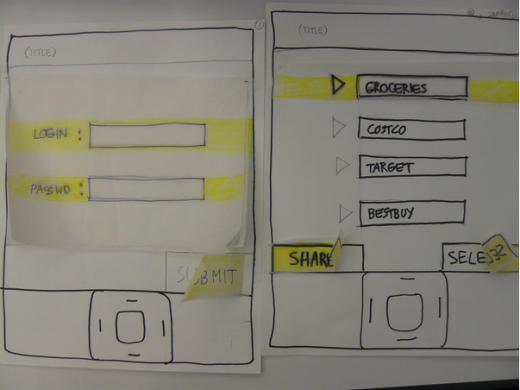
For example, you create a banking application. Expected scenario: the user wants to enable the automatic deposit of funds into the account:
Autodeposit off
[Autodeposit settings]
Choose a period
[Once a month] [Twice a month]
[A week later] [Every week]
Deposit
Once a month
[Select calendar day]
Set amount
[Enter amount]
[Autodeposit settings]
Before making a prototype, a handwritten scheme will help you learn the most important part of the application - content. Understanding the possible pattern of user interaction with the content will help give a more accurate estimate of the number of pages / screens needed in the program.
The next step is to create a scheme for each page of the transition (in our case these are four schemes). And here it is already possible to continue iterations, gradually moving from paper schemes to digital prototyping (a tool like UXPin can help with this ).
The scheme will help you quickly explore possible transitions to / from the pages of the application. Sketches will allow to “revive” the application and understand more details and structure of the program. And already a digital prototype will help test the behavior of real users.
4. Improving usability using familiar user patterns
The design of a mobile application should be made “familiar” to the user. For example, almost all map services use the slide-out navigation technique. This allows the user to feel "at home". The application is unfamiliar, but the scheme of working with it is well known and understandable.

It should be clarified that we do not offer you to copy the design of applications of other developers. We are talking about the use of public interface elements. If you use this advice, you should make sure that the design of your application meets the user's expectations.
We recommend using two categories of user interaction with the application interface:
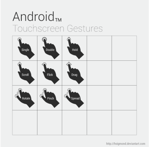
Gestures : Tap, swipe, double tap, pinch, scaling - all this has long become familiar to the user. Details about the gestures can be found here .
Revitalization : here we mean animation that will make the application more alive. We recommend combining animation with gestural control.
User interaction patterns with the application interface predetermine its structure and individual elements. For example, the navigation buttons at the bottom of the application are more familiar to users than the buttons at the top of the program.

Yelp is a great example of an application with an intuitive interface.
5. Consider the size of the user's fingers.
Yes, the fingers of many users are much more than lovers of sophisticated design could imagine. Therefore, be sure to adapt your program to the fingers of different sizes.
They just need to leave enough space. If your buttons are too small or too close together, some people simply won't be able to hit them. As a result, users will get annoyed and, perhaps, stop working with such a program.
Here's what to consider when designing buttons and other sensor elements:
We all hold the phone or tablet in different ways. Even the same person in different situations holds the device in different ways.
Our fingers are really big. Their width is about 45–57 pixels, which is more than most manuals for test devices recommend. Apple, for example, recommends a square-shaped target with a side size of 44 pixels . And this is not always enough.
6. Do not give up the gradient and shadows.
Yes, flat design has already become a new standard, but this does not mean at all that shadows and gradients are a distant past and this design option should be abandoned. Not at all, just the approach to design has changed somewhat.
Shadow is usually very relevant when designing buttons, switches and similar elements.
Shadows and gradient of individual elements make the interface more understandable to the user. These design techniques can be used to create volumetric buttons and input fields.
7. We remove chaos
The rule of three clicks is relevant now, and it should be used when designing application design. Why? Yes, because it allows you to understand what is really necessary for the pages of the application.
Ideally, the user should complete all tasks quickly and in as few actions as possible. Yahoo CEO Marissa Mayer even suggests using the two-tap rule. If this principle is not respected, Marissa proposes to work on the application further, improving its design.
Try to make the user have to perform the minimum number of actions. The less the user will have to make efforts when interacting with the program, the higher the likelihood that your application will become successful.
Source: https://habr.com/ru/post/260095/
All Articles