Once again about the design of the mobile application. What color to choose for your program's icon?
It seems to be not a very significant problem, right? In any case, the designer can cope without bothering too much about the choice of color. Nevertheless, the statistics tells us that the color of the application icon is of great importance for the promotion of the program. Actually, the color of any product is very important.
For example, if you ask a person what company he associates with red, most likely, the answer will be Coca-Cola or Ferrari (although we, of course, would call Appodeal :)). Let's try to determine which color is important for your product, or rather, for the icon of your application. The theme of color selection is quite complex, subjective. But there are a number of studies that allow you to talk about certain things with confidence.
First, some statistics
· 85% of buyers choose a product, paying attention to color - this is one of the main factors of choice;
· 90% of product judgment can be based only on color;
· It is proved that color can reinforce the impression of a read message, reveal emotions and generally have a positive effect on a person’s attitude to the world;
· About 80% of people believe that color improves brand awareness.
')
Associations
Now it is worth considering a list of color associations, which was obtained after a series of studies and surveys, which were attended by designers, psychologists, sociologists, marketers and other "-ologues":
· Green: health, order, money, nature.
· Blue: the color preferred by many men, office work, appetite, serenity.
· Red: strong emotions, hunger, energy.
· Yellow: warm and friendly, however this color can quickly cause eye fatigue.
· White: innocence, purity and order.
· Purple: success, wisdom, wealth.
· Brown: reliability, earth, practicality, boredom.
· Orange: delight, warmth, warning, enthusiasm.
Now let's see what colors use known (and not so) applications.
Red
TapStory is an educational app for children released for the iPad. The application team chose red as the main color because it is associated with energy, youth, emotions, and productivity.
Many other companies also use red, such as Nike, ESPN SportsCenter, Yelp. Red is one of the most popular colors for application icons in the catalog.
Orange
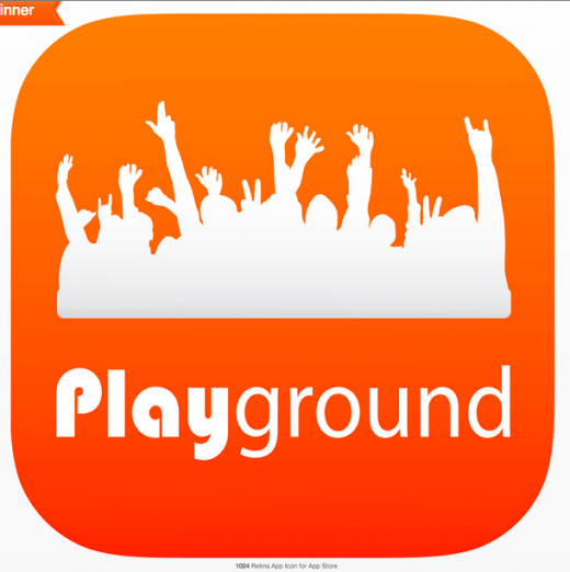
Orange is a friendly color, a color of cheerfulness, which is just beginning its victorious march on application icons and various catalogs.
One of the applications where this color is used is the Playground. This is a program for college students. Orange was chosen because this color is associated with energy, passion, meeting with other people.
Yellow
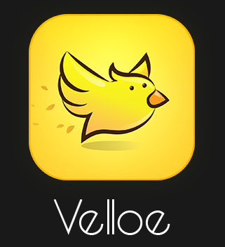
Like orange, yellow color for the icons of their applications, the developers are increasingly choosing. It uses different shades of yellow, which can be associated with warmth, cause optimism, no matter how strange it might sound.
By the way, yellow color is very actively used by well-known companies, including DHL, Sprint and other brands. Velloe, on the other hand, is an application icon of a startup of the same name, which allows customers to receive goods and services from local suppliers. Such an icon often immediately causes a friendly attitude from the user.
Green

Interestingly, the majority of applications related to finances have a green icon. Green is really associated with many users with money (dollars, of course). In addition, the same color is associated with peace and health.
The company Long Weekend, LLC has chosen green for its application to demonstrate the possible growth of user welfare. And the application turned out to be quite popular, users paid attention to it immediately after the program appeared in the catalog.
Of course, there are many other reasons that led to the popularity of the program, but the color, as mentioned above, is very important.
Blue / Blue

Blue and blue are the most popular colors among developers. For example, most social networking icons are blue or blue. Perhaps, because color is associated with globality, with the entire globe (there are studies that confirm this).
Here you can remember the icons of VKontakte, Facebook, LinkedIn and other applications.
But better choose something less well known. For example, Coinbolt is a Bitcoin digital cryptocurrency wallet application. Blue is also associated with the mind.
American Express, IBM, Intel - all these companies use blue or blue in the design of the icons of their applications and not only.
Purple
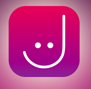
This is one of the most interesting and original colors chosen by developers for the design of their applications.
It is used, for example, by Yahoo. Uses this color and startup Jolimi, which is associated with the world of fashion and positioning itself as a tool for girls aged 17-25. Purple in this case is a fun, playful and creative color.
In addition, this color is also associated with such categories as success, wisdom, and wealth, as mentioned above.
Think about what you want users to say
The choice of color for the application icon is one of the most important decisions for the developer, which will influence the development of both the application and the company as a whole. Any product is individual, so the application icon must also be unique, individual, so as not to get lost among all the many programs on the display of someone's phone and stand out in the catalog.
And what color does your company (or yourself) use for your application's icons and why?
If you have long sorted out the color and promoted your applications, visit us at Appodeal.ru to raise the profitability of advertising in them.
Source: https://habr.com/ru/post/260093/
All Articles