How to create Pixel Perfect images in Adobe Illustrator
From translator
I am glad to welcome you,% username%!
I am new to the profession of interface designer, and some time ago, flipping through jobs, I was interested in the requirements for one of them. Among those such as knowledge of the Adobe package, prototyping tools, and ux / ui skills, I read that it would be a good idea for a job seeker to keep order in layers, structure, and file and folder names, as well as know and be able to apply on practice what is called pixel perfect. I was interested in it, because at my work they don’t demand it from me or from other employees, but I always tried to stick to it and even tried to convince others of it, but for some reason I didn’t have enough arguments to explain why need to.
I was not familiar with the concept of pixel perfect at that time, only heard about a couple of times, and since this item was at the end of the list of requirements for “accuracy,” I realized that this was something like apogee, iceberg tops in an organization work on layouts.
')
I began to search, but I found nothing except an article on Habré from a couple of paragraphs about Pixel perfect from a programmer. Then I somehow heard about Monument Valley, and even came across the directory of Pixel Perfect Precision, but I had no time to study so much information in English, and the first time he did not catch me. Time began to appear and some articles came out, one of which, filled with practical tips on Pixel Perfect, hooked me, and I decided not only to read and understand, but also to translate as literary as possible, to make the issue widely known, and to spread the topic on Habré.
A little technical moment. The original article with Tuts + is called “How to Create Pixel Perfect Artwork Using Adobe Illustrator”, while I can assure you that most of the settings proposed in the article are also present in Adobe Photoshop CS6, and in Adobe Photoshop CC you can even repeat all this completely.
In conclusion, the introductory part I want to ask you not to pay attention to the fact that I am new to design, and this is my first translation in my life. Be critical, a serious topic. I urge you to share your thoughts and experience in the comments.
Summary
This part is for those who are too lazy to delve into the aspects, but I want to quickly get instructions.
Either for those who have already read the full article, but now wants quickly without unnecessary paragraphs, in another workplace to apply all the necessary settings.
Abobe Illustrator Settings
- Edit> Preferences> Units> General → Pixels
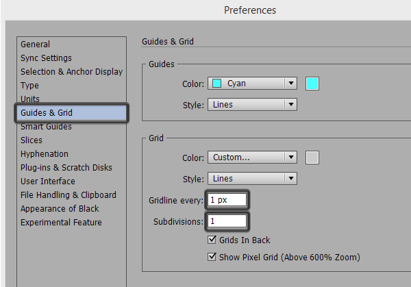
Edit> Preferences> Units> Stroke → Pixels - Edit> Preferences> Guides & Grid> Gridline every → 1px
Edit> Preferences> Guides & Grid> Subdivisions → 1px - Edit> Preferences> General> Keyboard Increment → 1px
- View> Snap to Grid
View> Snap to Point - View> Pixel Preview
Do not thank.
All interested please go under cat.
How to create pixel perfect images in Adobe Illustrator
Often, novice designers face a problem when they have to spend quite a lot of time on some little thing for the web (like an illustration or icon), and as a result, in the final picture they notice that the image is not sharp enough.
This is what we have to deal with if we are just starting to use Adobe Illustrator, so I decided to write a short article for those who are familiar with this problem and are looking for a solution.
1. Vector and raster images
To begin with, I would like to shed light on the differences in these basic concepts that you, I, and all those who chose the path of a designer regularly come across.
All images that we encounter in our creative craft can be divided into two large types. These are raster and vector images.
A vector image can include one or many objects, which in turn consist of a possible number of reference points (anchor points) and lines connecting them (paths). Such images can be scaled almost indefinitely, without loss of quality.
The bitmap, in turn, consists of a set of colored dots, each of which takes its strictly fixed place in the pixel grid of the image. This means that as soon as the image is saved, any scaling (zooming in, zooming out, and other operations such as rotation) will degrade the image quality. This will happen because we will force us to change the number of pixels in the image at the moment when we adjust one image for different resolutions, if the project requires it.
Reducing the resolution of the file does not affect the image quality so much, but the increase in the resolution of the existing image noticeably degrades the image quality, blurry areas appear, fuzzy edges appear. There are special programs like Perfect Resize, which use special complex algorithms to optimize the clarity of images that you increase. But for me personally, this fact is just more proof that raster graphics is inferior to vector in that it does not have a very important property - the ability to scale without losing quality (quality-agnostic scalability).
In fact, both types of images, both raster and vector, depend on the environment in which you use them. In general, as you know, any image can be printed live on a printer, or shown in “digital” form on a monitor screen. And while printers depend on real print resolution, digital screens (no matter what it is, displays of a PC or your smartphone, tablet and any other device) also depend on their resolution, and no matter what it is - vector or raster graphics.
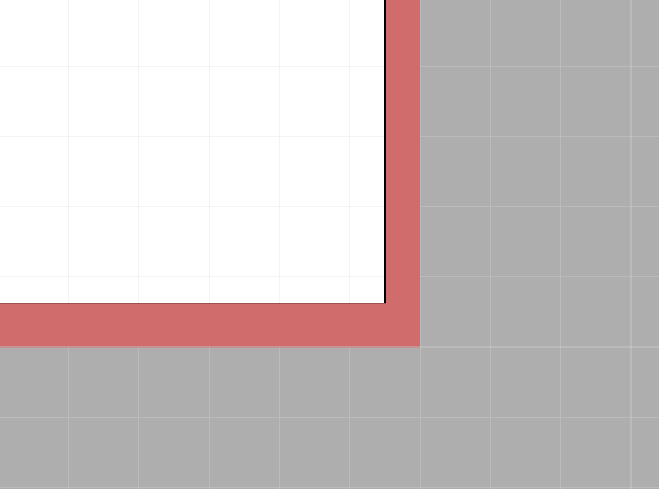
This is exactly what creates the problem we are talking about today. Vector graphics must fit into the pixel grid on which these graphics are superimposed. Therefore, we have a distinction between pixel-perfect graphics and that unsharp image that designers often get.
Fortunately, there is a solution that, in my opinion, should become the standard, and these settings should be applied at the beginning of work on any new project, whether it is graphics for the web or for printing.
2. Let's see how Adobe Illustrator works
Before you start fixing something, let's see how this something works. Illustrator is a software for creating vector graphics that uses mathematical algorithms to create and display curves (paths) (whether or not they are closed) and anchor points (anchor points). Anchor points are those with which you can control the size and shape of a vector object.

The control points themselves are not so important. What matters is how they are trimmed and the curve that they form on your canvas (Artboard) (with or without snaps), so in the next steps I will talk in detail about every little thing that will affect our pixel perfect image.
3. Customize Adobe Illustrator
By default, Adobe Illustrator is already pre-configured for most tasks, so you can start working immediately after the installation of the program on your computer has been completed. For many people in our profession, the standard settings may well be appropriate, but as soon as you pay more attention to the small details in your layouts, you will come to the conclusion that you will need to change something so that your layouts come out exactly what you want. would see them. In the next steps I will tell you about a few basic things, which in my opinion need to be configured after each new installation of Adobe Illustrator.
Before I begin, I would like to clarify that everything that is described below is my personal experience, and I came to this after a certain time, stepped on a certain rake, so I would not in any way call the settings I suggested ideal or the best. - just more suitable in my opinion for creating pixel-perfect images. It is very likely that the proposed solution is not suitable for all situations that you may have, but in most cases, I think you will find for yourself a couple of tips that will help you.
Step 1
Before we start setting up the units of measurement, I would like to take a couple of seconds and compare the points chosen by default in Adobe Illustrator with the pixels to see what changes from choosing the latter as units of measurement.
Items
The term came to us from typography and denotes the smallest unit by which you can measure font size and other parameters, indents, line spacing and spacing.
Pixels
If you turn to Wikipedia, it will tell you that a pixel is the minimum element displayed by a digital display. Since all our pictures are displayed on displays, we can say that a pixel is the minimum unit of measure, thanks to which we determine the image of the screen and the dimensions of the elements that are displayed on it.
So, we have a choice between two units of measure, so what’s the difference? Many articles say that 1 pixel is 1 point (1 pt = 1 px), but this is true only for displays and OS with a resolution of 72 ppi since 1 point = 1/72 of an inch , and this means that on other screens, where the value is PPI is different, there is a difference between a point and a pixel, and the more PPI, the difference is more noticeable. W3 Org , for example, says that 0.75 pt = 1 px .
Apple has written a whole article on this topic - the iOS Developer Library page , trying to explain why items are preferable to use than pixels, since using items makes it easier to make images for different screen sizes.
“For example, on high resolution screens, a line 1 point thick can turn into a line 2 pixels thick. In short, if you draw the same screen on different-sized screens (one with a higher resolution, the other with a smaller one), your drawing will look about the same on both screens ”
Only they forgot that today we have a huge number of manufacturers of devices with a variety of screens, resolution and pixel density. Therefore, the difference in the display of pictures becomes more and more noticeable.
Now you have to ask, so what to use? I myself tend to be more inclined towards pixels. Why? The simplest answer is that these are personal preferences based on personal experience. I mostly work as an illustrator, and I have never heard people complain that some line looks thicker on the illustrations on their iPhones than on their PCs.
In addition, the pixels are independent of PPI (i.e., the pixel density on the device), and you can simply control the resolution of the picture for devices with a larger screen by simply increasing the PPI value when creating a new file. In addition, due to the large difference in resolutions on different devices, I tend to think that while 1 point can be equal to 2 pixels on one of Apple devices, 1 point can also be equal to another number of pixels on another device from another manufacturer, for example, with a higher pixel density.
In fact, the decision to take you. If you decide, like me, to select pixels, then in Adobe Illustrator, open the Units menu from the Preference section (Edit> Preferences> Units) and change the General and Stroke values to Pixels . Since the font size is usually based on points (based on points), I would advise you to leave this value intact, especially since if you switch this size to pixels too, you will not improve the sharpness of your text.

Step 2
We have already set up the units in our layout, now it's time to go to the grid settings (Grid) . I will not talk a lot about what the grid is, because I have another article on this topic ( translation on Habré ), from which you can learn everything on this topic. The only thing I want to say is that if you really want to create a really high-quality and sharp image, you should pay attention to the grid, make it super-precise, stick to it, and work, periodically including the Pixel Preview mode (we will look at it more in a couple of minutes).
To change the default settings, go to the Edit> Preferences> Guides & Grid menu where you will see two options that we should pay attention to: the Gridline every option and the Subdivisions option. Personally, I use the value 1 in both cases, for myself I decided that these are the most appropriate settings for me, regardless of the project I'm working on. Yes, you will have to pay more attention to the location of the elements, but if our goal is to create the most detailed image, then this is our way.
Step 3
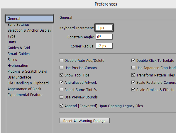
I hope you all use hotkeys in your work. Illustrator has settings that allow us to move objects over short distances with great accuracy using the arrow keys on the keyboard. Since we strive to ensure that everything in the layout is tied to the pixel boundaries, we must adjust this so that each click on the arrow moves our object by exactly 1 pixel.
These settings are in the menu Edit> Preferences> General> Keyboard Increment .
In fact, if you have not used it before, I will tell you - this is a super function that allows us to instantly move objects without error over short distances! Those are the situations when we need something to move a little.
4. The process
So, everything we did before this was to customize Illustrator to make it more pixel-sensitive, but it’s better to give something more than just the settings as a good example. I will tell you about the process, about the scheme, according to which I myself work, when I create something that will be used on the web.
Step 1
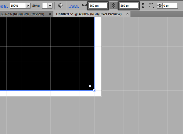
It all starts with the settings of our New Document. We need to pay a little attention to the settings when creating a new document, this will allow us to prepare the basis for creating a pixel-perfect image.
Press Ctrl + N (or go to File> New ) and notice some settings, starting with Profile .
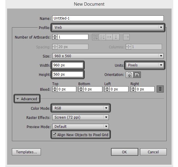
Since we are just crazy about Pixel perfect, our Profile should be set to Web . What makes this change? Illustrator in this case automatically changes units of measurement (Units) to pixels (Pixels) , and the color mode (Color Mode) to RGB (Red Green Blue) .
If you pay attention to the Size of our document, you will see that both Width and Height have round values (960 x 560 px) without a fractional part ( for example 960.5 x 560.38 ). What is so important about it? If you create a canvas (Artboard) , which will be for example 960.5 pixels wide, you will have a small area on the right, which will not coincide with the pixel grid.
This is terrible, because we want Adobe Illustrator to align all our new objects on the grid (Align New Objects to Pixel Grid) . This function is very important, its inclusion gives the program instructions for positioning new objects, and linking them to the Pixel Grid , which makes our image quality and sharp.
So, for example, if we create a rectangle with a size of 960 x 560 pixels , and then try to center (horizontally and vertically) this rectangle in relation to our Artboard , it will be impossible, since the right and bottom parts of the canvas do not coincide with the pixel grid and the borders of the canvas do not fall exactly on the borders of the pixels in this area.
Some of you might think that this option is important only if we draw, but it seems to me that when used in print, it will bear fruit, since you will be placing the Anchor points only at the nodes of the pixel grid, not anywhere.
To the note: If you have already begun work in a document whose dimensions have a fractional part, you can always fix it in the Artboard Tool window (Shift + O) . But I would still recommend to pay attention to it and immediately create canvases with the correct rounded values, it will save you from a headache in the future.
Step 2
If we set the document settings correctly, let's also observe this rule for the sizes of all elements - make sure that the width and height of all elements is without fractional parts.
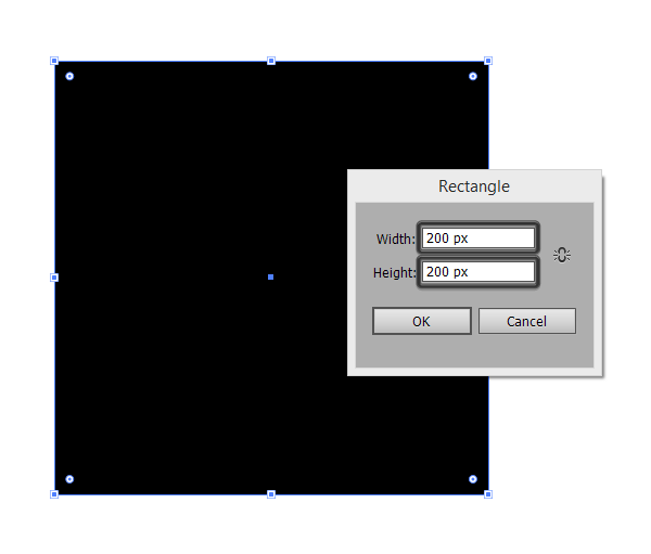
So, when creating objects, the overlay rule on the pixel grid should also be respected. If we want to create a clear image, even if it is a square, we need to set a fixed size (for example, 200 x 200 pixels ), so that each pixel of our shape will cover exactly one pixel on the pixel grid, and the pixel boundary of our shape will coincide with the border of exactly the same pixel number on Canvas (ArtBoard). To make sure of this, let's create a shape (Shape), zoom in (Zoom) as far as possible, and we will make sure that even at the maximum magnification our shape will look crystal clear, without any blurry edges!
If we created a 200.4 x 199.9 pixel shape , Illustrator would apply antialiasing (antialiasing effect) algorithms for the right and bottom of the shape, the borders would no longer match the pixel grid, and then our shape would look worse, not so sharp.
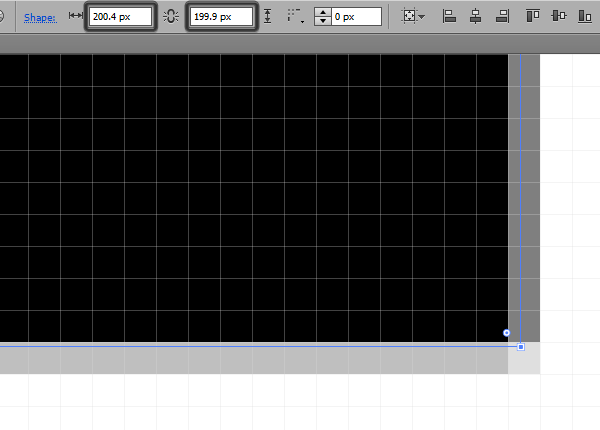
Fortunately, smart people from Adobe do not eat their bread for good reason, as they came up with a solution to this problem and offered it to us by adding the Align to Pixel Grid feature, which is located at the very bottom of the Transform palette. If you select a poorly located object, and turn on the Align to option for it, the size of the object is automatically rounded up to 200 pixels , since this is the closest integer value.
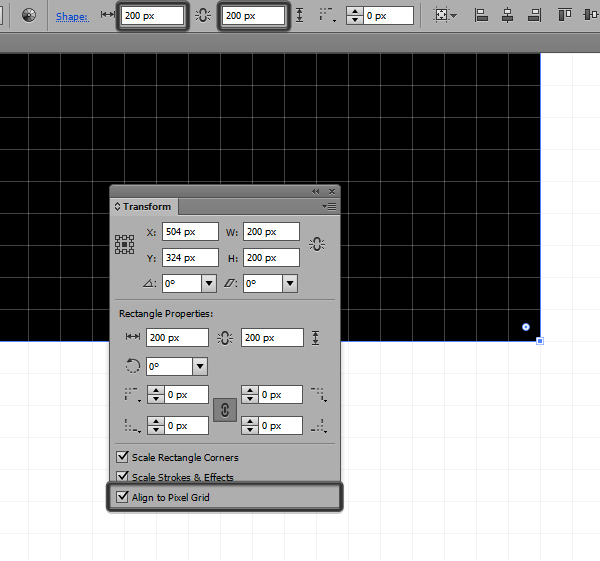
Note: If there is no such option in your Transform palette, you can turn on its display in the Transform palette by selecting Show Options .

Step 3
So, we come very close to the most important features in Adobe Illustrator, which allow you to create Pixel Perfect images. There are two functions that give a similar effect, but if you look, they have key differences.
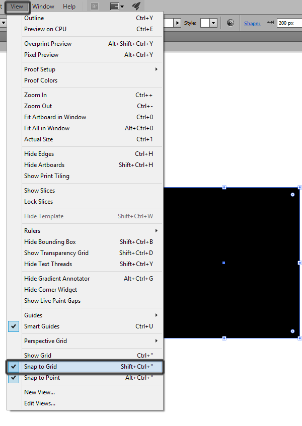
Snap to Grid
As the name suggests, this option binds objects to the Grid (Grid) , to the same Grid whose settings you previously set. This feature can be enabled in the View> Snap to Grid menu (Shift + Control + ”) . This feature includes in Adobe Illustrator algorithms by which all your objects on Canvas (Artboard) are bound to nodes and grid lines with their edges.
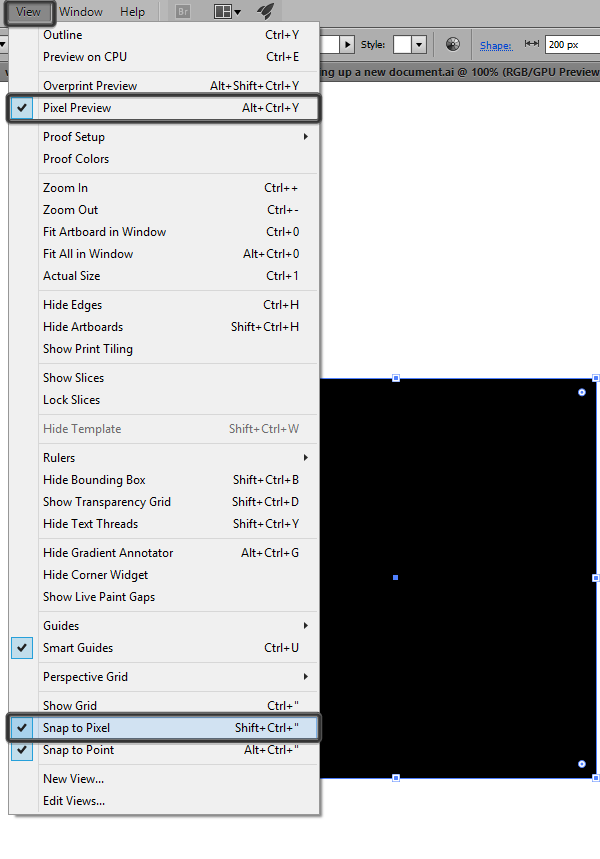
Pixel snapping
Snap to Pixel is slightly different from the previous function, because it binds objects to the Pixel Grid, which we cannot change. This feature is hidden until you enable Pixel Preview (Alt + Control + Y) , in which case you change the Snap to grid to Snap to pixel grid .
By the way, you can even the effect of these two functions Snap to Grid and Snap to Pixel if you tune your grid every 1 pixel , with division (Subdivision) by 1 , which is actually the minimum value of your grid, i.e. You are trimming a grid that is identical to a Pixel Grid .
Step 4
If you work with the pixel grid , the preview mode will be your main assistant in the process of creating crystal clear and sharp images. This allows you to zoom in at the pixel level, and see which parts of the higher image require close attention from you. I use this feature all the time, and it helps me all the time. As I said earlier, the option can be activated in the View> Pixel Preview menu or by pressing Alt + Ctrl + Y.
Step 5
When you have drawn everything that you need, take a little time, and just in case, make sure that all the reference points are attached to the Pixel Grid . If you find any point between the grid nodes, just pick up the Direct Selection Tool (A) , select this anchor point, and move it to the nearest grid point.
You will think that using the Align to Pixel Grid function takes care of these kinds of problems, but in my experience, sometimes errors occur in the program, and when this happens, I take the Direct Selection Tool (A) into my hands, and I correct these problems manually.
Step 6
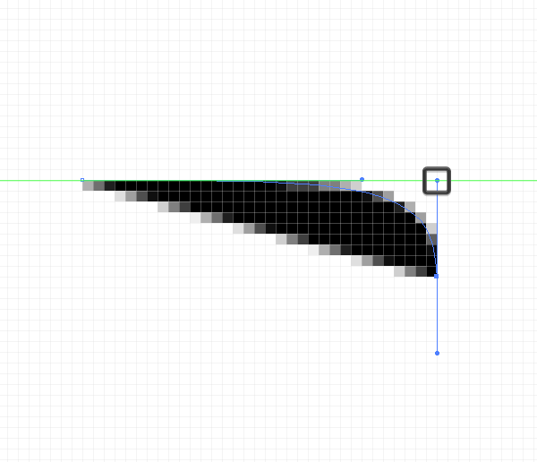
Bezier curves are an integral tool of any program working with vector graphics, with the help of guides you can change the shape of objects, change closed and unclosed curves. The problem with all newbies is that they often pull Bezier’s hands, especially without thinking, arbitrarily, and because of this, vector curves may not look very good, not as even as we would like.
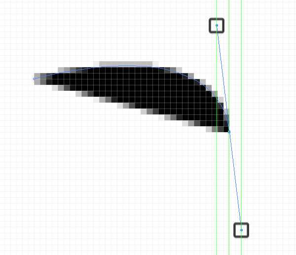
The trick is to ensure that the angle of the handles is a multiple of 45 ° , if possible. so that the guide line is clearly horizontal, vertical, or diagonal, this is done with the Shift key pressed . Thus, we can ensure that all points will be tied to the pixel grid.

By the way, if you have an object with a twisted right angle (like a button), then try to make sure that the pen reaches exactly that line of the object, which is its dimension, so that the handle does not go beyond the boundaries of the object.
5. Scaling objects
When we work with a Pixel Perfect image, changing the scale of a picture can be a real headache for you. If you select an object and pull the resizing handles of the bounding frame, the object will increase or decrease, yes, but many of its component parts may be distorted.
The solution is the Scale option (right click> Transform> Scale> Uniform) , and the use of values that are multiples of 50%, for example 150%, 200%, 250% for increasing and -50% for halving the initial size.
This means that you should always plan what, and in what size to create, you should think about the size requirements of your images in advance.

To the note: Even following this advice, unfortunately, you will not avoid the problems associated with changing the size of some objects, which consist of many elements. If this happens, you will need to ungroup your object, and change the size of each part separately.
6. Rotation of objects
When you work with rectangles, there are no special problems during rotation, because even if something flies, you can manually manually move the anchor point to the nearest node of the pixel grid. And what if we work with elements with rounded corners, or with curves?
Unfortunately, this is the saddest part of the work, if you like such a thing as Pixel Perfect, because at the moment there are no universal working algorithms that make it easy to automatically attach curve points to the pixel grid, and even in small things it will still affect general view of the image. Usually, if I have a rectangle with rounded corners and I need to rotate it, I rotate it and leave everything as it is.
It seems everything!
If you follow all these steps, then you will be able to create a high-definition image that will look great on any of the devices.
Useful links
- Pixel Perfect Precision - A book / reference book / guide from UsTwo, which made Monument Valley and introduced the concept of Pixel Perfect. This directory is currently 4 years old.
cdn.ustwo.com/PPP/PP3.pdf
If you are interested in my translation (or the original article), be sure to read this manual, or rather print a full color version and bring it to your colleagues' office! If you, like me, have problems with English, print out and bring to the office a full-fledged Russian version, which is located at the following link. - Translation of Pixel Perfect Precision to Russian. Translated 3 edition.
heartbeat.ua/pp3/PP3_rus.pdf - A small article about the translation of Pixel Perfect Precision on Habré.
habrahabr.ru/post/242373 - Short article about Pixel Perfect layout on Habré.
habrahabr.ru/post/195414
This is the very first and almost the only article that I managed to find in my time for the query “Pixel Perfect”.
Source: https://habr.com/ru/post/259723/
All Articles