Web typography today. Part IV
Part I - Part II - Part III - Part IV - Part V - Part VI
Part IV
So, it is time to find out which fonts and with what probability they may be installed on various operating systems, either as a result of some special situations (for example, when installing Microsoft Office, Adobe Creative Suite or CorelDRAW! Suite), or "Pristine clean" OS (which is undoubtedly the most acceptable option). And also to find out which of these fonts are suitable for use and in what specific cases.
')
For a start, it is worth remembering those fonts that have been and are being used in various operating systems as means for designing graphical interfaces, and also are used for various service applications. We are not going to consider those fonts that are also included in the standard set of OS, and are directly designed to work with text and web ( Arial , Verdana , etc.). We will talk about them later.
 The following system fonts can be found in the Windows family: Fixedsys , MS Gothic , MS Serif , MS Sans Serif , System , Terminal . All these fonts are present in all versions of MS Windows, so it could well be used as a basis for the design of text blocks. True, only if screen anti-aliasing is turned off, and the font size is indicated by some fixed values (usually 10 or 12 pixels), since most of these fonts are raster, ie correctly displayed in the size in which they were originally drawn. I had to observe the use of MS Sans Serif headset 8-10 years ago more than once. But today these fonts are not widely used in web development. Looking ahead, I note that Windows Vista uses the scalable Segoe UI system font, which we will discuss later.
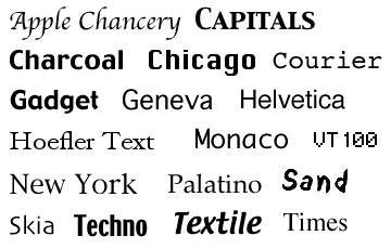 In MacOS of various versions, in addition to the already named Lucida Grande , the following system headsets were used or are used: Apple Chancery , Capitals , Charcoal , Chicago , Courier , Gadget , Geneva , Helvetica , Hoefler Text , Monaco , New York , Palatino , Sand , Skia , Techno , Textile , Times , VT100 . And here the situation is somewhat more complicated. Some of the headsets were used in early MacOS versions and disappeared with the advent of System 7, while others were replaced by new ones as a result of the transition to the OS X platform (as Charcoal replaced Chicago ). Therefore, at the same time, all these fonts are unlikely to be detected on the “Mac”. Yes, actually, there is no need. The headsets that are included in MacOS X are of the greatest interest to us, since it almost completely superseded all other versions of MacOS on Apple computers. Of the more or less usable "Makovsky fonts" I would note Geneva , Helvetica , Courier and Times . You can still see their inclusion in the list of fonts:
Charcoal , Palatino and Techno have also been cautiously used several times, but this is rather an exception: the share of “poppies” on the web is relatively small, although you can roughly replace these fonts with similar ones in other operating systems (for example, Palatino can be replaced by Times New Roman ).
 For systems of the Linux family, the list of fonts included in the standard distribution may be even greater. In some builds of Linux, some headsets may be present, in some - others. But there is a more or less common set, the so-called X11 core fonts set: Helvetica , Courier , Fixed , Terminal , New C.Schlbk , Lucida , Lucidabright , Lucidatty , Charter , Utopia , Times , Palatino , Clean , Avantgarde , Bookman , Zapf Chancery . Also very popular in the Linux environment is the DejaVu system font, which has Sans , Serif and Sans Mono styles and offers a very wide range of Unicode characters. DejaVu has no direct analogues in other operating systems, but with certain assumptions, you can count DejaVu Sans as Verdana analogue, DejaVu Serif as Georgia analogue, DejaVu Sans Mono analogue - Andale Mono analogue.
So, as you can see, in MacOS X and Linux, many fonts are the same: Helvetica , Courier , Times , Palatino . The nature of the pattern of these fonts may differ slightly, but in general they are quite similar.
This is important because it allows us to adjust the display of fonts in the event that the specific typeface that we specified in our style is not found in the system. Here the predictability factor is very relevant. Consider the following situation:
On Windows, everything will be displayed absolutely correctly, since the fonts specified in the style will be found and used. But in other OSs, if these fonts are not available, those headsets will be used that are specified by default in the browser settings (or directly in the OS settings) as grotesque (sans-serif), antiqua (serif) and monospaced ones . And there is no guarantee that some exotic variants are not used as default fonts. Although, of course, it is unlikely, but it may happen that the default grotesque headset has fatter touches and a large point, because of which the design of the site can “crumble”.
This situation can be avoided by placing specific fonts before specifying generalizing classes (serif, sans-serif, etc.), which we can predict (we can test) in advance . In this case, those fonts that exist in both Linux and MacOS turn out to be useful. But they are not in Windows. Therefore, it is necessary to determine some unwritten correspondence between operating system fonts. And then our design will look like this:
Familiar, is not it? Indeed, on most sites you can find similar constructions, and web developers often copy these lines without even thinking about their purpose. There are even oddities, when for some reason the order of the fonts changes, as a result of which unpredictable situations can occur. For example, if Arial and Helvetica are mixed up, then Helvetica will be used first in Windows if it is installed in the system. No big deal, you say? In principle, the way it is. But where is the guarantee that some unsuccessful, crookedly drawn or simply Russified version of Helvetica did not get into the system?
In order to avoid any undesirable consequences, I would recommend in all styles and always use these three constructions exactly in the given order, since all fonts can be divided conditionally into these three main groups. We will not consider the class of decorative fonts (fantasy), since it is not used in modern layout because of the lack of decorative fonts commonly used for all OSs, and also because of the complexity of using such fonts: as a rule, images or Flash are used for these purposes. .
So, using the above constructions, we will always know what the page will look like if the system does not have the right font.
But you want more, is not it?
We have already found out that the standard Arial and Times New Roman are far from ideal, and the sites with these fonts look quite old-fashioned and rather clumsy today.
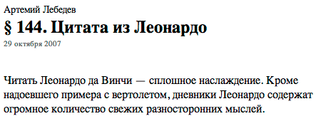
As an example, it is worth citing any paragraph of the Artemy Lebedev Ko / branch . Artemy himself was often an opponent of explicitly specifying fonts in HTML, so often the text in Ko / vodstvo is displayed in the manner specified by the browser (the font-family parameter for defining the base text is not found in the /kovodstvo/main.css file). In this case, the Mac user will see the following image with the Times font (this font is specified by default as a serif class in MacOS):
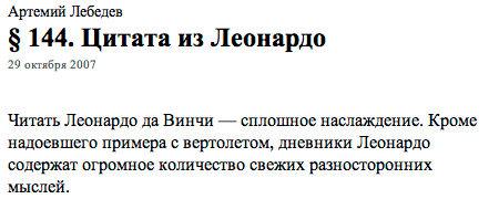
This text will be displayed in Windows using Times New Roman (the default font for serif):
- There is almost no ranits! Read Times New Roman is absolutely no worse than the Times! - many will exclaim. And wrong.
Indeed, in medium size (12–15pt) Times New Roman turns out to be quite tolerable for reading, although its drawing changes noticeably from size (in some cases the font is rendered rounded, in others - drawn out, etc.). But in a small or, on the contrary, large size, the font is terrible:
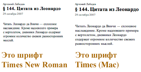
Look at how hard-to-read Times New Roman becomes when reducing the size of the base font to 10 points. Look closely at the bold face: the kerning pairs are absolutely not rebuilt (in the word Times, the letter e is far away from m - compare it with the same inscription made by Times (Mac)), the tick marks for E and t are much smaller than required, and the semicircle pattern for f simply ugly. All these nuances in the end affect fatigue, because reading an uneven font with poor-quality strokes is much more difficult than a smooth and minutely detailed headset. Needless to say, dear Artemy Andreevich did not take good care of the readers of his invaluable paragraphs? But this could have been avoided by using, for example, the well-established Georgia . However, we will leave this on the conscience of opponents of explicitly specifying fonts. The purpose of this review is just to find out how to unify and maximize the ease of reading text from any browsers on any operating systems.
Obviously, for this reason, Microsoft in 1996 prepared and released the Core fonts for Web suite. It became part of the MS Office suite, and also began to be included in the standard delivery of operating systems starting with Windows 98.
This set includes the following headsets: Andale Mono (monospace), Arial (grotesque), Comic Sans MS (decorative grotesque), Courier New (monospace), Georgia (antiqua), Impact (ultra-fat compact grotesque), Times New Roman (antiqua), Trebuchet MS (grotesque), Tahoma (grotesque), Verdana (grotesque), Webdings (character).
The Webdings font served as an addition to the already existing Wingdings , offering various bullets and icons designed specifically for the web industry, but did not receive wide distribution. Sincerely a pity, because the font really offers a lot of useful "mulechek" for web developers:

As you can see, in the Core fonts for Web set, several variants of grotesque fonts are offered at once (as many as four, not counting Impact and Comic Sans ) as compared to monospace and antiqualities (there are two). This is not by chance, since chopped fonts (grotesques) are much more suitable for reading from the screen (especially in small size, remember Lucida Grande and Myriad Pro ). And as we will see, Microsoft’s attempts to find the “perfect” grotesque are by no means over.
We have already learned enough about some fonts from this set ( Arial , Courier New , Georgia , Times New Roman , Tahoma , Verdana ), therefore we will consider the rest.
 Andale Mono is not widely used, because it is not proportional and is bad for everyday reading of text from the screen. But this font has become popular among programmers and web developers, as it is a good replacement for the outdated and very uncomfortable Courier New . In the field of web design Andale Mono can be used, for example, for some subtitles. But the most optimal environment for using it is programming articles using a large number of examples with some kind of code.
 Comic Sans MS and Impact - fonts are especially decorative, and therefore are not suitable for wide use in styles for the main text. Although I have often seen pages created using only Comic Sans MS . Nothing good came of it, because this font looks frivolous and sometimes even ridiculous. And if it looks more or less in the headlines of any websites of a childish or humorous nature, then the font for reading on corporate websites or in news portals is no good at all, and tires your eyes quickly.

Impact is generally the right idea. Only implemented not in the best way. In its design, this font is a compact and superfat grotesque, with something remotely resembling the outline of Helvetica Compressed , although the closest analogue is the Compacta headset (Monotype, ITC), even the name is similar. But if the commercial Compacta (Paratype's Cyrillic Compact analogue), with a certain adaptation for screen use, would be quite suitable where a high-quality compressed font for headings is required, then the free Impact turns out to be extremely limited in use. The thing is that he has only one typeface - superfat (black), and it is implemented too “bold”. On large pins (above 18pt) it looks even more or less (although it puts pressure on its “weight”), but for smaller headings it is absolutely unsuitable: a site visitor will constantly experience discomfort from an overly gloomy and heavy font design. So far I have met only one example of the active use of this font. On the Drive.ru automotive portal, you can see how Impact is used as headlines and article announcements. True, only Windows users (and, perhaps, Linux) will be able to evaluate this, since MacOS X uses Helvetica CY instead of it (this is implemented using separate CSS files for each OS).
For all systems without exception, the style is first written as follows:
And only then in separate .css-files (impact.css and helvetica.css) it is stipulated whether to leave the Impact font for the .title class or replace it with the Helvetica CY .
By the way, notice how illogical the alternation of fonts is in the indication: the most common Arial is preceded by Verdana and Tahoma , which are almost always if there are in the system, then only together. That is, Tahoma will never be used, and Verdana does not have the slightest chance: Arial will beat everyone with an absolute probability. Then why was it necessary to build such an absurd construction? I suppose these are the costs of thoughtless “copy-band”, when, as a result of numerous manipulations with style sheets, these lines acquired such an intricate look. Obviously, the developers simply copied them from other sites, added new parameters, and as a result, the design was enriched with such meaningless elements.
The font Helvetica CY is a special kind of horrible Helvetica, which I have never seen before and is not documented anywhere, but it turned out to be a good option for headings if you need bold and compressed font. However, in this case, there is a problem with the sticking of letters, because in the style specified negative tracking. Site programmers should take care of this and return the tracking to zero in the helvetica.css file to get the following:
Otherwise, for example, “Californication” in the title reads “Califomication”. However, this is, rather, not very important quibbles:

But, despite this omission of the developers of the site, the feasibility of using the Helvetica CY font on MacOS was justified. Because I forcibly installed the display of headings using the Cyrillic version of Impact (I had to find it separately, because I had a non-Cyrillized version of the font), and without exception, the Makov browsers made this ugly picture:

For Windows users, this font should appear much better. However, it should be used with great care in any case.
And finally, the “public favorite” - Trebuchet MS .
This font became popular in the late 90s, but only in an English-speaking environment, because it was not Russified for a long time. Only with the release of Windows XP and the MS Office 2007 package, did the Cyrillic version appear. Than they did not take advantage of a long time ago with envy domestic designers glancing at their western counterparts.
 Indeed, the Trebuchet MS font, developed in 1996 by the Microsoft designer Vincent Connare, turned out to be a good alternative to other Microsoft grotesque fonts. It looks equally good both in headings, typed in large size, and as the main text (up to the smallest screen size - bourgeois , 9pt). The font is well read due to the roundness of the points in the symbols, the relatively light saturation of the pattern and the characteristic recognizable elements (inclined side slopes in M, low crossbar in A, peculiar tails in Q and g, round dots in i and j, etc.) :

Text typed using Trebuchet MS looks more lightweight and stylish than with any other Corexon from the Core fonts for Web set . Especially with larger indents between the blocks and from the edges of the page (20 or more pixels), and with an increased leading (+ 4-8 points instead of the standard +2 points to the font size). As the designers say, this “need to breathe” font. Crushed by standard parameters, it loses its attractiveness and no longer looks so aristocratic. Using Trebuchet MS in your layouts, keep this in mind, otherwise it may not turn out much better than in the case of Verdana :

Let's go back to our fragments of the Apple and Co./Location site and see how they looked if the font Lucida Grande were replaced with Trebuchet MS :

Now put both fonts together for clarity:
In general, very good. Not without reason Trebuchet MS is so popular with designers along with the successful Georgia headset. Although, personally, in most cases, I would prefer Myriad Pro , if it were just as common, while Trebuchet MS itself would use it in quotation blocks and in some subtitles.
The Core fonts for Web suite is now included not only in Windows, but was also licensed by Apple, and is now a component of MacOS X Leopard. Also, all these fonts are included in the delivery of the most common Linux assemblies with graphic skins. Therefore, concerns about the prevalence of these fonts should not be experienced. Georgia , Tahoma , Verdana can be found in almost everyone (the almost “extinct” subspecies of users of old MacOS and Windows 95 do not count), and Russified Trebuchet MS will be found in about 8 out of 10 cases.
It should also be mentioned that in Windows there may be other fonts included in the package either directly from Windows, or when installing a newer version of Internet Explorer, or as part of the Microsoft Office suite (the same fonts come from Office and MacOS). You can search among your fonts like this:Algerian, Antique Olive, Arial Black, Arial Narrow, Arial Rounded MT, Book Antiqua, Bookman Old Style, Braggadocio, Brush Script MT, Century Schoolbook, Century Gothic CG Times, Cursive Elegant, Garamond, Gill Sans, Haettenschweiler, Matura MT Script , Modern, Old English, Univers, Zapf Chance . True, not all of them are Russified. In addition, their prevalence is unpredictable, so you should use them with great care in the layout.
From the above list, I would recommend using only Arial Black (the super-fat Arial version ) and Arial Narrow (a narrow version of Arial). They can sometimes be found in use on Russian sites. Although again, the fat and narrow headsets are very insidious, because on different computers and in different browsers for some reason they are rendered a little differently, which irritates the designers and forces them to look for other ways, to resort to using images or Flash. You can also try using Book Antiqua , Bookman Old Style and Century Schoolbook - three fairly good antiques that can be replaced by Palatino on other systems : Do not forget that the names of fonts containing spaces should be included in quotes. So, for example, Book Antiqua will look . Compare with Times New Roman
:
We will return to these three fonts later. And in the next part, we will consider new fonts from standard supplies in the OS, and also choose the most interesting options for using all fonts for various cases.
To be continued...
Part IV 
So, it is time to find out which fonts and with what probability they may be installed on various operating systems, either as a result of some special situations (for example, when installing Microsoft Office, Adobe Creative Suite or CorelDRAW! Suite), or "Pristine clean" OS (which is undoubtedly the most acceptable option). And also to find out which of these fonts are suitable for use and in what specific cases.
')
For a start, it is worth remembering those fonts that have been and are being used in various operating systems as means for designing graphical interfaces, and also are used for various service applications. We are not going to consider those fonts that are also included in the standard set of OS, and are directly designed to work with text and web ( Arial , Verdana , etc.). We will talk about them later.
The following system fonts can be found in the Windows family: Fixedsys , MS Gothic , MS Serif , MS Sans Serif , System , Terminal . All these fonts are present in all versions of MS Windows, so it could well be used as a basis for the design of text blocks. True, only if screen anti-aliasing is turned off, and the font size is indicated by some fixed values (usually 10 or 12 pixels), since most of these fonts are raster, ie correctly displayed in the size in which they were originally drawn. I had to observe the use of MS Sans Serif headset 8-10 years ago more than once. But today these fonts are not widely used in web development. Looking ahead, I note that Windows Vista uses the scalable Segoe UI system font, which we will discuss later. In MacOS of various versions, in addition to the already named Lucida Grande , the following system headsets were used or are used: Apple Chancery , Capitals , Charcoal , Chicago , Courier , Gadget , Geneva , Helvetica , Hoefler Text , Monaco , New York , Palatino , Sand , Skia , Techno , Textile , Times , VT100 . And here the situation is somewhat more complicated. Some of the headsets were used in early MacOS versions and disappeared with the advent of System 7, while others were replaced by new ones as a result of the transition to the OS X platform (as Charcoal replaced Chicago ). Therefore, at the same time, all these fonts are unlikely to be detected on the “Mac”. Yes, actually, there is no need. The headsets that are included in MacOS X are of the greatest interest to us, since it almost completely superseded all other versions of MacOS on Apple computers. Of the more or less usable "Makovsky fonts" I would note Geneva , Helvetica , Courier and Times . You can still see their inclusion in the list of fonts:font-family: Arial, Verdana, Geneva, Helvetica, sans-serif;
font-family: Georgia, Times New Roman, Times, serif;
font-family: Courier New, Courier, monospaced;
Charcoal , Palatino and Techno have also been cautiously used several times, but this is rather an exception: the share of “poppies” on the web is relatively small, although you can roughly replace these fonts with similar ones in other operating systems (for example, Palatino can be replaced by Times New Roman ).
For systems of the Linux family, the list of fonts included in the standard distribution may be even greater. In some builds of Linux, some headsets may be present, in some - others. But there is a more or less common set, the so-called X11 core fonts set: Helvetica , Courier , Fixed , Terminal , New C.Schlbk , Lucida , Lucidabright , Lucidatty , Charter , Utopia , Times , Palatino , Clean , Avantgarde , Bookman , Zapf Chancery . Also very popular in the Linux environment is the DejaVu system font, which has Sans , Serif and Sans Mono styles and offers a very wide range of Unicode characters. DejaVu has no direct analogues in other operating systems, but with certain assumptions, you can count DejaVu Sans as Verdana analogue, DejaVu Serif as Georgia analogue, DejaVu Sans Mono analogue - Andale Mono analogue.So, as you can see, in MacOS X and Linux, many fonts are the same: Helvetica , Courier , Times , Palatino . The nature of the pattern of these fonts may differ slightly, but in general they are quite similar.
This is important because it allows us to adjust the display of fonts in the event that the specific typeface that we specified in our style is not found in the system. Here the predictability factor is very relevant. Consider the following situation:
font-family: Verdana, sans-serif;
font-family: Georgia, serif;
font-family: Courier New, monospaced;
On Windows, everything will be displayed absolutely correctly, since the fonts specified in the style will be found and used. But in other OSs, if these fonts are not available, those headsets will be used that are specified by default in the browser settings (or directly in the OS settings) as grotesque (sans-serif), antiqua (serif) and monospaced ones . And there is no guarantee that some exotic variants are not used as default fonts. Although, of course, it is unlikely, but it may happen that the default grotesque headset has fatter touches and a large point, because of which the design of the site can “crumble”.
This situation can be avoided by placing specific fonts before specifying generalizing classes (serif, sans-serif, etc.), which we can predict (we can test) in advance . In this case, those fonts that exist in both Linux and MacOS turn out to be useful. But they are not in Windows. Therefore, it is necessary to determine some unwritten correspondence between operating system fonts. And then our design will look like this:
font-family: ( ), Arial, Helvetica, sans-serif;
font-family: ( ), "Times New Roman", Times, serif;
font-family: ( ), "Courier New", Courier, monospaced;
Familiar, is not it? Indeed, on most sites you can find similar constructions, and web developers often copy these lines without even thinking about their purpose. There are even oddities, when for some reason the order of the fonts changes, as a result of which unpredictable situations can occur. For example, if Arial and Helvetica are mixed up, then Helvetica will be used first in Windows if it is installed in the system. No big deal, you say? In principle, the way it is. But where is the guarantee that some unsuccessful, crookedly drawn or simply Russified version of Helvetica did not get into the system?
In order to avoid any undesirable consequences, I would recommend in all styles and always use these three constructions exactly in the given order, since all fonts can be divided conditionally into these three main groups. We will not consider the class of decorative fonts (fantasy), since it is not used in modern layout because of the lack of decorative fonts commonly used for all OSs, and also because of the complexity of using such fonts: as a rule, images or Flash are used for these purposes. .
So, using the above constructions, we will always know what the page will look like if the system does not have the right font.
But you want more, is not it?
We have already found out that the standard Arial and Times New Roman are far from ideal, and the sites with these fonts look quite old-fashioned and rather clumsy today.
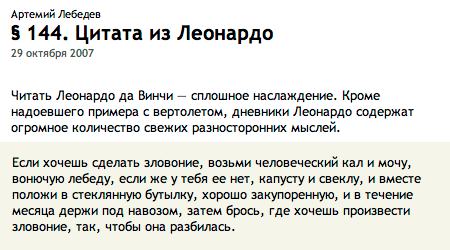
As an example, it is worth citing any paragraph of the Artemy Lebedev Ko / branch . Artemy himself was often an opponent of explicitly specifying fonts in HTML, so often the text in Ko / vodstvo is displayed in the manner specified by the browser (the font-family parameter for defining the base text is not found in the /kovodstvo/main.css file). In this case, the Mac user will see the following image with the Times font (this font is specified by default as a serif class in MacOS):
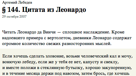
This text will be displayed in Windows using Times New Roman (the default font for serif):
- There is almost no ranits! Read Times New Roman is absolutely no worse than the Times! - many will exclaim. And wrong.
Indeed, in medium size (12–15pt) Times New Roman turns out to be quite tolerable for reading, although its drawing changes noticeably from size (in some cases the font is rendered rounded, in others - drawn out, etc.). But in a small or, on the contrary, large size, the font is terrible:
Look at how hard-to-read Times New Roman becomes when reducing the size of the base font to 10 points. Look closely at the bold face: the kerning pairs are absolutely not rebuilt (in the word Times, the letter e is far away from m - compare it with the same inscription made by Times (Mac)), the tick marks for E and t are much smaller than required, and the semicircle pattern for f simply ugly. All these nuances in the end affect fatigue, because reading an uneven font with poor-quality strokes is much more difficult than a smooth and minutely detailed headset. Needless to say, dear Artemy Andreevich did not take good care of the readers of his invaluable paragraphs? But this could have been avoided by using, for example, the well-established Georgia . However, we will leave this on the conscience of opponents of explicitly specifying fonts. The purpose of this review is just to find out how to unify and maximize the ease of reading text from any browsers on any operating systems.
Obviously, for this reason, Microsoft in 1996 prepared and released the Core fonts for Web suite. It became part of the MS Office suite, and also began to be included in the standard delivery of operating systems starting with Windows 98.
This set includes the following headsets: Andale Mono (monospace), Arial (grotesque), Comic Sans MS (decorative grotesque), Courier New (monospace), Georgia (antiqua), Impact (ultra-fat compact grotesque), Times New Roman (antiqua), Trebuchet MS (grotesque), Tahoma (grotesque), Verdana (grotesque), Webdings (character).
The Webdings font served as an addition to the already existing Wingdings , offering various bullets and icons designed specifically for the web industry, but did not receive wide distribution. Sincerely a pity, because the font really offers a lot of useful "mulechek" for web developers:
As you can see, in the Core fonts for Web set, several variants of grotesque fonts are offered at once (as many as four, not counting Impact and Comic Sans ) as compared to monospace and antiqualities (there are two). This is not by chance, since chopped fonts (grotesques) are much more suitable for reading from the screen (especially in small size, remember Lucida Grande and Myriad Pro ). And as we will see, Microsoft’s attempts to find the “perfect” grotesque are by no means over.
We have already learned enough about some fonts from this set ( Arial , Courier New , Georgia , Times New Roman , Tahoma , Verdana ), therefore we will consider the rest.
Andale Mono is not widely used, because it is not proportional and is bad for everyday reading of text from the screen. But this font has become popular among programmers and web developers, as it is a good replacement for the outdated and very uncomfortable Courier New . In the field of web design Andale Mono can be used, for example, for some subtitles. But the most optimal environment for using it is programming articles using a large number of examples with some kind of code. Andale Mono, , , - . Comic Sans MS and Impact - fonts are especially decorative, and therefore are not suitable for wide use in styles for the main text. Although I have often seen pages created using only Comic Sans MS . Nothing good came of it, because this font looks frivolous and sometimes even ridiculous. And if it looks more or less in the headlines of any websites of a childish or humorous nature, then the font for reading on corporate websites or in news portals is no good at all, and tires your eyes quickly.Impact is generally the right idea. Only implemented not in the best way. In its design, this font is a compact and superfat grotesque, with something remotely resembling the outline of Helvetica Compressed , although the closest analogue is the Compacta headset (Monotype, ITC), even the name is similar. But if the commercial Compacta (Paratype's Cyrillic Compact analogue), with a certain adaptation for screen use, would be quite suitable where a high-quality compressed font for headings is required, then the free Impact turns out to be extremely limited in use. The thing is that he has only one typeface - superfat (black), and it is implemented too “bold”. On large pins (above 18pt) it looks even more or less (although it puts pressure on its “weight”), but for smaller headings it is absolutely unsuitable: a site visitor will constantly experience discomfort from an overly gloomy and heavy font design. So far I have met only one example of the active use of this font. On the Drive.ru automotive portal, you can see how Impact is used as headlines and article announcements. True, only Windows users (and, perhaps, Linux) will be able to evaluate this, since MacOS X uses Helvetica CY instead of it (this is implemented using separate CSS files for each OS).
For all systems without exception, the style is first written as follows:
.title { font-family: Impact, Arial, Verdana, Tahoma, Geneva, sans-serif; font-size: 22px; color: #900; line-height: 18px; letter-spacing: -1px; }
And only then in separate .css-files (impact.css and helvetica.css) it is stipulated whether to leave the Impact font for the .title class or replace it with the Helvetica CY .
By the way, notice how illogical the alternation of fonts is in the indication: the most common Arial is preceded by Verdana and Tahoma , which are almost always if there are in the system, then only together. That is, Tahoma will never be used, and Verdana does not have the slightest chance: Arial will beat everyone with an absolute probability. Then why was it necessary to build such an absurd construction? I suppose these are the costs of thoughtless “copy-band”, when, as a result of numerous manipulations with style sheets, these lines acquired such an intricate look. Obviously, the developers simply copied them from other sites, added new parameters, and as a result, the design was enriched with such meaningless elements.
The font Helvetica CY is a special kind of horrible Helvetica, which I have never seen before and is not documented anywhere, but it turned out to be a good option for headings if you need bold and compressed font. However, in this case, there is a problem with the sticking of letters, because in the style specified negative tracking. Site programmers should take care of this and return the tracking to zero in the helvetica.css file to get the following:
.title { font-family: Helvetica CY, Tahoma, Arial, Geneva, sans-serif; font-weight: bold !important; letter-spacing: 0px; }
Otherwise, for example, “Californication” in the title reads “Califomication”. However, this is, rather, not very important quibbles:
But, despite this omission of the developers of the site, the feasibility of using the Helvetica CY font on MacOS was justified. Because I forcibly installed the display of headings using the Cyrillic version of Impact (I had to find it separately, because I had a non-Cyrillized version of the font), and without exception, the Makov browsers made this ugly picture:
For Windows users, this font should appear much better. However, it should be used with great care in any case.
And finally, the “public favorite” - Trebuchet MS .
This font became popular in the late 90s, but only in an English-speaking environment, because it was not Russified for a long time. Only with the release of Windows XP and the MS Office 2007 package, did the Cyrillic version appear. Than they did not take advantage of a long time ago with envy domestic designers glancing at their western counterparts.
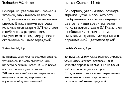
Indeed, the Trebuchet MS font, developed in 1996 by the Microsoft designer Vincent Connare, turned out to be a good alternative to other Microsoft grotesque fonts. It looks equally good both in headings, typed in large size, and as the main text (up to the smallest screen size - bourgeois , 9pt). The font is well read due to the roundness of the points in the symbols, the relatively light saturation of the pattern and the characteristic recognizable elements (inclined side slopes in M, low crossbar in A, peculiar tails in Q and g, round dots in i and j, etc.) :Text typed using Trebuchet MS looks more lightweight and stylish than with any other Corexon from the Core fonts for Web set . Especially with larger indents between the blocks and from the edges of the page (20 or more pixels), and with an increased leading (+ 4-8 points instead of the standard +2 points to the font size). As the designers say, this “need to breathe” font. Crushed by standard parameters, it loses its attractiveness and no longer looks so aristocratic. Using Trebuchet MS in your layouts, keep this in mind, otherwise it may not turn out much better than in the case of Verdana :
Let's go back to our fragments of the Apple and Co./Location site and see how they looked if the font Lucida Grande were replaced with Trebuchet MS :
Now put both fonts together for clarity:
In general, very good. Not without reason Trebuchet MS is so popular with designers along with the successful Georgia headset. Although, personally, in most cases, I would prefer Myriad Pro , if it were just as common, while Trebuchet MS itself would use it in quotation blocks and in some subtitles.
The Core fonts for Web suite is now included not only in Windows, but was also licensed by Apple, and is now a component of MacOS X Leopard. Also, all these fonts are included in the delivery of the most common Linux assemblies with graphic skins. Therefore, concerns about the prevalence of these fonts should not be experienced. Georgia , Tahoma , Verdana can be found in almost everyone (the almost “extinct” subspecies of users of old MacOS and Windows 95 do not count), and Russified Trebuchet MS will be found in about 8 out of 10 cases.
It should also be mentioned that in Windows there may be other fonts included in the package either directly from Windows, or when installing a newer version of Internet Explorer, or as part of the Microsoft Office suite (the same fonts come from Office and MacOS). You can search among your fonts like this:Algerian, Antique Olive, Arial Black, Arial Narrow, Arial Rounded MT, Book Antiqua, Bookman Old Style, Braggadocio, Brush Script MT, Century Schoolbook, Century Gothic CG Times, Cursive Elegant, Garamond, Gill Sans, Haettenschweiler, Matura MT Script , Modern, Old English, Univers, Zapf Chance . True, not all of them are Russified. In addition, their prevalence is unpredictable, so you should use them with great care in the layout.
From the above list, I would recommend using only Arial Black (the super-fat Arial version ) and Arial Narrow (a narrow version of Arial). They can sometimes be found in use on Russian sites. Although again, the fat and narrow headsets are very insidious, because on different computers and in different browsers for some reason they are rendered a little differently, which irritates the designers and forces them to look for other ways, to resort to using images or Flash. You can also try using Book Antiqua , Bookman Old Style and Century Schoolbook - three fairly good antiques that can be replaced by Palatino on other systems : Do not forget that the names of fonts containing spaces should be included in quotes. So, for example, Book Antiqua will look . Compare with Times New Roman
font-family: "Book Antiqua", Palatino, "Times New Roman", Times, serif;
:
We will return to these three fonts later. And in the next part, we will consider new fonts from standard supplies in the OS, and also choose the most interesting options for using all fonts for various cases.
To be continued...
Afterwords ...
Ps. I deliberately do not give examples with disabled anti-aliasing. I assure you that Verdana and Tahoma would have won in most cases, but I’m personally convinced that the text that is not smoothed is a relic of the past and must be abandoned, just as we abandoned the 256 color palette, the coding selection menu (remember these creepy WIN / KOI / DOS / LAT?), by tag640480. , . , , : , .
PPS. .
PPPS. , , .
Source: https://habr.com/ru/post/25958/
All Articles