Simplicity design: How to make effective plain-text letters

When creating a mailing list, companies often resort to the development of complex templates that require knowledge of various layout technologies. However, letters that contain nothing but text can be an effective tool leading to high conversion. Today we will talk about how to achieve this.
Why plain text is important
Of course, text versions of letters look far less “cool” than HTML templates, but this is no reason not to pay attention to them. There are several reasons for this:
- Spam filters - when a company produces an email list, plain-text and HTML versions of the letter are “glued together” using the MIME format. If the letter does not have a text version, for spam filters it will be a disturbing bell indicating that the message may be spam.
- User Tastes - Some people prefer to read the text, rather than looking at HTML letters. Many email clients (the same Gmail and Outlook) make it easy to switch to viewing text versions of letters.
- Mail clients - despite the fact that "legally" almost all modern mail programs support HTML, in fact the situation is not so rosy. In addition, some new devices (for example, Apple Watch) by default display plain-text versions of letters, because it is more convenient on a small screen (we wrote about the layout of letters on Watch in the last topic ).
What should look like effective text letters
When using email marketing tools like MailChimp , CampaignMonitor , Pechkin-mail.ru and others, a plain-text version of the letter will be created automatically. However, even in this case, you should take time to optimize it to achieve the highest conversion rates. There are several directions for such optimization.
')
Work with empty space to increase readability
The presence of free space between parts of the text increases its readability and allows people to more easily understand its meaning. Psychologists have found that the presence of spaces and indents in the text published in the web made it more pleasant to read, so users longer kept their eyes on the text and tried to understand the information more carefully.
To more clearly understand the impact of free space, let's compare two versions of a text letter.
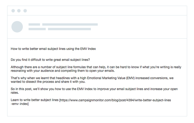
Without free space:

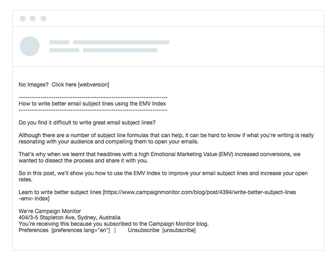
With empty space:

Obviously, if you break the text with spaces, it is much easier to read. This means that the likelihood is increased that the user will read it out and take the necessary action for the business.
Creating a hierarchy
One of the main difficulties in working with plain-text letters is the inability to work with traditional design elements (for example, headings).
However, even these restrictions should not prevent the creation of an information hierarchy - the user should easily understand how certain elements of the letter relate to each other.
To achieve this effect, you can use uppercase letters or special characters. We illustrate the idea with an example. Below is a letter without a highlighted heading:
And here - with the highlighted title:

As you can see, even the use of basic formatting elements made it much easier to read the letter.
Highlighting the main call to action
Tests show that the presence of call-to-action buttons in a letter increases the conversion. But this is not due to the fact that people just like to press buttons. Not at all, they simply select from the general mass of the text, which focuses attention on these elements.
In text letters, of course, there are no buttons, but with simple formatting manipulations, you can also effectively attract the attention of the reader. To highlight calls to action, you can use characters like an asterisk (*) or angle brackets (<>).
Without highlighting the call to action:
With highlighting:
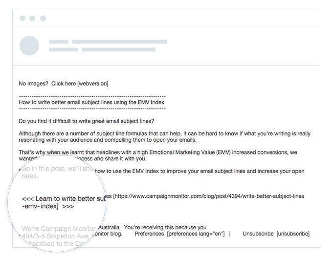
By adding angle brackets and additional spaces, we managed to make the call to action more visible and separate it from the body of the rest of the letter, while maintaining the information hierarchy of the message. This means that users still “consume” the letter in the right order (heading-> body-> call to action), but it is easier for them to figure out what awaits them in the next step.
Conclusion
By applying the three tactics described above, we were able to progressively improve an email text message that was impossible to read, to a completely acceptable state, with headers, clear calls to action, etc.
Source: https://habr.com/ru/post/259333/
All Articles