How we used design thinking when creating a new AdTrack

Published on behalf of Artics Internet Solution, a performance-marketing agency.
Most of the management systems and optimization of advertising campaigns are aimed directly at specialists. At the same time, for project managers, brand and marketing managers who, of course, are interested in the results of the campaign, but are not engaged in operational work, such systems are poorly adapted.
')
Not so long ago, we thought about creating a separate information panel for managers, where only the data they need would be displayed. And in December 2014, we announced the launch of the updated AdTrack, in which this idea was implemented. Now that we have already tested the tool and realized how successful our idea was, we want to tell you what we went through and how we learned to visualize complex data.
A little background or why we developed AdTrack?
A few years ago, the concept of performance marketing appeared in the online advertising industry. This approach aims to achieve a specific result, useful for business, and most importantly - measurable. For an online store, the goal of such marketing will be to increase the number of orders instead of increasing brand awareness, for a financial institution - the number of attracted customers instead of increasing the bank’s perception as “reliable”.
Modern performance marketing is, above all, a complex and technological industry. Achieving the result desired by the client is impossible without daily and hourly measurement of the results of advertising campaigns. By optimizing the rates and other settings for advertising placements, we improve performance by reaching maximum customer business indicators. At the same time, the campaigns themselves often have a large amount of data - tens and hundreds of thousands of ads, millions of keywords, tens of combinations of targeting. All this means that manual analysis and management of advertising is impossible - these actions will take an unacceptable amount of time.
We had the choice to use existing solutions to optimize and manage advertising campaigns or create your own tool. For some time we tried to use different systems, but ultimately we came to the conclusion that we need to develop our own solution, which would adapt as much as possible to the business of our clients. We created AdTrack in 2010 and have been developing it for more than five years.
Different tasks - different systems
A few words about what management systems and optimization of advertising campaigns exist on the market. For simplicity, we divide them into several groups. Firstly, it may be a Western solution (Adobe AdLens, Kenshoo, Marin, Acquisio, etc.), but in this case you need to be prepared for the fact that Western systems do not support some Russian channels (in this case you still have to use a local solution ). Secondly, depending on their needs, advertisers can choose a system to work with only one channel (for example, with contextual advertising - eLama, Garpun, K50, with social networks - Plarin, Control) or a system that allows managing multiple channels - Adobe AdLens, AdTrack, MarinSoftware, Marilyn. Such systems, as a rule, are targeted at large advertisers. Third, some agencies have separate solutions - AdTrack, Adhands, “Context Motor”. As mentioned above, their own solutions allow agencies to sharpen automation tools for those market segments in which they specialize.
We made a complicated system.
Creating AdTrack, we wanted to immediately "kill two birds with one stone": get a tool for internal use and give customers access to the course of advertising campaigns. And at first everything was fine - the system solved our tasks in managing and automating advertising campaigns and solving the tasks of clients. As time went on, the possibilities for analysis and management grew, responding to the challenges of an ever-evolving advertising market. Within the agency, no campaign was conducted without the use of AdTrack, and among clients the activity on the contrary decreased. For them, the system was difficult, moreover, many were not interested in how we work with advertising campaigns, they needed results and their dynamics - we saw this by the number of requests for reports on placements. As a result, we spent a lot of time writing reports, although customers could see the results themselves. In addition, by giving access to advertising campaigns, we wanted to make our work as transparent as possible and thereby increase the degree of customer confidence in us as an agency. But at that time, we realized that the task of providing information to customers AdTrack does not solve effectively.
We tried to hold a small master class, where we talked about the capabilities of the system and made up instructions for use. After that, we monitored calls under the client login-password - they remained catastrophically low, while requests for a report to the manager were sent regularly. The master class did not help us.
From the expanses of the universe to human interfaces
Internet advertising opportunities were constantly evolving, data became more and more, AdTrack successfully coped with new tasks, but its interfaces more and more resembled “spaces of the universe”, and our customers needed a simple and convenient tool that would allow them to track key parameters.
For example, this is what customers could see when logging into AdTrack under their login:

How to solve this problem and save the interface that our specialists use? We realized that customers need a separate dashboard (dashboard). But in order to make a truly good product, this time for our customers, not for us, you need to think like customers and clearly understand their needs. To identify these needs and visualize information in an accessible form for customers, we turned to design thinking, an approach that allows us to work with the consumer’s “tacit knowledge”. The basis of this approach is empathy - the ability to look at the world through the eyes of other people, to understand their needs, desires, and tasks. That is, we tried to put ourselves in the place of our customers and understand what kind of dashboards would be useful to them. The development process itself according to design thinking consists of five stages: empathy, focus, ideas, prototype, test.

How we used design thinking when creating the updated AdTrack
Empathy
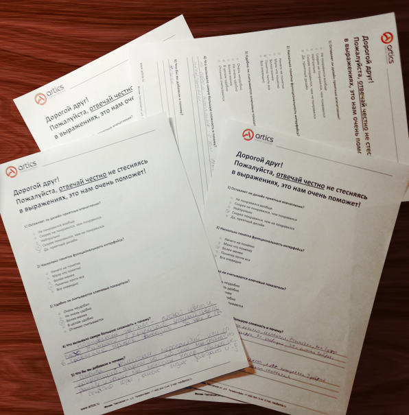
We had an understanding of the problem itself, but we decided to dig deeper and dive into the clients' workflows. For this purpose, we conducted several interviews with advertisers about how they generally work with campaign data and what features are lacking. We got the following points (interestingly, the range of needs of our clients is quite wide):
- Statistics of advertising placements and their results are reduced daily, I would like to save time on this.
- There is a fixed internal reporting structure, and daily results (not only for internet marketing) are sent daily.
- The company has dashboards on the course of business in the whole business - the data from them is displayed on the screens in the office, including from the CEO. Each department and employee has their own parameters. They include business indicators, but there are not enough operational indicators for marketing.
- All marketing is rated in "deep" business indicators (revenue, orders), common to all channels of promotion.
- Seeing the results in numbers is good, but it’s better to see the findings of the experts right away.
- The management assesses the results of marketing once a month. I would like to switch to a weekly or daily assessment.
- Statistics of campaigns are viewed both in the amount and in the section by products, geography.
- There are thresholds for deviation of parameters from planned values. On excess of thresholds need to know and take action.
- There is a desire and attempts to monitor the actions of competitors, but the possibilities are limited.
Focusing
When we turned to focusing, we needed to put together everything heard and seen in order to understand the big picture and highlight the most important parameters. To simplify this process, we tried to visualize the information - all nine points (see above) obtained in the initial interview were written out on the blackboard and tried to draw connections between them. We realized that we have three main problems looming:
- The display of data in them does not fit in with the way customers look at marketing from a business point of view (the management system shows the structure of the advertising campaign, and the data is needed in certain sections, comparison between them);
- Control systems are too complex to quickly check the situation, it is easy to get confused;
- Evaluation of marketing effectiveness does not make sense without taking into account the internal customer data.
Generation of ideas
In order to effectively solve these problems, we decided to dig to the goal from two sides, so we gathered two focus groups: one with technology leaders, the other with marketing ones. Before that, we prepared several variants of draft prototypes, based on customer needs and problems, and showed them to each group. In the course of the demonstration of draft dashboards, we gave our explanations of what tasks we were solving, answered questions from survey participants (and fixed ourselves what exactly they did not understand or did not like). We tried to understand how each group sees the solution to the needs identified at the very beginning. We had a few brainstorms: we listened to the comments, tried to figure out how to solve it, decided and returned with new ideas. As a result, we came to the understanding that the dashboard should display the following data:
- campaign baseline;
- comparison of campaign results with the market;
- indicators of changes made to the campaign;
- competitor advertisements;
- top competitors;
- daily or weekly manager comment based on campaign changes.
In addition, you must implement:
- automatic unloading of data in the client database;
- import customer business data into dashboards;
- automatic reporting and sending by mail;
- automatic notifications when you deviate from the plan.
So, we had ideas and it was necessary to check them on clients. Since the needs were initially very different, we were not limited to one version of the prototypes. We had several stages, during which we showed prototypes to customers, asked their opinion, made edits in accordance with their comments and showed a new version of prototypes. We had three such visits.

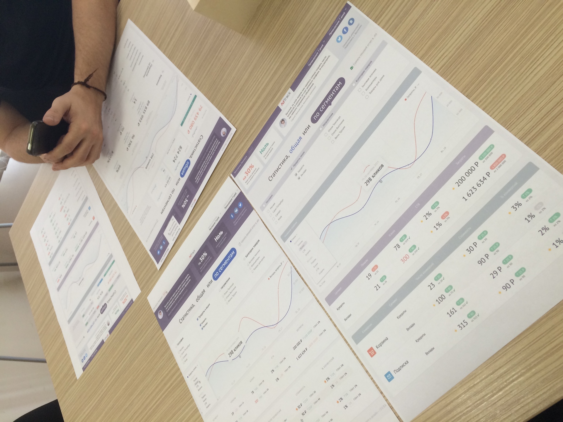
We prepared the first option (the “General Statistics” and “Statistics by Segments” pages) and discussed them both with those who had previously seen AdTrack and those who had not worked with it. Each participant in the process was necessary to select the blocks that they like and dislike and justify their choice.
Option 1.
We showed customers the first version of dashboards. All the data that customers wanted to track was presented on prototypes. We will deliberately dwell only on what customers did not like, since for all the other blocks, as a rule, they said “everything is good / nothing needs to be changed”.
Overall

Segments

Option 2.
We tried to take into account and correct all customer comments.
- Changed the quick tracker. Since some clients wanted to remove the parameters, others added, we did the following: we made two large blocks (key parameters will be displayed here) and two smaller blocks, and now customers can add additional parameters for quick tracking if necessary.
- Brought the schedule to a separate unit. In the previous version of the graphics were too small, and the information was not read at all, according to customers. At the same time, it was important for all customers that this functionality remained, and some even wanted to view several parameters.
We showed customers the second version of the prototypes, and this is what they didn’t like this time:
Overall

Segments

* It is interesting that many of the blocks we left unchanged, and only during the second viewing, customers realized that this was inconvenient.
Option 3.
This time a lot of work was done - because the customers didn’t like the accumulation of data, symbols, it was necessary to think how to present these indicators differently. In addition, we have made several of our edits.
And as usual, customers were shown what we did. This was the last approach to the development of prototypes, because we did not hear the wishes / comments from clients. So, what and how we remade:
Overall

Segments
Here we had to completely rework the bottom block - there was really a lot of data and it is impossible to try to present them clearly in one small window. Now all the data was presented in the form of tables.

Design
By this time a lot of work has been done. We found out the preferences of our customers, knew why they didn’t like certain moments. And we had to develop a design. Despite the fact that we were almost at the finish line, and we already had an understanding of how it should look in practice, everything turned out to be not so simple.
At first, we looked at what others were doing, chose some good examples for themselves (good graphics, buttons, states), discussed these options with customers in order to understand what they like and why they like it.

And here are a few dashboards, which, in our opinion, are unsuccessful examples:

We knew for sure that the design should be modern, stylish and light. And if everything was clear with some blocks, I had to tinker with the others.
For example, I had to try several versions of the graph view:

Long worked with the tables. Understood that general statistical indicators and performance indicators are large numbers, in order to make them easily readable, you need to spread them into different tables. In this case, information should not be lost. There were also several visits, during which customers gave their comments, what they liked and what did not. For example, they divided the page visually into two blocks in order to make data easier to read. To quickly navigate through the dynamics of indicators, the auxiliary dies of the table were colored.

These were the most controversial blocks. After we took into account all the shortcomings, we launched dashboards in this form:

Test
We received two interfaces: for managers and specialists. It remained to test new dashboards on customers. We did not give access to all clients at once, but intentionally limited the number of clients. So, what we got on the test results:
- 80% of users are interested in new dashboards, 50% enter the system at least once a week.
- Old habits did not go away immediately and at first the customers still turned to the managers with questions. If the answer to this question can be obtained in the dashboard, the manager politely reminded that this information is in the interface. About three hits were enough - the client started using AdTrack.
- From the client side, requests for the current campaign run have decreased. In addition, the ability to leave comments on dashboards allows the manager to answer these questions, even before they appear to customers. This saves time manager.
- Clients gained access to the course of advertising campaigns, and we saw that their trust in us is growing.
- By this moment, we understood what tasks the dashboard does not close. For example, some customers maintain statistics on campaigns across various marketing channels, including offline. Managers still have to provide statistics on such placements in the form of an Excel file or an online table in a format specified by the client.
We do not stop
We have been developing and developing AdTrack for a long time, not to say that we have always implemented all the processes of introducing new functionality easily and smoothly, but, frankly, we spent more time and effort on creating dashboards for managers. But we are pleased with the result - we checked on ourselves the action of design thinking, learned to listen and speak with clients, clearly identified their needs (even if it was a long time and not always easy), we learned exactly what functionality and how they needed it. In other words, we received a tool that our customers already use, and not just us. And we continue to take into account their wishes.
Now we are testing two ideas that were put off "for later" at the stage of creating dashboards.
Idea number one. The ability to share the results of campaigns in social networks
On the one hand, we see interest in this function, because everyone likes to talk about good results. On the other hand, the results of campaigns can be a business secret, and therefore it will be impossible to share success. Now we are studying this issue in more detail to find a balance of needs.
Idea number 2. Access to campaign results in client reporting systems
In fact, this idea has already found application in practice. For customers who reduce analytics on all advertising activities in their own system, we need data from AdTrack. We have created a special API for them, with the help of which they can get the results of campaigns and use them in their reporting systems.
Expert opinion

Source: https://habr.com/ru/post/259249/
All Articles