Content Iconification
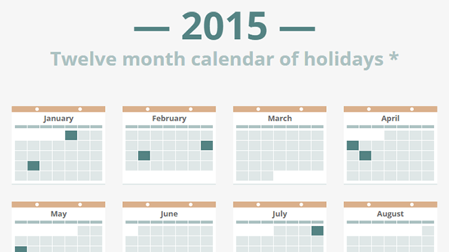
In this article we will talk about the concept of iconification - placing content on a page and using CSS to transform it into a simplified preview as an icon. Let's look at an example. This demo shows the icon on the example of the calendar. To expand a month, you need to click on its icon.
Visual abstraction
In the calendar example, simple colored squares are used as icons, indicating that the month contains dates of interest to us. For each icon, you can click and call a full view with more details, such as dates and holiday names. The context maintains a smooth transition between the two states.
This option is great for presenting a compact overview of the content, while constantly maintaining the availability of parts. In other words, it provides a visual abstraction of information.
HTML
Here is the HTML for one month:
<article tabindex="0"> <div class="outline"></div> <div class="dismiss"></div> <div class="binding"></div> <h1>January</h1> <table> <thead> <tr> <th>Sun</th> <th>Mon</th> <th>Tue</th> <th>Wed</th> <th>Thu</th> <th>Fri</th> <th>Sat</th> </tr> </thead> <tr> <td></td> <td></td> <td></td> <td></td> <td class="is-holiday"> <div class="day">1</div> <div class="holiday">New Year's Day</div> </td> <td><div class="day">2</div></td> <td><div class="day">3</div></td> </tr> <tr> <td><div class="day">4</div></td> <td><div class="day">5</div></td> <td><div class="day">6</div></td> <td><div class="day">7</div></td> <td><div class="day">8</div></td> <td><div class="day">9</div></td> <td><div class="day">10</div></td> </tr> <tr> <td><div class="day">11</div></td> <td><div class="day">12</div></td> <td><div class="day">13</div></td> <td><div class="day">14</div></td> <td><div class="day">15</div></td> <td><div class="day">16</div></td> <td><div class="day">17</div></td> </tr> <tr> <td><div class="day">18</div></td> <td class="is-holiday"> <div class="day">19</div> <div class="holiday">MLK Day</div> </td> <td><div class="day">20</div></td> <td><div class="day">21</div></td> <td><div class="day">22</div></td> <td><div class="day">23</div></td> <td><div class="day">24</div></td> </tr> <tr> <td><div class="day">25</div></td> <td><div class="day">26</div></td> <td><div class="day">27</div></td> <td><div class="day">28</div></td> <td><div class="day">29</div></td> <td><div class="day">30</div></td> <td><div class="day">31</div></td> </tr> </table> </article> ')
There are no surprises here. Calendars are actually just days arranged in a table format, so table here is an obvious semantic option. Each month, wrapped in an article, implying that it is a full-fledged part of the content. Each article includes a tabindex = "0" to enable tabs, which is very important when working from the keyboard (let's talk about this later).
CSS
There are a lot of CSS here, so I’ll only talk about the basics. Full CSS is available in the source and includes comments on some of the fixes for specific browsers.
Each article is centered inside li, which is located inside ul. The article centering technique I use allows me to overlap with the surrounding content and stay centered when expanded to full size. Relevant descriptions are below.
article { position: absolute; top: 50%; left: 50%; transform: translate(-50%, -50%) scale(.25); /* ... */ } Notice that the transform property also includes scale (.25). This is not for centering, but rather for creating an ¼ size icon.
The restoration of an article to its full size is performed by adding the class active to the parent element, which leads to a change in the transform property of the article.
transform: translate(-50%, -50%) scale(1); The scale (1) property speaks for itself, but it is still worth noting that the translate (-50%, -50%) must be declared, otherwise it will slip into its uncentered position.
At the same time, the inactive class is added to the related elements, so that another one cannot be expanded until the active article is minimized. This is done by blocking cursor events.
.inactive { pointer-events: none; } Overlaying z-index requires some precision. Active must appear on top of nearby content. This means an increase in z-index when the deployment animation starts (the simple part) and the prohibition of dropping the z-index until the compression animation (the difficult part) ends. Fortunately, the z-index can be animated, so for this we can use the transition-delay.
li { position: relative; z-index: 1; transition: z-index; transition-delay: .4s; /* */ /* ... */ } .active { z-index: 2; transition-delay: 0s; /* */ } The active class also causes changes in the opacity property in various children, which gives us an excellent effect of amplifying / fading out details.
Of course, none of these elements can be animated without a description of the transition in the article (for scaling) over the various child elements (for fading).
Pixel perfection
Achieving pixel perfection with transformed elements — before, during, and after animation — requires patience. We will have to fight a lot of hitch, but, fortunately, there are several tricks and approaches that can help with this.
All pixel dimensions in CSS are multiplied by 4. And this is not an accident. The content is scaled to ¼ size when displayed as an icon, so multiplying by 4 ensures that fractional pixel sizes do not occur. Due to this, the pixels are perfectly aligned, and smooth edges are obtained.
Another way to help determine the width and height of elements. This not only makes it easier to achieve the previously described pixel alignment, but can also help avoid displacement after the animation. Browsers constantly re-tune the text at the end of the animation. If an element containing such text does not have a fixed width / height, then its size will change accordingly, which will lead to a chain reaction of shifting the position of elements located after it.
Performance
Iconification of content implies the presence of a large number of elements in a limited space. Having such a number of animated elements, it is important not to forget about performance, otherwise you will get low frame rates and transition curves.
There are two things to avoid: repainting and recalculating a position. Repainting occurs because of the animation properties that cause the browser to change the color of the elements. This includes color, background, box-shadow and more. The recalculation of the position results from the animation properties that cause the browser to update the layout of the elements. This includes width, height, margin, top, left and so on.
Repainting and recalculation is not the end of the world, but they can reduce productivity. You can avoid such effects by using two properties that are quite effective when animating, since they are helped by the graphics processor: opacity and transform (when used for position, rotation, or scaling).
This explains some of the solutions used in CSS. There are places where the animation of the color or background-color elements will be more intuitive, but using the opacity approach provides better performance.
Javascript and availability
JavaScript is used to control the behavior of content expansion and compression. Mouse clicks are an obvious trigger, but keyboard accessibility is also an important point, so JavaScript also takes this into account. For convenience, jQuery is used.
function activate(e) { var $wrapper = $(e.currentTarget).parent(); $wrapper .addClass('active') .siblings().addClass('inactive'); } function dismiss(e) { var $wrapper = $(e.currentTarget).closest('li'); $wrapper .removeClass('active') .siblings().removeClass('inactive'); e.stopPropagation(); } function checkKey(e) { var $wrapper = $(e.currentTarget).parent(); var isActive = $wrapper.hasClass('active'); if (isActive && (e.keyCode === 13 || e.keyCode === 27)) { // , dismiss(e); } else if (!isActive && e.keyCode === 13) { // , activate(e); } } $('article').on({ 'click': activate, 'blur': dismiss, 'keyup': checkKey }); $('.dismiss').on('click', dismiss); Clicking on the article calls the activate () property, which applies the active class to the corresponding element and the inactive class for the remaining elements.
Clicking on the exit icon or clicking on a tab / click outside the article calls the dismiss () property, which simply removes the active and inactive classes.
The checkKey () property provides support for pressing certain keys. Pressing enter toggles the current article. Clicking on escape disables the current article if it is expanded.
This describes my first example. You can see the finished demo , if you have not seen it yet.
Second demo
Next will be the concept of icon profile cards. Demo .
Here most of the techniques described in the first demo are used. But there is a new interesting point - the transformation of individual words in the text of the profile into abstract blocks. The first step in doing this is wrapping each word into its own span tag, with the result that we have what we can work on. Doing it manually would be really difficult, so let JavaScript do it for us.
$('.about p').each(function() { var $this = $(this); var words = $this.text().trim().split(' '); var spans = '<span>' + words.join('</span> <span>') + '</span>'; $this.html(spans); }); This snippet simply collects text into p tags, breaks it wherever it finds spaces, then wraps each piece in span tags. Now we can use these span tags to include CSS.
.about span { position: relative; overflow: hidden; } .about span::after { content: ''; opacity: 1; display: block; position: absolute; top: -2px; bottom: -2px; left: 0; right: 0; background-image: linear-gradient(to bottom, #fff 25%, #c7c5bf 25%, #c7c5bf 75%, #fff 75%); transition: opacity .4s; } The span tag itself is basically omitted. Instead of :: after, a pseudo-element is used that covers each word with a color block. The top and bottom properties are set to slightly negative values in order to stretch the block so that it covers words that rise or hang (for example, “g”).
Unfortunately, it makes the blocks thicker, which visually does not look very attractive. The solution is to use a neat linear gradient that overlaps the top and bottom in white (to match the background). The blocks are getting thinner, the text is still covered, everyone is happy.
At the same time be careful, this technique with elements of span should be used under supervision. It is very easy to get carried away and spread the DOM tree due to too many span elements, each of which will be animated, which can lead to performance problems. It is best to use small pieces of text for this, as in the example.
Third demo
The last demo shows the icon in the context of the dashboard.
A lot of things happen in this demo, but in fact there are no new techniques for content identification, so I’ll stop here. If you are interested in the details, everything is in the source .
Useful Paysto solutions for Habr readers:
→ Get paid by credit card right now. Without a site, PI and LLC.
→ Accept payments from companies via the Internet. Without a site, PI and LLC.
→ Acceptance of payments from companies for your site. With document circulation and exchange of originals.
→ Automation of sales and service transactions with legal entities. Without intermediary in the calculations.
→ Accept payments from companies via the Internet. Without a site, PI and LLC.
→ Acceptance of payments from companies for your site. With document circulation and exchange of originals.
→ Automation of sales and service transactions with legal entities. Without intermediary in the calculations.
Source: https://habr.com/ru/post/258973/
All Articles