Universal soldier: how we developed and implemented an adaptive portal menu for all Mail.Ru projects
Hello! I am Egor Dydykin, head of the Mail.Ru. homepage development team. In this article I will talk about how we solved the problem of creating an adaptive portal menu - a block located at the top of almost every page of Mail.Ru projects. Creating, developing and modifying any cross-porting solutions (to which our adaptive menu also applies) is always a voluminous and complex task. The difficulty of working with such elements is that they are used on all projects of the Mail.Ru portal - and, accordingly, must take into account the technological and product specifics of each of them. It is necessary that the portal menu is technically independent and can work in any environment - it is easy to integrate into each of the projects and correspond to their logic.
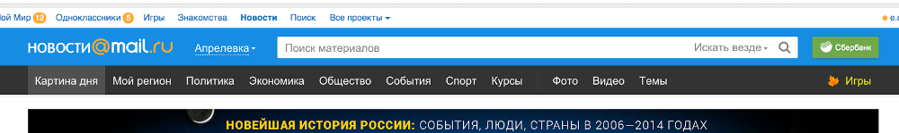
The new version of the portal menu was needed as a result of a major update of portal guidelines, which occurred last year. Details on what and why has changed, you can read on Behance . As part of the update, it was necessary to ensure the stylistic unity of many different projects of the Mail.Ru portal, as well as a single style of navigation, visually and functionally. On whatever project the user is located, it should be clear to him how to navigate through it. Therefore, the menu and technically should be a single, cross-project.

')
The result of our work was a decision that actually represents a designer with a large set of elements, including dynamic ones. Such an approach made it possible in real-time to “collect” from these elements a portal menu that meets the requirements of a project, and made it possible to bring to the forefront precisely those capabilities that are most needed by users. The format of the elements is also adapted depending on the resolution of the screen on which the user opened the page.
And now more about how we did it.
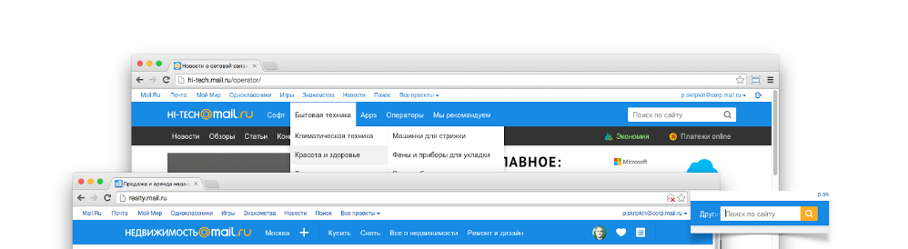
Each project has its own needs. One needs five buttons, the other two, and yes with dropdowns, the third one so that there are two buttons on the left, and one on the right. Even if one of the elements of the portal menu is found on several projects, it can play different roles everywhere. Take, for example, the search box. In Mail.Ru Search, it will naturally occupy a central place. In the Mail - will fade into the background: people often need to find a file or letter in a box, but still this is not the main function. And, say, on Mail.Ru News, search is rarely used, so it makes sense to make this element compact. And technically, projects differ radically from each other, both on the server (different platforms, languages and template engines) and on the client (different libraries, doctypes, styles and technologies). You should also not forget about the dynamic rebuild on the client in the SPA.
One of the largest pitfalls that can be encountered when working with cross-type elements is the complexity of the update. If you do not take care of updating the menu in advance, subsequent support will turn into a torment for the project team. You can make the portal menu static: the project receives from the developer of the portal solution a ready code with all controls, updates also come in the form of fully generated code. In this case, if the project team makes changes to the menu, compatibility with its next versions is lost. This makes it even more difficult to make general changes to the portal. In addition, the new version of the portal menu planned much more elements than in the past, including the dynamic with various states. Due to the wide variety of templating technologies on projects from the server and the obvious technical complexity of the proposed new solution, we chose to build a portal menu on the client, which made it possible to implement a significantly more complex logic of displaying elements and introduce features such as hidden or diminishing and stretching elements.
To avoid the problems described above and to ensure ease of updating, two conditions must be met. First, it is necessary to develop a component that is as isolated as possible from the environment, which can be easily integrated into the project and easily updated when it is necessary, for example, to change the color of the menu throughout the portal with minimal effort from the project side. Secondly, it is necessary to simplify the project code as much as possible by hiding the internal kitchen. The project said “I want a button” - on you there is a button, “I want on the right” - here you are on the right. Ideal for something declarative.
I see the ideal case of working with an integrable solution as follows: I connected the library, initialized the necessary components. This allows you to easily update the version, making a minimum of edits to the project code or not touching it at all. But since the portal menu is a significant element located at the very top of the page, it cannot be connected and drawn anyhow, as when. It is necessary that at the beginning of the page display the block takes its place and further does not affect the position of other blocks. This means that the portal menu should be divided into at least three parts: styles, script and basic HTML. HTML should be inserted in the right place on the page, drawn when loading; further the script will integrate various elements there.
There is a lot of functionality planned in the new menu, which means it will have a lot of weight. It is impossible to load all code synchronously - it will affect the loading time of the project too much. Ideally, divide the code into two parts: the code needed to draw the placeholder (the root menu item), and the rest of the code that will be loaded asynchronously.
In this case, it turns out that you can use the portal menu only when all external data is loaded. But I absolutely do not want to teach the project to determine when it will load everything you need. We must look for another way. In order to isolate the project from this knowledge, a proxy API was written, which is located in the in-line part.
A proxy in this case is a function that remembers all its calls with arguments and, at the moment of its readiness for a call, is replaced by a real function that is run as many times as it has accumulated arguments. In the cap are all the necessary functions for working with the portal menu, for example, drawing / redrawing.
To load external resources with one request, styles are included in the script and are dynamically connected. When assembling the portal menu code, the collected style code is placed in a script in a line and inserted into the house prior to API substitution.
It should be noted that some of the most popular browsers do not immediately apply styles under unknown circumstances. That is, the script that follows the connection of styles works with old data. Without thinking twice, we added an empty element to inline HTML, to which a set of rules is applied in external styles. By its appearance, the moment of applying the styles is determined and initialization begins. The use of styles is checked in the forehead - by timeout.
We have three assembly options (for all occasions):
Thus, we got the following assembly: we stick the inline part in the right place, we immediately start the initialization of the portal menu, and then it will figure out when and how to draw. When working with this assembly, connecting and updating to a new version comes down to copying the small inline portion to the right place in the code.
For projects for which the moment of connecting styles is critical, it was necessary to do an assembly with styles in a separate file and a similar external script, but without styles, respectively. An example of such a project is Mail. The need for semi-asynchronous assembly is due to the presence of different themes on the project. Two CSS files are connected in Mail - one with the geometry and colors of the default theme and the second with the colors of the selected theme. We have already talked about this in more detail in a separate article . In the usual assembly of portal menus, styles are connected at an indefinite moment to an uncontrollable place: with certain changes in the menu or on the project side, it can easily turn out that menu styles will connect after theme styles (see below for code), which means they will be more powerful. The semi-asynchronous build gives you control over the styles, and the rest is done by "itself."
For projects that are critical in controlling the loading process, a separate assembly has been made, which includes a piece of inline HTML and external files with styles and scripts, without a loader. A project can include files in its assemblies and load when necessary.
Having connected the portal menu, you need to call the drawing function, passing the configuration of the necessary elements and the callback function to which the set of API of the created elements will be transferred.
There are two menu levels in the portal menus: the main one (in the toolbar config) and the gray submenu (in the submenu config).
The main code finds out that the main code needs to be drawn after rendering the placeholder and increases its height by adding an additional line. Let me remind you that the placeholder is needed in order to reserve the place needed by the portal menu. This means that when you first render, you need to know about the plans for the submenu and immediately draw a high menu.
To do this, the inline menu code learned to understand from the option announced above in the config file whether it is necessary to immediately display the placeholder for the second level.
Then I will talk more about the content of the menu.
There are many items available for use in the portal menu. These are the search string, buttons, delimiters, extended delimiters, and so on. Most items have many options for customizing the look. For example, we have about N kinds of search string. The variety within the guidelines allows projects to flexibly customize the behavior and appearance of menu items for themselves. All this is configurable with a large number of options. I will not dwell on them in detail. Particularly interested can take a walk on Mail.Ru projects and assess the difference between the menus.

Together with the new portal menu, we have developed and implemented unified portal icons. The uniformity of icons helps to ensure a single user experience on all projects of the portal. For example, the new notification icon looks the same both at the Games and in My World.
In the portal menu for the buttons, an icon class is defined. If it is set, an icon item is created with this class. You can set your class icons with the appropriate styles or use the pre-set. The preset set is automatically assembled into a sprite from the set of icons in a specific folder. Pictures are organized by name and type. At the moment there is a “retin” and “nonretinic” png with the names name.png and name@2x.png, as well as two inverted icons that are displayed when opening the dropdown. Retinov we call icons double size, they are shown on screens with a density of more than 2. If there are both files, the icon is added to the set. From the set using https://github.com/aheckmann/gm , two sprites are assembled and styles are generated for later inclusion in the assembly.
The management of the elements of the portal menu occurs through the API.
When the render function is called, a set of APIs of the created elements is passed to the callback function. This set can also be obtained at any time by calling the function hat.getItems (function (items) {}).
Using the API, you can access DOM elements, hang handlers for different events, hide / show one or another element.
For certain types of items there are additional features. Thus, the button can change the status of the “current section” (you cannot make two “current” buttons), change the text and icon, update the number in the notification on the button. Dropdown has a recalculation and redrawing function, which is required when updating the content of HTML dropdowns. The search has functions for working with sadgets and a context selector.
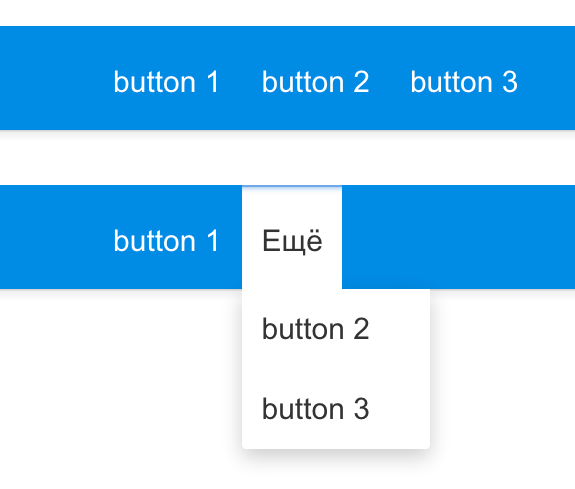
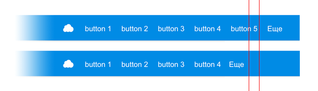
Each of the collapsing elements of such a group can be transferred to the “More” drop down menu if there is not enough space for it.

For example, this is a button with an icon that can be slammed from icon to button with text when there is enough space for it.
Currently, dragging elements are spacer without specifying a width and searching with the flexible parameter: true and searching.
By default, the free space remaining after hiding the inconsistent buttons and calculating the adaptive elements is divided equally between all the stretching elements, that is, flex = 1. For any stretching element, you can set the flex parameter other than 1, then the free space will be divided according to with this value. For example, if there are two stretching elements with flex = 1 and one element with flex = 2, when free space of 100 pixels is formed, 50 pixels will be allocated to the last element, and 25 by the rest.
<additional space for element> = <free space> / <∑ all flex> * <flex element>
Another necessary concept for stretching elements is the base width. This is the width relative to which free space is calculated. It is taken from the width in the config (for the stretching spacer = 0).
To determine the free space, all elements are rendered with a width equal to the base. The remaining space is divided between the stretching elements in accordance with the flex parameters and added to the base width.
<width of the trailing element> =
<additional space for element> + <base width>
hat.draw ({});
In the general case, the rendering of the portal menu is approximately as follows. After the inline part (i.e. appearing on the API page), the project requests rendering of the necessary elements. An external script is loaded in which the styles are connected, the “classes” of all the existing elements are created and the requested rendering is started.
At first, the config is processed, toolbar.items is brought to a set of groups. If it was
then the output will be three groups: with the first two buttons, the original group and the group with one button.
Further, the configuration of each element is normalized. We will not consider each element separately. Here, the default values of the config are set and the settings are changed that have no meaning in combination with other options. For example, disabling the collapse of the button to the icon if the button is textual.
Configs are transferred to the template engine (Fest), which generates the necessary markup. Elements are inserted in the right place and JS components are initialized. Each element inside itself initializes the necessary connections, hangs up event handlers, etc.
It was more interesting with dynamic elements: collapsing groups, adaptive buttons and stretching elements.
For further calculations, we will need to disassemble all the elements according to the collections — elements of collapsing groups, buttons “More” from collapsing groups, adaptive elements, stretching elements and total flex. The same happens when changing in the set of elements.
After initialization, all potentially visible elements are displayed. For the stretching elements, the width is set equal to the base, the adaptive collapse, the width of all the elements, the width of all the folding elements for the groups and the full width of the toolbar are cached.
Similar actions occur when changing the set of elements, hiding / showing, that is, changing the role of elements in the calculations or changing the set.
The portal menu is divided into two cells with display: table-cell. On the left is the logo, and the right - with a toolbar - takes up the remaining space. Tublar lies inside the right cell and is positioned absolutely, so as not to affect the width of the entire menu.
Thus, after reducing the elements to the default state (apparently), since we know the width of the cell and the toolbar, we also know how many pixels did not fit or, conversely, how much free space there is.
If the full width of the toolbar is less than the available one, simply show all the elements and hide the “More” buttons.
Otherwise, we show the “More” buttons and run through all the groups in order to hide the necessary number of elements in it.
If you try to hide elements in the forehead from right to left in the presence of several groups, it may turn out that from one group - the one to the right - we will hide everything. This is not good. We are looking for another option. You can hide by an equal number of elements from each group. Too bad: most likely, it turns out that we will hide more elements than necessary. So, it is necessary to distribute the hidden space in proportion to the total visible width of the group. The more elements in a group, the more you need to hide in it.

Most likely, it turns out that the group will have to ask to hide fewer pixels than you can. After all, it is impossible to hide an element in part, which means we will hide more. This is shown in the picture: the right line is how much was requested, the left line is how much eventually it will turn out.
In this scenario, it turns out that the elements jump at resize. They are shown in one group and hidden in another, then vice versa. To solve this problem, one should take into account the difference between the requested and actually hidden pixels and adjust the pixels of the next group for this difference.
When the groups are done, you can distribute the remaining pixels.
First you need to check if the adaptive buttons can be slammed.
The logic is simple. At the initialization stage, the sizes of the expanded and collapsed adaptive element are cached.
That is, you can easily find out if the broken elements fit in the remaining space. If so, then for the buttons we draw the text, and the search is switched in full view. If not, the buttons remain in the status of the icon, and the search in the form of a button, by clicking on which a form is displayed over the other elements.
Remaining stretching elements. If they do not have enough space, then we reduce their dimensions to the base width.
Otherwise, we distribute the free space between the stretching elements equally.
But, as we remember, we have flex factors that need to be considered. Total, the width of a particular trailing element will be equal to its base width, folded with an additional width, calculated in proportion to the flex coefficients.
There is a nuance. Suppose we have 100 pixels of free space and three stretching elements with flex 1. It turns out that we will give each of 33 pixels and 1 will remain unallocated. Resize the page, we get, for example, 99 pixels - everything is distributed.
That is, periodically the elements to the right of the last stretching element will jump onto this pixel relative to the right border.

To solve this problem, you can use a scheme similar to that used for collapsing groups. It is necessary to remember the difference between the calculated value set by the element and the actually applied one, that is, round and correct the next element by this value.
So, we managed to create an adaptive portal menu that meets both of the original requirements. Firstly, it turned out to be technically independent - due to the use of a single technical solution, we were able to support portal guidelines on all projects, and the new portal style looks truly uniform everywhere. Secondly, we have provided project teams with flexible management of the set of items in the portal menu. Now each of the teams can quickly “tune” it, while remaining within the framework of the guidelines.
What we have, we like it - this task can be considered solved. But we still have many such tasks, both voluminous and complex. Interesting? Come cod to us!
The new version of the portal menu was needed as a result of a major update of portal guidelines, which occurred last year. Details on what and why has changed, you can read on Behance . As part of the update, it was necessary to ensure the stylistic unity of many different projects of the Mail.Ru portal, as well as a single style of navigation, visually and functionally. On whatever project the user is located, it should be clear to him how to navigate through it. Therefore, the menu and technically should be a single, cross-project.
')
The result of our work was a decision that actually represents a designer with a large set of elements, including dynamic ones. Such an approach made it possible in real-time to “collect” from these elements a portal menu that meets the requirements of a project, and made it possible to bring to the forefront precisely those capabilities that are most needed by users. The format of the elements is also adapted depending on the resolution of the screen on which the user opened the page.
And now more about how we did it.
Swan, cancer and pike
Each project has its own needs. One needs five buttons, the other two, and yes with dropdowns, the third one so that there are two buttons on the left, and one on the right. Even if one of the elements of the portal menu is found on several projects, it can play different roles everywhere. Take, for example, the search box. In Mail.Ru Search, it will naturally occupy a central place. In the Mail - will fade into the background: people often need to find a file or letter in a box, but still this is not the main function. And, say, on Mail.Ru News, search is rarely used, so it makes sense to make this element compact. And technically, projects differ radically from each other, both on the server (different platforms, languages and template engines) and on the client (different libraries, doctypes, styles and technologies). You should also not forget about the dynamic rebuild on the client in the SPA.
One of the largest pitfalls that can be encountered when working with cross-type elements is the complexity of the update. If you do not take care of updating the menu in advance, subsequent support will turn into a torment for the project team. You can make the portal menu static: the project receives from the developer of the portal solution a ready code with all controls, updates also come in the form of fully generated code. In this case, if the project team makes changes to the menu, compatibility with its next versions is lost. This makes it even more difficult to make general changes to the portal. In addition, the new version of the portal menu planned much more elements than in the past, including the dynamic with various states. Due to the wide variety of templating technologies on projects from the server and the obvious technical complexity of the proposed new solution, we chose to build a portal menu on the client, which made it possible to implement a significantly more complex logic of displaying elements and introduce features such as hidden or diminishing and stretching elements.
To avoid the problems described above and to ensure ease of updating, two conditions must be met. First, it is necessary to develop a component that is as isolated as possible from the environment, which can be easily integrated into the project and easily updated when it is necessary, for example, to change the color of the menu throughout the portal with minimal effort from the project side. Secondly, it is necessary to simplify the project code as much as possible by hiding the internal kitchen. The project said “I want a button” - on you there is a button, “I want on the right” - here you are on the right. Ideal for something declarative.
Connection
<script src="hat.js"></script> <script> hat.draw({}); </script> I see the ideal case of working with an integrable solution as follows: I connected the library, initialized the necessary components. This allows you to easily update the version, making a minimum of edits to the project code or not touching it at all. But since the portal menu is a significant element located at the very top of the page, it cannot be connected and drawn anyhow, as when. It is necessary that at the beginning of the page display the block takes its place and further does not affect the position of other blocks. This means that the portal menu should be divided into at least three parts: styles, script and basic HTML. HTML should be inserted in the right place on the page, drawn when loading; further the script will integrate various elements there.
<link href="hat.css"/> <div class="hat">...</div> <script src="hat.js"></script> <script> hat.draw({}); </script> There is a lot of functionality planned in the new menu, which means it will have a lot of weight. It is impossible to load all code synchronously - it will affect the loading time of the project too much. Ideally, divide the code into two parts: the code needed to draw the placeholder (the root menu item), and the rest of the code that will be loaded asynchronously.
<style>/* base styles */</style> <div class="hat">...</div> <script> loadExternalScript(); </script> <script> hat.init(); </script> In this case, it turns out that you can use the portal menu only when all external data is loaded. But I absolutely do not want to teach the project to determine when it will load everything you need. We must look for another way. In order to isolate the project from this knowledge, a proxy API was written, which is located in the in-line part.
hat.draw = new DeferredQuery.getQuery(); hat.draw({}); // put in queue hat.draw({}); // put in queue hat.draw.replace(realDrawFn); // run two times hat.draw({}); // run immediately A proxy in this case is a function that remembers all its calls with arguments and, at the moment of its readiness for a call, is replaced by a real function that is run as many times as it has accumulated arguments. In the cap are all the necessary functions for working with the portal menu, for example, drawing / redrawing.
To load external resources with one request, styles are included in the script and are dynamically connected. When assembling the portal menu code, the collected style code is placed in a script in a line and inserted into the house prior to API substitution.
var styles = ".body{background:url(\"http://...\")}", style = document.createElement('style'); style.appendChild(document.createTextNode(styles)); body.appendChild(style); init(); It should be noted that some of the most popular browsers do not immediately apply styles under unknown circumstances. That is, the script that follows the connection of styles works with old data. Without thinking twice, we added an empty element to inline HTML, to which a set of rules is applied in external styles. By its appearance, the moment of applying the styles is determined and initialization begins. The use of styles is checked in the forehead - by timeout.
appendStyles(); whenStylesLoaded(init); Building the portal menu
We have three assembly options (for all occasions):
- Asynchronous - build for projects for which it does not matter when and how the portal menu is loaded, the main thing is that it works.
- Semi-asynchronous - for projects in which the moment of connecting styles is critical.
- Synchronous - for the guru of the web.
Asynchronous build
<style>/* base styles */</style> <div class="hat">...</div> <script> createAPI(); loadExternalScript(); </script> <script>hat.draw({});</script> Thus, we got the following assembly: we stick the inline part in the right place, we immediately start the initialization of the portal menu, and then it will figure out when and how to draw. When working with this assembly, connecting and updating to a new version comes down to copying the small inline portion to the right place in the code.
Semi-asynchronous build
For projects for which the moment of connecting styles is critical, it was necessary to do an assembly with styles in a separate file and a similar external script, but without styles, respectively. An example of such a project is Mail. The need for semi-asynchronous assembly is due to the presence of different themes on the project. Two CSS files are connected in Mail - one with the geometry and colors of the default theme and the second with the colors of the selected theme. We have already talked about this in more detail in a separate article . In the usual assembly of portal menus, styles are connected at an indefinite moment to an uncontrollable place: with certain changes in the menu or on the project side, it can easily turn out that menu styles will connect after theme styles (see below for code), which means they will be more powerful. The semi-asynchronous build gives you control over the styles, and the rest is done by "itself."
<link href="full.css"> <div class="hat">...</div> <script> createAPI(); loadExternalScriptWithoutCSS(); </script> <script>hat.draw({});</script> Synchronous build
For projects that are critical in controlling the loading process, a separate assembly has been made, which includes a piece of inline HTML and external files with styles and scripts, without a loader. A project can include files in its assemblies and load when necessary.
<link href="full.css"> <script src="full.js"></script> <div class="hat">...</div> <script>hat.draw({});</script> Initialization
Having connected the portal menu, you need to call the drawing function, passing the configuration of the necessary elements and the callback function to which the set of API of the created elements will be transferred.
hat.draw({ logo: {}, toolbar: {}, submenu: {} }, function(menuItems){ menuItems.toolbar // menuItems.submenu // }); There are two menu levels in the portal menus: the main one (in the toolbar config) and the gray submenu (in the submenu config).
The main code finds out that the main code needs to be drawn after rendering the placeholder and increases its height by adding an additional line. Let me remind you that the placeholder is needed in order to reserve the place needed by the portal menu. This means that when you first render, you need to know about the plans for the submenu and immediately draw a high menu.
hatConfig = { submenu: true } To do this, the inline menu code learned to understand from the option announced above in the config file whether it is necessary to immediately display the placeholder for the second level.
Then I will talk more about the content of the menu.
Items
There are many items available for use in the portal menu. These are the search string, buttons, delimiters, extended delimiters, and so on. Most items have many options for customizing the look. For example, we have about N kinds of search string. The variety within the guidelines allows projects to flexibly customize the behavior and appearance of menu items for themselves. All this is configurable with a large number of options. I will not dwell on them in detail. Particularly interested can take a walk on Mail.Ru projects and assess the difference between the menus.
Pak icons
Together with the new portal menu, we have developed and implemented unified portal icons. The uniformity of icons helps to ensure a single user experience on all projects of the portal. For example, the new notification icon looks the same both at the Games and in My World.
In the portal menu for the buttons, an icon class is defined. If it is set, an icon item is created with this class. You can set your class icons with the appropriate styles or use the pre-set. The preset set is automatically assembled into a sprite from the set of icons in a specific folder. Pictures are organized by name and type. At the moment there is a “retin” and “nonretinic” png with the names name.png and name@2x.png, as well as two inverted icons that are displayed when opening the dropdown. Retinov we call icons double size, they are shown on screens with a density of more than 2. If there are both files, the icon is added to the set. From the set using https://github.com/aheckmann/gm , two sprites are assembled and styles are generated for later inclusion in the assembly.
.icon { background: url(icons.png) no-repeat -3427px 0; background-size: 3458px 21px; } @media only screen and (min-device-pixel-ratio: 1.5){ .icon { background-image: url(icons@2x.png); }} The management of the elements of the portal menu occurs through the API.
Item APIs
When the render function is called, a set of APIs of the created elements is passed to the callback function. This set can also be obtained at any time by calling the function hat.getItems (function (items) {}).
hat.draw({}, function(menuItems){ menuItems.toolbar // menuItems.submenu // }); hat.getItems(function(menuItems){}); Using the API, you can access DOM elements, hang handlers for different events, hide / show one or another element.
For certain types of items there are additional features. Thus, the button can change the status of the “current section” (you cannot make two “current” buttons), change the text and icon, update the number in the notification on the button. Dropdown has a recalculation and redrawing function, which is required when updating the content of HTML dropdowns. The search has functions for working with sadgets and a context selector.
Dynamic elements
Collapsing groups
Each of the collapsing elements of such a group can be transferred to the “More” drop down menu if there is not enough space for it.
Adaptive elements
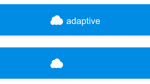
For example, this is a button with an icon that can be slammed from icon to button with text when there is enough space for it.
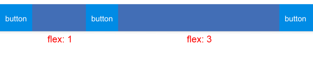
Stretching elements
Currently, dragging elements are spacer without specifying a width and searching with the flexible parameter: true and searching.
By default, the free space remaining after hiding the inconsistent buttons and calculating the adaptive elements is divided equally between all the stretching elements, that is, flex = 1. For any stretching element, you can set the flex parameter other than 1, then the free space will be divided according to with this value. For example, if there are two stretching elements with flex = 1 and one element with flex = 2, when free space of 100 pixels is formed, 50 pixels will be allocated to the last element, and 25 by the rest.
<additional space for element> = <free space> / <∑ all flex> * <flex element>
Another necessary concept for stretching elements is the base width. This is the width relative to which free space is calculated. It is taken from the width in the config (for the stretching spacer = 0).
To determine the free space, all elements are rendered with a width equal to the base. The remaining space is divided between the stretching elements in accordance with the flex parameters and added to the base width.
<width of the trailing element> =
<additional space for element> + <base width>
Rendering
hat.draw ({});
In the general case, the rendering of the portal menu is approximately as follows. After the inline part (i.e. appearing on the API page), the project requests rendering of the necessary elements. An external script is loaded in which the styles are connected, the “classes” of all the existing elements are created and the requested rendering is started.
At first, the config is processed, toolbar.items is brought to a set of groups. If it was
[ {type: 'button'}, {type: 'button'}, {type: 'group', items: [{type: 'button'},{type: 'button'}]}, {type: 'button'} ] then the output will be three groups: with the first two buttons, the original group and the group with one button.
[ {type: 'group', items: ... } {type: 'group', items: ... } {type: 'group', items: ... } ] Further, the configuration of each element is normalized. We will not consider each element separately. Here, the default values of the config are set and the settings are changed that have no meaning in combination with other options. For example, disabling the collapse of the button to the icon if the button is textual.
item = classes[item.type].getConfig(item); Configs are transferred to the template engine (Fest), which generates the necessary markup. Elements are inserted in the right place and JS components are initialized. Each element inside itself initializes the necessary connections, hangs up event handlers, etc.
html = fest(config); block.innerHTML = html; $(block).find('.elements').bem() It was more interesting with dynamic elements: collapsing groups, adaptive buttons and stretching elements.
Parsing items into groups
getEls(); getCollapsibleGroups(); getMoreButtons(); getAdaptive(); getFlexible(); For further calculations, we will need to disassemble all the elements according to the collections — elements of collapsing groups, buttons “More” from collapsing groups, adaptive elements, stretching elements and total flex. The same happens when changing in the set of elements.
Default state
elements.show(); adaptive.collapse(); flexible.width(baseWidth); els.each(funcion(el){ el._width = el.width(); }); fullWidth = sum(el._width); After initialization, all potentially visible elements are displayed. For the stretching elements, the width is set equal to the base, the adaptive collapse, the width of all the elements, the width of all the folding elements for the groups and the full width of the toolbar are cached.
Similar actions occur when changing the set of elements, hiding / showing, that is, changing the role of elements in the calculations or changing the set.
The portal menu is divided into two cells with display: table-cell. On the left is the logo, and the right - with a toolbar - takes up the remaining space. Tublar lies inside the right cell and is positioned absolutely, so as not to affect the width of the entire menu.
Thus, after reducing the elements to the default state (apparently), since we know the width of the cell and the toolbar, we also know how many pixels did not fit or, conversely, how much free space there is.
Calculation of visible elements
If the full width of the toolbar is less than the available one, simply show all the elements and hide the “More” buttons.
if (fullWidth <= currentWidth) moreButtonsHide(); collapsibleEls.show(); } Otherwise, we show the “More” buttons and run through all the groups in order to hide the necessary number of elements in it.
if (fullWidth > currentWidth) moreButtonsShow(); groups.each(function(group){ ... }) } Group calculation
If you try to hide elements in the forehead from right to left in the presence of several groups, it may turn out that from one group - the one to the right - we will hide everything. This is not good. We are looking for another option. You can hide by an equal number of elements from each group. Too bad: most likely, it turns out that we will hide more elements than necessary. So, it is necessary to distribute the hidden space in proportion to the total visible width of the group. The more elements in a group, the more you need to hide in it.
Most likely, it turns out that the group will have to ask to hide fewer pixels than you can. After all, it is impossible to hide an element in part, which means we will hide more. This is shown in the picture: the right line is how much was requested, the left line is how much eventually it will turn out.
In this scenario, it turns out that the elements jump at resize. They are shown in one group and hidden in another, then vice versa. To solve this problem, one should take into account the difference between the requested and actually hidden pixels and adjust the pixels of the next group for this difference.
var groupToHide = Math.round(pixelsToHide * group.collapsibleWidth /collapsibleFullWidth); var hiddenFromGroup = group.expand(groupToHide + notHidden); notHidden = groupToHide - hiddenFromGroup; Adaptive elements
When the groups are done, you can distribute the remaining pixels.
First you need to check if the adaptive buttons can be slammed.
The logic is simple. At the initialization stage, the sizes of the expanded and collapsed adaptive element are cached.
this.expand(); this._expandedWidth = this.el.clientWidth; this.collapse(); this._width = this.el.clientWidth; That is, you can easily find out if the broken elements fit in the remaining space. If so, then for the buttons we draw the text, and the search is switched in full view. If not, the buttons remain in the status of the icon, and the search in the form of a button, by clicking on which a form is displayed over the other elements.
if (currentWidth + adaptiveFullWidth <= avaibleWidth){ adaptive.expand(); } Stretching elements
Remaining stretching elements. If they do not have enough space, then we reduce their dimensions to the base width.
if (avaibleWidth <= 0){ flexible.width(baseWidth); } Otherwise, we distribute the free space between the stretching elements equally.
if (avaibleWidth > 0){ flexible.width(baseWidth + + avaibleWidth / flexible.length); } But, as we remember, we have flex factors that need to be considered. Total, the width of a particular trailing element will be equal to its base width, folded with an additional width, calculated in proportion to the flex coefficients.
var pix = (flexEl.flex) * (avaibleWidth) / (flexSum); flexEl.width(baseWidth + pix); There is a nuance. Suppose we have 100 pixels of free space and three stretching elements with flex 1. It turns out that we will give each of 33 pixels and 1 will remain unallocated. Resize the page, we get, for example, 99 pixels - everything is distributed.
That is, periodically the elements to the right of the last stretching element will jump onto this pixel relative to the right border.
To solve this problem, you can use a scheme similar to that used for collapsing groups. It is necessary to remember the difference between the calculated value set by the element and the actually applied one, that is, round and correct the next element by this value.
var pix = (flexEl.flex) * (avaibleWidth) / / (flexSum) + delta; var roundedPix = Math.round(pix); flexEl.width(baseWidth + roundedPix); delta += (pix - roundedPix); Finally
So, we managed to create an adaptive portal menu that meets both of the original requirements. Firstly, it turned out to be technically independent - due to the use of a single technical solution, we were able to support portal guidelines on all projects, and the new portal style looks truly uniform everywhere. Secondly, we have provided project teams with flexible management of the set of items in the portal menu. Now each of the teams can quickly “tune” it, while remaining within the framework of the guidelines.
What we have, we like it - this task can be considered solved. But we still have many such tasks, both voluminous and complex. Interesting? Come cod to us!
Source: https://habr.com/ru/post/258901/
All Articles