Optical compensation

At the beginning of my design path, I relied solely on Photoshop and CSS in questions of truth and lies. If Photoshop claimed that the two figures are aligned, it means that they are aligned. If two different figures were of different sizes, then it was. If two colors had the same hex codes, then they looked the same.
This approach seemed logical to me, but it turned out to be wrong.
')
The calculations performed by the program are reasonable, but the program cannot take into account the human perception of the shape, color and size. In addition, the program can not understand the relationship of objects, their place in the general visual context or how a person perceives this object.
The irrational mind of a person decides whether an object looks optically true or not, because we can see and understand the context in contrast to a computer. Understanding these subtle differences and the ability to compensate for them and makes a good designer even better, because few will notice corrections, but many will see a mistake.
Let's take a look at a small number of illustrative examples.
Alignment + Visual Weight
Computers cannot determine the visual weight of an object in relation to other objects. It can only calculate the width, height, or position of the object in the XY axis. Designers sometimes have to compensate for this with the help of the so-called optical compensation.
The triangle inside the icon is aligned to the center of the circle, right? Not properly. If you draw a rectangle on top of a triangle, we will see that it is not in the center.

The icon on the left looks centered, even though the triangle is not in the center of the circle.
In this case, the visual weight of the triangle. A significant part of its area is on the left side, this creates an optical illusion that the triangle is not centered.
To solve the problem, we need to manually push the triangle.
Colour
Optical compensation in colors is less noticeable. But in this case it is all about the optical weight of the object.
If you use the same shade of green for both the icon and the text, the text will look a little dimmer.
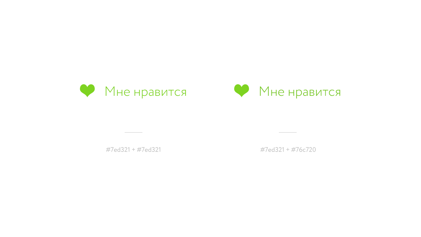
The icon and the text on the left is the same hex code, while the icon and the text on the right are different.
To avoid different optical weights, you can either make the icon a little brighter, or the text - darker.
Scale
Scale is how our mind perceives the size of objects, including text. For example, the area of a square 120 × 120 pixels is larger than the area of a circle with a diameter of 120 pixels, so the circle needs to be made larger to compensate.

Both figures are 120 × 120 pixels on the left, so the circle seems smaller. The circle on the right is 126 × 126 pixels to compensate for a larger area of the square.
Compared to other adjustments, a color change is fine tuning. But even resizing an object by 1 pixel can significantly improve your design.

Notice how the top and bottom of the letters in the Didot font jump relative to the baseline.
Capital letters
A final example where corrections need to be made is the use of capitalized text near standard text. The title text is more noticeable than the standard one, so it needs to be compensated.

The text typed in capital letters seems to be much larger than text with a regular register, the size of the text below has been reduced by 2 pixels.
When working on a full-fledged project, even small changes will affect the overall perception of the picture. It is the attention to detail that distinguishes good design from excellent.

Computers or even artificial intelligences cannot understand the context of a single piece of design, and therefore they cannot make the changes that designers can make. We must rely on our eyes and instinct when working on a design.
From the translator. With all the wishes and comments about the translation, please contact me in PM. Thank!
Source: https://habr.com/ru/post/258571/
All Articles