Web typography today. Part III
Part I - Part II - Part III - Part IV - Part V - Part VI
It turned out that even since the time of Windows 98 a font called Lucida Sans Unicode is included in the standard kit, which is not used anywhere else. Let's try to replace them with Apple's Lucida Grande .
')
I want to exclaim: Voilà !!! Happened! Lucida Sans Unicode is really close in character to Lucida Grande .
However, the differences are still there. This is evident in the subtitles in bold. In the case of Lucida Grande , as we remember, it looks like this:
In a small size, Lucida Sans Unicode even has a tiny advantage - it looks a little sharper. But in large skittles, and even more so in fat styles, Lucida Grande is much nicer:
In any case, it is better than nothing. For a huge army of Windows users would be able to view the Apple site in approximately the same form as the Mac user, if in the style sheet of the apple.com site, the very basic style was this:
Unfortunately, I don’t know about the existence of a similar font in the Linux family, but even the guideline to the vast majority (Mac + Windows) is already of great importance to some extent.
But even that is not all.
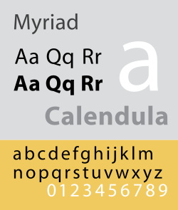 For a long time, Apple used the Apple Garamond font for all advertising materials and packaging, but since 2002 this headset has been replaced with the Myriad Pro font, developed by Adobe (Robert Slimbach and Carol Twombly). This wonderful font has a very rich set of outlines, as well as separate versions for capitals, ligatures and alternative characters. There is also a separately developed set of Myriad Web for the best on-screen display. It turned out that all the major headlines on the Apple site are typed with this particular font, which has a certain similarity with Lucida Grande , but is better suited for large pins. The Myriad font itself is commercial, and is not included in the standard supply of operating systems, but is included with all key Adobe products. So we can safely hope that it will be found in 90% of all designers on the planet. Therefore, it would be possible to try and fit it into an imaginary basic style, since it also looks very good (especially in small skittles):
Then ordinary Linux users would see the Apple site using the Arial or Helvetica font , ordinary Windows and Mac users would enjoy the designer’s ideas using Lucida, and the most advanced users who have for some reason installed the Myriad Pro font, would be the following picture:
Look how he played, flashed the text! It would seem that at first glance - nothing unusual. But in fact, reading the site when Myriad Pro is turned on turns into a real pleasure. Since the font has sufficient clarity, and a rich set of outlines. But I used the regular version, and not Myriad Web , which was even more strongly optimized for screen display.
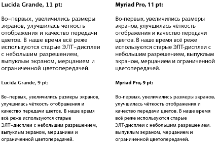
This is how the text looks compared to Lucida Grande :
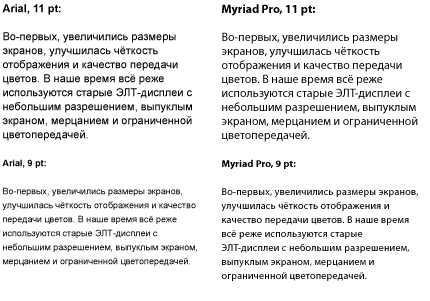
In comparison with Arial :
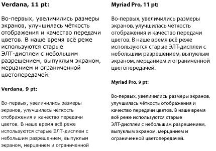
In comparison with Verdana :
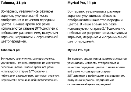
In comparison with Tahoma :
Tell me, you are not yet tired of the ubiquitous "Verdan" with "tachoma"?
It turns out that there are already fonts that can fundamentally change the situation in web typography. The only trouble is that these fonts are not free and publicly available, and they have pre-licensed licenses only when using very expensive graphic and office packages. Myriad Pro - in this case only a single example. In fact, there are many wonderful commercial typefaces (for example, the richest family of Univers ) that could be used as basic fonts in web typography.
But alas, we are forced to depend only on the font set that comes with the default operating systems. And it is necessary to have close or at least approximate analogues in other OS. Otherwise, some users will see "beautiful", and others - "somehow." Unfortunately, in all operating systems, without exception, the fonts are by no means the best. Only two given examples ( Georgia and Lucida Grande / Sans ) at least partially correct the situation.
I do not urge to abandon the use of fonts Arial , Times New Roman , Verdana or Tahoma . You just need to learn how to use them to good use where they look the best way. And do not be afraid to try to look for new interesting options.
Moreover, there are such options. About what new system fonts appeared in the OS and what system fonts are best suited for what purposes today, we will discuss in the next part of the story.
To be continued...
Part III
It turned out that even since the time of Windows 98 a font called Lucida Sans Unicode is included in the standard kit, which is not used anywhere else. Let's try to replace them with Apple's Lucida Grande .
')
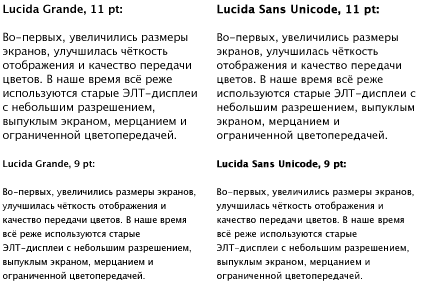
I want to exclaim: Voilà !!! Happened! Lucida Sans Unicode is really close in character to Lucida Grande .
However, the differences are still there. This is evident in the subtitles in bold. In the case of Lucida Grande , as we remember, it looks like this:
In a small size, Lucida Sans Unicode even has a tiny advantage - it looks a little sharper. But in large skittles, and even more so in fat styles, Lucida Grande is much nicer:
In any case, it is better than nothing. For a huge army of Windows users would be able to view the Apple site in approximately the same form as the Mac user, if in the style sheet of the apple.com site, the very basic style was this:
/* TYPE */
body { font: 12px/18px "Lucida Grande", "Lucida Sans Unicode", Verdana, Arial, Helvetica, sans-serif; background-color: #fff; color: #333; }
Unfortunately, I don’t know about the existence of a similar font in the Linux family, but even the guideline to the vast majority (Mac + Windows) is already of great importance to some extent.
But even that is not all.
For a long time, Apple used the Apple Garamond font for all advertising materials and packaging, but since 2002 this headset has been replaced with the Myriad Pro font, developed by Adobe (Robert Slimbach and Carol Twombly). This wonderful font has a very rich set of outlines, as well as separate versions for capitals, ligatures and alternative characters. There is also a separately developed set of Myriad Web for the best on-screen display. It turned out that all the major headlines on the Apple site are typed with this particular font, which has a certain similarity with Lucida Grande , but is better suited for large pins. The Myriad font itself is commercial, and is not included in the standard supply of operating systems, but is included with all key Adobe products. So we can safely hope that it will be found in 90% of all designers on the planet. Therefore, it would be possible to try and fit it into an imaginary basic style, since it also looks very good (especially in small skittles):/* TYPE */
body { font: 12px/18px "Myriad Pro", "Lucida Grande", "Lucida Sans Unicode", Verdana, Arial, Helvetica, sans-serif; background-color: #fff; color: #333; }
Then ordinary Linux users would see the Apple site using the Arial or Helvetica font , ordinary Windows and Mac users would enjoy the designer’s ideas using Lucida, and the most advanced users who have for some reason installed the Myriad Pro font, would be the following picture:
Look how he played, flashed the text! It would seem that at first glance - nothing unusual. But in fact, reading the site when Myriad Pro is turned on turns into a real pleasure. Since the font has sufficient clarity, and a rich set of outlines. But I used the regular version, and not Myriad Web , which was even more strongly optimized for screen display.
This is how the text looks compared to Lucida Grande :
In comparison with Arial :
In comparison with Verdana :
In comparison with Tahoma :
Tell me, you are not yet tired of the ubiquitous "Verdan" with "tachoma"?
It turns out that there are already fonts that can fundamentally change the situation in web typography. The only trouble is that these fonts are not free and publicly available, and they have pre-licensed licenses only when using very expensive graphic and office packages. Myriad Pro - in this case only a single example. In fact, there are many wonderful commercial typefaces (for example, the richest family of Univers ) that could be used as basic fonts in web typography.
But alas, we are forced to depend only on the font set that comes with the default operating systems. And it is necessary to have close or at least approximate analogues in other OS. Otherwise, some users will see "beautiful", and others - "somehow." Unfortunately, in all operating systems, without exception, the fonts are by no means the best. Only two given examples ( Georgia and Lucida Grande / Sans ) at least partially correct the situation.
I do not urge to abandon the use of fonts Arial , Times New Roman , Verdana or Tahoma . You just need to learn how to use them to good use where they look the best way. And do not be afraid to try to look for new interesting options.
Moreover, there are such options. About what new system fonts appeared in the OS and what system fonts are best suited for what purposes today, we will discuss in the next part of the story.
To be continued...
Source: https://habr.com/ru/post/25852/
All Articles