Vitaly Friedman on UXPeople: “Responsive Design is not a small straightening, it demands to change everything”
One of the most exciting speeches of the last UXPeople as text.

I almost never speak in Russian, and this is very unusual for me - but why not? Today I would like to talk about Responsive Design.
Now, over time, Responsive Design has become an ordinary web design. In fact, to separate them from each other now does not make much sense, and when they do web design in general, today many companies are starting to do Responsive Design. And now I would not like to talk about trends that come and go. What is much more interesting than trends is how we, developers and designers, are engaged in the development and design of pages. Therefore, the conversation will focus on the technique that is used today. And since we are at a UX conference, this is a conversation about UX patterns. Again, these are things that are used not in theoretical, but in real projects.
')
When we think about the Internet as a whole, we imagine it in a similar way - “the web lives in a browser”. More simply, according to the designer, “the web is a peculiar set of rectangles with texts and pictures.” And the task of the designer is to arrange these "rectangles" in such a way that the user can comfortably work with the information on the screen. I love the quote by Tim Brown, who said: “Creating web pages is an attempt to visualize a tesseract.” And, in fact, designers create a system out of chaos, trying to express what is quite difficult to express. And Responsive Design is one of the means to create designs that fit the display of the Internet.
Those who are engaged in Responsive Design, understand that this is far from just a small “straightening”, requiring something to fix in the finished project. Responsive Design requires you to completely change everything. Change not only the way “the designer draws the rectangles,” but also how they are arranged and how people work together. We need to think about exactly how the various components should be placed on the pages. In addition, we also need to think about the strategy - what exactly we want to do on the page. Responsive Design includes many different tasks - and, as expected, it is quite difficult, and spends a lot of time and effort. And this is actually difficult - especially at the beginning when you go from non-Responsive sites to Responsive sites. However, this work becomes much easier for those designers who already know the process and have in their mind some kind of system according to which pages are created.
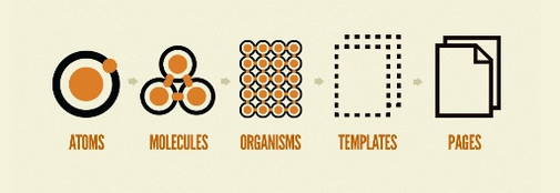
For example - two years ago, I had no idea how to create Responsive pages. Now I can not imagine how to make pages that are not Responsive. Because now I have a system in my head, thanks to which I know exactly what I need to do. And now the question is only how do we make this system. For example, recall the 60s, the work of Paul Rand. In the 60s, he was approached by a customer who wanted to have a new logo. In such a situation, usually the first thing they do is start to draw a logo. But Paul at that time was thinking how to make a system that will work well regardless of where it is applied. And so he was thinking about typography, as well as about the different contexts in which the logo is applied - on cars or elsewhere. And because of this, Paul Rand created a library system that was supposed to be universal. The same can be done with Atomic Design - this is the name given to a concept that allows it to achieve this systemic nature. It is quite simple and does not contain anything particularly revolutionary. It offers five levels in the design of the pages: “atoms,” “molecules,” “organisms,” “grounds,” and “pages.” "Atoms" - the smallest components of the page, which only can be. These are elements that can not be broken into any other components.
Accordingly, if we connect “atoms”, then we can make “molecules”, and if we connect “molecules” with each other, then we can make “organisms”. The peculiarity of such a system is that we begin work with the smallest components. By drawing them, we create the basics, the so-called library, from which we can later create new components.
Typically, customers are asked to provide them with demonstration images. You can create a picture with the "atmosphere" of design, including a variety of pictures and icons. On the other hand, it is possible as a sample to provide a client with a data library and an interface allowing to generate effects on the fly. And now you can talk about those techniques that can be used for this.
We have many different monitors, and you need to take into account that each small icon should look good on a smartphone, on a tablet, and on a personal computer. There are two techniques that can be used to illustrate icons - SVG and Icon Fonts. When we add a new icon, we do not cut out the old one - we just add a new one down and the file grows further. It would be much better to work on the technique: “if an icon is needed, it can be inserted, and if not needed, it can be pulled out”. SVG-files are well suited for this, in which icons are superimposed on each other, and if necessary, the corresponding icon is displayed to the user. The Snap.svg library is very easy to use, allowing you to create high-quality animations. It is good and convenient to use SVG, but not always - if there are a lot of small details in the file, it turns out to be too “weighty”. Most browsers "understand" SVG, but even if the browser "does not understand" the SVG file, it will display PNG. In general, it is very convenient.
The second opportunity today is called Icon Fonts. When working with it, we simply “define” Font and we can take from there exactly what we need. One of the features of this technique is that it allows you to generate new icons on the fly. Icon Fonts is suitable for use almost anywhere.
So what to choose for work - SVG or Icon Fonts? Many use the second option, which is not a very good idea. If you compare how SVG and Icon Fonts are used in different browsers, you can see that the support of the first is much better than the second. This is a big problem, because if the SVG is not displayed, then the PNG file is displayed. And if Icon Fonts is not supported, then nothing is displayed at all. Therefore, it will be better to use SVG.
Depending on the resolution of the browser, the icon should be able to change. Because on the big screen there is a lot of space and you can show a lot of details, whereas on a small screen there is less space, and accordingly this possibility is absent. To change the icons, you can use CSS animation. When using SVG, you can control each polygon in the file, changing both the icons themselves and their parts. This is convenient, the only problem is that it is quite difficult.
Small icons can actually carry a lot of useful information. For example, if there is a video on the page, it would be convenient to display its length by time or its size on the icon. And if we are talking about an article, it would be convenient for the user to immediately see the number of comments to it.
As for Responsive Design - here the most convenient can be called the fact that many of the problems that exist on the Internet have been solved here for quite some time. One of the big problems in Responsive Design is what to do with pictures so as not to upload large pictures to small phones. And this is the only problem that has not yet been solved, whereas all other problems have already been solved, and in just three years. For example, when displaying large tables with multiple columns on a smartphone, it is impossible to display them all properly. However, Responsive Design allows you to demonstrate only those columns that are possible, and allows the user to choose for himself exactly what he wants to see.
And if there is a table with information that can be presented visually, then on small screens it can automatically turn into an SVG graph, which is also very convenient. Easy navigation is also a problem with small screens - when the screen narrows, everything naturally becomes smaller, and if a map is on the screen, for example, it may shrink so much that the user simply cannot select the item of interest. In this case, the map will appear on the smartphone screen as a pop-up heading in which you can select the state or region you are interested in. The same system is used in graphs, in biographical pages with information about certain people, etc.
One of the most difficult things is forms. How to fill out forms on mobile devices? On mobile devices, this problem is also solved with the help of Responsive Design. The user always sees on the screen only one specific field, which is very convenient to fill using the on-screen keyboard. In general, the above described very convenient technologies that will probably come in handy for modern designers - with their help, you can create things that are quite likely to be used for many years.
This is a rather brief lecture summary. The whole report can be seen here: uxpeople.ru/video
I almost never speak in Russian, and this is very unusual for me - but why not? Today I would like to talk about Responsive Design.
Now, over time, Responsive Design has become an ordinary web design. In fact, to separate them from each other now does not make much sense, and when they do web design in general, today many companies are starting to do Responsive Design. And now I would not like to talk about trends that come and go. What is much more interesting than trends is how we, developers and designers, are engaged in the development and design of pages. Therefore, the conversation will focus on the technique that is used today. And since we are at a UX conference, this is a conversation about UX patterns. Again, these are things that are used not in theoretical, but in real projects.
')
When we think about the Internet as a whole, we imagine it in a similar way - “the web lives in a browser”. More simply, according to the designer, “the web is a peculiar set of rectangles with texts and pictures.” And the task of the designer is to arrange these "rectangles" in such a way that the user can comfortably work with the information on the screen. I love the quote by Tim Brown, who said: “Creating web pages is an attempt to visualize a tesseract.” And, in fact, designers create a system out of chaos, trying to express what is quite difficult to express. And Responsive Design is one of the means to create designs that fit the display of the Internet.
Those who are engaged in Responsive Design, understand that this is far from just a small “straightening”, requiring something to fix in the finished project. Responsive Design requires you to completely change everything. Change not only the way “the designer draws the rectangles,” but also how they are arranged and how people work together. We need to think about exactly how the various components should be placed on the pages. In addition, we also need to think about the strategy - what exactly we want to do on the page. Responsive Design includes many different tasks - and, as expected, it is quite difficult, and spends a lot of time and effort. And this is actually difficult - especially at the beginning when you go from non-Responsive sites to Responsive sites. However, this work becomes much easier for those designers who already know the process and have in their mind some kind of system according to which pages are created.
For example - two years ago, I had no idea how to create Responsive pages. Now I can not imagine how to make pages that are not Responsive. Because now I have a system in my head, thanks to which I know exactly what I need to do. And now the question is only how do we make this system. For example, recall the 60s, the work of Paul Rand. In the 60s, he was approached by a customer who wanted to have a new logo. In such a situation, usually the first thing they do is start to draw a logo. But Paul at that time was thinking how to make a system that will work well regardless of where it is applied. And so he was thinking about typography, as well as about the different contexts in which the logo is applied - on cars or elsewhere. And because of this, Paul Rand created a library system that was supposed to be universal. The same can be done with Atomic Design - this is the name given to a concept that allows it to achieve this systemic nature. It is quite simple and does not contain anything particularly revolutionary. It offers five levels in the design of the pages: “atoms,” “molecules,” “organisms,” “grounds,” and “pages.” "Atoms" - the smallest components of the page, which only can be. These are elements that can not be broken into any other components.
Accordingly, if we connect “atoms”, then we can make “molecules”, and if we connect “molecules” with each other, then we can make “organisms”. The peculiarity of such a system is that we begin work with the smallest components. By drawing them, we create the basics, the so-called library, from which we can later create new components.
Typically, customers are asked to provide them with demonstration images. You can create a picture with the "atmosphere" of design, including a variety of pictures and icons. On the other hand, it is possible as a sample to provide a client with a data library and an interface allowing to generate effects on the fly. And now you can talk about those techniques that can be used for this.
We have many different monitors, and you need to take into account that each small icon should look good on a smartphone, on a tablet, and on a personal computer. There are two techniques that can be used to illustrate icons - SVG and Icon Fonts. When we add a new icon, we do not cut out the old one - we just add a new one down and the file grows further. It would be much better to work on the technique: “if an icon is needed, it can be inserted, and if not needed, it can be pulled out”. SVG-files are well suited for this, in which icons are superimposed on each other, and if necessary, the corresponding icon is displayed to the user. The Snap.svg library is very easy to use, allowing you to create high-quality animations. It is good and convenient to use SVG, but not always - if there are a lot of small details in the file, it turns out to be too “weighty”. Most browsers "understand" SVG, but even if the browser "does not understand" the SVG file, it will display PNG. In general, it is very convenient.
The second opportunity today is called Icon Fonts. When working with it, we simply “define” Font and we can take from there exactly what we need. One of the features of this technique is that it allows you to generate new icons on the fly. Icon Fonts is suitable for use almost anywhere.
So what to choose for work - SVG or Icon Fonts? Many use the second option, which is not a very good idea. If you compare how SVG and Icon Fonts are used in different browsers, you can see that the support of the first is much better than the second. This is a big problem, because if the SVG is not displayed, then the PNG file is displayed. And if Icon Fonts is not supported, then nothing is displayed at all. Therefore, it will be better to use SVG.
Depending on the resolution of the browser, the icon should be able to change. Because on the big screen there is a lot of space and you can show a lot of details, whereas on a small screen there is less space, and accordingly this possibility is absent. To change the icons, you can use CSS animation. When using SVG, you can control each polygon in the file, changing both the icons themselves and their parts. This is convenient, the only problem is that it is quite difficult.
Small icons can actually carry a lot of useful information. For example, if there is a video on the page, it would be convenient to display its length by time or its size on the icon. And if we are talking about an article, it would be convenient for the user to immediately see the number of comments to it.
As for Responsive Design - here the most convenient can be called the fact that many of the problems that exist on the Internet have been solved here for quite some time. One of the big problems in Responsive Design is what to do with pictures so as not to upload large pictures to small phones. And this is the only problem that has not yet been solved, whereas all other problems have already been solved, and in just three years. For example, when displaying large tables with multiple columns on a smartphone, it is impossible to display them all properly. However, Responsive Design allows you to demonstrate only those columns that are possible, and allows the user to choose for himself exactly what he wants to see.
And if there is a table with information that can be presented visually, then on small screens it can automatically turn into an SVG graph, which is also very convenient. Easy navigation is also a problem with small screens - when the screen narrows, everything naturally becomes smaller, and if a map is on the screen, for example, it may shrink so much that the user simply cannot select the item of interest. In this case, the map will appear on the smartphone screen as a pop-up heading in which you can select the state or region you are interested in. The same system is used in graphs, in biographical pages with information about certain people, etc.
One of the most difficult things is forms. How to fill out forms on mobile devices? On mobile devices, this problem is also solved with the help of Responsive Design. The user always sees on the screen only one specific field, which is very convenient to fill using the on-screen keyboard. In general, the above described very convenient technologies that will probably come in handy for modern designers - with their help, you can create things that are quite likely to be used for many years.
This is a rather brief lecture summary. The whole report can be seen here: uxpeople.ru/video
Source: https://habr.com/ru/post/258365/
All Articles