Web typography today. Part II
Part I - Part II - Part III - Part IV - Part V - Part VI
First, the screen sizes have increased, the clarity of the display and the quality of color delivery have improved. Nowadays, old CRT displays with a low resolution, a raised screen, flickering or limited color rendition (remember CGA / EGA / VGA?) Are becoming less and less common. In fact, the number of such monitors compared to modern flat-panel LCD displays can already be safely neglected today. The unofficial de facto standards for resolution have also changed: if at the very beginning sites were created to fit the screen size of 640x480 pixels, then for 800x600, then today the standard 1024x768 is used. With the advent of widescreen (wide) monitors, the new standard of 1280x960 began to loom, but compact devices like the Asus eeePC or Apple iPhone have recently become more popular, so the fact that the resolution will be less than 1024x768 is not excluded. However, in this case it is not so important, because in any case today the screen resolution directly depends on its physical size, and the size of one displayed point is rather small compared to pixels of a decade ago, which allows displaying fonts of equal quality on any modern devices . This, incidentally, leads to the second factor.
')
Secondly, screen font smoothing is being increasingly used. Virtually all operating systems offer the possibility of enabling anti-aliasing, there are even sub-pixel rendering technologies.
This fact opens up broad prospects for designers. If you used to have to choose the font size in pixels, so that it somehow fit into the design and not too ruffled in the eyes, now the designer uses more familiar parameters for him, indicating the size in points, peaks or emmah and not caring how much pixels takes up every line. In the presence of antialiasing, the layout of the site turns out to be practically indistinguishable from the layout of the printed publication, the WYSIWYG formula is manifested in all aspects (WYSIWYG). It remains only to influence the community of visitors to the sites so that they use screen antialiasing.
It should be noted that the manufacturers of operating systems to some extent have already taken care of this. For example, Apple offers only one type of display of fonts in the MacOS X system - with anti-aliasing (you can, however, disable anti-aliasing for pins less than 12 points, but all large pins will be smoothed). Microsoft Windows Vista by default displays all fonts smoothed (using ClearType technology for TFT displays). Microsoft Windows XP offers a kind of transitional option: most of the pins are not smoothed, and very large ones get some kind of not-so-good anti-aliasing renderer. However, in all systems of the Windows family, you can forcibly turn off anti-aliasing and enjoy jagged letters in the spirit of the 80-90s. In various Linux builds with graphical shells, anti-aliasing has also recently been used for fonts. If judged subjectively, then I prefer Apple's anti-aliasing algorithm, even my favorite anti-aliasing methods in Adobe Photoshop (sharp, crisp, smooth, strong) now seem not so optimal.
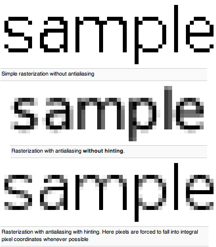
There are many anti-aliasing opponents for web design. Such people in the old-fashioned way draw sketches in Photoshop, turning off anti-aliasing (mode none), out of habit they pick up old fonts optimized for text without smoothing and maliciously creak their teeth, each time making sure that more and more people view the sites they created quite differently Than these designers conceived. I must admit that your humble servant has long been in this legion of “jagged verdana” lovers.
But as soon as I turned on anti-aliasing on a Mac, read some texts for a couple of hours, and then return to the normal mode without anti-aliasing, as I immediately noticed how much it dazzles in my eyes, and how quickly I get tired of reading an un-smoothed font. Now, looking at my old layouts, I am horrified at how ridiculous and illogical these archaic pixel letters look, in fact suitable only for primitive games and programs for computers with black and white CGA monitors.
So, in the light of the above, what awaits us in the field of screen typography? The arrival of new markup languages and style layout tools (HTML 5, XHTML 2, CSS 4, etc.), which will allow embedding any fonts into web documents, as implemented in Flash and Acrobat technologies, is not far off. There is also the fact of the universal use of high-quality data display systems and well-thought-out algorithms for drawing lines, curves and fonts. All these trends can be expressed as follows: we are on the verge of discovering complete freedom for web designers. That which for so long held back and made it impossible to realize their most courageous ideas can now be completely forgotten. We can not worry about how well the visitor of the site will see the beauty we have conceived. We will simply create these beautiful. And anyone will see them exactly as we intended. Almost like in the printing industry. Is this not the dream of every web designer or programmer?
And what's really going on today?
And going on amazingly depressing thing. The vast majority of sites are still being put on in the old fashioned way. Nine out of ten found websites contain a line copied from each other from the 90s: in the worst case , and at best, everything is the same, but with the indication of the
Even with anti-aliasing turned on, even with the general accuracy of the layout and perfectly matched colors, such sites "somehow look not so" as on some professionally created sites. That, in fact, was the reason for the failure of my colleague, who turned to me for advice.
I went to the Apple site and peeped (well, just a little, peeped with one eye) into the stylesheet of this site and found there a single line, thanks to which all the questions from my colleague fell off by themselves:
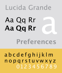 In other words, the Lucida Grande font, supplied with MacOS X, is used as the basis for all the text blocks on the Apple website, and Arial or Verdana is suggested for other operating systems. And this solution is somewhat incomprehensible, because everywhere where Verdana is , there must be Arial , because it was previously “Verdana” included in the set of almost all operating systems. It would be necessary to swap the alternation of these fonts, but we will leave this aspect as some special idea of the developers of the site apple.com.
It is noteworthy that, regardless of the font size (from 9 to 16 pixels), the same interline width of 18 pixels is used, which creates a rigid grid of layout like what is done in the InDesign and QuarkXPress programs (align to baseline), and the lines in the neighboring columns do not jump anyhow. It just causes a sense of rigor and optimal interaction of all blocks.
The Lucida Grande font was created by the designer Charles Bigelow and Kris Holmes for Apple and belongs to the large Lucida family used in all major components of the MacOS X system. Version 5.0d8e1 (Revision 1.002) of this font contains 2,826 glyphs in the Unicode table (2,245 characters) and covers very wide range of supported languages: Latin with all extensions, Greek, Cyrillic, Arabic, Hebrew and Thai.
It turns out that only users of "poppies" will see the Apple site as such, as the authors conceived it? Namely, this (shown fragment):
Yes and no.
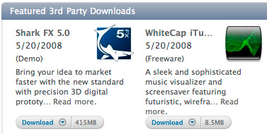
Yes - in the event that a visitor (who came from other OS) does not indicate a forced replacement of all fonts used on the site with his own. In such a situation, a visitor using Windows will see a slightly different picture drawn in Arial. It will look like this (here I used the function of the forced replacement of the font implemented in the iCab browser about which I wrote recently ):

In principle, it seems to be quite good. But this is only at first glance. If you wander through the Apple site, including the replacement of Arial everywhere, sooner or later you begin to feel that all the pages of the site seem to be somewhat sluggish, and reading the text is a little tiring. Especially on the "dark" pages . And it is worth returning back to displaying the text with the Lucida Grande font, as the site comes to life, acquires some kind of special firm "Apple" gloss and gloss.
And this is how the site would look like if there were nothing in the system except Verdana :
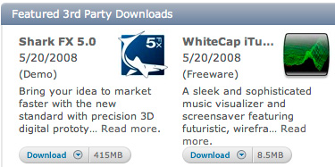
And again - it seems to be perfectly readable. But the characteristic Verdan's “puzatost” of letters, which has already scored the edge of the pattern of individual letters, evoke the feeling of some kind of dampness. There is no due elegance and compactness. Finally, approximately the same thing we would expect when using Tahoma , only here we would be faced with the typical “sticking” of closely standing symbols for this font:

It seems that any of the above options is somehow good. The letters are quite well read. But still Lucida Grande is incomparably better suited for this site. This is a purely subjective assessment, consisting of a long viewing of various pages when you turn on all of the above headsets. This font is much less tiring to the eye during a quick reading and in general causes a feeling of completeness, stylistic integrity, and is also very fresh in the character of its design.
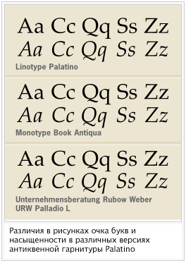 By the way, many reputable Western publications, changing headsets from time to time, are chasing such “freshness”. At first glance, one is no different from the other. So why then do font manufacturers with an enviable regularity release an unimaginable number of antiqua headsets, to a simple man in the world seemingly only clones of The Times ? And why all the same these fonts are bought up, although they already exist thousands of names? But just the whole thing in the subjective perception of the whole picture entirely. It is difficult to assess differences in fonts, considering only small fragments of text. But on the subconscious level, the difference is felt, when the character of the character point drawing changes, the spatial saturation and “darkness” of the font change. That's just the appearance of a new, not yet used in wide circles of the font, introduces some freshness into the publication, makes the publication tune in with some new colors and give a new sensation when reading articles. Experienced designers know these nuances and always try to find interesting "undrained" headsets.
However, it should be noted that this only works in the case of Latin. The scope of Cyrillic fonts is negligible compared to the world of Latin fonts. And the Cyrillic peculiarities do not allow the text to be just as “tasty”: there are too many not very harmonious symbols in the Russian language (b, h, u, g, f, b), there are no hyperfine characters (like i and l in Latin) and relatively few remote elements ( ascendants and descendants as in the symbols d, b, q, j, g, h, k, t) - all this deprives the designer working with Cyrillic many of the charms of modern typography. But do not be discouraged. After all, someone else is worse. Japanese, for example. They have three types of alphabets at all, and the characters there have the widest range of saturation of the pattern, which causes a feeling of untidiness and dirt. Just look at the Russian sites in comparison with the sites of Japanese, Chinese or Korean and make sure that everything is not so bad. Yes, and in Latin only sites in English and Spanish are good. In all other cases, there is an abundance of various "umlauts" and "stresses", which entails an increase in detail in the font richness, and this does not in the best way affect the perception of the text.
In the next part, we will see what options exist for those who for some reason did not have either “poppy” or Lucida Grande font at hand. And also we will learn some other tricks, we will conduct a peculiar rating of screen fonts and draw a number of important conclusions, which allow us to impose sites in a modern form.
To be continued...
Part II
First, the screen sizes have increased, the clarity of the display and the quality of color delivery have improved. Nowadays, old CRT displays with a low resolution, a raised screen, flickering or limited color rendition (remember CGA / EGA / VGA?) Are becoming less and less common. In fact, the number of such monitors compared to modern flat-panel LCD displays can already be safely neglected today. The unofficial de facto standards for resolution have also changed: if at the very beginning sites were created to fit the screen size of 640x480 pixels, then for 800x600, then today the standard 1024x768 is used. With the advent of widescreen (wide) monitors, the new standard of 1280x960 began to loom, but compact devices like the Asus eeePC or Apple iPhone have recently become more popular, so the fact that the resolution will be less than 1024x768 is not excluded. However, in this case it is not so important, because in any case today the screen resolution directly depends on its physical size, and the size of one displayed point is rather small compared to pixels of a decade ago, which allows displaying fonts of equal quality on any modern devices . This, incidentally, leads to the second factor.
')
Secondly, screen font smoothing is being increasingly used. Virtually all operating systems offer the possibility of enabling anti-aliasing, there are even sub-pixel rendering technologies.
This fact opens up broad prospects for designers. If you used to have to choose the font size in pixels, so that it somehow fit into the design and not too ruffled in the eyes, now the designer uses more familiar parameters for him, indicating the size in points, peaks or emmah and not caring how much pixels takes up every line. In the presence of antialiasing, the layout of the site turns out to be practically indistinguishable from the layout of the printed publication, the WYSIWYG formula is manifested in all aspects (WYSIWYG). It remains only to influence the community of visitors to the sites so that they use screen antialiasing.
It should be noted that the manufacturers of operating systems to some extent have already taken care of this. For example, Apple offers only one type of display of fonts in the MacOS X system - with anti-aliasing (you can, however, disable anti-aliasing for pins less than 12 points, but all large pins will be smoothed). Microsoft Windows Vista by default displays all fonts smoothed (using ClearType technology for TFT displays). Microsoft Windows XP offers a kind of transitional option: most of the pins are not smoothed, and very large ones get some kind of not-so-good anti-aliasing renderer. However, in all systems of the Windows family, you can forcibly turn off anti-aliasing and enjoy jagged letters in the spirit of the 80-90s. In various Linux builds with graphical shells, anti-aliasing has also recently been used for fonts. If judged subjectively, then I prefer Apple's anti-aliasing algorithm, even my favorite anti-aliasing methods in Adobe Photoshop (sharp, crisp, smooth, strong) now seem not so optimal.
There are many anti-aliasing opponents for web design. Such people in the old-fashioned way draw sketches in Photoshop, turning off anti-aliasing (mode none), out of habit they pick up old fonts optimized for text without smoothing and maliciously creak their teeth, each time making sure that more and more people view the sites they created quite differently Than these designers conceived. I must admit that your humble servant has long been in this legion of “jagged verdana” lovers.
But as soon as I turned on anti-aliasing on a Mac, read some texts for a couple of hours, and then return to the normal mode without anti-aliasing, as I immediately noticed how much it dazzles in my eyes, and how quickly I get tired of reading an un-smoothed font. Now, looking at my old layouts, I am horrified at how ridiculous and illogical these archaic pixel letters look, in fact suitable only for primitive games and programs for computers with black and white CGA monitors.
So, in the light of the above, what awaits us in the field of screen typography? The arrival of new markup languages and style layout tools (HTML 5, XHTML 2, CSS 4, etc.), which will allow embedding any fonts into web documents, as implemented in Flash and Acrobat technologies, is not far off. There is also the fact of the universal use of high-quality data display systems and well-thought-out algorithms for drawing lines, curves and fonts. All these trends can be expressed as follows: we are on the verge of discovering complete freedom for web designers. That which for so long held back and made it impossible to realize their most courageous ideas can now be completely forgotten. We can not worry about how well the visitor of the site will see the beauty we have conceived. We will simply create these beautiful. And anyone will see them exactly as we intended. Almost like in the printing industry. Is this not the dream of every web designer or programmer?
And what's really going on today?
And going on amazingly depressing thing. The vast majority of sites are still being put on in the old fashioned way. Nine out of ten found websites contain a line copied from each other from the 90s: in the worst case , and at best, everything is the same, but with the indication of the
font-family: Tahoma, Arial, Helvetica, sans-serif; parameters font-family: Tahoma, Arial, Helvetica, sans-serif; and font-size: 11px; in cascading style sheets. At the same time, 90% of all designers forget about the task of leading (interline distance), relying on standard plus two points to the font size. Meanwhile, the font is often read better if you specify a slightly more extensive inter-link. And if you play with tracking and kerning ... But we’ll leave this out of the scope of this discussion, because web technologies do not yet have the means to interact with hundreds of specified kerning pairs. Even with anti-aliasing turned on, even with the general accuracy of the layout and perfectly matched colors, such sites "somehow look not so" as on some professionally created sites. That, in fact, was the reason for the failure of my colleague, who turned to me for advice.
I went to the Apple site and peeped (well, just a little, peeped with one eye) into the stylesheet of this site and found there a single line, thanks to which all the questions from my colleague fell off by themselves:
/* TYPE */
body { font: 12px/18px "Lucida Grande", Arial, Verdana, sans-serif; background-color: #fff; color: #333; }
In other words, the Lucida Grande font, supplied with MacOS X, is used as the basis for all the text blocks on the Apple website, and Arial or Verdana is suggested for other operating systems. And this solution is somewhat incomprehensible, because everywhere where Verdana is , there must be Arial , because it was previously “Verdana” included in the set of almost all operating systems. It would be necessary to swap the alternation of these fonts, but we will leave this aspect as some special idea of the developers of the site apple.com. It is noteworthy that, regardless of the font size (from 9 to 16 pixels), the same interline width of 18 pixels is used, which creates a rigid grid of layout like what is done in the InDesign and QuarkXPress programs (align to baseline), and the lines in the neighboring columns do not jump anyhow. It just causes a sense of rigor and optimal interaction of all blocks.
The Lucida Grande font was created by the designer Charles Bigelow and Kris Holmes for Apple and belongs to the large Lucida family used in all major components of the MacOS X system. Version 5.0d8e1 (Revision 1.002) of this font contains 2,826 glyphs in the Unicode table (2,245 characters) and covers very wide range of supported languages: Latin with all extensions, Greek, Cyrillic, Arabic, Hebrew and Thai.
It turns out that only users of "poppies" will see the Apple site as such, as the authors conceived it? Namely, this (shown fragment):
Yes and no.
Yes - in the event that a visitor (who came from other OS) does not indicate a forced replacement of all fonts used on the site with his own. In such a situation, a visitor using Windows will see a slightly different picture drawn in Arial. It will look like this (here I used the function of the forced replacement of the font implemented in the iCab browser about which I wrote recently ):
In principle, it seems to be quite good. But this is only at first glance. If you wander through the Apple site, including the replacement of Arial everywhere, sooner or later you begin to feel that all the pages of the site seem to be somewhat sluggish, and reading the text is a little tiring. Especially on the "dark" pages . And it is worth returning back to displaying the text with the Lucida Grande font, as the site comes to life, acquires some kind of special firm "Apple" gloss and gloss.
And this is how the site would look like if there were nothing in the system except Verdana :
And again - it seems to be perfectly readable. But the characteristic Verdan's “puzatost” of letters, which has already scored the edge of the pattern of individual letters, evoke the feeling of some kind of dampness. There is no due elegance and compactness. Finally, approximately the same thing we would expect when using Tahoma , only here we would be faced with the typical “sticking” of closely standing symbols for this font:
It seems that any of the above options is somehow good. The letters are quite well read. But still Lucida Grande is incomparably better suited for this site. This is a purely subjective assessment, consisting of a long viewing of various pages when you turn on all of the above headsets. This font is much less tiring to the eye during a quick reading and in general causes a feeling of completeness, stylistic integrity, and is also very fresh in the character of its design.
By the way, many reputable Western publications, changing headsets from time to time, are chasing such “freshness”. At first glance, one is no different from the other. So why then do font manufacturers with an enviable regularity release an unimaginable number of antiqua headsets, to a simple man in the world seemingly only clones of The Times ? And why all the same these fonts are bought up, although they already exist thousands of names? But just the whole thing in the subjective perception of the whole picture entirely. It is difficult to assess differences in fonts, considering only small fragments of text. But on the subconscious level, the difference is felt, when the character of the character point drawing changes, the spatial saturation and “darkness” of the font change. That's just the appearance of a new, not yet used in wide circles of the font, introduces some freshness into the publication, makes the publication tune in with some new colors and give a new sensation when reading articles. Experienced designers know these nuances and always try to find interesting "undrained" headsets. However, it should be noted that this only works in the case of Latin. The scope of Cyrillic fonts is negligible compared to the world of Latin fonts. And the Cyrillic peculiarities do not allow the text to be just as “tasty”: there are too many not very harmonious symbols in the Russian language (b, h, u, g, f, b), there are no hyperfine characters (like i and l in Latin) and relatively few remote elements ( ascendants and descendants as in the symbols d, b, q, j, g, h, k, t) - all this deprives the designer working with Cyrillic many of the charms of modern typography. But do not be discouraged.
After all, someone else is worse. Japanese, for example. They have three types of alphabets at all, and the characters there have the widest range of saturation of the pattern, which causes a feeling of untidiness and dirt. Just look at the Russian sites in comparison with the sites of Japanese, Chinese or Korean and make sure that everything is not so bad. Yes, and in Latin only sites in English and Spanish are good. In all other cases, there is an abundance of various "umlauts" and "stresses", which entails an increase in detail in the font richness, and this does not in the best way affect the perception of the text. In the next part, we will see what options exist for those who for some reason did not have either “poppy” or Lucida Grande font at hand. And also we will learn some other tricks, we will conduct a peculiar rating of screen fonts and draw a number of important conclusions, which allow us to impose sites in a modern form.
To be continued...
Source: https://habr.com/ru/post/25836/
All Articles