Habr, let's fix the letters?
Hey.
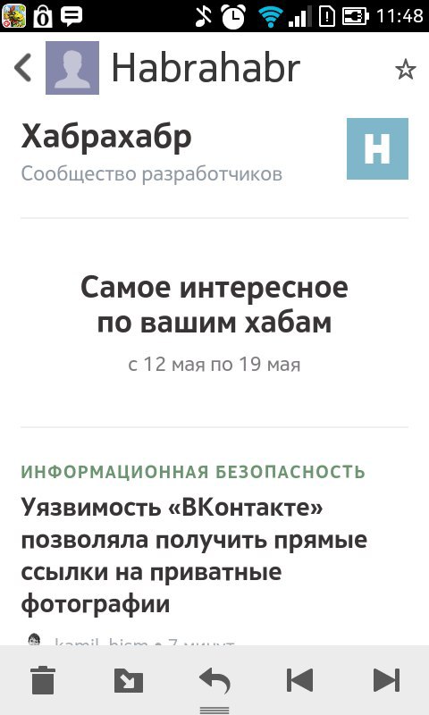
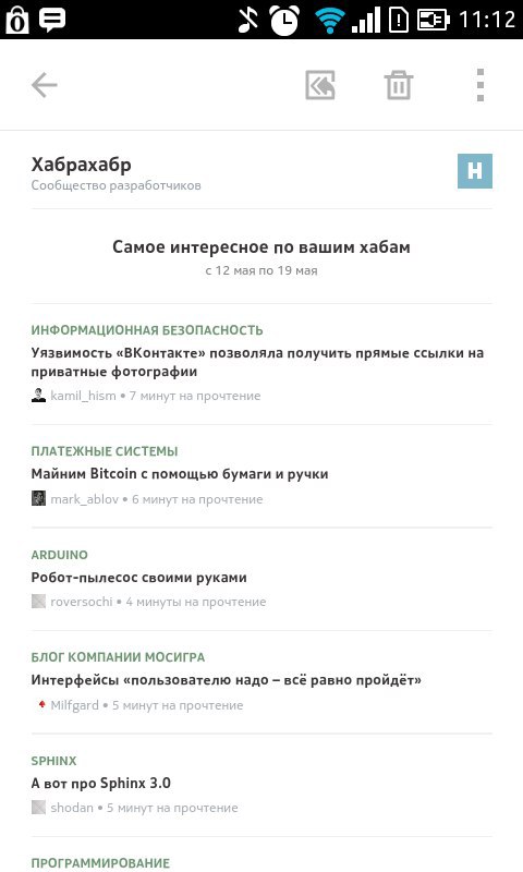
Once again, receiving a letter from Habr, I was upset. And the thing is this. In the screenshot on the left we see a normal adapted letter. So it is displayed in all sane mobile email clients that support media queries. Now let's take a look at the screen on the right. So we see the letter in mobile Gmail, Yandex, Mail.ru clients both on android and on the apple. As you may have guessed, these clients of media queries do not support.
In the case of Habr, the task is simple to the pain. We need to abandon media queries in favor of a banal rubber layout with pieces of magic. Let's imagine that the current letter of the habr is # NEWSLETTER # to simplify the perception of the code.
')
First of all, consider the wrapper of the letter in its current form:
Let's get rid of the trash:
Already much better. And now let's make the wrapper adaptive:
That's all. What benefit we have derived from this: the letter is adapted for all mobile mail clients without exception, the only thing to watch out for is the absence of elements inside the wrapper that exceed 280px (300 minus 10 * 2px indent wrapper) in its width. Inside only tires. And also for each text block there should be a wrapper div with text formatting.
However, there is one small joint in this whole scheme. the bat! does not support max-width, hacks, rendered styles and media queries. Therefore, in this mailer our letter will be the full width of the mailer. Agree, this is a small sacrifice compared with the adaptation of the three mobile clients? However, if someone offers a working solution, he will receive a bonus from me.
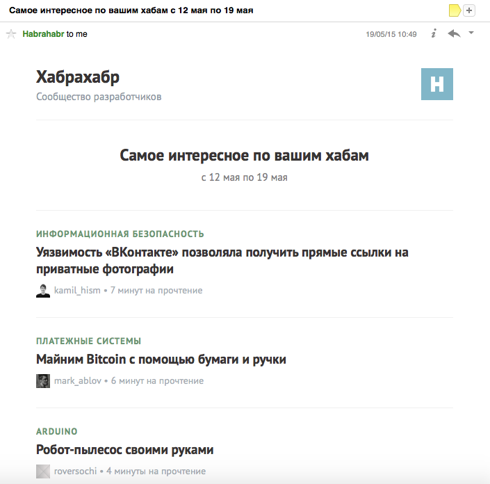
Subjective post script: the font size in the letter is too large. It looks fine on desktops, but a lot of free space is saved on the smartphone. It is enough to reduce the size of the topic headers to 16px and there will be candy. I attach the screen of the desktop version of the letter for those who do not know how it looks.
Once again, receiving a letter from Habr, I was upset. And the thing is this. In the screenshot on the left we see a normal adapted letter. So it is displayed in all sane mobile email clients that support media queries. Now let's take a look at the screen on the right. So we see the letter in mobile Gmail, Yandex, Mail.ru clients both on android and on the apple. As you may have guessed, these clients of media queries do not support.
In the case of Habr, the task is simple to the pain. We need to abandon media queries in favor of a banal rubber layout with pieces of magic. Let's imagine that the current letter of the habr is # NEWSLETTER # to simplify the perception of the code.
')
First of all, consider the wrapper of the letter in its current form:
<div style="border:0;padding:0;margin:0;background-color:#fff;font-family:'PT Sans',Helvetica Neue,Helvetica,Lucida Grande,tahoma,verdana,arial,sans-serif;text-align:center" bgcolor="white"> <div style="background-color:#fff"> <table align="center" width="624" cellpadding="12" cellspacing="0" style="border-collapse:collapse"> <tr> <td> #NEWSLETTER# </td> </tr> </table> </div> </div> Let's get rid of the trash:
<table align="center" width="624" cellpadding="10" cellspacing="0" style="border-collapse:collapse"> <tr> <td> #NEWSLETTER# </td> </tr> </table> Already much better. And now let's make the wrapper adaptive:
<style> body { margin:0; } @media only screen and (min-width: 600px) { .wrapper { width:600px !important; } /* 600px , */ } </style> <!--[if gte mso 9]> <style> .wrapper { width:600px !important; } /* 600px */ </style> <![endif]--> <!--[if lte mso 9]> <style> .wrapper { width:600px !important; } /* 600px */ </style> <![endif]--> <table class="wrapper" align="center" width="600" cellpadding="10" cellspacing="0" style="border-collapse:collapse; margin:auto; width:auto; max-width:600px;"> <tr> <td> #NEWSLETTER# </td> </tr> </table> That's all. What benefit we have derived from this: the letter is adapted for all mobile mail clients without exception, the only thing to watch out for is the absence of elements inside the wrapper that exceed 280px (300 minus 10 * 2px indent wrapper) in its width. Inside only tires. And also for each text block there should be a wrapper div with text formatting.
However, there is one small joint in this whole scheme. the bat! does not support max-width, hacks, rendered styles and media queries. Therefore, in this mailer our letter will be the full width of the mailer. Agree, this is a small sacrifice compared with the adaptation of the three mobile clients? However, if someone offers a working solution, he will receive a bonus from me.
Subjective post script: the font size in the letter is too large. It looks fine on desktops, but a lot of free space is saved on the smartphone. It is enough to reduce the size of the topic headers to 16px and there will be candy. I attach the screen of the desktop version of the letter for those who do not know how it looks.
Source: https://habr.com/ru/post/258317/
All Articles