Using media queries in the layout of email-letters: the pros and cons
Designers working on creating attractive email templates for email newsletters spend a lot of time trying to achieve adequate display on different devices. Nowadays, almost half of all letters are viewed from smartphones and tablets, which means that you need to make sure that the letter looks good on different form factors. That is why in the layout and began to use media queries.
However, before diving into the world of web design and layout of unique email campaigns, you should take a closer look at media queries as a tool that has its pros and cons.
What is media query
Media query is a component of the CSS language. This component is often used as a “switch”, which, based on a set of rules, is responsible for choosing one or another design style.
')
A media query consists of three parts: the media type ('media'), the expression ('expression'), and the style rules that are contained in the media query itself.
Media type is used to declare the environment to which the rules will apply. There are four options: all, print, screen, speech (all, print, screen and speech). For email tasks, the screen type is almost always used.
Expressions allow you to target devices using narrower conditions. Expressions describe the properties of the device, such as width (witdh) and height of the screen, aspect ratio (aspect-ratio) and color. Often designers use the following properties:
max-andmin-width;max-andmin-device-width;device-pixel-ratio.
And finally, the curly brackets indicate the CSS rules that apply if the letter opens on a device that meets the requirements for the media type and properties in the expression. Media queries are written in the style block, which is usually located in the header of the html template.
Pluses media queries
With this tool you can create letters that look good on different devices in different email clients. Many designers create their mailings using the desktop first approach — fixed-width tables are used, and everything is optimized so that the letter looks good on the desktop.
In this case, problems may arise when opening a letter on a mobile device: the email client “zumits” the letter, as a result of which the buttons and text become very small and unreadable, and to see the left part of the letter you need to resort to horizontal scrolling.
Without media queries, designers didn’t have many opportunities to influence this situation, but that’s all changed.
Small example
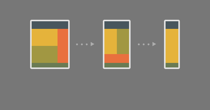
As you know, templates with a fixed width are usually scaled in email clients, which can lead to a reduction in the text to the degree of complete unreadability. At the same time, the "liquid" template with percentage widths allow the flexibility to display content on devices with different screens.
Now suppose that we have a table-container (we wrote about them in more detail) with a fixed width of 600 pixels. In this scenario, you need to switch from a fixed width of 600 pixels when viewed on the desktop to the "liquid" percentage (100%) width when opening a letter on a mobile device:
<table border="0" cellpadding="0" cellspacing="0" width="600" class="container-table"> As you can see, the
class attribute was added to the table - you can achieve the desired effect by using classes to designate HTML elements and media queries to work with these classes. Each class must have a name, in the example it is named .containter-table . The interaction with the class is carried out using the attribute selection method: /* - */ table.container-table {} /* */ table[class="container-table"] {} After adding a class to a table in the
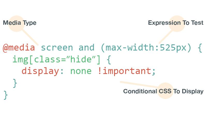
HTML- media query, . max-width:600px media query , , 600 .

@media screen and (max-width:600px) { table[class="container-table"] { } }
CSS. - «» , 600 :

@media screen and (max-width:600px) { table[class="container-table"] { width: 100% !important; } }
, , . , «» , , :

@media screen and (max-width:600px) { td[class="mobile-text"] { font-size: 18px !important; } }
, media queries , inline-. CSS — , media query HTML- . , inline- , - .

!important :

td { font-size: 24px !important; font-weight: bold !important; }
- !important , — .


, media queries , .

, . SVG, CSS- , , , - .

media queries , .

, email- email, media query «» , . Webkit-, Apple Mail Outlook 2011 Mac. media query , , :

@media screen and (-webkit-min-device-pixel-ratio: 0) { /* Insert styles here */ }
, . , iPhone 6 Plus , :

@media screen and (max-device-width: 414px) and (max-device-height: 776px) { /* Insert styles here */ }
:
media queries . , Gmail — , media queries.

email- , Google CSS , , , media queries, . :

Media Query
iOS (iPhone/iPad)
 Gmail app (iOS + Android)
 Inbox by Gmail app (iOS + Android)
 Android 4.x native client
 Android Outlook Exchange via native client
 Android Outlook.com app
 Android Yahoo! Mail app
 Gmail (Android Browser)
 Mailbox (iOS + Android)
 Outlook.com (Android Browser)
 Outlook.com (iOS)
 Yahoo! Mail (Android Browser)
 Windows Phone 7
 Windows Phone 7.5
 Windows Phone 8
 BlackBerry OS 6
 BlackBerry OS 7
 BlackBerry Z10
 Kindle Fire native client

media queries HTML - media queries «», . CSS media query, , , .HTML- media query, . max-width:600px media query , , 600 .
@media screen and (max-width:600px) { table[class="container-table"] { } }
CSS. - «» , 600 :
@media screen and (max-width:600px) { table[class="container-table"] { width: 100% !important; } }
, , . , «» , , :
@media screen and (max-width:600px) { td[class="mobile-text"] { font-size: 18px !important; } }
, media queries , inline-. CSS — , media query HTML- . , inline- , - .
!important :
td { font-size: 24px !important; font-weight: bold !important; }
- !important , — .
, media queries , .
, . SVG, CSS- , , , - .
media queries , .
, email- email, media query «» , . Webkit-, Apple Mail Outlook 2011 Mac. media query , , :
@media screen and (-webkit-min-device-pixel-ratio: 0) { /* Insert styles here */ }
, . , iPhone 6 Plus , :
@media screen and (max-device-width: 414px) and (max-device-height: 776px) { /* Insert styles here */ }
:
media queries . , Gmail — , media queries.
email- , Google CSS , , , media queries, . :
Media Query
iOS (iPhone/iPad)
Gmail app (iOS + Android)
Inbox by Gmail app (iOS + Android)
Android 4.x native client
Android Outlook Exchange via native client
Android Outlook.com app
Android Yahoo! Mail app
Gmail (Android Browser)
Mailbox (iOS + Android)
Outlook.com (Android Browser)
Outlook.com (iOS)
Yahoo! Mail (Android Browser)
Windows Phone 7
Windows Phone 7.5
Windows Phone 8
BlackBerry OS 6
BlackBerry OS 7
BlackBerry Z10
Kindle Fire native client
media queries HTML - media queries «», . CSS media query, , , . HTML- media query, . max-width:600px media query , , 600 .
@media screen and (max-width:600px) { table[class="container-table"] { } }
CSS. - «» , 600 :
@media screen and (max-width:600px) { table[class="container-table"] { width: 100% !important; } }
, , . , «» , , :
@media screen and (max-width:600px) { td[class="mobile-text"] { font-size: 18px !important; } }
, media queries , inline-. CSS — , media query HTML- . , inline- , - .
!important :
td { font-size: 24px !important; font-weight: bold !important; }
- !important , — .
, media queries , .
, . SVG, CSS- , , , - .
media queries , .
, email- email, media query «» , . Webkit-, Apple Mail Outlook 2011 Mac. media query , , :
@media screen and (-webkit-min-device-pixel-ratio: 0) { /* Insert styles here */ }
, . , iPhone 6 Plus , :
@media screen and (max-device-width: 414px) and (max-device-height: 776px) { /* Insert styles here */ }
:
media queries . , Gmail — , media queries.
email- , Google CSS , , , media queries, . :
Media Query
iOS (iPhone/iPad)
Gmail app (iOS + Android)
Inbox by Gmail app (iOS + Android)
Android 4.x native client
Android Outlook Exchange via native client
Android Outlook.com app
Android Yahoo! Mail app
Gmail (Android Browser)
Mailbox (iOS + Android)
Outlook.com (Android Browser)
Outlook.com (iOS)
Yahoo! Mail (Android Browser)
Windows Phone 7
Windows Phone 7.5
Windows Phone 8
BlackBerry OS 6
BlackBerry OS 7
BlackBerry Z10
Kindle Fire native client
media queries HTML - media queries «», . CSS media query, , , .HTML- media query, . max-width:600px media query , , 600 .
@media screen and (max-width:600px) { table[class="container-table"] { } }
CSS. - «» , 600 :
@media screen and (max-width:600px) { table[class="container-table"] { width: 100% !important; } }
, , . , «» , , :
@media screen and (max-width:600px) { td[class="mobile-text"] { font-size: 18px !important; } }
, media queries , inline-. CSS — , media query HTML- . , inline- , - .
!important :
td { font-size: 24px !important; font-weight: bold !important; }
- !important , — .
, media queries , .
, . SVG, CSS- , , , - .
media queries , .
, email- email, media query «» , . Webkit-, Apple Mail Outlook 2011 Mac. media query , , :
@media screen and (-webkit-min-device-pixel-ratio: 0) { /* Insert styles here */ }
, . , iPhone 6 Plus , :
@media screen and (max-device-width: 414px) and (max-device-height: 776px) { /* Insert styles here */ }
:
media queries . , Gmail — , media queries.
email- , Google CSS , , , media queries, . :
Media Query
iOS (iPhone/iPad)
Gmail app (iOS + Android)
Inbox by Gmail app (iOS + Android)
Android 4.x native client
Android Outlook Exchange via native client
Android Outlook.com app
Android Yahoo! Mail app
Gmail (Android Browser)
Mailbox (iOS + Android)
Outlook.com (Android Browser)
Outlook.com (iOS)
Yahoo! Mail (Android Browser)
Windows Phone 7
Windows Phone 7.5
Windows Phone 8
BlackBerry OS 6
BlackBerry OS 7
BlackBerry Z10
Kindle Fire native client
media queries HTML - media queries «», . CSS media query, , , .
HTML- media query, . max-width:600px media query , , 600 .@media screen and (max-width:600px) { table[class="container-table"] { } }CSS. - «» , 600 :
@media screen and (max-width:600px) { table[class="container-table"] { width: 100% !important; } }, , . , «» , , :
@media screen and (max-width:600px) { td[class="mobile-text"] { font-size: 18px !important; } }, media queries , inline-. CSS — , media query HTML- . , inline- , - .
!important :td { font-size: 24px !important; font-weight: bold !important; }-
!important , — ., media queries , .
, . SVG, CSS- , , , - .
media queries , .
, email- email, media query «» , . Webkit-, Apple Mail Outlook 2011 Mac. media query , , :
@media screen and (-webkit-min-device-pixel-ratio: 0) { /* Insert styles here */ }, . , iPhone 6 Plus , :
@media screen and (max-device-width: 414px) and (max-device-height: 776px) { /* Insert styles here */ }:
media queries . , Gmail —
, media queries.
email- , Google CSS , , , media queries, . :
Media Query
iOS (iPhone/iPad)
Gmail app (iOS + Android)
Inbox by Gmail app (iOS + Android)
Android 4.x native client
Android Outlook Exchange via native client
Android Outlook.com app
Android Yahoo! Mail app
Gmail (Android Browser)
Mailbox (iOS + Android)
Outlook.com (Android Browser)
Outlook.com (iOS)
Yahoo! Mail (Android Browser)
Windows Phone 7
Windows Phone 7.5
Windows Phone 8
BlackBerry OS 6
BlackBerry OS 7
BlackBerry Z10
Kindle Fire native client
media queries HTML - media queries «», . CSS media query, , , .HTML- media query, . max-width:600px media query , , 600 .
@media screen and (max-width:600px) { table[class="container-table"] { } }
CSS. - «» , 600 :
@media screen and (max-width:600px) { table[class="container-table"] { width: 100% !important; } }
, , . , «» , , :
@media screen and (max-width:600px) { td[class="mobile-text"] { font-size: 18px !important; } }
, media queries , inline-. CSS — , media query HTML- . , inline- , - .
!important :
td { font-size: 24px !important; font-weight: bold !important; }
- !important , — .
, media queries , .
, . SVG, CSS- , , , - .
media queries , .
, email- email, media query «» , . Webkit-, Apple Mail Outlook 2011 Mac. media query , , :
@media screen and (-webkit-min-device-pixel-ratio: 0) { /* Insert styles here */ }
, . , iPhone 6 Plus , :
@media screen and (max-device-width: 414px) and (max-device-height: 776px) { /* Insert styles here */ }
:
media queries . , Gmail — , media queries.
email- , Google CSS , , , media queries, . :
Media Query
iOS (iPhone/iPad)
Gmail app (iOS + Android)
Inbox by Gmail app (iOS + Android)
Android 4.x native client
Android Outlook Exchange via native client
Android Outlook.com app
Android Yahoo! Mail app
Gmail (Android Browser)
Mailbox (iOS + Android)
Outlook.com (Android Browser)
Outlook.com (iOS)
Yahoo! Mail (Android Browser)
Windows Phone 7
Windows Phone 7.5
Windows Phone 8
BlackBerry OS 6
BlackBerry OS 7
BlackBerry Z10
Kindle Fire native client
media queries HTML - media queries «», . CSS media query, , , . HTML- media query, . max-width:600px media query , , 600 .
@media screen and (max-width:600px) { table[class="container-table"] { } }
CSS. - «» , 600 :
@media screen and (max-width:600px) { table[class="container-table"] { width: 100% !important; } }
, , . , «» , , :
@media screen and (max-width:600px) { td[class="mobile-text"] { font-size: 18px !important; } }
, media queries , inline-. CSS — , media query HTML- . , inline- , - .
!important :
td { font-size: 24px !important; font-weight: bold !important; }
- !important , — .
, media queries , .
, . SVG, CSS- , , , - .
media queries , .
, email- email, media query «» , . Webkit-, Apple Mail Outlook 2011 Mac. media query , , :
@media screen and (-webkit-min-device-pixel-ratio: 0) { /* Insert styles here */ }
, . , iPhone 6 Plus , :
@media screen and (max-device-width: 414px) and (max-device-height: 776px) { /* Insert styles here */ }
:
media queries . , Gmail — , media queries.
email- , Google CSS , , , media queries, . :
Media Query
iOS (iPhone/iPad)
Gmail app (iOS + Android)
Inbox by Gmail app (iOS + Android)
Android 4.x native client
Android Outlook Exchange via native client
Android Outlook.com app
Android Yahoo! Mail app
Gmail (Android Browser)
Mailbox (iOS + Android)
Outlook.com (Android Browser)
Outlook.com (iOS)
Yahoo! Mail (Android Browser)
Windows Phone 7
Windows Phone 7.5
Windows Phone 8
BlackBerry OS 6
BlackBerry OS 7
BlackBerry Z10
Kindle Fire native client
media queries HTML - media queries «», . CSS media query, , , .HTML- media query, . max-width:600px media query , , 600 .
@media screen and (max-width:600px) { table[class="container-table"] { } }
CSS. - «» , 600 :
@media screen and (max-width:600px) { table[class="container-table"] { width: 100% !important; } }
, , . , «» , , :
@media screen and (max-width:600px) { td[class="mobile-text"] { font-size: 18px !important; } }
, media queries , inline-. CSS — , media query HTML- . , inline- , - .
!important :
td { font-size: 24px !important; font-weight: bold !important; }
- !important , — .
, media queries , .
, . SVG, CSS- , , , - .
media queries , .
, email- email, media query «» , . Webkit-, Apple Mail Outlook 2011 Mac. media query , , :
@media screen and (-webkit-min-device-pixel-ratio: 0) { /* Insert styles here */ }
, . , iPhone 6 Plus , :
@media screen and (max-device-width: 414px) and (max-device-height: 776px) { /* Insert styles here */ }
:
media queries . , Gmail — , media queries.
email- , Google CSS , , , media queries, . :
Media Query
iOS (iPhone/iPad)
Gmail app (iOS + Android)
Inbox by Gmail app (iOS + Android)
Android 4.x native client
Android Outlook Exchange via native client
Android Outlook.com app
Android Yahoo! Mail app
Gmail (Android Browser)
Mailbox (iOS + Android)
Outlook.com (Android Browser)
Outlook.com (iOS)
Yahoo! Mail (Android Browser)
Windows Phone 7
Windows Phone 7.5
Windows Phone 8
BlackBerry OS 6
BlackBerry OS 7
BlackBerry Z10
Kindle Fire native client
media queries HTML - media queries «», . CSS media query, , , .
HTML- media query, . max-width:600px media query , , 600 .@media screen and (max-width:600px) { table[class="container-table"] { } }CSS. - «» , 600 :
@media screen and (max-width:600px) { table[class="container-table"] { width: 100% !important; } }, , . , «» , , :
@media screen and (max-width:600px) { td[class="mobile-text"] { font-size: 18px !important; } }, media queries , inline-. CSS — , media query HTML- . , inline- , - .
!important :td { font-size: 24px !important; font-weight: bold !important; }-
!important , — ., media queries , .
, . SVG, CSS- , , , - .
media queries , .
, email- email, media query «» , . Webkit-, Apple Mail Outlook 2011 Mac. media query , , :
@media screen and (-webkit-min-device-pixel-ratio: 0) { /* Insert styles here */ }, . , iPhone 6 Plus , :
@media screen and (max-device-width: 414px) and (max-device-height: 776px) { /* Insert styles here */ }:
media queries . , Gmail —
, media queries.
email- , Google CSS , , , media queries, . :
Media Query
iOS (iPhone/iPad)
Gmail app (iOS + Android)
Inbox by Gmail app (iOS + Android)
Android 4.x native client
Android Outlook Exchange via native client
Android Outlook.com app
Android Yahoo! Mail app
Gmail (Android Browser)
Mailbox (iOS + Android)
Outlook.com (Android Browser)
Outlook.com (iOS)
Yahoo! Mail (Android Browser)
Windows Phone 7
Windows Phone 7.5
Windows Phone 8
BlackBerry OS 6
BlackBerry OS 7
BlackBerry Z10
Kindle Fire native client
media queries HTML - media queries «», . CSS media query, , , .HTML- media query, . max-width:600px media query , , 600 .
@media screen and (max-width:600px) { table[class="container-table"] { } }
CSS. - «» , 600 :
@media screen and (max-width:600px) { table[class="container-table"] { width: 100% !important; } }
, , . , «» , , :
@media screen and (max-width:600px) { td[class="mobile-text"] { font-size: 18px !important; } }
, media queries , inline-. CSS — , media query HTML- . , inline- , - .
!important :
td { font-size: 24px !important; font-weight: bold !important; }
- !important , — .
, media queries , .
, . SVG, CSS- , , , - .
media queries , .
, email- email, media query «» , . Webkit-, Apple Mail Outlook 2011 Mac. media query , , :
@media screen and (-webkit-min-device-pixel-ratio: 0) { /* Insert styles here */ }
, . , iPhone 6 Plus , :
@media screen and (max-device-width: 414px) and (max-device-height: 776px) { /* Insert styles here */ }
:
media queries . , Gmail — , media queries.
email- , Google CSS , , , media queries, . :
Media Query
iOS (iPhone/iPad)
Gmail app (iOS + Android)
Inbox by Gmail app (iOS + Android)
Android 4.x native client
Android Outlook Exchange via native client
Android Outlook.com app
Android Yahoo! Mail app
Gmail (Android Browser)
Mailbox (iOS + Android)
Outlook.com (Android Browser)
Outlook.com (iOS)
Yahoo! Mail (Android Browser)
Windows Phone 7
Windows Phone 7.5
Windows Phone 8
BlackBerry OS 6
BlackBerry OS 7
BlackBerry Z10
Kindle Fire native client
media queries HTML - media queries «», . CSS media query, , , .Source: https://habr.com/ru/post/258313/
All Articles