Count the life of the site, or visualize the connection between pages
When I started working on the recommendations widget aka “Read also”, I didn’t even suspect that the data obtained for forming recommendations could be no less useful than the recommendations themselves. Actually, I want to share this data with you today in the topic. Of these, you can learn interesting knowledge about the specifics of traffic to different sites. Under the cut you will find geek porn a brief excursion describing how this data is formed, the analysis of several typical experimental graphs, as well as a bonus of 18+.
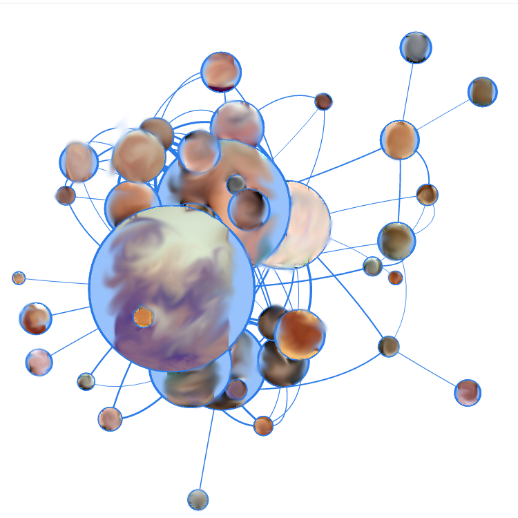
To heat interest, here is a picture of one of the experimental ones:

For a start, a little introduction about the recommendation algorithms. Most recommender systems are based on collaborative filtering. This is a family of algorithms that calculate recommendations to the user based on the choices of other users. This family, in turn, is divided into two main categories:
And it is the second category - our case. The fact is that in so many media sites, up to 95% of users are not regular readers, or vice versa, they read up to 100% of the site materials, so an objective portrait of a user is problematic. And for such an algorithm we build a graph on the site, where each node is a website page, and the link between two nodes is established if one user has read both of these pages (in fact, everything is more complicated, but in general it looks like this). Links are weighted, and their weight is greater, the more users read both of these pages during one session on the site. On the graphs below, 120 of the most “heavy” links are selected, and the size of the nodes indicates the total weight of the attached links.
Vis.js library was used for visualization on the service, or rather its Force-directed layout. This is a graph visualization algorithm, with the help of which edge intersections are minimized and a more or less human-clear picture is formed. To do this, a simulation of the impact of "forces" from the real world (elastic forces according to Hooke's law in this case) is applied to the nodes and edges.
')
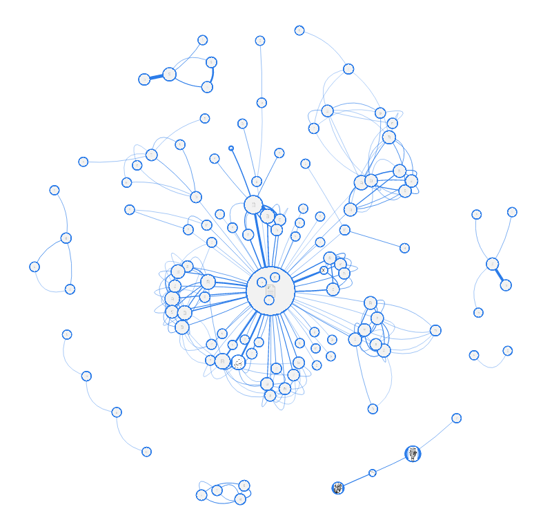
We proceed to the preparation of the first experimental. The picture above shows a themed professional portal. The following interesting information can be gathered from the scheme:
Site 1 is a site search page. With such user activity through this page, I would, at the site of the owner of the portal, think about reorganizing the navigation on the site.
Site 3 is the “latest blog content” page. In general, nothing surprising, she just clearly collected the most popular blog material around her.
Well, nodes 2 and 4 are materials that attract a large amount of search traffic. From them comes a lot of transitions to materials in adjacent sections, so they gathered around them such "stars".
You can also see floating “orphan” pairs around - these are just pages with very similar content that complement each other. In the recommendations to each other, respectively, they will also fall in the first place.
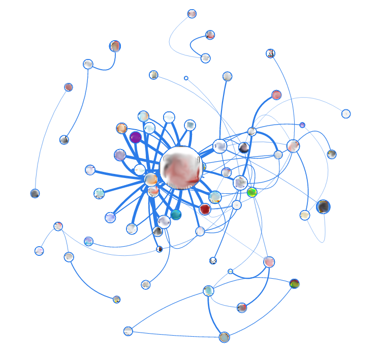
The next test subject is also a portal, a language one this time. In the center of the most "fat" site - this time not search, and not even the most visited, but the navigation page, which contains a list of subsections. In general, I brought this picture here in order to show you the difference with the following experimental subjects. As it is easy to see, the portals have a clear hierarchy and systematization of the content, so these “stars” are obtained. This picture is even noticeable, as inside the main "star" content is bundled up in subsections (for this, I, however, specifically took the 250 fattest edges instead of 120).
Next up is our SEO blog. According to this graph, a large randomness of links between pages is already noticeable. However, one very important thing can be learned from it. It is easy to see that in the center there are two of the most "fat" nodes (the largest, and the smallest near it), which give the most of the most "fat" links. So, this is not the most visited pages. The blog attracts most of the traffic from search engines, and most of it does not remain on the site beyond one viewing. But these two pages spread traffic "deep into" the site.

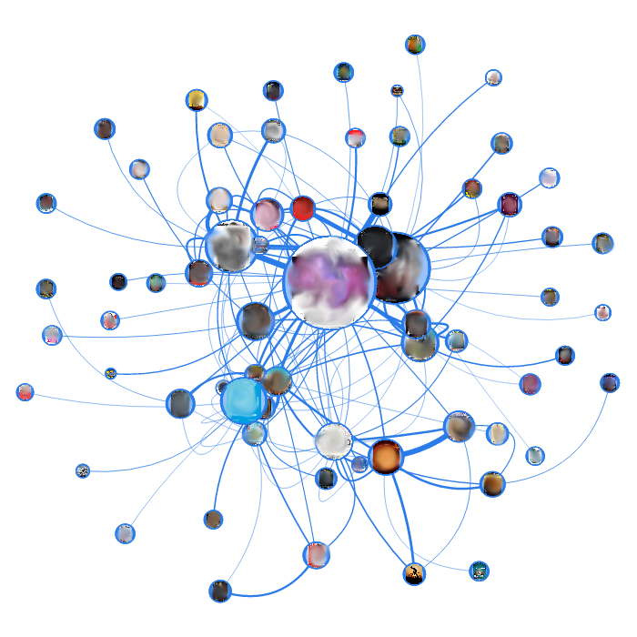
These two columns are the regional media and the regional events poster, respectively. In both patients, the same randomness of arcs is noticeable, but if you look closely, the nominal grouping of nodes is noticeable. In the media, the reason for grouping is different for each group (dates, general subjects, project, etc.), for posters - the pages are grouped by the date of the event. It is on the basis of such date-specific specifics that I am now preparing for such sites a graph display with page filtering by week.
Well, the last patients for today - the promised bonus of 18+ ! (Of course, also with smeared knots, and what you thought).
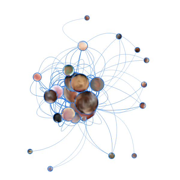
It is not difficult to guess from the abundance of beige color that these are porn blogs. A characteristic feature of these two graphs is that, despite the abundance of (hundreds) of various pages, the graphs have a clearly distinguished core of a dozen of the “fattest” pages, which are most often transferred from the search, and between which there are most internal transitions. This concept is retained even with an increase in the sample of edges for the graph: instead of a proportional increase in “small” nodes along the edges, the heap in the middle merges even more together. Also here, like in the SEO blog, it is noticed that the “fattest” sites are not the most visited.
To heat interest, here is a picture of one of the experimental ones:
For a start, a little introduction about the recommendation algorithms. Most recommender systems are based on collaborative filtering. This is a family of algorithms that calculate recommendations to the user based on the choices of other users. This family, in turn, is divided into two main categories:
- User-based recommendations - find users whose tastes are most similar to yours, and forms the issue based on them. Algorithms from this category are good when you can average a fairly accurate portrait of a user (for example, based on purchases or rating of watched movies), and when you need output that does not depend on context (i.e., advise the next movie to watch tastes of the user, regardless of the page viewed now any movie).
- Item-based recommendations - put the focus on the similarity of recommended units (based on the same user views, though). They are used where user-based inefficiencies: where it is difficult to make a clear portrait of a user, there is a lot of random factor in the choice of records, and when calculating the model of user similarity is too costly in view of the data specifics
And it is the second category - our case. The fact is that in so many media sites, up to 95% of users are not regular readers, or vice versa, they read up to 100% of the site materials, so an objective portrait of a user is problematic. And for such an algorithm we build a graph on the site, where each node is a website page, and the link between two nodes is established if one user has read both of these pages (in fact, everything is more complicated, but in general it looks like this). Links are weighted, and their weight is greater, the more users read both of these pages during one session on the site. On the graphs below, 120 of the most “heavy” links are selected, and the size of the nodes indicates the total weight of the attached links.
Vis.js library was used for visualization on the service, or rather its Force-directed layout. This is a graph visualization algorithm, with the help of which edge intersections are minimized and a more or less human-clear picture is formed. To do this, a simulation of the impact of "forces" from the real world (elastic forces according to Hooke's law in this case) is applied to the nodes and edges.
')
We proceed to the preparation of the first experimental. The picture above shows a themed professional portal. The following interesting information can be gathered from the scheme:
Site 1 is a site search page. With such user activity through this page, I would, at the site of the owner of the portal, think about reorganizing the navigation on the site.
Site 3 is the “latest blog content” page. In general, nothing surprising, she just clearly collected the most popular blog material around her.
Well, nodes 2 and 4 are materials that attract a large amount of search traffic. From them comes a lot of transitions to materials in adjacent sections, so they gathered around them such "stars".
You can also see floating “orphan” pairs around - these are just pages with very similar content that complement each other. In the recommendations to each other, respectively, they will also fall in the first place.
The next test subject is also a portal, a language one this time. In the center of the most "fat" site - this time not search, and not even the most visited, but the navigation page, which contains a list of subsections. In general, I brought this picture here in order to show you the difference with the following experimental subjects. As it is easy to see, the portals have a clear hierarchy and systematization of the content, so these “stars” are obtained. This picture is even noticeable, as inside the main "star" content is bundled up in subsections (for this, I, however, specifically took the 250 fattest edges instead of 120).
Next up is our SEO blog. According to this graph, a large randomness of links between pages is already noticeable. However, one very important thing can be learned from it. It is easy to see that in the center there are two of the most "fat" nodes (the largest, and the smallest near it), which give the most of the most "fat" links. So, this is not the most visited pages. The blog attracts most of the traffic from search engines, and most of it does not remain on the site beyond one viewing. But these two pages spread traffic "deep into" the site.
These two columns are the regional media and the regional events poster, respectively. In both patients, the same randomness of arcs is noticeable, but if you look closely, the nominal grouping of nodes is noticeable. In the media, the reason for grouping is different for each group (dates, general subjects, project, etc.), for posters - the pages are grouped by the date of the event. It is on the basis of such date-specific specifics that I am now preparing for such sites a graph display with page filtering by week.
Well, the last patients for today - the promised bonus of 18+ ! (Of course, also with smeared knots, and what you thought).
It is not difficult to guess from the abundance of beige color that these are porn blogs. A characteristic feature of these two graphs is that, despite the abundance of (hundreds) of various pages, the graphs have a clearly distinguished core of a dozen of the “fattest” pages, which are most often transferred from the search, and between which there are most internal transitions. This concept is retained even with an increase in the sample of edges for the graph: instead of a proportional increase in “small” nodes along the edges, the heap in the middle merges even more together. Also here, like in the SEO blog, it is noticed that the “fattest” sites are not the most visited.
Source: https://habr.com/ru/post/258213/
All Articles