How we do landings
It is time to greet Habrahabr on behalf of Ecoisme startup!
The administration has long ago provided a start-up account for our company, and in return we promised to talk about all the interesting things that we use.
Today we will tell about how we do landing pages (landing pages).
We use those things that most developers do not use yet, but which make life easier for us and can make it easier for others.
Landings are made to attract the target audience in order to explain to potential customers what's what and to make them want to perform the target action (subscribe, buy something).
')
Due to the fact that the audience is usually segmented, there are several landing options for different groups of visitors, and the difference is usually in some infographics and texts.
Our landings change almost every day (sometimes several times a day), and there is a need for an approach that provides enough flexibility in creating and customizing pages so that the support of several variations does not become a headache.
Subsequently, the tests and experiments appeared a few stable rules that work very well for us, and what we decided to share.
This means that the HTML returned by the server has practically nothing to do with how the content will be displayed.
This means that the content of the page is formed as semantically correct as possible and with the minimum necessary number of tags.
For example, like this:
Since our content with the appearance has little in common - the web components take on all the work on the graphical presentation and allow us to get up on the page all that comes to the designer’s head.
For convenience, Polymer elements are used that inherit system
The web component for the code above consists of two parts:
and some styles (in fact, taking into account the mobile version is not so little), the result is a beautiful block:
In this case, everything is simple, all the content as it is, gets inside, but sometimes the content is divided into parts and inserted elementwise:
Adaptability for Landing is also important, for example, 45% of visitors come to Ecoisme from mobile devices, and the vast majority of them are smartphones, not tablets.
Since the content is separate and our appearance is separate, the content should be adaptive. We connect a polyfill for the
In fact, these are all content changes.
The remaining changes occur inside the web component - the order and placement of elements change, the page layout is completely rebuilt:
Since the web components themselves are usually small and are an autonomous self-sufficient part of the page, it is easier to maintain them, you do not need to invent a complicated class naming system (here we say hello to BEM), at least one nesting level does not interfere with its styles with another.
Web components are quite independent, which means they can be reused.
For example, a once created component of a subscription form is used several times on one page, and also on another.
Some components are similar, not exactly the same - here you can customize the web component using attributes, or inherit the component and override certain styles / functionality.
In the functional part of our site we use these features for graphs:
These graphs are very similar and basically differ in appearance in that they have a different color, and under the hood, the device id is transmitted as an attribute, the consumption of which needs to be shown, and the corresponding data is loaded.
Also on the charts used a lot of interesting things under the hood, but more on that another time, we are on the landing now.
Due to the fact that web components and the
At the beginning of their use (about a year ago) they had a number of unpleasant bugs, some of which had to be fixed and patches sent to the developers.
Fortunately, at the moment all the bugs that interfered, have long been fixed, and no inconvenience arises.
Also, for full use, you need to thoroughly understand how the Shadow DOM works, since almost everything is in it.
And yet - jQuery has no idea about shadow trees (some important fixes are already available in the Git version of jQuery), so you can use it, but you need to understand where and how, that is, the percentage of VanillaJS will be much more :)
As a result, the creation of a new landing takes about one working day per person, which is quite good. And the creation of a similar landing page, if the differences are small, is possible within one or two working hours.
You can see it live on our website , do not hesitate to pick a page with an inspector and debugger, tell us what you think.
The administration has long ago provided a start-up account for our company, and in return we promised to talk about all the interesting things that we use.
Today we will tell about how we do landing pages (landing pages).
We use those things that most developers do not use yet, but which make life easier for us and can make it easier for others.
What is the essence
Landings are made to attract the target audience in order to explain to potential customers what's what and to make them want to perform the target action (subscribe, buy something).
')
Due to the fact that the audience is usually segmented, there are several landing options for different groups of visitors, and the difference is usually in some infographics and texts.
Our landings change almost every day (sometimes several times a day), and there is a need for an approach that provides enough flexibility in creating and customizing pages so that the support of several variations does not become a headache.
Subsequently, the tests and experiments appeared a few stable rules that work very well for us, and what we decided to share.
The server gives only content
This means that the HTML returned by the server has practically nothing to do with how the content will be displayed.
This means that the content of the page is formed as semantically correct as possible and with the minimum necessary number of tags.
For example, like this:
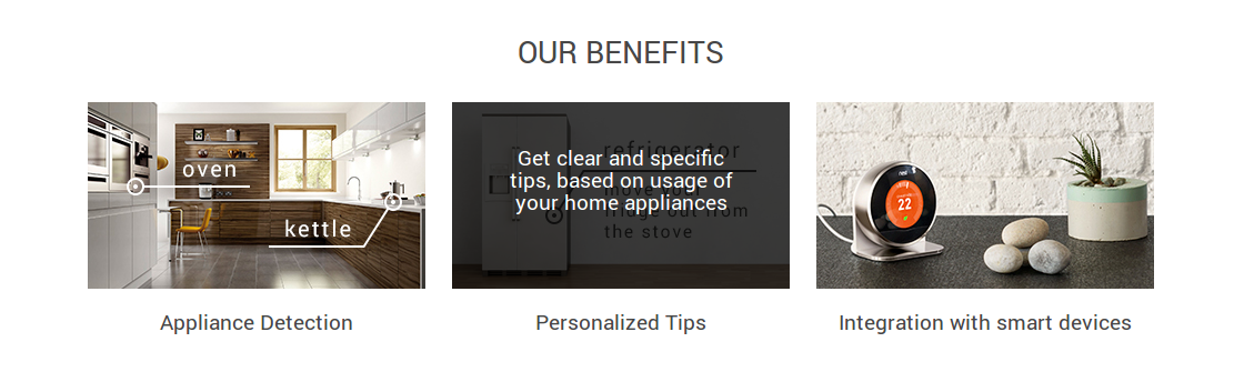
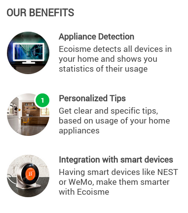
<article is="cs-indiegogo-benefits" id="benefits"> <h1>Our benefits</h1> <picture> <source srcset="/components/modules/Indiegogo/includes/img/benefits-1-mobile.jpg" media="(max-width: 1100px)"> <img src="/components/modules/Indiegogo/includes/img/benefits-1.jpg" alt="Benefits"> </picture> <picture> <source srcset="/components/modules/Indiegogo/includes/img/benefits-2-mobile.jpg" media="(max-width: 1100px)"> <img src="/components/modules/Indiegogo/includes/img/benefits-2.jpg" alt="Benefits"> </picture> <picture> <source srcset="/components/modules/Indiegogo/includes/img/benefits-3-mobile.jpg" media="(max-width: 1100px)"> <img src="/components/modules/Indiegogo/includes/img/benefits-3.jpg" alt="Benefits"> </picture> <dl> <dt>Appliance Detection</dt> <dd>Ecoisme detects all devices in your home and shows you statistics of their usage</dd> <dt>Personalized Tips</dt> <dd>Get clear and specific tips, based on usage of your home appliances</dd> <dt>Integration with smart devices</dt> <dd>Having smart devices like NEST or WeMo, make them smarter with Ecoisme</dd> </dl> </article> Web components display content according to design.
Since our content with the appearance has little in common - the web components take on all the work on the graphical presentation and allow us to get up on the page all that comes to the designer’s head.
For convenience, Polymer elements are used that inherit system
<header> , <article> and the like.The web component for the code above consists of two parts:
<polymer-element name="cs-indiegogo-benefits" extends="article" noscript> <template> <link rel="stylesheet" href="style.css"> <div> <content></content> </div> </template> </polymer-element> and some styles (in fact, taking into account the mobile version is not so little), the result is a beautiful block:
In this case, everything is simple, all the content as it is, gets inside, but sometimes the content is divided into parts and inserted elementwise:
<polymer-element name="cs-indiegogo-header" extends="header"> <template> <link rel="stylesheet" href="style.css"> <div horizontal layout center wrap> <a href="/"> <content select="picture"></content> </a> <div flex></div> <img id="menu" src="/components/modules/Indiegogo/includes/html/cs-indiegogo-header/menu.png" on-tap="{{menu_toggle}}"> <content select="ul"></content> <button id="subscribe" target="#main">Subscribe</button> </div> </template> <script src="script.js"></script> </polymer-element> Adaptability
Adaptability for Landing is also important, for example, 45% of visitors come to Ecoisme from mobile devices, and the vast majority of them are smartphones, not tablets.
Since the content is separate and our appearance is separate, the content should be adaptive. We connect a polyfill for the
<picture> and use responsive images: <picture> <source srcset="/components/modules/Indiegogo/includes/img/benefits-1-mobile.jpg" media="(max-width: 1100px)"> <img src="/components/modules/Indiegogo/includes/img/benefits-1.jpg" alt="Benefits"> </picture> In fact, these are all content changes.
The remaining changes occur inside the web component - the order and placement of elements change, the page layout is completely rebuilt:
Convenience support
Since the web components themselves are usually small and are an autonomous self-sufficient part of the page, it is easier to maintain them, you do not need to invent a complicated class naming system (here we say hello to BEM), at least one nesting level does not interfere with its styles with another.
Similar pages and their parts
Web components are quite independent, which means they can be reused.
For example, a once created component of a subscription form is used several times on one page, and also on another.
Some components are similar, not exactly the same - here you can customize the web component using attributes, or inherit the component and override certain styles / functionality.
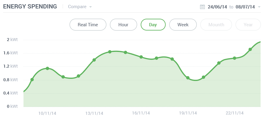
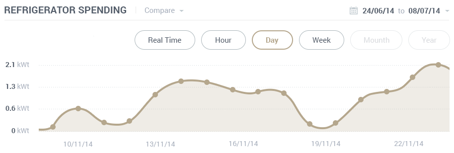
In the functional part of our site we use these features for graphs:
These graphs are very similar and basically differ in appearance in that they have a different color, and under the hood, the device id is transmitted as an attribute, the consumption of which needs to be shown, and the corresponding data is loaded.
Also on the charts used a lot of interesting things under the hood, but more on that another time, we are on the landing now.
Difficulties and nuances
Due to the fact that web components and the
<picture> are not yet supported out of the box by all browsers, you have to use polyfiles.At the beginning of their use (about a year ago) they had a number of unpleasant bugs, some of which had to be fixed and patches sent to the developers.
Fortunately, at the moment all the bugs that interfered, have long been fixed, and no inconvenience arises.
Also, for full use, you need to thoroughly understand how the Shadow DOM works, since almost everything is in it.
And yet - jQuery has no idea about shadow trees (some important fixes are already available in the Git version of jQuery), so you can use it, but you need to understand where and how, that is, the percentage of VanillaJS will be much more :)
Conclusion
As a result, the creation of a new landing takes about one working day per person, which is quite good. And the creation of a similar landing page, if the differences are small, is possible within one or two working hours.
You can see it live on our website , do not hesitate to pick a page with an inspector and debugger, tell us what you think.
Source: https://habr.com/ru/post/258165/
All Articles