Glitter and poverty of standard selects
 Translator's note : We continue to publish materials that will be useful to web developers, designers and layout designers. In past topics, we looked at the principles of creating animations on the web and using the SVG format . Today we will talk about the
 select element or simply about the select.In this article, we take a close look at the
<select> and consider some subtleties and pitfalls that you need to be aware of if you decide to use non-standard drop-down lists that differ in appearance and functionality from those built into the browser. Spoiler: it is better not to do so.Understand designers
It is not difficult to understand designers who seek to create for their customers a unique product, every detail of which will be individual. This attitude demonstrates the love of your work and the desire to be proud of what you are doing. If you allow someone (for example, the browser) to do part of your work for you and determine how something will look, then it turns out that you did not work. The same goes for using Bootstrap elements. So do only lazy and non-professionals, is not it?
What is the difference
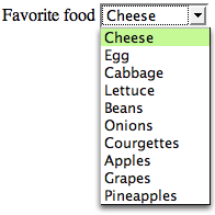
Suppose you create a drop-down list using HTML. Without the use of styles, it will look like this:
')
Not the most beautiful thing in the world, but it does its job. Let's take a closer look at this element and look at how it looks in different browsers on OS X Yosemite and Windows 8:
| OS | Browser | Closed | Open |
|---|---|---|---|
| Windows 8 | IE10 |  | 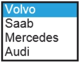 |
| Windows 8 | Chrome | 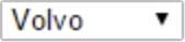 | 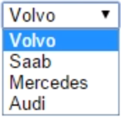 |
| Windows 8 | Opera |  | 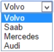 |
| Windows 8 | Firefox |  |  |
| OSX Yosemite | Safari |  | 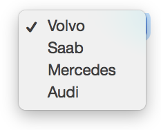 |
| OSX Yosemite | Firefox |  | 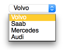 |
| OSX Yosemite | Chrome |  | 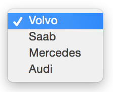 |
| OSX Yosemite | Opera |  | 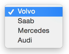 |
Bring sharpness
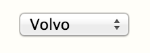
There are practically no differences between selects within one OS, since browsers use system controls and display settings from the OS.
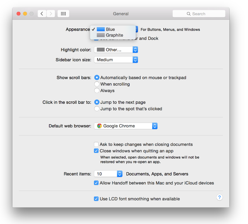
Example: see how browsers on OS X Yosemite "render" drop-down lists. If the user chooses Blue as the design theme, then the select block with the arrows on the right will be blue. And if the Graphite theme is selected, the block with arrows will be gray:
The fact that all selects, checkboxes and radio buttons, not only in the browser, but also in the entire OS, are made in the same style, helps users better understand the functionality of the various elements appearing on the site.
The differences in the two OSs discussed above are not very large at first glance, but from the point of view of UX, they are quite noticeable. The key point is that on Windows in the selection window the arrow always looks down , and on OS X there are two arrows up and down . Apple’s approach in this case is preferable - if the user chooses an item in the middle of the list and then chooses another, then when they click on a select in OS X, they’ll be shown the selected item in the middle, and the neighboring options are above and below it. In Windows, selects always look like a drop-down list. But his main task is not to “fall out”, but to “unfold” and allow it to conveniently choose options.
Why native selects are excellent
The
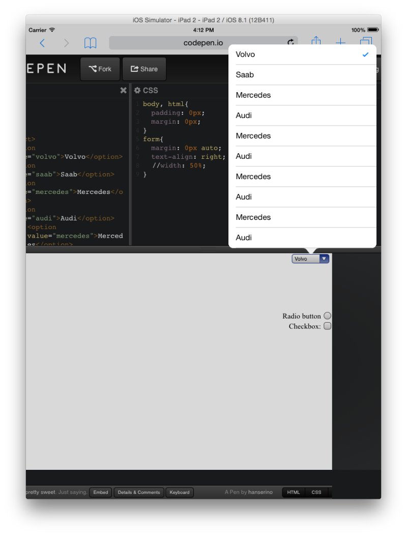
<select> element is HTML difficult child. The reason for this is in relation to his browser. When the user clicks on the select, the browser does not behave as usual to display options for selection . If the site has a select that is located at the very bottom, at the bottom edge of the browser, then when you click on such a select, the browser assigns it a z-index , which can be superimposed on all other z-index , and can even draw a list of options outside the window. Look at the screenshot below: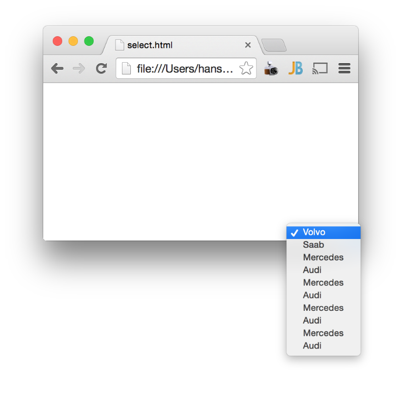
If the select from the example were not a standard browser, but a custom one, then it would simply not work. More precisely, you would not see a list of options - it would simply be clipped to the border of the browser window. It would even be unclear whether the button was pressed or not.
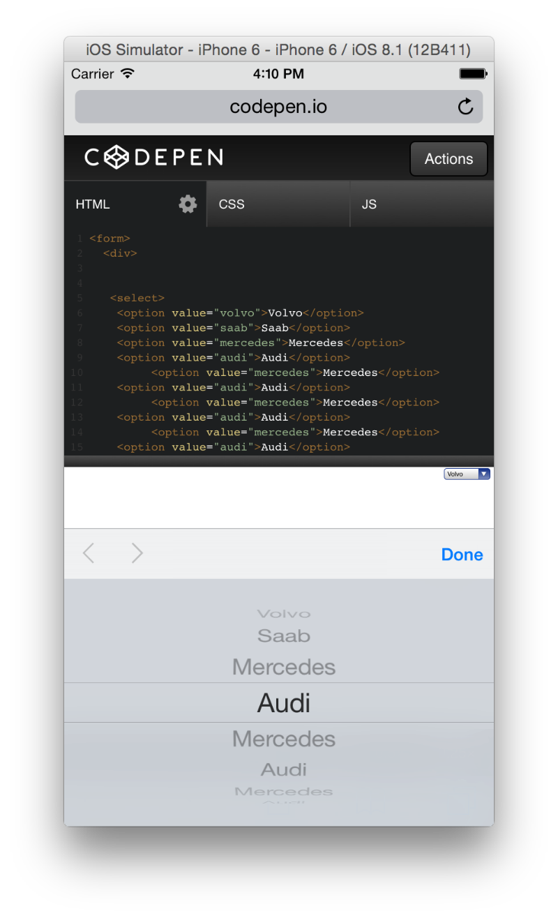
Another interesting topic is how selects behave in touch devices and operating systems. Take a look at a couple of screenshots:
Customization must be a hybrid
As far as possible, front-end developers should communicate with designers about the proposed solutions, and in such conversations, the attention of colleagues should be drawn to the following points:
- Never settle for full customization. Browsers in a special, reverent manner handle
<select>elements - try to always keep this behavior. Therefore, to create a non-standard selection field, you need to use the<select>. It is necessary to convey to the designer all the disadvantages of complete customization, which means giving up<select>and creating something like this . - When you have convinced the designer to use
<select>, you should proceed to an explanation of the fact that you cannot control the appearance of the drop-down list of options. This is a browser case. Point. You can only control the appearance of the button to open the list. - In the next step, you need to decide whether you are using the standard select or still customize the button to open the list. And if you customize the button, then in what style - with one arrow, as in Windows, or with two in the style of Apple? The use of the second option will lead to confusion for Windows users who are accustomed to the "one-hand" option. Browser detection is a separate topic. From the point of view of UX, a much wiser solution would be to use the standard "non-stylized" version of the select - it will adapt to any operating system and browsers, and users will not have any difficulties.
Hybrid technology
The hybrid technique is to use a wrapper container for the
<select> element. .selectContainer call this container .selectContainer . It must have overflow-x: hidden; , and the <select> element inside the container should have a width of about 160% to hide the default arrows of the browser or OS. The container is used to create for the user the illusion of interaction with the usual <select> . In the example below, the pseudo-element ::after .selectContainer container .selectContainer contains the text “icon”, but it could be replaced with a background image (by clicking on the image, editing in the sandbox opens on Codepen):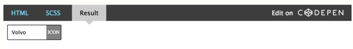
Conclusion
The main idea of the article - be sure to discuss with the designer non-standard selects, and it is better to do this before the design goes “into production”. It is important to understand the pros and cons of “native” and customized selektov, as well as how the browser interacts with each of them.
To decide whether to use standard or custom selects, you need to ask yourself (or the designer) the question:
“Will
<select> include a large number of options? What can go wrong? Will all options be visible in the open options list? ”If the answer is“ no, ”you should use the standard non-stylized or elegant hybrid version. If the answer is positive, then you should call your element a “block with drop-down options” and arrange it in such a way that there is not even a hint of similarity with standard selections and their behavior.If the
<select> element is not used to create drop-down lists, the semantics and level of accessibility of the interface for users suffers. Changing the appearance of form elements is undesirable for people with poor eyesight. Failure to <select> also complicates screen reading. This element is similar to a road sign - if a motorist crosses the border in a car, and in the new country the “give way” sign will look completely different - this will clearly confuse him and may lead to driving errors. No need to help people make mistakes. Users need the consistent appearance of all the applications they work with. For them, getting to a new site is like going to a foreign country.Therefore, before you begin to develop customized selekta, you should think twice.
Source: https://habr.com/ru/post/257743/
All Articles