Responsive design + Icon fonts = Adaptive icons
Hi, Habr!
Today we talk about responsive icons and a couple of life hacking with font icons.

')
Recently, the trend of “responsive design” is gaining momentum. The idea embodied in this methodology is modified in real time, supplemented and overgrown with new functions. I am not a fan of trends and fashion as such; I have not developed mutual love with them. But in the professional sphere, everything is different: here the trends rule the ball, and throwing them out just does not work.
Responsive and responsive design continues to capture virtual space and our screens. The presence of a separate mobile version of the site, most likely, will disappear even from such adherents as Facebook and Twitter - more and more patterns and solutions appear for updating various functionalities and display via media queries and scripts.
Originating in early 2013, by the end of its trend has captured the minds of web developers. What is the reason for the popularity of flat design?
These are the main positive properties of flat-design, causing its growing popularity.
Quite a fresh trend in the world of web design. The idea is simple: create a set of SVG images, and then collect them with a special service that outputs a set of several CSS files for different purposes, the actual font in EOT, SVG, WOFF and even TTF formats that can be installed into the system and use, for example, in a graphical editor. Unfortunately, font icons are devoid of some of the charms of SVG, for example, coloring individual elements of one icon, but in most cases you can go to these sacrifices or circumvent them with some tricks.
I turn to the main topic of the article - a pattern that incorporates all the above trends and the idea of Joe Harrison Responsive Icons , the essence of which is very simple. When the window size is changed, the detailing of the icon also changes to always correspond to the screen capabilities and not create pixelated noise at low resolution.
Let's get started Let's say we have this design in three sizes:


As you can see, in each version, all the icons are different. Let's try to solve this problem without sprites.
Following the methodology of the Progressive enhancement, to begin with, we will create a simple markup for our file (let's leave the logo for later, let's do the lower icons first):
Next, let's do the styles. Following the practice of Mobile first, we first create a style for the minimum size:
We do not yet have icons, so we make SVG from mobile design icons, call them according to our classes: announces, partners and news. Note that the entire icon in the SVG must be a single figure (single compound path). We go to the service (I use fontello.com ), create a font there and call it, say, ittalk-font-small:
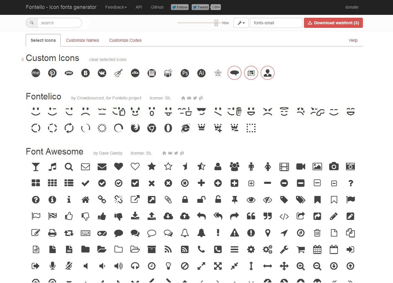
On the second tab (Customize Names), you can change the default names that will be used in the generated css. Since we called the files by class, we have nothing to do there. On the third tab, you can change the Unicode of each character in the font, thus associating it, for example, with certain letters. But we do not plan to use the font in the operating system, that is, we also skip this page. Click on the “Download webfont (3)” button and save the ready archive to the computer. In the archive we are interested in the folder “font” and the file “ittalk-font-small.css” from the folder “css”. Copy them into the subfolder “fonts” of our project and add to the “style-320.css” line at the very beginning of the file:
In the “ittalk-font-small.css” file, we change all the paths in @ font-face from '.. / font / ...' to 'small /'.
So, our links have icons. Not bad. Add some code to the CSS:
Hooray! We still have some icons. Do the same with medium and large sizes:
Style-720.css:
Style-big.css:
Demo intermediate version . Watch in Chrome or Firefox.
Pros :
Cons :
Now let's deal with the logo, along with the problem of monochrome icons. As you can see, it consists of four elements that gradually disappear with a change in the level of detail:


Prepare four SVGs (make sure the source files are the same height and width) in which each element is in its place relative to the overall composition, and make up the font of them. To do this, go to fontello, add the SVG and change on the third tab the binding to the letters “L”, ”o”, ”g” and a point, for example.
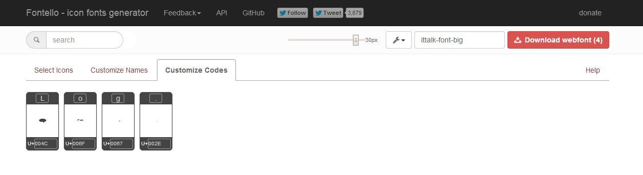
Name the font “ittalk-logo” and download the finished file. Unload the fonts into the “logo” subfolder and copy @ font-face from the “ittalk-logo.css” file (without forgetting to change the paths).
Add in all styles a few lines.
Style-480.css:
Style-720.css:
Style-big.css
NB : You may have to select the font size values, and under it - and padding-top, height and margin-left.
The logo is one-color, therefore elements are not visible. The easiest way to solve this is to spoil the semantics of the html file, add some “extra” tags to it.
It looks awful, but I remind you: we just sort out an interesting solution here in the fastest way =).
Next, add the rules to all styles:
Style-big.css
Style-720.css
Style-480.css
Voila! We have responsive icons without using SVG and high-resolution raster images. Icons that change the detail depending on the width of the screen.
View the demo here . You can change the width of the window and watch the result or open it on your mobile phone and rotate the screen. Watch on the desktop better in Chrome or Firefox.
In conclusion, I would like to remind you that all the code, all the illustrations are presented here, only to show the possibilities of working with Adaptive icons. Of course, the icons are bad, and the structure of the project leaves much to be desired, it would be possible to make conditions repeated in each style file, it was possible to refactor the code, create more styles for black and white screens and much more. But the purpose of the article is not in this, but in presenting a new look at trends, their combination and the creation of a cool solution that may be useful in some places.
I hope you were interested, and you learned a little new things for yourself that will be useful in the development of sites. Good luck!
Author: Artem Markushev
Today we talk about responsive icons and a couple of life hacking with font icons.
')
Prehistory About trends
Recently, the trend of “responsive design” is gaining momentum. The idea embodied in this methodology is modified in real time, supplemented and overgrown with new functions. I am not a fan of trends and fashion as such; I have not developed mutual love with them. But in the professional sphere, everything is different: here the trends rule the ball, and throwing them out just does not work.
Trend first. Continuing the expansion of Responsive design.
Responsive and responsive design continues to capture virtual space and our screens. The presence of a separate mobile version of the site, most likely, will disappear even from such adherents as Facebook and Twitter - more and more patterns and solutions appear for updating various functionalities and display via media queries and scripts.
Trend Two. Flat design.
Originating in early 2013, by the end of its trend has captured the minds of web developers. What is the reason for the popularity of flat design?
- Ease of perception . Minimalism (correct, of course) has always been distinguished by the ease of textures and the freedom that design, content and structure breathe.
- The scope and ease of development . Flat design is as simple as a square and, in most cases, you don’t need to have a three GB storage with graphic references.
- Lightness Especially valuable property in the era of mobile Internet. Flat design can operate with images with a minimum of colors, or even do without them. And with the support and popularization of SVG that appeared in browsers, it is possible to use vector graphics.
These are the main positive properties of flat-design, causing its growing popularity.
Trend Three. Icon Fonts.
Quite a fresh trend in the world of web design. The idea is simple: create a set of SVG images, and then collect them with a special service that outputs a set of several CSS files for different purposes, the actual font in EOT, SVG, WOFF and even TTF formats that can be installed into the system and use, for example, in a graphical editor. Unfortunately, font icons are devoid of some of the charms of SVG, for example, coloring individual elements of one icon, but in most cases you can go to these sacrifices or circumvent them with some tricks.
Adaptive icons
I turn to the main topic of the article - a pattern that incorporates all the above trends and the idea of Joe Harrison Responsive Icons , the essence of which is very simple. When the window size is changed, the detailing of the icon also changes to always correspond to the screen capabilities and not create pixelated noise at low resolution.
Let's get started Let's say we have this design in three sizes:
As you can see, in each version, all the icons are different. Let's try to solve this problem without sprites.
The first approach to creating responsive icons
Following the methodology of the Progressive enhancement, to begin with, we will create a simple markup for our file (let's leave the logo for later, let's do the lower icons first):
<!DOCTYPE html> <html> <head> <link rel="stylesheet" type="text/css" href="style-480.css" media="screen and (max-width:480px)"> </head> <body> <header class="logo-container"> <div class="logo">Logo</div> </header> <div class="content"> <a href="#" class="icon icon-announces">Announces</a> <a href="#" class="icon icon-partners">Partners</a> <a href="#" class="icon icon-news">News</a> </div> </body> </html> Next, let's do the styles. Following the practice of Mobile first, we first create a style for the minimum size:
body { background-color: #f0f0f0; text-align: center; } a { text-decoration: none; } .icon { display: inline-block; color: #919191; margin-bottom: 20px; width: 100%; } We do not yet have icons, so we make SVG from mobile design icons, call them according to our classes: announces, partners and news. Note that the entire icon in the SVG must be a single figure (single compound path). We go to the service (I use fontello.com ), create a font there and call it, say, ittalk-font-small:
On the second tab (Customize Names), you can change the default names that will be used in the generated css. Since we called the files by class, we have nothing to do there. On the third tab, you can change the Unicode of each character in the font, thus associating it, for example, with certain letters. But we do not plan to use the font in the operating system, that is, we also skip this page. Click on the “Download webfont (3)” button and save the ready archive to the computer. In the archive we are interested in the folder “font” and the file “ittalk-font-small.css” from the folder “css”. Copy them into the subfolder “fonts” of our project and add to the “style-320.css” line at the very beginning of the file:
@import "fonts/ittalk-font-small.css"; body { ... In the “ittalk-font-small.css” file, we change all the paths in @ font-face from '.. / font / ...' to 'small /'.
So, our links have icons. Not bad. Add some code to the CSS:
@import "fonts/ittalk-font-small.css"; body { background-color: #f0f0f0; text-align: center; } a { text-decoration: none; } .icon { display: inline-block; color: #919191; margin-bottom: 20px; width: 100%; height: 80px; /* , */ line-height: 80px; /* */ overflow: hidden; /* . */ } .icon:before { width: 100%; font-size: 50px; } Hooray! We still have some icons. Do the same with medium and large sizes:
<!DOCTYPE html> <html> <head> <link rel="stylesheet" type="text/css" href="style-480.css" media="screen and (max-width:480px)"> <link rel="stylesheet" type="text/css" href="style-720.css" media="screen and (min-width:481px) and (max-width:720px)"> <link rel="stylesheet" type="text/css" href="style-big.css" media="screen and (min-width:721px)"> </head> <body> ... Style-720.css:
@import "fonts/ittalk-font-medium.css"; body { background-color: #f0f0f0; text-align: center; } a { text-decoration: none; } .icon { display: inline-block; color: #919191; width: 32%; height: 130px; line-height: 130px; overflow: hidden; } .icon:before { width: 100%; font-size: 72px; } Style-big.css:
@import "fonts/ittalk-font-big.css"; body { background-color: #f0f0f0; text-align: center; } a { text-decoration: none; } .icon { display: inline-block; color: #919191; width: 30%; height: 210px; line-height: 210px; overflow: hidden; } .icon:before { width: 100%; font-size: 128px; } Demo intermediate version . Watch in Chrome or Firefox.
Pros :
- Vectorness
- Little code.
- Easy to use and update.
- Flexibility.
- Lack of javascript
Cons :
- Maximum one color per icon.
- Additional downloads (fonts).
- Problems with support for older browsers.
The second approach to creating responsive icons
Now let's deal with the logo, along with the problem of monochrome icons. As you can see, it consists of four elements that gradually disappear with a change in the level of detail:
Prepare four SVGs (make sure the source files are the same height and width) in which each element is in its place relative to the overall composition, and make up the font of them. To do this, go to fontello, add the SVG and change on the third tab the binding to the letters “L”, ”o”, ”g” and a point, for example.
Name the font “ittalk-logo” and download the finished file. Unload the fonts into the “logo” subfolder and copy @ font-face from the “ittalk-logo.css” file (without forgetting to change the paths).
Add in all styles a few lines.
Style-480.css:
@import "fonts/ittalk-font-small.css"; @font-face { font-family: 'ittalk-logo'; src: url('fonts/logo/ittalk-logo.eot?39703710'); src: url('fonts/logo/ittalk-logo.eot?39703710#iefix') format('embedded-opentype'), url('fonts/logo/ittalk-logo.woff?39703710') format('woff'), url('fonts/logo/ittalk-logo.ttf?39703710') format('truetype'), url('fonts/logo/ittalk-logo.svg?39703710#ittalk-logo') format('svg'); font-weight: normal; font-style: normal; } body { background-color: #f0f0f0; text-align: center; } a { text-decoration: none; } .icon { display: inline-block; color: #919191; margin-bottom: 20px; width: 100%; height: 80px; /* , */ line-height: 80px; /* */ overflow: hidden; /* . */ } .icon:before { width: 100%; font-size: 50px; } .icon-logo { font-family: 'ittalk-logo'; display: inline-block; word-wrap: break-word; width: 1px; line-height: 0px; font-size: 180px; padding-top: 100px; height: 60px; margin-left: -0.7em; } Style-720.css:
@import "fonts/ittalk-font-medium.css"; @font-face { font-family: 'ittalk-logo'; src: url('fonts/logo/ittalk-logo.eot?39703710'); src: url('fonts/logo/ittalk-logo.eot?39703710#iefix') format('embedded-opentype'), url('fonts/logo/ittalk-logo.woff?39703710') format('woff'), url('fonts/logo/ittalk-logo.ttf?39703710') format('truetype'), url('fonts/logo/ittalk-logo.svg?39703710#ittalk-logo') format('svg'); font-weight: normal; font-style: normal; } body { background-color: #f0f0f0; text-align: center; } a { text-decoration: none; } .icon { display: inline-block; color: #919191; width: 32%; height: 130px; line-height: 130px; overflow: hidden; } .icon:before { width: 100%; font-size: 72px; } .icon-logo { font-family: 'ittalk-logo'; display: inline-block; word-wrap: break-word; width: 1px; line-height: 0px; font-size: 320px; padding-top: 200px; height: 60px; margin-left: -0.75em; } Style-big.css
@import "fonts/ittalk-font-big.css"; @font-face { font-family: 'ittalk-logo'; src: url('fonts/logo/ittalk-logo.eot?39703710'); src: url('fonts/logo/ittalk-logo.eot?39703710#iefix') format('embedded-opentype'), url('fonts/logo/ittalk-logo.woff?39703710') format('woff'), url('fonts/logo/ittalk-logo.ttf?39703710') format('truetype'), url('fonts/logo/ittalk-logo.svg?39703710#ittalk-logo') format('svg'); font-weight: normal; font-style: normal; } body { background-color: #f0f0f0; text-align: center; } a { text-decoration: none; } .icon { display: inline-block; color: #919191; width: 30%; height: 210px; line-height: 210px; overflow: hidden; } .icon:before { width: 100%; font-size: 128px; } .icon-logo { font-family: 'ittalk-logo'; display: inline-block; word-wrap: break-word; width: 1px; line-height: 0px; font-size: 640px; padding-top: 300px; height: 120px; margin-left: -0.75em; } NB : You may have to select the font size values, and under it - and padding-top, height and margin-left.
The logo is one-color, therefore elements are not visible. The easiest way to solve this is to spoil the semantics of the html file, add some “extra” tags to it.
<!DOCTYPE html> <html> <head> <link rel="stylesheet" type="text/css" href="style-480.css" media="screen and (max-width:480px)"> </head> <body> <header class="logo-container"> <div class="logo"> <span class="icon-logo"> L<b>o</b><i>g</i><s>.</s> </span> </div> </header> <div class="content"> <a href="#" class="icon icon-announces">Announces</a> <a href="#" class="icon icon-partners">Partners</a> <a href="#" class="icon icon-news">News</a> </div> </body> </html> It looks awful, but I remind you: we just sort out an interesting solution here in the fastest way =).
Next, add the rules to all styles:
Style-big.css
.icon-logo { color: #1c82c4; } .icon-logo b { color: #acd03c; font-weight: normal; } .icon-logo i { color: #fff; font-style: normal; } .icon-logo s { color: #fff; text-decoration: none; } Style-720.css
.icon-logo { color: #1c82c4; } .icon-logo b { color: #acd03c; font-weight: normal; } .icon-logo i { color: #fff; font-style: normal; } .icon-logo s { display: none; } Style-480.css
.icon-logo { color: #1c82c4; } .icon-logo b { color: #acd03c; font-weight: normal; } .icon-logo i { display: none; } .icon-logo s { display: none; } Voila! We have responsive icons without using SVG and high-resolution raster images. Icons that change the detail depending on the width of the screen.
View the demo here . You can change the width of the window and watch the result or open it on your mobile phone and rotate the screen. Watch on the desktop better in Chrome or Firefox.
Conclusion
In conclusion, I would like to remind you that all the code, all the illustrations are presented here, only to show the possibilities of working with Adaptive icons. Of course, the icons are bad, and the structure of the project leaves much to be desired, it would be possible to make conditions repeated in each style file, it was possible to refactor the code, create more styles for black and white screens and much more. But the purpose of the article is not in this, but in presenting a new look at trends, their combination and the creation of a cool solution that may be useful in some places.
I hope you were interested, and you learned a little new things for yourself that will be useful in the development of sites. Good luck!
Author: Artem Markushev
Source: https://habr.com/ru/post/257505/
All Articles