Apple Watch Human Interface Guideline
Apple's official Apple Watch interface development guide is now in Russian! Alconost technical translators did their best . However, while this material was typed, Apple rolled out a new version of the guideline, so stay tuned to our blog.
')
IMPORTANT!
This is a preliminary document describing the API or technology under development. Apple provides this information so that you can plan the implementation of the technologies and software interfaces described here for Apple products. The information contained herein is subject to change, therefore software created using this document must be tested with the final versions of the operating system and use the final versions of the documentation. For future beta versions of the API or technology, new versions of this document may be created.
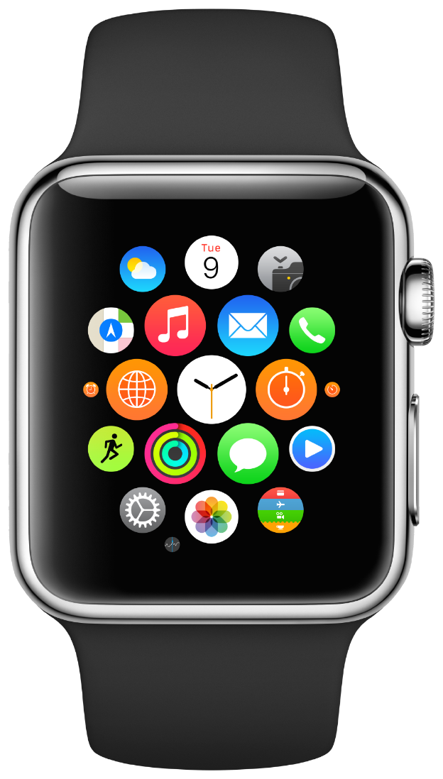
The Apple Watch device embodies the following concepts.
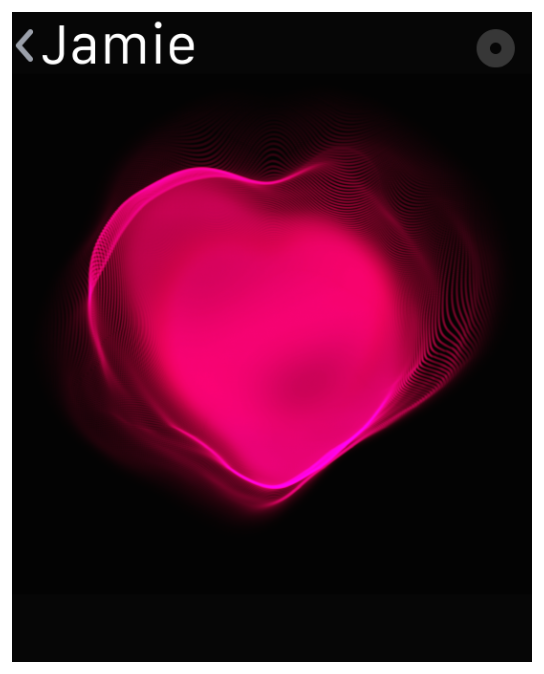
Personality Since the Apple Watch product is designed to be worn, so the user interface of the device adapts to the user's actions. For example, if you raise your wrist, time and new notifications will be displayed on the device screen. Thanks to the Digital Touch system (in particular, its Heartbeat and Sketch functions), you can use new types of personal communication. Using the accelerometer and heart rate sensor, you can get information about the daily activity of the device owner. None of the Apple devices has ever been so closely associated with its owner. When developing applications for the Apple Watch, you need to remember this connection.
Integrity. The Apple Watch device blurs the boundaries between a physical object and software. Digital Crown is a finely tuned hardware control that allows you to navigate in the application, taking into account a variety of nuances. The Taptic Engine system provides a soft physical response when notifying and interacting with interface elements on the screen. Force Touch is a hardware feature recognizing and interpreting physical gestures. It opens up completely new opportunities for contextual software controls. Even the physical border of the Retina display is taken into account, so the user interface design is designed in such a way that this border becomes invisible. You should think through the design of the application so as to increase the feeling of the unity of the hardware and software.
 Ease. Applications for Apple Watch are developed with the expectation of fast and simple interactions, during which the display of the watch is used most effectively, and the position of the watch on the wrist is also taken into account. The user can quickly and easily access information or remove it from the screen. This ensures confidentiality and convenience of work. For example, Short-Look alerts are short alerts. They display additional information only if the owner of the watch is interested in it. Glance controls display the information provided by applications in an easy-to-use interface that can be controlled by finger movements. In the process of developing applications for Apple Watch, it is necessary to take into account the fact that the owner of the device will use them often, on a small screen and spend a short time on them.
WatchKit apps complement the core iOS apps, not replace them. If the interaction time with an iOS application is measured in minutes, then the user will most likely interact with the WatchKit application in a matter of seconds. Therefore, it is necessary that interaction sessions with applications are short-lived and interfaces are simple.
In order to be able to launch your application, the Apple Watch device must be paired with an iPhone smartphone.
WatchKit applications support two navigation methods described below.
If it is necessary to organize a complex system of user interaction with the application, then usually a hierarchical rather than a simple page-based navigation model is better suited for these purposes.

On the dotted indicator, located at the bottom of each page, the position of the page in the set is displayed. To simplify navigation, you need to use as few pages as possible.
It is not possible to combine hierarchical and page interface styles. At the design stage, you must choose the style that best suits the content of your application, and its design.
Applications using these interface styles can display content modally. Modal interfaces allow the user to perform a task or obtain information without being distracted by interacting with the rest of the application. See section " Modal windows ".
Multiple finger gestures, such as compression gestures, are not supported on the Apple Watch device.
Previews are screens grouped in time and context with information from user applications. Each screen contains current data on its program. At the bottom of the preview left room for the scroll indicator.

Previews have the following features:
Create a preview based on the user's context . Unnecessary information reduces the benefit of the preview. Use your current time and location to offer only useful data here and now.
Use Handoff to connect with the WatchKit app. The previews send the application information about the user's actions with the preview using Handoff. WatchKit uses this information to tweak the application interface for the situation.
Show only useful information. For example, do not use the preview as a shortcut to launch the main application.
The Apple Watch alert system makes it easy to work with local and external notifications. Interaction with alerts occurs in two stages, for which there are short and full-sized interface options. Brief is called when a notification is received - at that moment a very limited set of information is displayed. If the user lowers the wrist, the preview disappears. The full interface is used when working with the clock or is called by pressing the short version. In this case, more information and opportunities are available, and the window is closed only at the request of the user.
Be careful with the frequency of sending alerts . The user may find the program notifications too frequent annoying and simply turn them off. Always ensure that alerts reflect current user needs.
The reduced previews are shown not for long and in order to understand where the notification came from. They are based on the template and contain the application name, its icon and the notification header. The name is shown by the main color of the program.
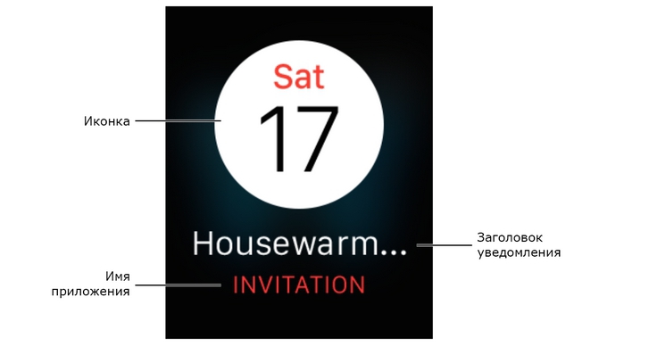
Use concise and informative headlines. The place for the title is limited, so it should have been short and relevant. Headings do not convey details, they only suggest.
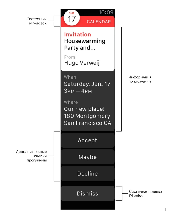
Full-size previews convey more information about the notification. The clock has a standard look for them, but you can change it to fit your needs and add the necessary graphics. The structure of the full interface is identical for all applications. At the top of the preview is the system header with the icon and the name of the program, and the Dismiss button is located at the bottom. The space between them is for information and additional buttons for your alerts.
Create static interfaces and, in addition to them, dynamic ones. Dynamic previews are more flexible in customization, but show the same information in alerts. Static interfaces are used when dynamic is not available.
Add up to four additional buttons. Apple Watch displays interaction buttons based on interactive notifications from iOS apps. These buttons are automatically substituted according to the category of notification, and complement the system Dismiss button.
Combine the header color with the gamut of the application. The color and transparency of the system header in the modified interface can be changed.
Detailed information on static and dynamic interfaces, as well as on setting action buttons is contained in the Apple Watch Programming Guide .
Modal windows are designed to perform a specific task by the user, get information without “background noise”, or continue the action started in the Menu control. To do this, modal windows temporarily limit user interaction with the main interface of the application.
It is best to minimize the use of modality in the program. Such interfaces are usually justified in the following cases:
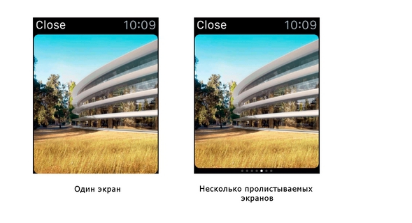
A modal interface consists of one or more screens, which are organized into scrollable pages. The only difference here is the presence or absence of a scroll indicator at the bottom. The upper left corner always contains the Close button. When clicking on it (or when swiping from the left edge), the system closes the modal window without further action.
Do not add a separate close button to the window . System Close is required, but you can always rename it to better fit the context. Typical naming options are Close or Cancel, and the color is always white.
Add an Accept button for tasks requiring consent. Use the standard button to accept - after pressing it, the necessary actions are performed with the subsequent closing of the modal window.
Try to make modal tasks easier . Avoid calling additional modal windows from the main one.
 Applications display the same interface regardless of the size of the Apple Watch. Relative positioning allows interface elements to fill the screen correctly.
Limit the number of closely located controls. Use icons instead of captions when placing buttons close to each other. Never place too close more than three elements - with a larger number they become too small to use.
Fully use the full width of the screen. Since the Apple Watch frame visually removes content from the edges, you do not need to add separate indents (note that there is no such frame in iOS Simulator).
Use left alignment. Interface elements are located from top to bottom and from left to right. Aligning along the left border leaves more room for expanding elements and placing content.
Create text buttons for the entire width of the screen. Buttons with captions are best not to limit in width, which will allow to fit the inscription completely.
 Use the context menu for minor actions. Instead of placing additional buttons, use the context menu. In it you can hide options that are called less often. See menu .
Content must be identical for different screen sizes. When placing items use relative dimensions and indents. This will allow the interface to change depending on the available screen space.
If possible, use one set of images for both displays. If the same graphics looks good enough on displays of different sizes, then it’s better to leave it that way. Otherwise, you may need a separate set of images for each display.
Readability is the guiding principle of using color and typography in an application.
Color helps to achieve visual integrity and compliance with the corporate style of the application.

Use black as background. Black background merges with the frame of the device, which creates the illusion of the screen without edges. Avoid light backgrounds in the interface.
Use the main color of the application to highlight the corporate identity or reflect the state of the application. There is a primary color for each application. The system uses it in the upper left corner for the title, in the alerts to highlight the program name and other important information. Use this color and to emphasize the corporate style of the application.
For text, use contrasting colors. With contrasting colors, the text is easier to read.
Avoid using color to emphasize the interactivity of an element. Use color for styling, but do not attempt to mark the interactivity of buttons and other controls in this way. Remember the different color perception. Most people with limited color perception hardly distinguish between red and green. Test applications to be sure that there are no places where red and green are used to distinguish between program states (some graphic editors offer special tools for finding problem combinations).
Study the perception of color by users of different countries and cultures. Everyone sees colors in their own way, and many cultures differ in their views on a particular color. If possible, check that the selected color will express exactly what is intended.
First of all, the text should be readable. If the user cannot read what is written, then the beauty of the outlines becomes meaningless.
The system font is created and optimized specifically for the Apple Watch. When the font size is large, the letters are condensed to take up less space in width. But when you decrease the size, they are placed more freely, and the character outline is optimized for better readability. Punctuation marks increase proportionally with pin size. When you resize text, Apple Watch dynamically redraws the font to preserve its clarity and readability.
Always use dynamic types. They give the application the following features:
ATTENTION
When using your own fonts, you still have the opportunity to change their proportions in accordance with the system settings. Your application is responsible for the correct response to user settings.
When using inline styles, you automatically get dynamic scaling. If you embed third-party fonts, then you will need to additionally take care of the correct operation of this function. For more information on the use of text styles and the correct response of the application to the system font settings, look in Text Styles .
If possible, use the built-in styles. Preset text styles are designed specifically for the Apple Watch and automatically support dynamic scaling.
Use one font for your application. The use of many styles spoils the visual unity of the application and creates a sense of carelessness.
When choosing a system font, proceed from the recommended values. Use San Francisco Text for lettering size 19 or less. For text larger than 20 points, San Francisco Display is better suited.
Beautiful, elegant animation well complements the user experience from Apple Watch and makes use of the device more dynamic and exciting. Correct animation:
Create pre-prepared animations from static images. Store the finished animations in WatchKit so that you can show them to the user without undue delay. Such animations at the same time will allow to achieve high FPS and overall smoothness. Dynamic animation creation through WatchKit extension and then loading into the watch adds a delay before playback.
If you need to control playback, use Image and Group objects. Most interface objects play animation endlessly. Only Image and Group offer the option of programmatically stopping and starting.
There are plenty of options to add corporate identity to the application: icons, colors, unique buttons and fonts, texts. When working on graphic design, remember that each element in itself should look and work perfectly. But, besides this, all embedded or third-party elements should be well combined with each other and look like a single whole.
When working with corporate style, try not to impose it. People use applications for a specific task or just for fun; they don't like being forced to watch ads. For a better User experience, gently remind the user about the brand with the help of fonts, company colors and pictures.
Do not be tempted to use the logo in the application or preview. The space on the clock screen is too small for the logo to eat off the useful space of the content. Moreover, the logos in the application and on the website perform different functions: users usually come to the site without a clear understanding of who owns it, but they usually see the program icon before launch.
Tags are designed to display static text.
Features tags:
Use tags to display short messages to the user. Tags - one of the most used elements of the application. Although they can display any amount of text, they are better suited for small volumes.
Tags must be well readable. Use contrasting text colors and dynamic fonts to fit them correctly. System fonts are very visual and therefore recommended for use in the Apple Watch. If you choose non-standard fonts, try not to sacrifice readability in favor of elegant design and unusual colors.
Maximum use system fonts. Ready-made system styles automatically support dynamic scaling and are designed with an emphasis on convenience and visibility.
For more detailed guidelines for working with text and dynamic scaling, see Color and typography .
The “image” object can display a single image or animation.
Features of the object:
Choose the correct image size for each Apple Watch option. Use the shared resource file where possible, but never stretch or compress the picture - it looks awful. Instead, make a set of images with different resolutions for the required number of watch models.
Create all pictures in the format @ 2x (High Resolution). Image options without Retina support are not needed.
Groups are useful for placing content in an interface and are containers for other objects. The group itself does not look at all, but for it you can choose a background color and a picture. Also, each group has attributes of positions, sizes, borders and other properties useful for marking.
Features of the group:
Groups are the main tools for working with markup. But they can also be used as a visual element due to the support of background colors and images.
When creating complex layouts, use nested groups. You can use nesting groups to place some elements vertically, and others horizontally. It may also be useful to use fields or intervals of an external group.
Choose the correct background image size for different Apple Watch displays. Use the shared resource file where possible, but never stretch or compress the picture - it looks awful. Instead, make a set of images with different resolutions for the necessary watch models.
The table displays the rows of data in one column. Use this type to display dynamically changing information.

Features:
Select your own type of content at the design stage. All string types must be preformed. When the application is running, you can choose which one to show right now.
Use the lines as intended. May require a separate version of the line for content, title and footnotes. In this case, do not show the title in the content string, and vice versa. Each type must display the data under which it was designed.
Do not mix strings with completely different content. When displaying content, be consistent in choosing the type of string. Separate types can be used as section breaks or to group lines. Working with a single string type in the table ensures that the content will be properly scaled and easy to read.
Limit the maximum number of lines displayed at a time. Tables of more than 20 rows are already hard to perceive and it is inconvenient to flip through them. Show as much information as you need right now; To load the rest, create a separate option.
Do not limit the table to groups. Tables change size dynamically according to the number of rows. As a result, any group height restrictions are ignored.
Buttons perform certain program actions.
Features:
The background of the button is usually called a platter. The color or image displayed in the platter can be changed while the application is running.
Create buttons across the entire width of the screen. It is highly desirable to use elements that occupy the entire width of the screen. If one button is not enough, then you should not fit more than two pieces in a row.
If possible, use the buttons of the same height. If several buttons are placed on the same screen at once, set the same height for each one.
Keep the standard corner radius. The default is the corner radius of 6 points.
The switch offers a choice of two mutually exclusive actions or states.
Switch features:
, — / /.
. .
Features:
, . - , .
. , . Maps.
, . WatchKit ; , .
, . , , Apple Watch.
. — , . .
, .

. WatchKit . .

.
Features:
, Date labels.

Features:
Timer label .
Retina- Apple Watch , . .
:
. , .
, . .
. . . .
.
, . - , , iOS.
, 20-1 . @2x (Xcode ).
20-1 WatchKit app
WatchKit Apple Watch iPhone . 20-2 . (Xcode ).
20-2 Apple Watch iPhone
. .
PNG. interlaced PNG; .
. — 24 ( 8 , ). -.
Apple Watch , . iOS-, . , . WatchKit- “ ” iOS, . iOS “” , .
, . , .
, . . , Mail , .
. , . , , . . .
. — .
iOS- . WatchKit “ ” iOS.
Apple Watch . , Apple Watch. 20-1.
Force Touch , -. .
21-1, (canvas) . , .
21-1
Use lines of such thickness that blend well with the design and complexity of the glyph. Do not use lines thinner than four pixels, otherwise the glyphs may become illegible. Refer to Figure 21-1.
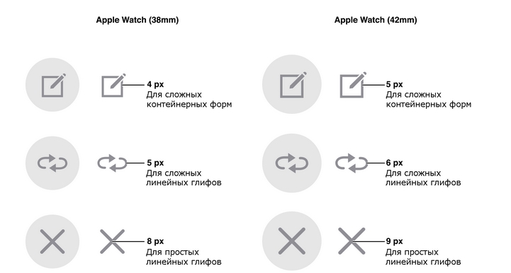
Figure 21-1 Glyph size for context menu
images Use PNG for all images and icons. Avoid interlaced PNG.
About the translator
The article is translated in Alconost.
Alconost is engaged in the localization of applications, games and websites in 60 languages. Language translators, linguistic testing, cloud platform with API, continuous localization, 24/7 project managers, any formats of string resources.
We also make advertising and training videos - for websites selling, image, advertising, training, teasers, expliners, trailers for Google Play and the App Store.
Read more: https://alconost.com
UI Design Basics
Creating a design for Apple Watch
')
IMPORTANT!
This is a preliminary document describing the API or technology under development. Apple provides this information so that you can plan the implementation of the technologies and software interfaces described here for Apple products. The information contained herein is subject to change, therefore software created using this document must be tested with the final versions of the operating system and use the final versions of the documentation. For future beta versions of the API or technology, new versions of this document may be created.
The Apple Watch device embodies the following concepts.
Personality Since the Apple Watch product is designed to be worn, so the user interface of the device adapts to the user's actions. For example, if you raise your wrist, time and new notifications will be displayed on the device screen. Thanks to the Digital Touch system (in particular, its Heartbeat and Sketch functions), you can use new types of personal communication. Using the accelerometer and heart rate sensor, you can get information about the daily activity of the device owner. None of the Apple devices has ever been so closely associated with its owner. When developing applications for the Apple Watch, you need to remember this connection.
Integrity. The Apple Watch device blurs the boundaries between a physical object and software. Digital Crown is a finely tuned hardware control that allows you to navigate in the application, taking into account a variety of nuances. The Taptic Engine system provides a soft physical response when notifying and interacting with interface elements on the screen. Force Touch is a hardware feature recognizing and interpreting physical gestures. It opens up completely new opportunities for contextual software controls. Even the physical border of the Retina display is taken into account, so the user interface design is designed in such a way that this border becomes invisible. You should think through the design of the application so as to increase the feeling of the unity of the hardware and software.
Ease. Applications for Apple Watch are developed with the expectation of fast and simple interactions, during which the display of the watch is used most effectively, and the position of the watch on the wrist is also taken into account. The user can quickly and easily access information or remove it from the screen. This ensures confidentiality and convenience of work. For example, Short-Look alerts are short alerts. They display additional information only if the owner of the watch is interested in it. Glance controls display the information provided by applications in an easy-to-use interface that can be controlled by finger movements. In the process of developing applications for Apple Watch, it is necessary to take into account the fact that the owner of the device will use them often, on a small screen and spend a short time on them.WatchKit apps complement the core iOS apps, not replace them. If the interaction time with an iOS application is measured in minutes, then the user will most likely interact with the WatchKit application in a matter of seconds. Therefore, it is necessary that interaction sessions with applications are short-lived and interfaces are simple.
Anatomy of an application
In order to be able to launch your application, the Apple Watch device must be paired with an iPhone smartphone.
Ways to navigate the interface
WatchKit applications support two navigation methods described below.
- Hierarchical . This method is similar to the navigation method used in iOS, and is best suited for applications with a hierarchical organization of information. In an application with a hierarchical structure, the user sequentially selects one element on each screen until the desired result is achieved. To perform another action, the user needs to go back a few steps, or even to the very beginning, and only then go through another branch of the hierarchy.
If it is necessary to organize a complex system of user interaction with the application, then usually a hierarchical rather than a simple page-based navigation model is better suited for these purposes.
- Page . The page interface allows the user to navigate from page to page by swiping his finger across the screen in a horizontal direction. Such an interface is best suited for applications with simple data models, in which the data on each page does not have a direct connection with the data on other pages.
On the dotted indicator, located at the bottom of each page, the position of the page in the set is displayed. To simplify navigation, you need to use as few pages as possible.
It is not possible to combine hierarchical and page interface styles. At the design stage, you must choose the style that best suits the content of your application, and its design.
Applications using these interface styles can display content modally. Modal interfaces allow the user to perform a task or obtain information without being distracted by interacting with the rest of the application. See section " Modal windows ".
Types of user interaction
- Events based on action . Touching the screen means choosing or interacting with an item. A single touch is the main way the user will interact with your application. Rows of tables, buttons, switches, and other items are controlled by touch. Information about them is transferred to the program code of your WatchKit extension.
- Gestures . The system processes all gestures and uses them to perform the following standard actions.
- If you drag your finger vertically across the display, the contents of the current screen will be scrolled.
- If you drag your finger horizontally, the previous or next page of the page interface will be displayed.
- If you swipe your finger near the left edge of the screen, you will be taken to the parent interface.
Multiple finger gestures, such as compression gestures, are not supported on the Apple Watch device.
- Force Touch function. The Retina display not only detects touches, but also determines the force with which the user's finger presses the screen. When information about a touch and its strength is detected, the system displays the context menu for the current screen (if provided). Using this menu, applications can display possible actions for the current content. See the “ Menu ” section.
- Digital Crown control. The Digital Crown hardware control allows you to use the adaptively configured accelerated scrolling function without blocking the Apple Watch device screen. With it, the user can easily scroll through long pages. In third-party applications, the Digital Crown control is available only to scroll the screen.
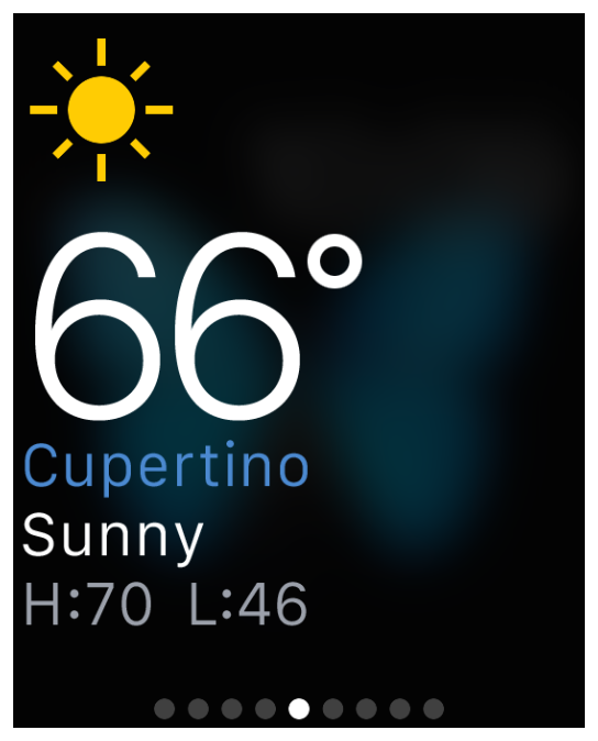
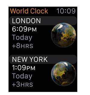
Preview
Previews are screens grouped in time and context with information from user applications. Each screen contains current data on its program. At the bottom of the preview left room for the scroll indicator.
Previews have the following features:
- Sample . There is a set of ready-made templates for the upper and lower half of the screen. You can select the appropriate one using Xcode.
- Non-leafing . All information such previews fit on one screen.
- Perform only one action . Clicking on any part of the preview opens a specific application screen.
- Optional . Not all applications need to constantly show something, so the user can hide and display the preview.
Create a preview based on the user's context . Unnecessary information reduces the benefit of the preview. Use your current time and location to offer only useful data here and now.
Use Handoff to connect with the WatchKit app. The previews send the application information about the user's actions with the preview using Handoff. WatchKit uses this information to tweak the application interface for the situation.
Show only useful information. For example, do not use the preview as a shortcut to launch the main application.
Alerts
The Apple Watch alert system makes it easy to work with local and external notifications. Interaction with alerts occurs in two stages, for which there are short and full-sized interface options. Brief is called when a notification is received - at that moment a very limited set of information is displayed. If the user lowers the wrist, the preview disappears. The full interface is used when working with the clock or is called by pressing the short version. In this case, more information and opportunities are available, and the window is closed only at the request of the user.
Be careful with the frequency of sending alerts . The user may find the program notifications too frequent annoying and simply turn them off. Always ensure that alerts reflect current user needs.
Brief Alerts
The reduced previews are shown not for long and in order to understand where the notification came from. They are based on the template and contain the application name, its icon and the notification header. The name is shown by the main color of the program.
Use concise and informative headlines. The place for the title is limited, so it should have been short and relevant. Headings do not convey details, they only suggest.
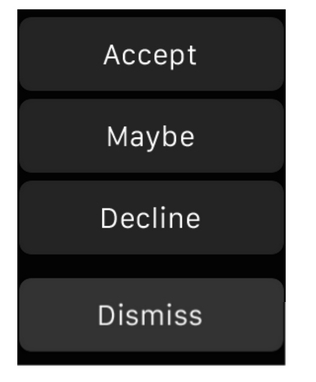
Customizable full-size alerts
Full-size previews convey more information about the notification. The clock has a standard look for them, but you can change it to fit your needs and add the necessary graphics. The structure of the full interface is identical for all applications. At the top of the preview is the system header with the icon and the name of the program, and the Dismiss button is located at the bottom. The space between them is for information and additional buttons for your alerts.
Create static interfaces and, in addition to them, dynamic ones. Dynamic previews are more flexible in customization, but show the same information in alerts. Static interfaces are used when dynamic is not available.
Add up to four additional buttons. Apple Watch displays interaction buttons based on interactive notifications from iOS apps. These buttons are automatically substituted according to the category of notification, and complement the system Dismiss button.
Combine the header color with the gamut of the application. The color and transparency of the system header in the modified interface can be changed.
Detailed information on static and dynamic interfaces, as well as on setting action buttons is contained in the Apple Watch Programming Guide .
Modal windows
Modal windows are designed to perform a specific task by the user, get information without “background noise”, or continue the action started in the Menu control. To do this, modal windows temporarily limit user interaction with the main interface of the application.
It is best to minimize the use of modality in the program. Such interfaces are usually justified in the following cases:
- Be sure to attract the user's attention.
- An independent task should be performed or explicitly rejected when it is necessary to ensure data integrity.
A modal interface consists of one or more screens, which are organized into scrollable pages. The only difference here is the presence or absence of a scroll indicator at the bottom. The upper left corner always contains the Close button. When clicking on it (or when swiping from the left edge), the system closes the modal window without further action.
Do not add a separate close button to the window . System Close is required, but you can always rename it to better fit the context. Typical naming options are Close or Cancel, and the color is always white.
Add an Accept button for tasks requiring consent. Use the standard button to accept - after pressing it, the necessary actions are performed with the subsequent closing of the modal window.
Try to make modal tasks easier . Avoid calling additional modal windows from the main one.
Layout
Applications display the same interface regardless of the size of the Apple Watch. Relative positioning allows interface elements to fill the screen correctly.Basic recommendations
Limit the number of closely located controls. Use icons instead of captions when placing buttons close to each other. Never place too close more than three elements - with a larger number they become too small to use.
Fully use the full width of the screen. Since the Apple Watch frame visually removes content from the edges, you do not need to add separate indents (note that there is no such frame in iOS Simulator).
Use left alignment. Interface elements are located from top to bottom and from left to right. Aligning along the left border leaves more room for expanding elements and placing content.
Create text buttons for the entire width of the screen. Buttons with captions are best not to limit in width, which will allow to fit the inscription completely.
Use the context menu for minor actions. Instead of placing additional buttons, use the context menu. In it you can hide options that are called less often. See menu .Screen size
Content must be identical for different screen sizes. When placing items use relative dimensions and indents. This will allow the interface to change depending on the available screen space.
If possible, use one set of images for both displays. If the same graphics looks good enough on displays of different sizes, then it’s better to leave it that way. Otherwise, you may need a separate set of images for each display.
Color and typography
Readability is the guiding principle of using color and typography in an application.
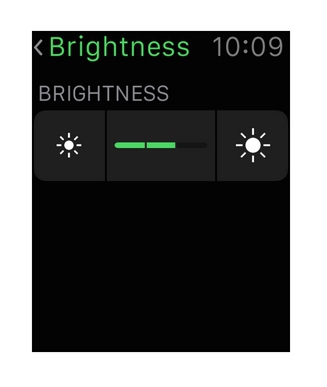
Colour
Color helps to achieve visual integrity and compliance with the corporate style of the application.
Use black as background. Black background merges with the frame of the device, which creates the illusion of the screen without edges. Avoid light backgrounds in the interface.
Use the main color of the application to highlight the corporate identity or reflect the state of the application. There is a primary color for each application. The system uses it in the upper left corner for the title, in the alerts to highlight the program name and other important information. Use this color and to emphasize the corporate style of the application.
For text, use contrasting colors. With contrasting colors, the text is easier to read.
Avoid using color to emphasize the interactivity of an element. Use color for styling, but do not attempt to mark the interactivity of buttons and other controls in this way. Remember the different color perception. Most people with limited color perception hardly distinguish between red and green. Test applications to be sure that there are no places where red and green are used to distinguish between program states (some graphic editors offer special tools for finding problem combinations).
Study the perception of color by users of different countries and cultures. Everyone sees colors in their own way, and many cultures differ in their views on a particular color. If possible, check that the selected color will express exactly what is intended.
Typography
First of all, the text should be readable. If the user cannot read what is written, then the beauty of the outlines becomes meaningless.
The system font is created and optimized specifically for the Apple Watch. When the font size is large, the letters are condensed to take up less space in width. But when you decrease the size, they are placed more freely, and the character outline is optimized for better readability. Punctuation marks increase proportionally with pin size. When you resize text, Apple Watch dynamically redraws the font to preserve its clarity and readability.
Always use dynamic types. They give the application the following features:
- automatic adjustment of letter spacing and line height for any size;
- the ability to specify different text styles for semantically different blocks, such as body text, footnotes or headings;
- the text will change correctly in accordance with the settings selected by the user (including large and high-contrast options).
ATTENTION
When using your own fonts, you still have the opportunity to change their proportions in accordance with the system settings. Your application is responsible for the correct response to user settings.
When using inline styles, you automatically get dynamic scaling. If you embed third-party fonts, then you will need to additionally take care of the correct operation of this function. For more information on the use of text styles and the correct response of the application to the system font settings, look in Text Styles .
If possible, use the built-in styles. Preset text styles are designed specifically for the Apple Watch and automatically support dynamic scaling.
Use one font for your application. The use of many styles spoils the visual unity of the application and creates a sense of carelessness.
When choosing a system font, proceed from the recommended values. Use San Francisco Text for lettering size 19 or less. For text larger than 20 points, San Francisco Display is better suited.
Animations
Beautiful, elegant animation well complements the user experience from Apple Watch and makes use of the device more dynamic and exciting. Correct animation:
- gives feedback and status reports;
- allows people to visualize the result of their actions.
Create pre-prepared animations from static images. Store the finished animations in WatchKit so that you can show them to the user without undue delay. Such animations at the same time will allow to achieve high FPS and overall smoothness. Dynamic animation creation through WatchKit extension and then loading into the watch adds a delay before playback.
If you need to control playback, use Image and Group objects. Most interface objects play animation endlessly. Only Image and Group offer the option of programmatically stopping and starting.
Branding
There are plenty of options to add corporate identity to the application: icons, colors, unique buttons and fonts, texts. When working on graphic design, remember that each element in itself should look and work perfectly. But, besides this, all embedded or third-party elements should be well combined with each other and look like a single whole.
When working with corporate style, try not to impose it. People use applications for a specific task or just for fun; they don't like being forced to watch ads. For a better User experience, gently remind the user about the brand with the help of fonts, company colors and pictures.
Do not be tempted to use the logo in the application or preview. The space on the clock screen is too small for the logo to eat off the useful space of the content. Moreover, the logos in the application and on the website perform different functions: users usually come to the site without a clear understanding of who owns it, but they usually see the program icon before launch.
User Interface Elements
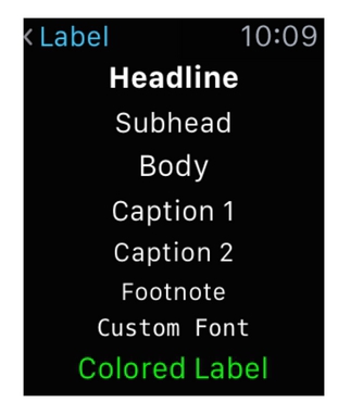
Labels
Tags are designed to display static text.
Features tags:
- display of static text of any size is possible;
- do not involve direct user interaction;
- software update is available;
- may take several lines.
Use tags to display short messages to the user. Tags - one of the most used elements of the application. Although they can display any amount of text, they are better suited for small volumes.
Tags must be well readable. Use contrasting text colors and dynamic fonts to fit them correctly. System fonts are very visual and therefore recommended for use in the Apple Watch. If you choose non-standard fonts, try not to sacrifice readability in favor of elegant design and unusual colors.
Maximum use system fonts. Ready-made system styles automatically support dynamic scaling and are designed with an emphasis on convenience and visibility.
For more detailed guidelines for working with text and dynamic scaling, see Color and typography .
Images
The “image” object can display a single image or animation.
Features of the object:
- just shows a picture, does not contain information and design by itself;
- does not involve user interaction;
- supports program management of start and stop animation.
Choose the correct image size for each Apple Watch option. Use the shared resource file where possible, but never stretch or compress the picture - it looks awful. Instead, make a set of images with different resolutions for the required number of watch models.
Create all pictures in the format @ 2x (High Resolution). Image options without Retina support are not needed.
Groups
Groups are useful for placing content in an interface and are containers for other objects. The group itself does not look at all, but for it you can choose a background color and a picture. Also, each group has attributes of positions, sizes, borders and other properties useful for marking.
Features of the group:
- Places objects horizontally or vertically;
- contains at least one object UI;
- there are attributes to adjust the boundaries and distances between the elements of the group;
- can display a solid color or image as a background;
- it is possible to set the corner radius for the background and content.
Groups are the main tools for working with markup. But they can also be used as a visual element due to the support of background colors and images.
When creating complex layouts, use nested groups. You can use nesting groups to place some elements vertically, and others horizontally. It may also be useful to use fields or intervals of an external group.
Choose the correct background image size for different Apple Watch displays. Use the shared resource file where possible, but never stretch or compress the picture - it looks awful. Instead, make a set of images with different resolutions for the necessary watch models.
Tables
The table displays the rows of data in one column. Use this type to display dynamically changing information.
Features:
- supports different types of strings;
- scrolls through;
- allows selection of a background color or picture;
- user can interact with strings.
Select your own type of content at the design stage. All string types must be preformed. When the application is running, you can choose which one to show right now.
Use the lines as intended. May require a separate version of the line for content, title and footnotes. In this case, do not show the title in the content string, and vice versa. Each type must display the data under which it was designed.
Do not mix strings with completely different content. When displaying content, be consistent in choosing the type of string. Separate types can be used as section breaks or to group lines. Working with a single string type in the table ensures that the content will be properly scaled and easy to read.
Limit the maximum number of lines displayed at a time. Tables of more than 20 rows are already hard to perceive and it is inconvenient to flip through them. Show as much information as you need right now; To load the rest, create a separate option.
Do not limit the table to groups. Tables change size dynamically according to the number of rows. As a result, any group height restrictions are ignored.
Buttons
Buttons perform certain program actions.
Features:
- contain custom background;
- the corners of the buttons are rounded so that it is easier to distinguish them from other elements;
- can be added with a label or a group object.
The background of the button is usually called a platter. The color or image displayed in the platter can be changed while the application is running.
Create buttons across the entire width of the screen. It is highly desirable to use elements that occupy the entire width of the screen. If one button is not enough, then you should not fit more than two pieces in a row.
If possible, use the buttons of the same height. If several buttons are placed on the same screen at once, set the same height for each one.
Keep the standard corner radius. The default is the corner radius of 6 points.
Switches
The switch offers a choice of two mutually exclusive actions or states.
Switch features:
- plays the role of a binary status indicator;
- always contains an explanation label.
, — / /.
(Slider)
. .
Features:
- ;
- , ;
- ;
- .
, . - , .
. , . Maps.
, . WatchKit ; , .
, . , , Apple Watch.
. — , . .
, .
. WatchKit . .
,
.
Date labels
Features:
- , ;
- ;
- WatchKit.
, Date labels.
Timer Labels
Features:
- ;
- ;
- WatchKit.
Timer label .
Menu
Retina- Apple Watch , . .
:
- , ;
- , ;
- ;
- , .
. , .
, . .
. . . .
.
, . - , , iOS.
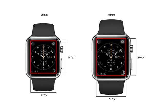
, 20-1 . @2x (Xcode ).
20-1 WatchKit app
| Apple Watch (38mm) | Apple Watch (42mm) | |
| 48 . | 55 . | |
| 80 . | 88 . | |
| 80 . | 80 . | |
| 172 . | 196 . |
WatchKit Apple Watch iPhone . 20-2 . (Xcode ).
20-2 Apple Watch iPhone
| @2x | @3x | |
| 58 . | 87 . |
. .
PNG. interlaced PNG; .
. — 24 ( 8 , ). -.
Apple Watch , . iOS-, . , . WatchKit- “ ” iOS, . iOS “” , .
, . , .
, . . , Mail , .
. , . , , . . .
. — .
iOS- . WatchKit “ ” iOS.
Apple Watch . , Apple Watch. 20-1.
Force Touch , -. .
21-1, (canvas) . , .
21-1
| Content | ||
| Apple Watch (38mm) | 70 . | 46 . |
| Apple Watch (42mm) | 80 . | 54 . |
Use lines of such thickness that blend well with the design and complexity of the glyph. Do not use lines thinner than four pixels, otherwise the glyphs may become illegible. Refer to Figure 21-1.
Figure 21-1 Glyph size for context menu
images Use PNG for all images and icons. Avoid interlaced PNG.
About the translator
The article is translated in Alconost.
Alconost is engaged in the localization of applications, games and websites in 60 languages. Language translators, linguistic testing, cloud platform with API, continuous localization, 24/7 project managers, any formats of string resources.
We also make advertising and training videos - for websites selling, image, advertising, training, teasers, expliners, trailers for Google Play and the App Store.
Read more: https://alconost.com
Source: https://habr.com/ru/post/257317/
All Articles