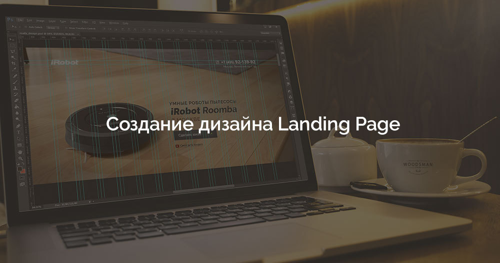
Creating a Landing Page Design
Landing Page - (hereinafter referred to as the Landing Page ) is a one-page website constructed in such a way as to ensure the collection of contacts for the maximum number of target visitors and maximum conversion in the context of its use.
When developing landing pages, you may encounter two main problems that can lead a developer to a stupor or seriously affect the final result not for the better. The first problem is stupid "selling" content. The second problem is slop clearance. Landing pages that have good content and look decent are extremely rare. Most often, landing pages are dull slag.
')
So let's learn how to create high-quality and beautiful landing pages. We divide the lesson into 3 parts. Content , Design and Practice .
The chronology of the presentation of the material will go from the beginning to the end, so that you can safely take this article into service when developing your next selling masterpiece. Here I will try to collect and take into account absolutely everything related to the experience of mankind in the development of landing pages and what really works, while this format of sales is still relevant.
After the theory, in the “ Practice ” section, we will create a design, I’m not afraid of this word, the “correct” landing page, taking into account all the rules and recommendations considered.
Part 1. Content Landing Page
1.1 Text is everything
First of all, you need to write the text. Just write text, open Word and write text. Title text, proposal text, review text. The problem of many, even experienced web designers, is that they start their work from the Photoshop window, not the text. You need to pull yourself together, have patience and do everything in order if you want to make a truly high-quality landing page, and not to produce another dull creation, which not only does not fulfill its function and is not a tool in principle, but also as a bonus, it negatively affects your overall well-being and causes frustration from your own incompetence when you hand over the project to the client.
About the text in order.
1.2 Landing Page Title
The first thing you need to understand is that the landing page is created not for a natural search results, but for advertising, for a specific query or requests for which the corresponding position or place on the site will be purchased. And here a lot of web designers are starting to mess up in full. They begin to invent some obscure headlines, such as - “You came to the right address”, “We are the best in the business”, “We are so cool that, in principle, we don’t even need to write about what we are doing”.
Do you understand what is wrong? If the user typed in the search box "iRobot Roomba Vacuum Cleaners in Moscow", then he is deeply violet who you are, how cool you are and how many years you have been on the market. He wants to see iRobot Roomba vacuum cleaners and be able to buy them in Moscow. The more precisely the title matches the search query, the better your landing page.
You can strengthen the title with the words “Best, fastest, most powerful”, etc. The result should be something like "Smart robots vacuum cleaners iRobot Roomba in Moscow." Feel free, it really works.
1.3 Less water in the text
Here lies a very hackneyed, not always obvious and, at the same time, a serious mistake. Water. The user feels the water, he reads the text until he is very hard to get sick of your text. And even if it were not for the text, but there was only a bright picture of the vacuum cleaner in the header with the price and the “Order” button - then 50 out of 100 could have bought this vacuum cleaner. But thanks to your text and the attempts in the writings for which you killed half a day - the target audience scatters in all directions with nauseous urges towards the pseudo-page and its author, in particular.
How to get rid of water? Support each statement with FACTS, FIGURES and GRAPHICS. You do not need to write “We have a lot of satisfied customers”, write how many happy customers, detail and segment customers. So many women bought a vacuum cleaner, so many bachelors were satisfied with the miracle device, so many hours this vacuum cleaner saved time, worked so many hours. Support each statement with figures or do not make a statement at all to save the visitor from the desire to embrace a white friend.
Get rid of unnecessary and unnecessary words. You do not need to be afraid that the page will be empty, you do not need to score it only in order “to be”. With proper work, as a result you will get a harmonious landing page. The main thing is do not rush.
1.4 Do not be fooled
If you are a designer of a landing page, you have a serious responsibility, you must ensure that all information is accurate. Very often, the client himself does not understand what horrible consequences deceit and unreliable information can lead to and with joy goes to the incompetent marketer or even offers to place such information on the page. All secret becomes clear, do not forget about it. Find the benefits that really exist , beat and present them beautifully. No need to invent something that is not and suck out of the finger the reputation of the client.
1.5 Benefit / Benefits
Write in the document the list of benefits that a potential buyer will receive by ordering a service or product on the landing page and make a brief description of each benefit. This is the only place where you need to seriously think and analyze all possible benefits.
But be careful. Sometimes the clients who ordered the landing page sent me a list of benefits that was, to put it mildly, sucked from the finger. Analyze the real benefits, not just those that the seller sees. His assessment, for obvious reasons, may not be objective and look rather silly in the eyes of a real buyer. Although this does not happen often, it is necessary to listen to the customer, as he worked with the product for quite a long time and can provide you with the necessary information. Analyze.
Try as interesting as possible to draw benefits in the design. Feel free to use infographics, characters, interesting visual design, markers. Work on this. Add an animation in the layout.
1.6 Indicate that a product or service is new.
Yes, no matter how strange it may sound, but the target audience is very disposed towards this kind of statement. The words "New", "New", "Modern", "Fresh" magically affect the conversion of the landing page is very positive. Feel free to, in general.
1.7 Be sure to post reviews
I will add. Post THESE REVIEWS . Imagine the situation, a potential client came to the landing page, got acquainted with the conditions, was ready to purchase the product, but came across typical, sugar reviews, and in addition, photos that they had already seen somewhere - or the same landing page, either in a photo bank, or in the results of search results. After the user feels deception - you will lose it forever. They buy from those they trust, those who lie will never buy .
Use only real reviews with real photos. Strain the customer to communicate with their best customers, it is not as difficult as it seems, but as a result you will be proud of their quality work.
Each review should begin with a headline, which can be an excerpt from the text of the review itself, describing the benefits for the client, for example, “ Thanks to the iRobot Roomba vacuum cleaner, I save about 20 hours of cleaning per month ... ”. After the title is the text of the review. Then, the name of the person who wrote the review and who he is is a family man, a gene. director, accountant, housewife, etc. It is important that the review is supported not only by a good title, but also by a photo of a real person. Emphasize the important achievements of the client (thanks to the product or service, of course) in the text with bold selection or color, respectively, and in the design during the design.
1.8 Money Back Guarantee
Money back guarantee at times increases the credibility of the seller and helps the visitor to the landing page easier to part with their money. Be sure to make such a microsection on the landing page, prepare the appropriate text for it in a text editor for quick formatting. It is also desirable to use a print or visual component, an icon next to the warranty text. Such an element will enhance the effect of perception.
Part 2. Landing Page Decoration
2.1 Product in action
The image of the goods in the cap or on the first screen is all. If you understand all the recklessness of writing empty, not supported by facts texts, then take this time to create a bright and colorful pictures of the goods in the cap. Take enough time for this. Experiment, improve the product or service in Photoshop until you get a decent result.
Very often, I have to observe such a shame as a pizza that looks rotten in a hat, a black and white picture of a car, an incomprehensible device flying in the air, and other errors. It is necessary to make so that the product or service wanted to purchase. If it is a pizza, let it be so appetizing, with melted cheese, bright, that you will want to eat it immediately. Add color to the product, haze, crisp crust. Within reason, of course. Show the product in action. If this application is for mobile devices, take the user with the phone and your software on board or, at worst, download the Mockup PSD with the phone in hand and place a screenshot of the application in working condition. Food display bright, hot and ready to eat. It should be in the cap. In addition, it would not be bad to put a video with the presentation of the product. Laconic title, button and product in action ...
2.2 Call-to-action button on the first screen
There is nothing complicated here - place the call-to-action button (“Order a vacuum cleaner”) on the first screen. This, of course, does not mean that you should not place this element anywhere else, just try to make it so that the visitor visiting the site sees the opportunity to purchase a product or order a service immediately.
Do not forget to duplicate the call-to-action button throughout the page, but do it competently. This button will look pretty silly in every section, after each element. Do not overdo it.
2.3 Forget about popanders
Forget about popanders who pop up regardless of the user's will. This relic of the development of the industry, unfortunately, sometimes still occurs. If in the first days you may notice some increase in requests, then after a while an extremely negative impression will be formed among the audience. If you intend to work in the market for a long time and fruitfully - do not use popanders.
Here we are not talking about the pop-up forms that appear when you click on the call-to-action buttons, the buttons that the user clicks on. Controlled pop-up forms work quite well and do not annoy the visitor.
2.4 Do not make a lot of fields in the forms.
All that a landing page is for is to collect a contact and send it to the manager for processing. Do not add to the feedback form extra fields. Name, telephone. Perhaps E-mail, according to the situation. But not more.
2.5 Feel free to show faces, addresses and phone numbers.
It’s trivial, but if a person sees on the landing page a card, phone or photos of employees, then he unconsciously trusts the project. I often have to convince customers not to be shy to show the faces of the organization, addresses and phone numbers. Apparently, the echoes of the 90s make themselves felt and the habit of hiding, just to buy and get rid of, originates in this period, after the collapse of the Union, when there were hard times and "We survived as we could."
On the landing page must be photos of managers, phone numbers and real contacts. The card is required if the company has a permanent address.
2.6 Post logos of famous brands
If the company for which you are developing a landing page, somehow worked with well-known brands, used the services, technology - be sure to list them at the bottom of the page. Usually this section is called “Our partners”.
So, we looked at the key points that need to be considered when developing the Landing Page. Let's combine all of the above in the next section, write text and create a landing page design in Photoshop.
We will develop the Landing Page, by the will of fate, for the iRobot Roomba Vacuum Cleaner . An example is absolutely random and came to mind in the process of writing this manual.
To pass the lesson, we need the source data that you can take from GitHub .
Part 3. Practice
3.1 Text Landing Page
So, after studying parts 1 and 2, we already have some idea of what the “correct” landing page should be. This is quite enough to write the text. Please note that the main recommendations were given above, but depending on the product or service, you can add your own points, sections and functionality - you need to study the object and think a little.
In addition, our product has a certain range that it would be strange not to present to a potential buyer.
Text.
- Cap: logo, image of vacuum cleaner, headline: “Smart robots vacuum cleaners iRobot Roomba in Moscow”, phone, address, button.
- Section with video: "iRobot Roomba in work." Under the video - the button.
- Section Model range (Photo - Price - Old price - Buy):
- Roomba 630
- Roomba 870
- Roomba 880
- Scooba 450
- Warranty. The text of the money back guarantee under the models.
- Section benefits:
- Title: "Advantages over a conventional vacuum cleaner"
- Subtitle: “This is an exceptionally“ smart ”equipment, which independently cleans the room and after completing the work returns to the station for recharging”
- #one. Saves time . You save your time and energy by spending it on more enjoyable activities.
- # 2. Does not need to be managed . The vacuum cleaner itself makes for itself the best route, thanks to the intelligent AWARE system.
- # 3. Compact . The equipment does not take up much space and works without connecting to the mains.
- #four. Self-charging The battery charge lasts for 2 hours, after which the robot returns to the platform for recharging.
- Section reviews. Photo - Name - Who is - Review text.
- Customer Support Section. Specialist's photo - name - contacts (phone, social network).
- Section Contacts. Address and map tagged.
3.2 Design
The end result of all the attempts can be found here .
Before we start doing design, let's define what needs to be considered when creating a design (general recommendations):
- Always consider the brand, product style, identity, if any, try to draw the site in the same style;
- Try to use no more than 3 colors in the design and several derived shades;
- Choose pleasant font combinations for design;
- Do not sculpt the elements close together - this is a sign of bad taste;
- Observe the vertical rhythm in the arrangement of the elements, give air to the design;
- Do not make too small leading (line-height) between the lines in text blocks;
- Do not use bad quality pictures in the design;
- Compress all graphics with TinyPng or similar tools.
- Before resizing an image, be sure to convert it to a smart object in Photoshop, in case you suddenly have to enlarge the image without losing quality.
- In this example, the maximum content width is 1170px (Bootstrap grid, a clean file in the references / bootstrap-1170.psd archive).
Now we will draw the design according to the text made in p. 3.1. We will not dive into the basics of working with Photoshop, consider the key points when creating the Landing Page design. All sections will be the full width of the layout, and the content within the grid Bootstrap. Install the Raleway fonts from the Fonts folder. You can see the sizes and colors in the references / ready_design.psd layout.
So, in the text.
- Cap: logo, image of vacuum cleaner, headline: “Smart robots vacuum cleaners iRobot Roomba in Moscow”, phone, address, button.
Place the logo on top, on the right - the phone number and address. Place the background image so that the vacuum cleaner is on the left (the first 6 columns of the grid), and the header of the landing page is on the right. In addition, we will place the order button and the pseudo link to watch the video.

- Section with video: "iRobot Roomba in work." Under the video - the button.
The section has a title and subtitle, do not forget.

- Section Model range (Photo - Price - Old price - Buy).
In the next section “Model range” we will display 4 devices. New price, old price and order button. The old price tells the visitor that the discount system is working and it has the opportunity to buy a device cheaper. Each item is placed in 3 columns of the grid.

- Warranty. The text of the money back guarantee under the models. This section is highly desirable, but if the seller does not have such an option in sales, you can not invent.

- Section benefits:
This section is also implemented in the grid as a model line, but we do not use the padding in the Bootstrap grid. When you hover the cursor, items change their appearance, the photo gradually increases (in layout).

- Section reviews. Photo - Name - Who is - Review text.
We implement as follows, without any special bells and whistles, within 10 columns, two of which are taken by a photo and a name, and 8 columns are reserved for the review itself. Reviews should be with headlines:

- Customer Support Section. Specialist's photo - name - contacts (phone, social network).
Required attribute of the landing page. Do not be lazy to get real pictures of the support product or service. In the grid we place as follows:

- Section Contacts. Address and map tagged.

You can get more detailed information about design elements, work methods by downloading PSD source code with a ready-made design from GitHub .
The post was prepared to make this world a little bit better.
Thanks for attention. Until.
Source: https://habr.com/ru/post/257211/
All Articles