7 things that every designer should know about the design of accessible sites
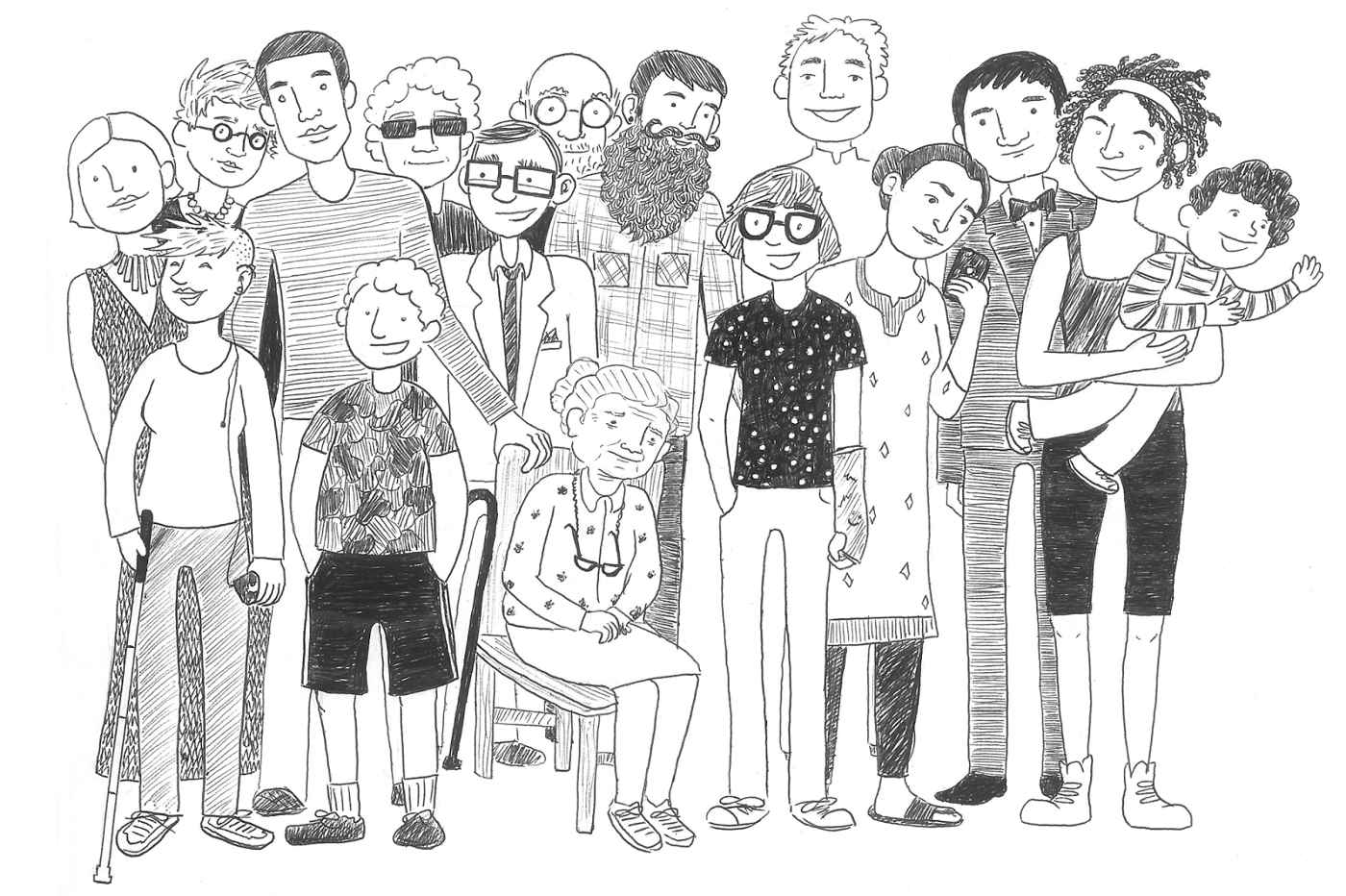
Accessibility allows people with disabilities to understand, move, interact and give feedback to websites. If all designers were well versed in how to make websites accessible, then only a bad design could hinder the use of websites.
1. Accessibility is not a barrier to innovation.
It is not necessary to make ugly, boring or crooked products. Accessibility imposes a set of restrictions that need to be taken into account.
')
Always remember that you are not designing for the sake of your colleagues. Design a website for a variety of people who will interact with your product.
These can be blind people, color blind, poorly seeing, deaf and hard of hearing, people with problems of the musculoskeletal system, etc. Develop websites for young, old, experienced users and beginners. Accept this set of rules as you accept any other set of design rules. This is just one of the challenges to creating amazing products.
2. Do not limit color to transmit information.
This will help users who have difficulty separating colors. 1 out of 12 men and 1 out of 200 women do not distinguish colors, 1 out of 30 people do not see well, 1 out of 188 people are blind.
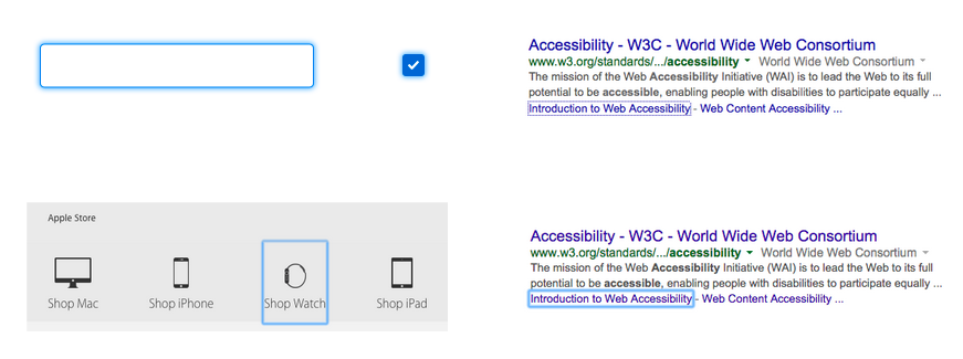
Use color to highlight or complement what is already visible. How many fields in the following example are in the error state? Most will say "one thing" - the captcha window contains an exclamation mark.
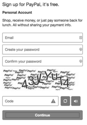
But if we look at the color version, it turns out that all four fields contain errors.
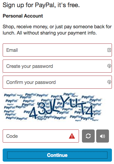
There are many ways to solve this problem. Add exclamation marks to all fields. Use text explaining where the error is. Tips, thick frames, bold text, underline, etc. There are many options - the main thing is not to use only color.
3. Make sure there is sufficient contrast between the text and the background.
According to the rules of WCAG ( Web Content Accessibility Guidelines 2.0 ), this contrast should be no less than 4.5 to 1. If the font size is 24 px or 19 px bold, then the minimum will be 3 to 1.
For example, if the text is 24 px, 19 px bold or more, then the gray tint of the color on a white background should not be lighter than # 959595.
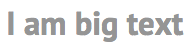
For smaller text, you must use at least # 767676. If the background is gray, the text should be darker.
There are some great palette selection tools - Color Safe , WebAIM's Color Contrast Checker .
Logos or those elements that are currently disabled (disabled) are an exception to the rule. Placeholder is NOT an exception.
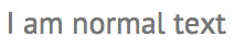
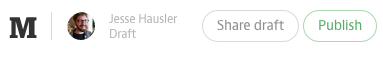
Here is an example from a popular blog site with text below normal contrast. Only the letter M corresponds to the norm:
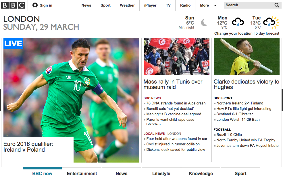
The following example from the BBC website shows the correct selection of colors - the lightest gray color of them is # 767676.
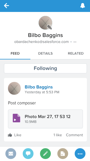
I proudly work in the Salesforce Design Systems team, where I accepted these standards for color contrast and, with their consideration, developed the Salesforce1 application:
Play with contrasts. Designers who have tried this practice once are amazed at how much more pleasant it becomes to work with contrasting designs.
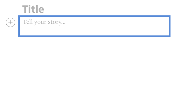
4. Mark visually where the input focus is.
First, thank css reset for the versatility and monotony that they brought to the web.
And now we will be scolded for spoiling the input fields with this formula:
:focus {outline: 0;} This makes it almost impossible to use the website from the keyboard. Fortunately, many popular css reset kits have already eliminated this directive.
It was included in the set for designers to replace it with something that is clearly visible and fits the style of the site.
Unfortunately, most designers did not create their own styles for focusing. These indicators are usually not found on the page.
Example: open the website of the company that made your phone. Press Tab to navigate the page. See the input focus designation? See it only for some links, but not for all? Imagine what this site will use to someone who does it exclusively from the keyboard.
If you remove the default focus, replace it with something better. Example: The BBC uses a color underscore to indicate focus:

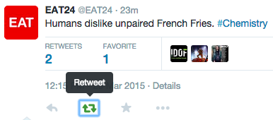
Twitter uses a combination of default focus and tooltips. The icon turns from gray to green. This is the whole three input focus indications.
If you make your own display - do not forget to remove the default one so that it does not work out like the following screenshot where the blue rectangle from Chrome is superimposed on the blue highlighting of the menu item.
5. Be careful with the forms.
Recently, forms have evolved. Designers discard traditional attributes and interactivity in favor of minimalism. Forms lack two important properties needed for accessibility: frames and labels.
Borderless Forms
Before you is an example of a traditional input field. This is a rectangle with clear frames. You can fill it with color, but not necessarily. There is also a label to the left of the field.
Users with mobility or recognition problems need a clear framework. When using adaptive input devices, you need to know the size and position of the field. It can be difficult for users with disabilities to find and interact with fields that do not have standard visual cues.
Here is an example of a search field for one popular recording application:
Where can I click to enter a search query? On the screen - only one input field. Can you determine where the field borders are?
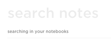
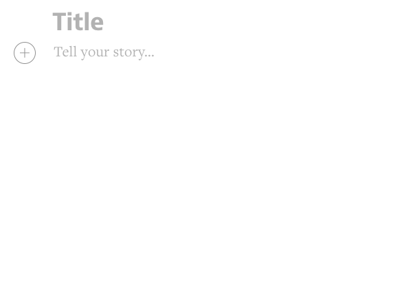
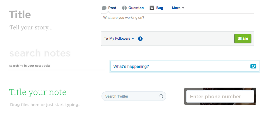
Here is another example of borderless fields from one of the popular blog platforms. Before you - two input fields. Where should I click to enter text in the “Tell your story” field?
But you have the same page, only with a frame.
Next is another example of the entry field. It does not use traditional input fields, but gives more cognitive information. The title is located between two horizontal lines, and text entry is performed after a click between the two bottom lines.
Forms without tags
Tags indicate the purpose of the field, and retain their usefulness even after entering information in the field. Placeholder is a bad replacement for a visual tag.
Usually they have no contrast. Of the few examples below, only one has a sufficient contrast of 4.5: 1.
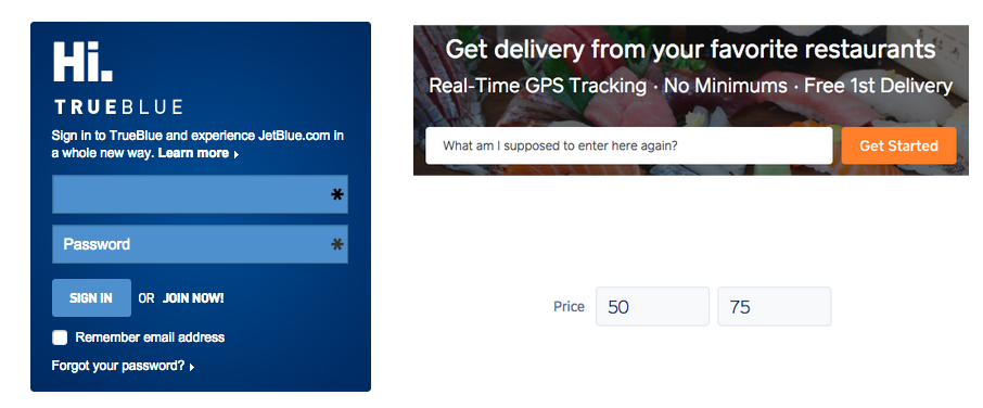
Text from placeholders disappears. In the examples below - what do I need to enter in these fields? On JetBlue's website - email, first name, last name, number? On site Caviar - dish, restaurant, address? Are the fields for the price minimum and maximum, more or less, or before and after?
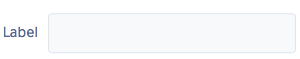
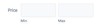
Here is a more convenient way to design fields for price. You can see the labels, min and max, even after entering data.
6. Define the meaning of the components more clearly.
Question: when the menu is no longer a menu?
Answer: when it ceases to be modal.
This is one of the biggest problems with the availability of websites. Check out W3C's Authoring Practices for Design Patterns (web design patterns and practices). It says how to create an accessible version of different parts of sites - menus, modal menus, autocompletion, trees, bookmarks, and more.
For all templates, a set of recommended HTML elements, keyboard behavior and the use of ARIA attributes ( Accessible Rich Internet Applications Suite , a technology standard developed by the consortium to enable people with physical disabilities to use the Internet) are specified. Attributes are intended for screen readers, and to tell how to use components from the keyboard. They report changes on the page when interacting with it. For example, they tell people that you need to use the down and up buttons to navigate through the menu.
Here is an example of a modest auto-completion input field:

But about the same thing, but with icons:
The user enters something in the input field. A rectangle appears below the input results. The user can use the up-down keys or the mouse to select an option.
And below is an example of auto-completion with a self-identification crisis. The user is offered not only the filter and the choice of options, they can also edit or delete items from the list through special icons. Autocompletion with hidden functions will not be able to tell about auxiliary devices about themselves.
Such a system breaks accepted field work with auto-completion from the keyboard. There are no specifications for it.
The same applies to the menu. In the examples below from the site of the Virgin, two approximately identical fields, but only the right popup - the menu. Left - non-modal dialogue.
A menu is a tool that offers the user several choices. As soon as we have several choices in one line (as on the left), this is no longer a menu. This is already a modified model of interaction with the keyboard, since instead of arrows it is necessary to use Tab. This is another input focus change system.
Non-modal dialogs can be made available. Understand their differences and how they affect user interaction with the site.
7. Do not force people to mouse in search of the right things.
This applies to people with limited mobility. This also applies to those who use only the keyboard, and those who use text-reading systems from pages like Dragon Naturally Speaking . They all count on the elements that are visible on the page. If they are not there, they cannot be “clicked” with a voice. If a user with a keyboard does not see a button, how can he go to the place where it “should appear”?
Below is a screenshot of Gmail, on which Dragon Naturally Speaking shows a layer with numbered links. The user pronounces the number and follows the link. What if the link is not visible until you hover the mouse over it? Will numbers appear next to empty places?
I understand why it has become fashionable to hide things until you hover over them. This is the introduction of the generally accepted rule formulated by Alan Kay:
Simple things should be simple, complex things should be possible.
Great, but this rule should be applied so that complex things are possible for all users. Unfortunately, many perceived this rule as:
Show the basic things, and minor things - hide before mouseover.
Do not hide actions and information - use other, more convenient alternatives.
- place secondary actions within the menu, or non-modal dialogs
- make the contrast of the secondary icons less bright, and increase it when you hover the mouse
- use the noticeable things that cause additional menus. Icon instead of empty space.
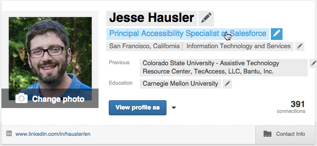
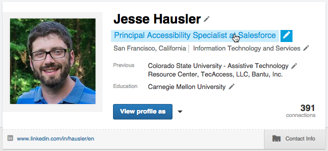
Here is an example from LinkedIn - profile:

And if I hover the mouse on this card:
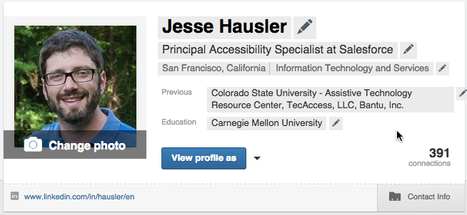
Suddenly, indicators appear that I can edit all the fields on the page. Further, if I cast on one of the fields, the text turns blue, indicating that there you can click:
Below is one of the solutions to the design problem, facilitating its use by some users. Smaller pencils next to the fields that are visible all the time.

And when I hover the mouse on the field, a blue color appears:
And then the designers will say:
But this makes the page heavier, isn't it?
Maybe. But this is only one solution to the problem. Moreover, this is just my profile on my page. How often do you view your profile? Would not this “weight” be justified in order to facilitate access to profile editing? What can be done if you do not like these pencils:
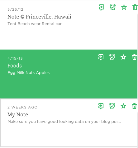
Here is another example with Evernote. List of notes. If you hover the mouse over a row, four icons appear.
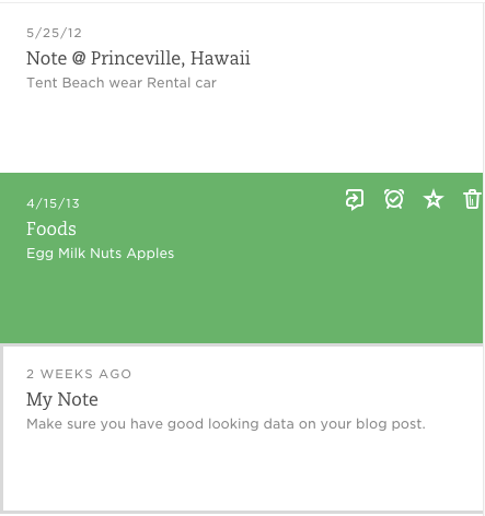
I would suggest the designer to leave them visible. They can be made green on white, and invert when you mouse over.
Perhaps this decision will also be "difficult", but we are not developing for designers. We make websites for a heterogeneous public, which has different needs and different tools for accessing computers.
At first it will seem to you that all these rules for using components limit your creativity. But, on the contrary, they encourage your creative beginning when you begin to find beautiful and at the same time affordable solutions for page design.
Source: https://habr.com/ru/post/257097/
All Articles