Material Design. Dynamic Toolbar on a live example
I am sure that those who are following the changes in the Android world have noticed that the Toolbar is starting to play an increasingly important role in applications. For example, in the latest version of the Gmail client, the Toolbar has almost all the functionality for working with mail, and in the new Google Chrome Toolbar is responsible for working with the text of the pages.
In this article I will try to talk about creating a dynamic Toolbar, which will allow the user to work with content in four different ways within one Activity. We will look at the whole Toolbar development process from the xml style files to the animation of the icons, and at the end of the article I will leave a link to the GitHub repository with an example of a fully working application.
We will develop a toolbar for an application that will allow the user to follow stock price changes. The main screen will display a list of all stocks the user is following, we also need to implement the basic functionality: deleting, searching and sorting stocks. This is how I implemented this functionality using the dynamic toolbar:
So, first of all we need to create an xml file of the Toolbar itself. I advise you to do this in a separate file, since in the future we will most likely want to use the same (or similar) Toolbar in all the Activities of our application.
')
res / layout / toolbar.xml
Now we can add toolbar.xml in xml Activity as follows:
res / layout / activity_main.xml
Since the Search widget will be located in our Toolbar, we can customize its appearance in the styles.xml file of our application. In the 21 versions of the Android SDK, there are much more possibilities for customizing the search widget (SearchView Widget), you can see the full list of attributes at this link: AppCompat v21 - Material Design for Pre-Lollipop Devices! In the same file we set the color of our toolbar.
res / values / styles.xml
And finally, create a file with a list of all the elements of our Toolbar. Here we have several options:
I chose the second option because we do not have so many elements inside the Toolbar and it makes no sense to save memory by storing only visible elements in it.
There are also two ways to create Toolbar elements:
I decided to use the menu method because, first, we don’t need to create our layout for the Toolbar. Secondly, we will have no problems with backward compatibility, and thirdly, we will avoid conflicts between the Toolbar and Navigation Drawer (the sidebar is present in the application and controlled by ActionBarDrawerToggle, which in turn works with MenuItem)
res / menu / menu_activity_main.xml
All xml files are created and now we can add Toolbar to the Activity. To begin, overwrite the onCreateOptionsMenu method, which is responsible for initializing the menu.
Now we will set the Toolbar as ActioanBar, this will provide us with backward compatibility with previous versions of Android (API Level <21).
You can see the full code for managing items in the sample repository on github, and in the article we will focus on the main methods:
To create the animation, I used the AndroidViewAnimations library. This library can animate any View class objects or class objects that inherit from View. The main problem we face when we want to create an animation for Toolbar elements is the lack of an object of the View class. We only have the MenuItem of the item we want to animate.
If we work with MenuItem, which we created ourselves, for example, with the search icon, then getting it to View is pretty easy:
Everything becomes complicated when we want to get a View of the Toolbar system element, for example, the back arrow, which becomes visible in search mode (see the screenshot of the search mode). Since we don’t know the id of this arrow, we’ll have to use Field , which allows us to gain dynamic access to any member of the class. In our cases, the “back” arrow is a member of the Toolbar class, but before we begin we need to know the name of the arrow inside the class. Go to the Android source code, open the Toolbar class and find our arrow on the 100th row under the name "mNavButtonView". An example of code in which we get the View Arrows and animate it:
In this article, we reviewed the process of creating a dynamic Toolbar and methods of working with its elements. Unfortunately, within the framework of one article it is impossible to consider absolutely all the nuances and disassemble all the code, so if you are interested in learning more, you can take a look at the application code that we used as a live example on GitHub .
In this article I will try to talk about creating a dynamic Toolbar, which will allow the user to work with content in four different ways within one Activity. We will look at the whole Toolbar development process from the xml style files to the animation of the icons, and at the end of the article I will leave a link to the GitHub repository with an example of a fully working application.
Let's start with the problem statement
We will develop a toolbar for an application that will allow the user to follow stock price changes. The main screen will display a list of all stocks the user is following, we also need to implement the basic functionality: deleting, searching and sorting stocks. This is how I implemented this functionality using the dynamic toolbar:
| Standard mode | Search mode | Deletion mode | Sort mode |
|---|---|---|---|
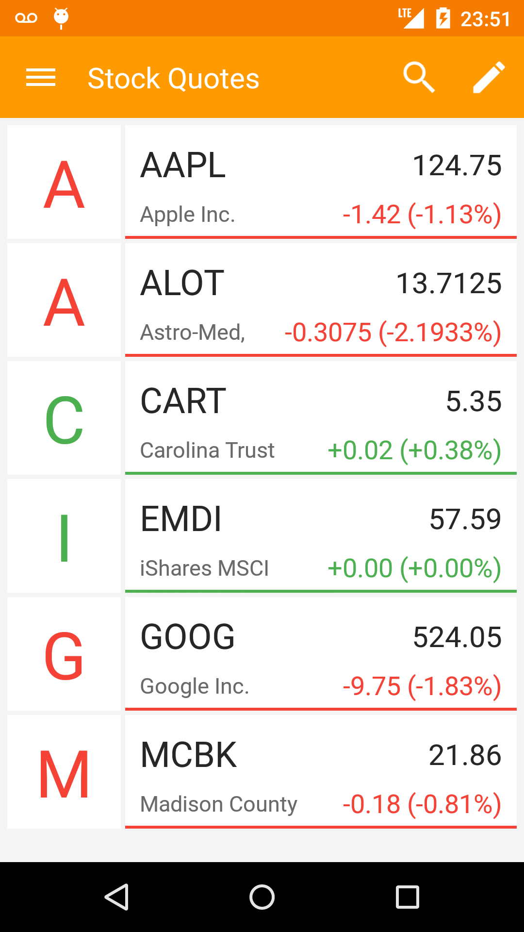 | 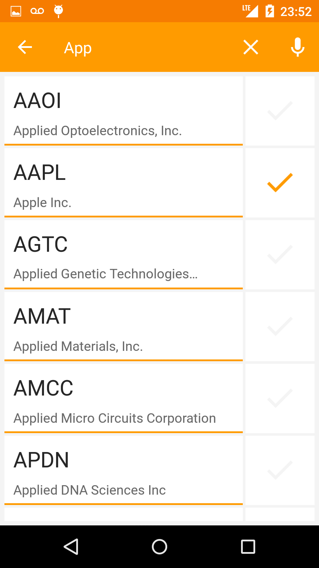 | 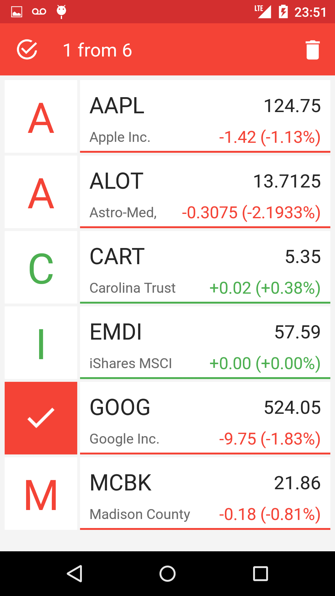 | 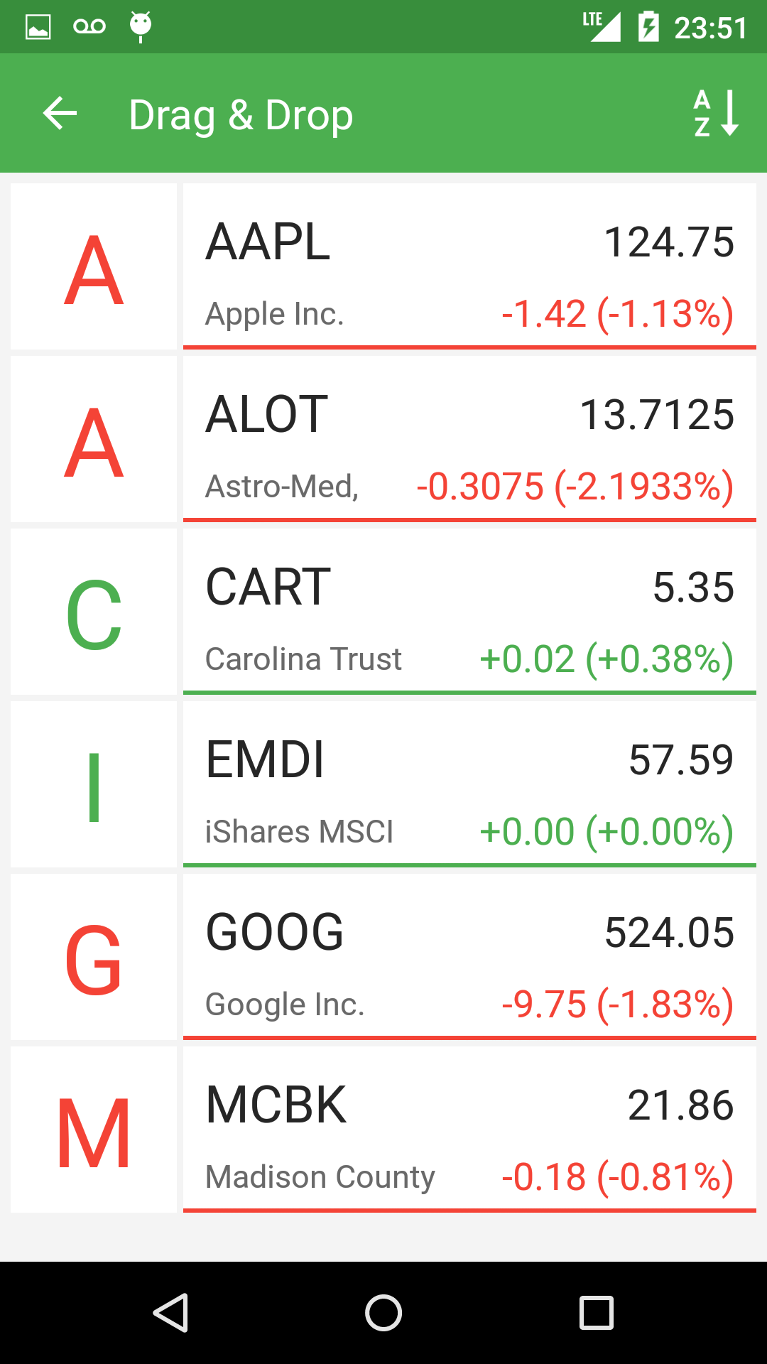 |
Create xml configuration files
So, first of all we need to create an xml file of the Toolbar itself. I advise you to do this in a separate file, since in the future we will most likely want to use the same (or similar) Toolbar in all the Activities of our application.
')
res / layout / toolbar.xml
<?xml version="1.0" encoding="utf-8"?> <android.support.v7.widget.Toolbar xmlns:android="http://schemas.android.com/apk/res/android" xmlns:app="http://schemas.android.com/apk/res-auto" android:id="@+id/toolbar_actionbar" android:layout_width="match_parent" app:theme="@style/ThemeOverlay.AppCompat.Dark.ActionBar" android:layout_height="?android:actionBarSize" android:background="@color/toolbar_orange"/> Now we can add toolbar.xml in xml Activity as follows:
res / layout / activity_main.xml
<include layout="@layout/toolbar" /> Since the Search widget will be located in our Toolbar, we can customize its appearance in the styles.xml file of our application. In the 21 versions of the Android SDK, there are much more possibilities for customizing the search widget (SearchView Widget), you can see the full list of attributes at this link: AppCompat v21 - Material Design for Pre-Lollipop Devices! In the same file we set the color of our toolbar.
res / values / styles.xml
<resources> <style name="AppTheme" parent="Theme.AppCompat.Light.NoActionBar"> <item name="colorPrimaryDark">@color/status_bar_orange</item> <item name="searchViewStyle">@style/AppSearchViewStyle</item> </style> <style name="AppSearchViewStyle" parent="Widget.AppCompat.SearchView"> <item name="android:textCursorDrawable">@drawable/white_cursor</item> <item name="queryBackground">@android:color/transparent</item> <item name="searchIcon">@drawable/icon_toolbar_search</item> <item name="closeIcon">@drawable/icon_toolbar_clear</item> <item name="queryHint">@string/search_hint</item> <item name="android:imeActionId">6</item> </style> </resources> And finally, create a file with a list of all the elements of our Toolbar. Here we have several options:
- At the beginning, create only those elements that will be visible in the standard mode, and then add or remove elements in the code when switching between modes.
- Immediately create all the existing elements in the xml file, and in the code simply manage their visibility.
I chose the second option because we do not have so many elements inside the Toolbar and it makes no sense to save memory by storing only visible elements in it.
There are also two ways to create Toolbar elements:
- Create items within a menu (Menu) as instances of the MenuItem class. This method was used in previous versions of Andrroid (API Level <21), when there was no Toolbar yet.
- Create all elements as normal View inside file toolbar.xml .
I decided to use the menu method because, first, we don’t need to create our layout for the Toolbar. Secondly, we will have no problems with backward compatibility, and thirdly, we will avoid conflicts between the Toolbar and Navigation Drawer (the sidebar is present in the application and controlled by ActionBarDrawerToggle, which in turn works with MenuItem)
res / menu / menu_activity_main.xml
<?xml version="1.0" encoding="utf-8"?> <menu xmlns:android="http://schemas.android.com/apk/res/android" xmlns:yourapp="http://schemas.android.com/apk/res-auto"> <item android:id="@+id/action_search" android:title="@android:string/search_go" android:icon="@drawable/icon_toolbar_search" yourapp:showAsAction="always|collapseActionView" yourapp:actionViewClass="android.support.v7.widget.SearchView" /> <item android:id="@+id/action_edit" android:title="@string/edit" android:icon="@drawable/icon_toolbar_edit" yourapp:showAsAction="ifRoom" /> <item android:id="@+id/action_micro" android:title="@string/microphone" android:icon="@drawable/icon_toolbar_micro" yourapp:showAsAction="always" /> <item android:id="@+id/action_remove" android:title="@string/remove" android:icon="@drawable/icon_toolbar_remove" yourapp:showAsAction="always" /> <item android:id="@+id/action_sort" android:title="@string/sort_ab" android:icon="@drawable/icon_toolbal_sort" yourapp:showAsAction="always" /> </menu> Add Toolbar to Activity
All xml files are created and now we can add Toolbar to the Activity. To begin, overwrite the onCreateOptionsMenu method, which is responsible for initializing the menu.
@Override public boolean onCreateOptionsMenu(Menu menu) { getMenuInflater().inflate(R.menu.menu_activity_main, menu); return true; } Now we will set the Toolbar as ActioanBar, this will provide us with backward compatibility with previous versions of Android (API Level <21).
@Override protected void onCreate(Bundle savedInstanceState) { Toolbar mActionBarToolbar = (Toolbar) findViewById(R.id.toolbar_actionbar); setSupportActionBar(mActionBarToolbar); } Toolbar control
You can see the full code for managing items in the sample repository on github, and in the article we will focus on the main methods:
- Method onOptionsItemSelected (MenuItem item) - called when any click on the item inside the Toolbar
- The onMenuItemActionExpand method (MenuItem item) is called when the search widget becomes active. In order for this method to be called up, you must implement the MenuItemCompat.OnActionExpandListener interface, and then set it for the MenuItem search:
MenuItemCompat.setOnActionExpandListener(searchMenuItem, this); //this - MenuItemCompat.OnActionExpandListener - OnMenuItemActionCollapse method - called when the search widget is closed, it also needs to implement the OnActionExpandListener interface. You can also call it artificially, for example, when the user presses the back button. Example:
@Override public void onBackPressed() { if (mode == Mode.SEARCH) searchMenuItem.collapseActionView(); }
Animating Toolbar Items
To create the animation, I used the AndroidViewAnimations library. This library can animate any View class objects or class objects that inherit from View. The main problem we face when we want to create an animation for Toolbar elements is the lack of an object of the View class. We only have the MenuItem of the item we want to animate.
If we work with MenuItem, which we created ourselves, for example, with the search icon, then getting it to View is pretty easy:
MenuItem searchMenuItem = menu.findItem(R.id.action_search); View searchItemView = findViewById(searchMenuItem.getItemId()); Everything becomes complicated when we want to get a View of the Toolbar system element, for example, the back arrow, which becomes visible in search mode (see the screenshot of the search mode). Since we don’t know the id of this arrow, we’ll have to use Field , which allows us to gain dynamic access to any member of the class. In our cases, the “back” arrow is a member of the Toolbar class, but before we begin we need to know the name of the arrow inside the class. Go to the Android source code, open the Toolbar class and find our arrow on the 100th row under the name "mNavButtonView". An example of code in which we get the View Arrows and animate it:
// View ImageButton btnToolbarButton = null; try { Toolbar mActionBarToolbar = (Toolbar) findViewById(R.id.toolbar_actionbar); Field fNavBtn = mActionBarToolbar.getClass().getDeclaredField("mNavButtonView"); fNavBtn.setAccessible(true); btnToolbarButton = (ImageButton) fNavBtn .get(mActionBarToolbar); } catch (NoSuchFieldException e) { e.printStackTrace(); } catch (IllegalAccessException e) { e.printStackTrace(); } // if(btnToolbarButton!=null) YoYo.with(Techniques.FlipInX).duration(850).playOn(btnToolbarButton); Conclusion
In this article, we reviewed the process of creating a dynamic Toolbar and methods of working with its elements. Unfortunately, within the framework of one article it is impossible to consider absolutely all the nuances and disassemble all the code, so if you are interested in learning more, you can take a look at the application code that we used as a live example on GitHub .
Source: https://habr.com/ru/post/256643/
All Articles