Interfaces "the user needs - it will still pass"
Here is the comic book "The Adventures of a Single User on an Order Form":
There are such interfaces that run to the end of 100 out of 100 users. Butbefore the battery only the ears get damned angry.
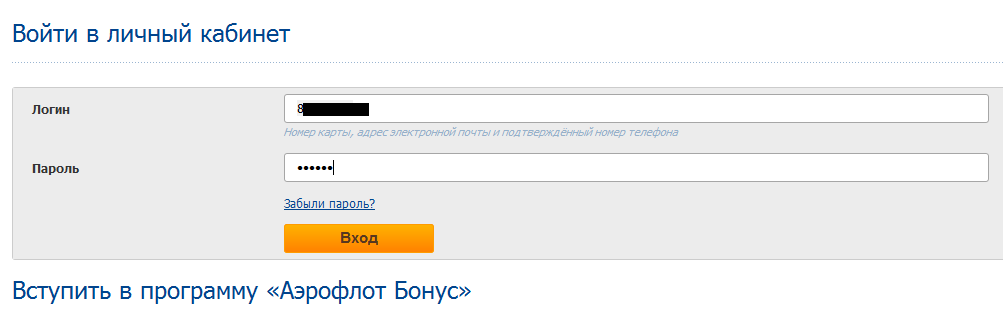
The application, for example, for a Schengen visa refers to an interface that does not need any improvement from the point of view of the final conversion. 100 people came for a visa, 100 people filled out. No problem, right?
')
But, of course, the problem is not in the final level of the quest, but in the effort spent on the road. And “I didn’t pass” - this is 300 rubles for a girl for correct filling with words of a traveler (as, for example, in the Greek embassy). All reach the end just because they are willing to go on such difficulties to get a visa.
The same applies to many interfaces. For example, if you see a laptop for 1000 rubles cheaper than in a “convenient” store, you will probably lose your temper and fill out the form. Even if it flushes all data when checking the page. If you send the phone in the form, you will again try and enter it the second time without +7, as the idiotic JS-check wants.
Or, if you fill out an application in the housing office from the third time, you will also do it, because in this case the service provider is a natural monopolist and you have no choice.
Let's see how this may look in less extreme cases, when it is not a matter of life and death, but just a small increase in convenience.
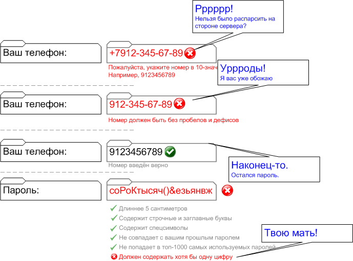
The form once (replenishing the balance WM, allows you to enter a number from Uzbekistan, for example):

Form two (damn beautiful replenishment of the cellular balance in Yandex.Money):
A similar form of replenishment of a single striped opsos (puts itself hyphens):

The forms above are definitely cool and immediately get rid of the questions how to enter the number. But I still think that Grandpa Raskin was right in terms of natural interfaces. Actually, I saw enough of everyone in the form of entering the phone and he repeatedly sent "not specified".
Our quick order form:

This form cannot be filled incorrectly. There are no asterisks, you can send a directly empty form, you can write anything in any field, we will filter. The task is to take an order. If a person is sealed - we have a phone and mail, we will decide (and usually enter everything). No boring verification.
If you send this form as in the screenshot above, it will be "Thank you, we will call you back."
City numbers were driven into the form by 6 digits, horseback healthy numbers from other countries, starting not at +7, numbers by 8, numbers in 10-digit format, two numbers each, two numbers indicating when to call, Naturally, the phrase "not specified" and even "only by mail, I am deaf and dumb."
But do not do this:
Bank card details - this is a real hell on input. At the Russian Railways, I remember, I turned the map three or four times and stupidly for a long time, how to enter the bank - using a period, hyphen, Russian or English letters (although the bank can be set by number). When I observe how this operation is done by older people, the most common jamb is not to find a CVV. There are still a lot of questions that fill in the name with “revolving” gift-type cards. Compare forms:
And this:

The result is likely to be the same: you have to pay for something - but imagine the user's emotions at the end.
And this is the place where I beat my head on the interface for about two minutes and at the same time regretted those pensioners who received cards for such activation:

Do you know the worst? This is not an activation form for first use, although the link on the card is given here. I have no chance to complete this form.
But the good practice of entering such pieces:

The field itself parses what is there, and it will understand, login is, mail or phone. And if the phone is in what format.
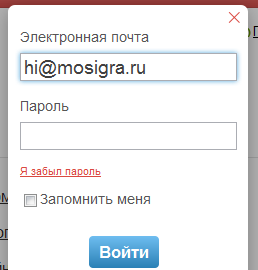
Most of all, as a user, I am frustrated by the need to re-enter data . Here is the most common case - a password reminder. Pay attention to the background. Guess what is already entered in the first form, and that they ask me again.

It reminds me of calls in support of Akado, when the first line first asks for the contract number and full name, then switches to the second one, so that they also ask for the contract number and full name.
"37 signals" simply substitute the email you entered earlier in the password recovery field - this once became good practice.
And this is how it can be solved more (our example):
It used to be in two windows, but it turned out that the user often enters mail, and then reads further. And happily clicks on "I forgot my password." An alert with "A new password sent message" pops up; the page is not even updated.
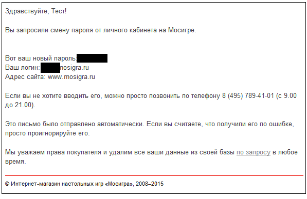
The phone in this letter also increases the percentage of successful solution of the problem. Calling is often easier, yes.
The letter, of course, is not perfect - you need to send a one-time token on the link immediately to the next step on the task on the site, and not to change the password, but this is still in the plans. In general, we now wool all our processes on such trifles. In six months I will show that I’ve dug out more.
Another completely fucking place - this is the first entry field of the city, then the street. Somewhere in the middle of entering the street to this city, KLADR is sometimes loaded, and everything entered into the street is erased. Well, block the field of the street, if such a strict logic in the order of input. This is a conflict between the designer and the developer - the first one drew, not understanding how it would work. And the second implemented, not understanding why users are so stupid. There are no guilty ones, but it is necessary to correct them.
We decided this: the delivery needs the nearest metro station and the exact address in normalized form. We try to show the KLADR hint, but if the user dismisses it, we start further and process it manually at our place. The clue should be shown to reduce input and avoid a situation where there are streets with the same name in two districts of the city. Or there is such a passage and an alley, for example. We don’t ask the Metro at all, but we automatically pull the Yandex.Maps API and specify it on the backend from there.
Another strange point of searching for such small human improvements is the search. I already wrote about what we have done before, so that a person, upon requests from the “tower”, “zhzhenga” or “l; tyuf”, finds exactly what the user was looking for.
There remains one more minor touch, which took 4 hours of work with the tests.
The condition is very simple:
- If there were hints in the search after several entered characters.
- And after the new symbol of the tips left.
- Then show up to the next character previous tips.
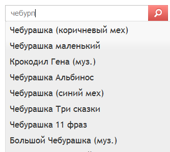
What for? I see that more percent of users are pressing backspace in the search field. The assumption was that the user types the first few letters of the search query, and then pokes at the hint. If two-three-four-five is typed correctly and one is wrong, there is nowhere to click. I stepped on a rake a couple of times on a tablet and constantly see just such a scenario for inexperienced users.
Another suspicion is that the user, who finds it difficult, looks at the keyboard and dials 2-3-4 characters of the request, expecting a hint to pop up later, and then looking back at the screen, check if everything has come up, and if not, no, he has allowed whether he is typos. Even if it printed obliquely, an inexperienced user will in most cases still look up to check what needs to be erased. And there he will be waited by a hint, which he (hopefully, with relief) will take advantage of.
After rolling a feature, the number of users using backspace in the search field decreased by 3.21%. The measurement error is at least 30% (that is, about 1 percent of 3.21%), but the result is still noticeable. Also, the number of search queries per user has slightly decreased (but within the framework of the error).
Did we continue those 4 hours for nothing? I dont know. I suspect that it is unlikely that we have made someone worse than this update, but at least a hundred users a month have helped a little. Even if ten of these hundreds did not notice their mistake and calmly stuck at the hint - ok, it will pay off.
But this form, suddenly, clearly helps the user to improve computer literacy. Although initially it was supposed to increase convenience by substituting the most frequent cities for this letter up.
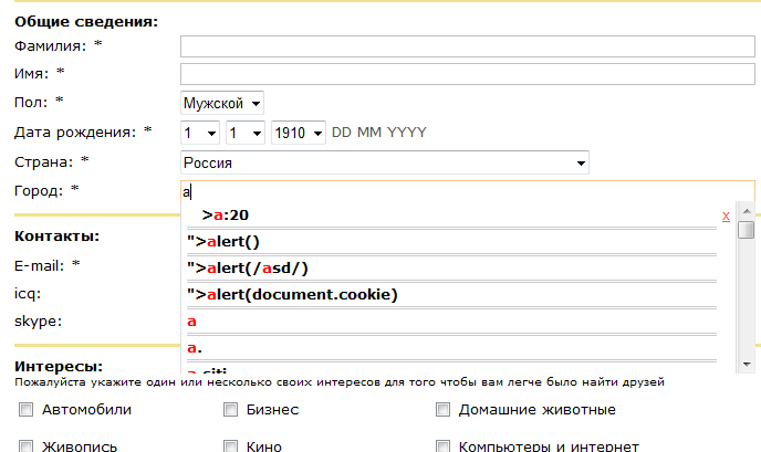
Best of all, the script has cleverly converted the Russian “a” into English too for tips. It was probably a robot butler with an English sense of humor.
There are such interfaces that run to the end of 100 out of 100 users. But
IRL Example
The application, for example, for a Schengen visa refers to an interface that does not need any improvement from the point of view of the final conversion. 100 people came for a visa, 100 people filled out. No problem, right?
')
But, of course, the problem is not in the final level of the quest, but in the effort spent on the road. And “I didn’t pass” - this is 300 rubles for a girl for correct filling with words of a traveler (as, for example, in the Greek embassy). All reach the end just because they are willing to go on such difficulties to get a visa.
The same applies to many interfaces. For example, if you see a laptop for 1000 rubles cheaper than in a “convenient” store, you will probably lose your temper and fill out the form. Even if it flushes all data when checking the page. If you send the phone in the form, you will again try and enter it the second time without +7, as the idiotic JS-check wants.
Or, if you fill out an application in the housing office from the third time, you will also do it, because in this case the service provider is a natural monopolist and you have no choice.
Let's see how this may look in less extreme cases, when it is not a matter of life and death, but just a small increase in convenience.
Examples
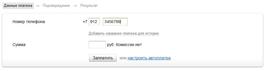
The form once (replenishing the balance WM, allows you to enter a number from Uzbekistan, for example):
Form two (damn beautiful replenishment of the cellular balance in Yandex.Money):
A similar form of replenishment of a single striped opsos (puts itself hyphens):
The forms above are definitely cool and immediately get rid of the questions how to enter the number. But I still think that Grandpa Raskin was right in terms of natural interfaces. Actually, I saw enough of everyone in the form of entering the phone and he repeatedly sent "not specified".
Our quick order form:
This form cannot be filled incorrectly. There are no asterisks, you can send a directly empty form, you can write anything in any field, we will filter. The task is to take an order. If a person is sealed - we have a phone and mail, we will decide (and usually enter everything). No boring verification.
If you send this form as in the screenshot above, it will be "Thank you, we will call you back."
City numbers were driven into the form by 6 digits, horseback healthy numbers from other countries, starting not at +7, numbers by 8, numbers in 10-digit format, two numbers each, two numbers indicating when to call, Naturally, the phrase "not specified" and even "only by mail, I am deaf and dumb."
But do not do this:
Another natural interface
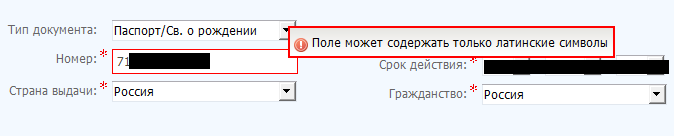
Bank card details - this is a real hell on input. At the Russian Railways, I remember, I turned the map three or four times and stupidly for a long time, how to enter the bank - using a period, hyphen, Russian or English letters (although the bank can be set by number). When I observe how this operation is done by older people, the most common jamb is not to find a CVV. There are still a lot of questions that fill in the name with “revolving” gift-type cards. Compare forms:
And this:
The result is likely to be the same: you have to pay for something - but imagine the user's emotions at the end.
Here is another example.
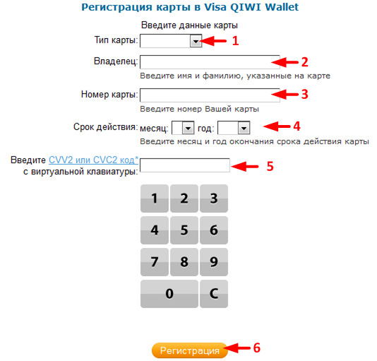
And this is the place where I beat my head on the interface for about two minutes and at the same time regretted those pensioners who received cards for such activation:
Do you know the worst? This is not an activation form for first use, although the link on the card is given here. I have no chance to complete this form.
But the good practice of entering such pieces:
The field itself parses what is there, and it will understand, login is, mail or phone. And if the phone is in what format.
Saving data
Most of all, as a user, I am frustrated by the need to re-enter data . Here is the most common case - a password reminder. Pay attention to the background. Guess what is already entered in the first form, and that they ask me again.
It reminds me of calls in support of Akado, when the first line first asks for the contract number and full name, then switches to the second one, so that they also ask for the contract number and full name.
"37 signals" simply substitute the email you entered earlier in the password recovery field - this once became good practice.
And this is how it can be solved more (our example):
It used to be in two windows, but it turned out that the user often enters mail, and then reads further. And happily clicks on "I forgot my password." An alert with "A new password sent message" pops up; the page is not even updated.
The phone in this letter also increases the percentage of successful solution of the problem. Calling is often easier, yes.
The letter, of course, is not perfect - you need to send a one-time token on the link immediately to the next step on the task on the site, and not to change the password, but this is still in the plans. In general, we now wool all our processes on such trifles. In six months I will show that I’ve dug out more.
Another completely fucking place - this is the first entry field of the city, then the street. Somewhere in the middle of entering the street to this city, KLADR is sometimes loaded, and everything entered into the street is erased. Well, block the field of the street, if such a strict logic in the order of input. This is a conflict between the designer and the developer - the first one drew, not understanding how it would work. And the second implemented, not understanding why users are so stupid. There are no guilty ones, but it is necessary to correct them.
We decided this: the delivery needs the nearest metro station and the exact address in normalized form. We try to show the KLADR hint, but if the user dismisses it, we start further and process it manually at our place. The clue should be shown to reduce input and avoid a situation where there are streets with the same name in two districts of the city. Or there is such a passage and an alley, for example. We don’t ask the Metro at all, but we automatically pull the Yandex.Maps API and specify it on the backend from there.
In the meantime, another experiment
Another strange point of searching for such small human improvements is the search. I already wrote about what we have done before, so that a person, upon requests from the “tower”, “zhzhenga” or “l; tyuf”, finds exactly what the user was looking for.
There remains one more minor touch, which took 4 hours of work with the tests.
The condition is very simple:
- If there were hints in the search after several entered characters.
- And after the new symbol of the tips left.
- Then show up to the next character previous tips.
What for? I see that more percent of users are pressing backspace in the search field. The assumption was that the user types the first few letters of the search query, and then pokes at the hint. If two-three-four-five is typed correctly and one is wrong, there is nowhere to click. I stepped on a rake a couple of times on a tablet and constantly see just such a scenario for inexperienced users.
Another suspicion is that the user, who finds it difficult, looks at the keyboard and dials 2-3-4 characters of the request, expecting a hint to pop up later, and then looking back at the screen, check if everything has come up, and if not, no, he has allowed whether he is typos. Even if it printed obliquely, an inexperienced user will in most cases still look up to check what needs to be erased. And there he will be waited by a hint, which he (hopefully, with relief) will take advantage of.
After rolling a feature, the number of users using backspace in the search field decreased by 3.21%. The measurement error is at least 30% (that is, about 1 percent of 3.21%), but the result is still noticeable. Also, the number of search queries per user has slightly decreased (but within the framework of the error).
Did we continue those 4 hours for nothing? I dont know. I suspect that it is unlikely that we have made someone worse than this update, but at least a hundred users a month have helped a little. Even if ten of these hundreds did not notice their mistake and calmly stuck at the hint - ok, it will pay off.
At last
But this form, suddenly, clearly helps the user to improve computer literacy. Although initially it was supposed to increase convenience by substituting the most frequent cities for this letter up.
Best of all, the script has cleverly converted the Russian “a” into English too for tips. It was probably a robot butler with an English sense of humor.
Source: https://habr.com/ru/post/256601/
All Articles