Do you know linear-gradient well?
Working on the translation of an article about the singlediv.com project showed that some CSS tools are more widely used than I used to think. But in order to be able to find this application, it is necessary to clearly understand the features of the property. A striking example was the linear-gradient, which Lynn Fisher masterly used in her works.
Want to make a cute gradient background on your website? background-image: linear-gradient (red, blue); is ready! Yes, it is a bit boring. Therefore, if you want something more, I recommend you this article with tips on css and MDN page. Are you here? Then let's take a look at some points on how linear gradients actually work. To begin with, let's recall the syntax that can be used in a linear gradient function:
The function accepts an optional first argument, which defines the angle of the gradient, and which can be expressed using a unit of measure (degree, radius, degree, rotation) or as a keyword (side or angle).
After that, the function takes a list of colors.
')
The gradient image has no dimensions, it is infinite in contrast to other background images. The gradient field gives it visible dimensions, i.e. the area in which it is displayed.
Typically, when you apply a background image as a linear gradient to a DOM element, this area is the border of the element (which is the area in which the background color is displayed).
Moreover, if you also use the background-size CSS property (background size) and set it to, say, 200px * 200px, then the gradient field will have this size and will, by default, be placed in the upper left corner of the DOM element, unless you also set the background-position.
Therefore, when reading the following sections, just remember that the gradient field is not always the same and has the same dimensions as the DOM element to which you apply this gradient.
In a gradient field, a line that passes through the center and along which colors are distributed is called a gradient line. This line can be described more simply by explaining the angle of the gradient, so more on this in the next section.
It is quite obvious that the angle of a linear gradient is used to determine which direction the gradient will go. But let's look at this aspect in more detail.
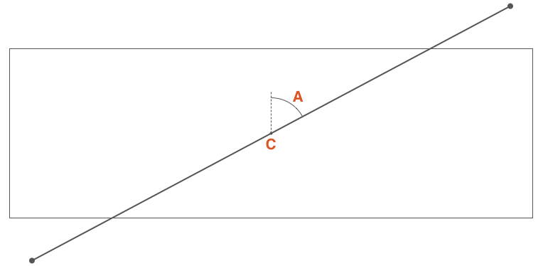
If C is the center point of the gradient field, then A is the angle between the vertical line passing through C and the gradient line that also passes through C and along which the stop colors of the gradient are distributed.
This angle can be defined in two ways:
• Using one of the keywords: to top (up), to bottom (down), to left (left), to right (right), to top right (right up), to top left (left up), to bottom right (right down), to bottom left (left down);
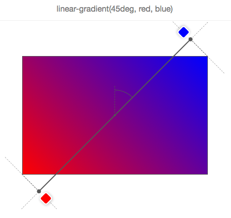
• Or by determining the angle with the number and unit of measurement, for example, 45deg (45 degrees), 1turn (1 turn);
If the angle is not specified, then by default it goes down (i.e. it is 180 degrees or 0.5 turn):
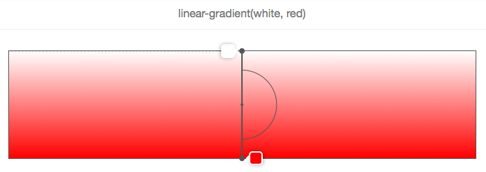
On this and the following images, the gradient field is bounded by a rectangle, and the gradient line is a bold gray line that passes through the center and along which the colors are displayed.
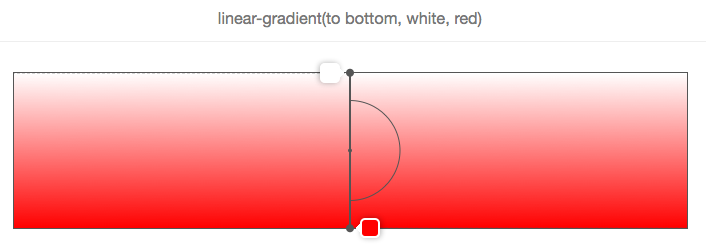
In the above example, the angle is not specified, so the gradient from white to red moves from top to bottom, which corresponds to the keyword to bottom, as shown below:
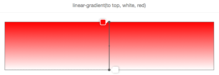
And, as shown in the following 2 images, to top (up) corresponds to an angle of zero degrees:

Another important point to consider when using angle keywords is that to top right (for example, up or down), for example, (or any other angle keyword) depends on the size of the gradient field.
The logic is that if you wanted to make a gradient from red to blue in the direction of the upper right corner of the element, then such an element should be blue in the upper right corner, and the purple color in the middle of the gradient should be formed around the line that runs from the top left to bottom right corner. Here is what it looks like on the image:
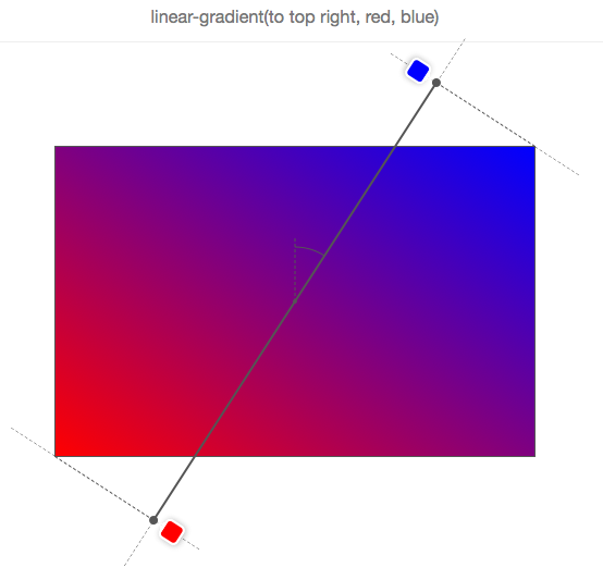
Therefore, to top right (right up) does not mean that the gradient line passes through the upper right corner, and this does not even mean that the angle of the gradient is 45 degrees!
Let's take a look at how the gradient line moves as the angle changes, using the following animation:

In this animation, the angle tilts from 0 to 360 degrees in 10-degree increments. The low resolution of the GIF even allows you to better see how different colors are displayed as “lines”, which are always perpendicular to the gradient lines.
Let's remember what we know about the gradient angles:
• The angle is measured between the gradient line and the line that extends from the center of the gradient field and moves up.
• Therefore, 0 degrees means up.
• The standard angle value, if not specified, is down, which is 180 degrees.
• Angle keywords depend on the size of the gradient field.
Before we can see how colors are distributed along the gradient line, we need to explain one thing. You may have noticed in the previous animation that the colors are sometimes located outside of the gradient field, which may look a little strange at first glance, but this is logical if you know the reason.
Look at an example:
We need a gradient from red to blue with an angle of 45 degrees, and, due to the aspect ratio of the gradient field, the gradient line cannot pass through the upper right corner.
But the browser wants (that is, the specifications force it) to make the upper right corner pure blue. If we made the gradient line begin and end at the edges of the field, then the blue color would occupy most of the field, and the gradient would not blur.
Therefore, in order to do this, the gradient line sometimes has to go beyond the gradient field. It is quite easy to know where it starts and where it ends. Simply draw a line that runs through the nearest angle, and that is perpendicular to the gradient line. The point where this line intersects the gradient line is the starting / ending point.
In fact, if you specify the width of the gradient field W, the height H, and the angle of the gradient, then the length of the gradient line is:
abs (W * sin (A)) + abs (H * cos (A))
Colors are a comma-separated list in which each element can be defined as follows:
Therefore, it is not necessary to indicate where the colors should be placed on the gradient line. For example:
None of the colors has its position, so the browser itself has determined their position.
In the simplest example, with only 2 colors, color 1 will be placed at 0% (at the beginning of the gradient line), and color 2 at 100% (at the end of the gradient line).
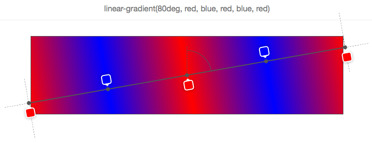
Then, if you add the third color, color 1 will still remain at 0%, color 2 will be at 50%, and color 3 at 100%, and so on.
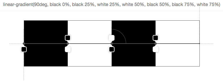
In the above example, 5 stop colors were set, and the browser calculated their relative position as 0%, 25%, 50%, 75%, 100%. The reason for this is the uniform distribution along the gradient field.
The color position can be expressed either as a percentage (relative to the size of the gradient line) or as a length of CSS (where any unit of CSS applies).
Here is an example:
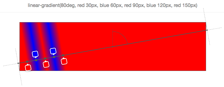
As you can see, each of the 5 stop colors has its position in pixels. These positions are calculated from the beginning of the gradient line.
Using such positions, you can get some interesting effects. For example, you can use a gradient to not draw a gradient as such, but leave a few colors:
The image above has 7 colors, and they are set so that the next color starts in exactly the same position as the last one, which means that the browser does not need to fill the space between the two stop-colors with a gradient.
Of course, this is all cute and funny, but what happens if you mix positioned colors with non-positioned? Then you make the browser work harder and ask it to automatically distribute colors for which you did not specify a position:

In this simple example, the second color (orange) has no position, so the browser itself determines it and finds a suitable place between the previously specified and the next color. Here it is very simple, since the immediate neighbors of the second color have their own position, but if only some colors have positions, or if the previous or next colors do not have a position, everything becomes more complicated.
Let's look at a few examples:
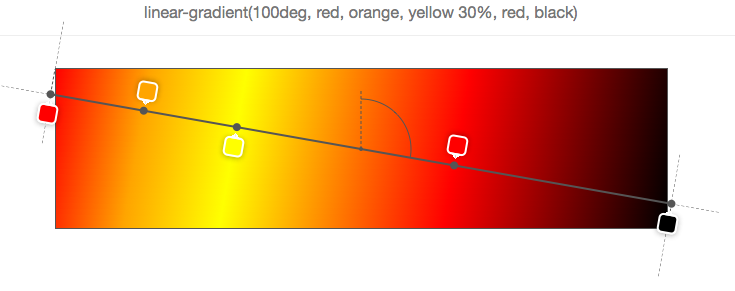
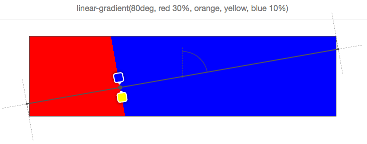
In the example above, only the third color (yellow) is positioned at 30%. Therefore, in order to better distribute all the others, the first is placed at 0%, the last at 100%, and the rest of the colors are distributed in between (so that orange ends directly between 0% and 30%, and red ends between 30% and 100%) .
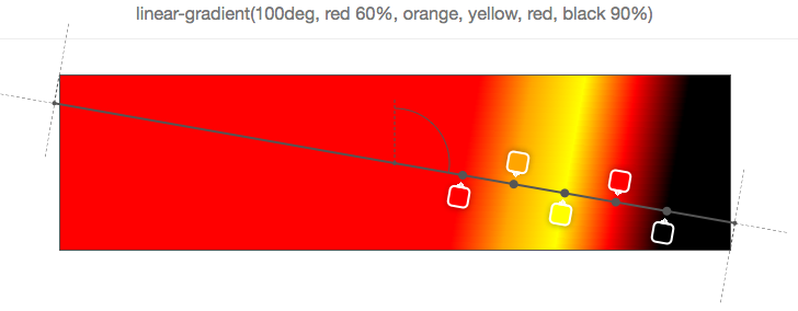
In the example above, the first and last colors are positioned, so the rest are evenly distributed between the two.
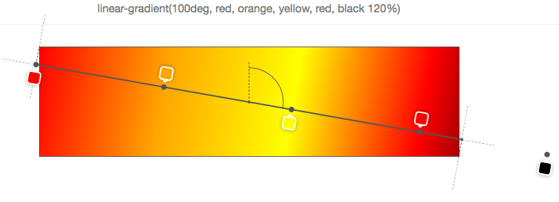
Of course, it would be too easy if 0% and 100% were a rigid framework, which cannot be exceeded. But as can be seen from the previous example, the last color is located at 120%, and therefore all other colors should be distributed appropriately relative to this position (the default starting point in this case remains 0%).
And if you want to make your browser work even more, why not specify the order of the positions?
In fact, colors should have order, but nothing prevents you from doing this, and nothing terrible will happen if you do not. Your browser will just fix everything, as shown below:
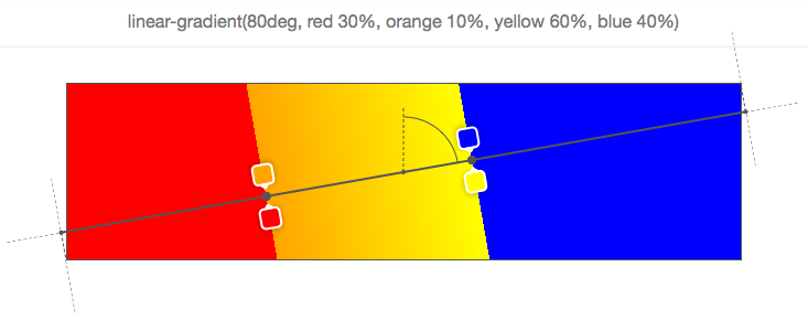
Let's start with the first color (red), located at 30%. Then the second color is located at 10%, which is already wrong, since, as mentioned above, the colors should be indicated in the ascending position. Therefore, here the browser corrects the position of the second color and sets it to the same position as the previous color (30%). Next is the third color (yellow), located at 60%, which is correct, but it is followed by the fourth (blue) by 40%. Again, the position is adjusted and set to the same value as the previous positioned color.
Ultimately, as shown in the example above, the last color (blue) is positioned incorrectly and the browser makes its position the same as the previous color, which in this case is neither its immediate neighbor (yellow) nor the neighbor color stands in front of him (orange), so he must return to the first color (red). Thus, all colors between red and blue are set to 30% and are therefore invisible.
All screenshots in this article are taken from a simple tool that I made on the codepen, which allows you to enter a linear gradient function and see the gradient field, gradient line, angle, and color information on top of the element.
The tool has all kinds of bugs and limitations (see comments in javascript), so do not expect much from it.
Want to make a cute gradient background on your website? background-image: linear-gradient (red, blue); is ready! Yes, it is a bit boring. Therefore, if you want something more, I recommend you this article with tips on css and MDN page. Are you here? Then let's take a look at some points on how linear gradients actually work. To begin with, let's recall the syntax that can be used in a linear gradient function:
linear-gradient ([ <> | <-->]?, <color-stop-list>); The function accepts an optional first argument, which defines the angle of the gradient, and which can be expressed using a unit of measure (degree, radius, degree, rotation) or as a keyword (side or angle).
After that, the function takes a list of colors.
')
Gradient field
The gradient image has no dimensions, it is infinite in contrast to other background images. The gradient field gives it visible dimensions, i.e. the area in which it is displayed.
Typically, when you apply a background image as a linear gradient to a DOM element, this area is the border of the element (which is the area in which the background color is displayed).
Moreover, if you also use the background-size CSS property (background size) and set it to, say, 200px * 200px, then the gradient field will have this size and will, by default, be placed in the upper left corner of the DOM element, unless you also set the background-position.
Therefore, when reading the following sections, just remember that the gradient field is not always the same and has the same dimensions as the DOM element to which you apply this gradient.
Gradient line
In a gradient field, a line that passes through the center and along which colors are distributed is called a gradient line. This line can be described more simply by explaining the angle of the gradient, so more on this in the next section.
Gradient angle
It is quite obvious that the angle of a linear gradient is used to determine which direction the gradient will go. But let's look at this aspect in more detail.
If C is the center point of the gradient field, then A is the angle between the vertical line passing through C and the gradient line that also passes through C and along which the stop colors of the gradient are distributed.
This angle can be defined in two ways:
• Using one of the keywords: to top (up), to bottom (down), to left (left), to right (right), to top right (right up), to top left (left up), to bottom right (right down), to bottom left (left down);
• Or by determining the angle with the number and unit of measurement, for example, 45deg (45 degrees), 1turn (1 turn);
If the angle is not specified, then by default it goes down (i.e. it is 180 degrees or 0.5 turn):
On this and the following images, the gradient field is bounded by a rectangle, and the gradient line is a bold gray line that passes through the center and along which the colors are displayed.
In the above example, the angle is not specified, so the gradient from white to red moves from top to bottom, which corresponds to the keyword to bottom, as shown below:
And, as shown in the following 2 images, to top (up) corresponds to an angle of zero degrees:
Another important point to consider when using angle keywords is that to top right (for example, up or down), for example, (or any other angle keyword) depends on the size of the gradient field.
The logic is that if you wanted to make a gradient from red to blue in the direction of the upper right corner of the element, then such an element should be blue in the upper right corner, and the purple color in the middle of the gradient should be formed around the line that runs from the top left to bottom right corner. Here is what it looks like on the image:
Therefore, to top right (right up) does not mean that the gradient line passes through the upper right corner, and this does not even mean that the angle of the gradient is 45 degrees!
Let's take a look at how the gradient line moves as the angle changes, using the following animation:
In this animation, the angle tilts from 0 to 360 degrees in 10-degree increments. The low resolution of the GIF even allows you to better see how different colors are displayed as “lines”, which are always perpendicular to the gradient lines.
Let's remember what we know about the gradient angles:
• The angle is measured between the gradient line and the line that extends from the center of the gradient field and moves up.
• Therefore, 0 degrees means up.
• The standard angle value, if not specified, is down, which is 180 degrees.
• Angle keywords depend on the size of the gradient field.
Gradient line length
Before we can see how colors are distributed along the gradient line, we need to explain one thing. You may have noticed in the previous animation that the colors are sometimes located outside of the gradient field, which may look a little strange at first glance, but this is logical if you know the reason.
Look at an example:
We need a gradient from red to blue with an angle of 45 degrees, and, due to the aspect ratio of the gradient field, the gradient line cannot pass through the upper right corner.
But the browser wants (that is, the specifications force it) to make the upper right corner pure blue. If we made the gradient line begin and end at the edges of the field, then the blue color would occupy most of the field, and the gradient would not blur.
Therefore, in order to do this, the gradient line sometimes has to go beyond the gradient field. It is quite easy to know where it starts and where it ends. Simply draw a line that runs through the nearest angle, and that is perpendicular to the gradient line. The point where this line intersects the gradient line is the starting / ending point.
In fact, if you specify the width of the gradient field W, the height H, and the angle of the gradient, then the length of the gradient line is:
abs (W * sin (A)) + abs (H * cos (A))
Colors
Colors are a comma-separated list in which each element can be defined as follows:
<> [< > | <>]? Therefore, it is not necessary to indicate where the colors should be placed on the gradient line. For example:
None of the colors has its position, so the browser itself has determined their position.
In the simplest example, with only 2 colors, color 1 will be placed at 0% (at the beginning of the gradient line), and color 2 at 100% (at the end of the gradient line).
Then, if you add the third color, color 1 will still remain at 0%, color 2 will be at 50%, and color 3 at 100%, and so on.
In the above example, 5 stop colors were set, and the browser calculated their relative position as 0%, 25%, 50%, 75%, 100%. The reason for this is the uniform distribution along the gradient field.
The color position can be expressed either as a percentage (relative to the size of the gradient line) or as a length of CSS (where any unit of CSS applies).
Here is an example:
As you can see, each of the 5 stop colors has its position in pixels. These positions are calculated from the beginning of the gradient line.
Using such positions, you can get some interesting effects. For example, you can use a gradient to not draw a gradient as such, but leave a few colors:
The image above has 7 colors, and they are set so that the next color starts in exactly the same position as the last one, which means that the browser does not need to fill the space between the two stop-colors with a gradient.
Of course, this is all cute and funny, but what happens if you mix positioned colors with non-positioned? Then you make the browser work harder and ask it to automatically distribute colors for which you did not specify a position:
In this simple example, the second color (orange) has no position, so the browser itself determines it and finds a suitable place between the previously specified and the next color. Here it is very simple, since the immediate neighbors of the second color have their own position, but if only some colors have positions, or if the previous or next colors do not have a position, everything becomes more complicated.
Let's look at a few examples:
In the example above, only the third color (yellow) is positioned at 30%. Therefore, in order to better distribute all the others, the first is placed at 0%, the last at 100%, and the rest of the colors are distributed in between (so that orange ends directly between 0% and 30%, and red ends between 30% and 100%) .
In the example above, the first and last colors are positioned, so the rest are evenly distributed between the two.
Of course, it would be too easy if 0% and 100% were a rigid framework, which cannot be exceeded. But as can be seen from the previous example, the last color is located at 120%, and therefore all other colors should be distributed appropriately relative to this position (the default starting point in this case remains 0%).
And if you want to make your browser work even more, why not specify the order of the positions?
In fact, colors should have order, but nothing prevents you from doing this, and nothing terrible will happen if you do not. Your browser will just fix everything, as shown below:
Let's start with the first color (red), located at 30%. Then the second color is located at 10%, which is already wrong, since, as mentioned above, the colors should be indicated in the ascending position. Therefore, here the browser corrects the position of the second color and sets it to the same position as the previous color (30%). Next is the third color (yellow), located at 60%, which is correct, but it is followed by the fourth (blue) by 40%. Again, the position is adjusted and set to the same value as the previous positioned color.
Ultimately, as shown in the example above, the last color (blue) is positioned incorrectly and the browser makes its position the same as the previous color, which in this case is neither its immediate neighbor (yellow) nor the neighbor color stands in front of him (orange), so he must return to the first color (red). Thus, all colors between red and blue are set to 30% and are therefore invisible.
Instruments
All screenshots in this article are taken from a simple tool that I made on the codepen, which allows you to enter a linear gradient function and see the gradient field, gradient line, angle, and color information on top of the element.
The tool has all kinds of bugs and limitations (see comments in javascript), so do not expect much from it.
Useful Paysto solutions for Habr readers:
→ Get paid by credit card right now. Without a site, PI and LLC.
→ Accept payments from companies via the Internet. Without a site, PI and LLC.
→ Acceptance of payments from companies for your site. With document circulation and exchange of originals.
→ Automation of sales and service transactions with legal entities. Without intermediary in the calculations.
→ Accept payments from companies via the Internet. Without a site, PI and LLC.
→ Acceptance of payments from companies for your site. With document circulation and exchange of originals.
→ Automation of sales and service transactions with legal entities. Without intermediary in the calculations.
Source: https://habr.com/ru/post/256479/
All Articles