Analysis of weather station data based on Arduino
Creating your own personal weather station has become much easier than before. Given the inconstant weather in New England, we decided that we wanted to create our own weather station and use MATLAB to analyze weather data.
In the article we will answer the following questions:
It is clear that the questions discussed are quite simple, but the described techniques and commands will help you to solve more complex practical problems.
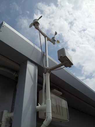
First, we had to decide where to place our weather station. We decided to do it on the top floor of the car park. The place was chosen because it was under the influence of weather, but also had a roof for mounting electronics. Due to the fact that we ultimately wanted to give data to a third-party data aggregator, we had to take this into account when choosing a place and iron.
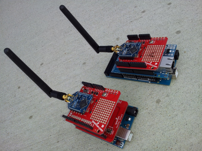
The location chosen was outside the range of the Wi-Fi of our building, so we had to find a way to transfer data from the station to the receiver, which was inside the neighboring building. To do this, we connected the Arduino Uno to the XBee high power transmitter. The data is then transferred to the receiving XBee module on the Arduino Mega already inside the building. This Arduino was connected to the Internet and the data is sent to a free data aggregation service, ThingSpeak.com . A complete list of the equipment we used in our installation is given below.
')
External Arduino is installed in the garage and is responsible for collecting measurements and transferring data to the Arduino indoors. To implement this exchange, we first connected the contacts from the Weather shield and the XBee shield. Then we connected the XBee shield with the Arduino Uno in accordance with the documentation provided with the shields. The XBee shield has a high-power XBee transceiver. We used the X-CTU software to program the desired recipient address and download the correct firmware to the XBee shield. An anemometer, rain wind sensors were connected to the weather shield using the included RJ-45 connectors.
The internal Arduino is located inside our building, and is responsible for receiving data from the external Arduino, for checking the validity of the data, and sending it to ThingSpeak. To build such a system, we first soldered the contacts on the Ethernet shield and the second XBee shield. XBee shield in Mega Arduino in accordance with the documentation. We again used X-CTU to program the required recipient address and download the necessary firmware on the XBee shield.
Next, we programmed the Arduino to receive XBee messages and forward packets to ThingSpeak at a rate of once per minute. Before sending the ThingSpeak message, we set up an account and configured the channel and location information. As soon as the data transfer setup was finished, we began to analyze the data in MATLAB.
Please note that to reproduce the analysis given in the article, you do not need to buy and tune equipment. The current data of our station is available on channel 12,397 .
To answer our first two questions, we use the command
8000 points is the maximum number of points that ThingSpeak allows you to query at a time. For our measurement frequency, this corresponds to about 6 days of measurement.
To get a better understanding of our data, we find the minimum, maximum and average values for the data we imported and we find the time for the maximum and minimum values. This gives us a quick way to validate the data from our weather station.
If we get unexpected values, such as a maximum atmospheric pressure of 40 atmospheres or a maximum temperature of 1700 degrees, we can assume that the data are incorrect. Such errors may occur due to transmission errors, voltage spikes and other causes. At the end of the article, we will show some ways to handle such “outliers”, but for uploaded data, when this report was published, everything looks fine.
For the code above, we used a tabular data type, first introduced in MATLAB R2013b. See the blog entry to learn more about this data type.
Since our weather station receives meteorological reports about once a minute, we look at the last 180 minutes to answer our question about what the wind was in the last 3 hours, and we use the MATLAB Compass plot to see the speed and direction wind in the time of interest. This is a mathematical compass, where the North (0 degrees) is on the right, and the degrees increase counterclockwise. 90 degrees represents the East (top), 180 degrees represents the south (left) and 270 degrees represents the West (bottom). If there is no wind shear due to thunderstorms or with a frontal passage, the compass, as a rule, shows the preferential wind direction indicated by higher density arrows on the graph. In the case of the data requested in this example, we observe wind direction mainly from the south and southwest, typical of summer time in New England.

Now we are ready to answer our second question about how the temperature and dew point changed during
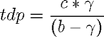
last week. The dew point is the temperature at which the air (when cooled) becomes saturated with water vapor. The higher the humidity of the air mass, the higher the dew point. Dew point is also sometimes used as a measure of discomfort. When the dew point exceeds 65 degrees (+ 18C), many people begin to say that the air is “sticky”. At a dew point of 70, many feel uncomfortable. The overall estimate for the dew point, TDP, can be found using the equation and constants, as shown below:
Where

with
Now, having written the above equations, as the MATLAB code we have:
Now that we have calculated the dew point, we are ready to visualize the data and observe their behavior over the past 5 or 6 days.

During a typical week, you can clearly see daily variations in temperature and humidity. As expected, relative humidity usually increases at night (as the temperature drops to the dew point) and maximum temperatures are usually reached in the afternoon. The dew point temperature indicates the humidity of the air masses. When we collected the data for publishing this example, you can see that the dew point was over 70 degrees, which is typical of a hot and humid summer day in New England. If you run this code in MATLAB, you can get different answers as you go. how you will request the latest data reported by the weather station.
The last question we wanted to answer is: is the atmospheric pressure really falling before the rain? To do this, we obtained data from a weather station for a famous rainy day. This time, we are interested in barometric pressure and precipitation. We used a self emptying sensor, which is emptied when it is full. Our sensor rotates and empties when 0.01 inches of precipitation falls. Our Arduino code counts the number of emptyings per minute and transmits the corresponding precipitation value to ThingSpeak. We use MATLAB to sample hourly samples from our data so that we can easily see precipitation accumulation and pressure trends.
Did it really rain on June 5th? It's hard to say if we just look at every minute of data transfer, since the maximum value is only 0.01 inch. However, if we sum up all the precipitations for June 5, we see that we received 0.48 inches of precipitation, which is 13% of the monthly average of 3.68 inches, which indicates that the day was really very rainy. To get a more complete picture of when the maximum precipitation fell, we converted the data into hourly data, as shown below.
After we have pre-processed our data, we are ready to visualize them. Here we use MATLAB, to find the trend line to barometric pressure data. If we plot, will we see a drop in pressure before a heavy downpour?
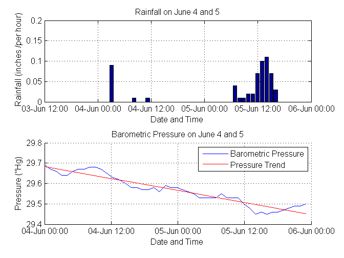
After we visualize this data and look at the trend, we clearly see that the atmospheric pressure really drops exactly before the onset of precipitation!
Our questions were fairly simple, but sometimes there are problems with the available data. For example, on May 30, we recorded some inaccurate temperature data. Let's see how to use MATLAB to filter them.
Deleting items that did not pass the threshold test. In this case, we have some values that are obviously unreliable, such as a temperature value of -1766 degrees Fahrenheit. Therefore, you can use data that includes only temperature values, between 0 and 120, which are acceptable values for a spring day in New England.
Construct graphics cleaned and source data.

Another way to remove bad data is to apply a median filter. The median filter does not require as much knowledge about the data set. It will simply remove the values that fall outside the average nearest neighbors. The filtering results are a vector of the same length as the original one, in contrast to deleting data points, which leads to data breaks and shortening the record. This type of filter can also be used to remove noise from a signal.
Large n values denote the number of “neighbors” for comparison. At temperatures collected once a minute, we choose n = 5, because the temperature should not, as a rule, vary greatly within 5 minutes.
So, we analyzed the data from our weather station and answered questions of interest to us.
We also demonstrated some ways to filter data that does not pass the initial test.
The questions posed in the article are elementary, but think about what can be achieved by collecting data from thousands of stations? In addition, you can measure and analyze real-time changes in industrial and scientific systems and make decisions based on data.
We remind you that in order to reproduce the analysis given in the article, you do not need to buy and set up equipment. Live data from our installation is available on channel 12,397 on ThingSpeak.com.
MATLAB project code
In the article we will answer the following questions:
- In which direction did the wind blow during the last 3 hours?
- How did the temperature and dew point change during the last week?
- Does barometric pressure actually fall as thunderstorms approach?
It is clear that the questions discussed are quite simple, but the described techniques and commands will help you to solve more complex practical problems.
Step 1: Location of the weather station
First, we had to decide where to place our weather station. We decided to do it on the top floor of the car park. The place was chosen because it was under the influence of weather, but also had a roof for mounting electronics. Due to the fact that we ultimately wanted to give data to a third-party data aggregator, we had to take this into account when choosing a place and iron.
Step 2: Select Hardware
The location chosen was outside the range of the Wi-Fi of our building, so we had to find a way to transfer data from the station to the receiver, which was inside the neighboring building. To do this, we connected the Arduino Uno to the XBee high power transmitter. The data is then transferred to the receiving XBee module on the Arduino Mega already inside the building. This Arduino was connected to the Internet and the data is sent to a free data aggregation service, ThingSpeak.com . A complete list of the equipment we used in our installation is given below.
')
Equipment list
- Arduino Uno with Weather shield and weather sensors
- 2x XBee Shield and 2x XBee Extended Range Modules from Digi International
- Arduino Mega with Ethernet Shield
- 2 sets for mounting Arduino
- 2x 5V transformer for Arduino power
- XBee Explorer Dongle for programming the XBee transmitter
Step 3: Connecting the weather station transmitter and programming the outdoor Arduino
External Arduino is installed in the garage and is responsible for collecting measurements and transferring data to the Arduino indoors. To implement this exchange, we first connected the contacts from the Weather shield and the XBee shield. Then we connected the XBee shield with the Arduino Uno in accordance with the documentation provided with the shields. The XBee shield has a high-power XBee transceiver. We used the X-CTU software to program the desired recipient address and download the correct firmware to the XBee shield. An anemometer, rain wind sensors were connected to the weather shield using the included RJ-45 connectors.
Step 4: Connect the Weather Station Receiver and Indoor Arduino Programming
The internal Arduino is located inside our building, and is responsible for receiving data from the external Arduino, for checking the validity of the data, and sending it to ThingSpeak. To build such a system, we first soldered the contacts on the Ethernet shield and the second XBee shield. XBee shield in Mega Arduino in accordance with the documentation. We again used X-CTU to program the required recipient address and download the necessary firmware on the XBee shield.
Next, we programmed the Arduino to receive XBee messages and forward packets to ThingSpeak at a rate of once per minute. Before sending the ThingSpeak message, we set up an account and configured the channel and location information. As soon as the data transfer setup was finished, we began to analyze the data in MATLAB.
Please note that to reproduce the analysis given in the article, you do not need to buy and tune equipment. The current data of our station is available on channel 12,397 .
Step 5: Answer the questions
Retrieving weather data from ThingSpeak
To answer our first two questions, we use the command
thingSpeakFetch [d,t,ci] = thingSpeakFetch(12397,'NumPoints',8000); % fetch last 8000 minutes of data 8000 points is the maximum number of points that ThingSpeak allows you to query at a time. For our measurement frequency, this corresponds to about 6 days of measurement.
tempF = d(:,4); % field 4 is temperature in deg F baro = d(:,6); % pressure in inches Hg humidity = d(:,3); % field 3 is relative humidity in percent windDir = d(:,1); windSpeed = d(:,2); tempC = (5/9)*(tempF-32); % convert to Celsius availableFields = ci.FieldDescriptions' availableFields = 'Wind Direction (North = 0 degrees)' 'Wind Speed (mph)' '% Humidity' 'Temperature (F)' 'Rain (Inches/minute)' 'Pressure ("Hg)' 'Power Level (V)' 'Light Intensity' Calculation of some basic statistics for the observation period and their visualization
To get a better understanding of our data, we find the minimum, maximum and average values for the data we imported and we find the time for the maximum and minimum values. This gives us a quick way to validate the data from our weather station.
[maxData,index_max] = max(d); maxData = maxData'; times_max = datestr(t(index_max)); times_max = cellstr(times_max); [minData,index_min] = min(d); minData = minData'; times_min = datestr(t(index_min)); times_min = cellstr(times_min); meanData = mean(d); meanData = meanData'; % make column vector summary = table(availableFields,maxData,times_max,meanData,minData,times_min) % display summary = availableFields maxData times_max ____________________________________ _______ ______________________ 'Wind Direction (North = 0 degrees)' 338 '10-Jul-2014 05:01:32' 'Wind Speed (mph)' 6.3 '10-Jul-2014 12:47:14' '% Humidity' 86.5 '15-Jul-2014 04:51:24' 'Temperature (F)' 96.7 '12-Jul-2014 16:28:55' 'Rain (Inches/minute)' 0.04 '15-Jul-2014 13:47:13' 'Pressure ("Hg)' 30.23 '11-Jul-2014 09:25:07' 'Power Level (V)' 4.44 '10-Jul-2014 10:25:01' 'Light Intensity' 0.06 '12-Jul-2014 13:23:38' meanData minData times_min _________ _______ ______________________ NaN 0 '10-Jul-2014 04:54:32' 3.0272 0 '10-Jul-2014 01:33:14' 57.386 25.9 '12-Jul-2014 13:39:39' 80.339 69.6 '11-Jul-2014 06:59:54' 5.625e-05 0 '10-Jul-2014 01:02:11' 30.04 29.78 '15-Jul-2014 13:04:08' 4.4149 4.38 '11-Jul-2014 09:22:06' 0.0092475 0 '10-Jul-2014 01:02:11' If we get unexpected values, such as a maximum atmospheric pressure of 40 atmospheres or a maximum temperature of 1700 degrees, we can assume that the data are incorrect. Such errors may occur due to transmission errors, voltage spikes and other causes. At the end of the article, we will show some ways to handle such “outliers”, but for uploaded data, when this report was published, everything looks fine.
For the code above, we used a tabular data type, first introduced in MATLAB R2013b. See the blog entry to learn more about this data type.
Visualization of the wind in the last three hours
Since our weather station receives meteorological reports about once a minute, we look at the last 180 minutes to answer our question about what the wind was in the last 3 hours, and we use the MATLAB Compass plot to see the speed and direction wind in the time of interest. This is a mathematical compass, where the North (0 degrees) is on the right, and the degrees increase counterclockwise. 90 degrees represents the East (top), 180 degrees represents the south (left) and 270 degrees represents the West (bottom). If there is no wind shear due to thunderstorms or with a frontal passage, the compass, as a rule, shows the preferential wind direction indicated by higher density arrows on the graph. In the case of the data requested in this example, we observe wind direction mainly from the south and southwest, typical of summer time in New England.
figure(1) windDir = windDir((end-180):end); % last 3 hours windSpeed = windSpeed((end-180):end); rad = windDir*2*pi/360; u = cos(rad) .* windSpeed; % x coordinate of wind speed on circular plot v = sin(rad) .* windSpeed; % y coordinate of wind speed on circular plot compass(u,v) titletext = strcat(' for last 3 hours ending on: ',datestr(now)); title({'Wind Speed, MathWorks Weather Station'; titletext}) Dew point calculation
Now we are ready to answer our second question about how the temperature and dew point changed during
last week. The dew point is the temperature at which the air (when cooled) becomes saturated with water vapor. The higher the humidity of the air mass, the higher the dew point. Dew point is also sometimes used as a measure of discomfort. When the dew point exceeds 65 degrees (+ 18C), many people begin to say that the air is “sticky”. At a dew point of 70, many feel uncomfortable. The overall estimate for the dew point, TDP, can be found using the equation and constants, as shown below:
Where
with
Now, having written the above equations, as the MATLAB code we have:
b = 17.62; c = 243.5; gamma = log(humidity/100) + b*tempC ./ (c+tempC); tdp = c*gamma ./ (b-gamma); tdpf = (tdp*1.8) + 32; % convert back to Fahrenheit Visualization of temperature, humidity and dew point as a function of time
Now that we have calculated the dew point, we are ready to visualize the data and observe their behavior over the past 5 or 6 days.
figure(2) [ax, h1, h2] = plotyy(t,[tempF tdpf],t,humidity); set(ax(2),'XTick',[]) set(ax(2),'YColor','k') set(ax(1),'YTick',[0,20,40,60,80,100]) set(ax(2),'YTick',[0,20,40,60,80,100]) datetick(ax(1),'x','keeplimits','keepticks') set(get(ax(2),'YLabel'),'String',availableFields(3)) set(get(ax(1),'YLabel'),'String',availableFields(4)) grid on legend('Location','South','Temperature','Dew point', 'Humidity') During a typical week, you can clearly see daily variations in temperature and humidity. As expected, relative humidity usually increases at night (as the temperature drops to the dew point) and maximum temperatures are usually reached in the afternoon. The dew point temperature indicates the humidity of the air masses. When we collected the data for publishing this example, you can see that the dew point was over 70 degrees, which is typical of a hot and humid summer day in New England. If you run this code in MATLAB, you can get different answers as you go. how you will request the latest data reported by the weather station.
Retrieving and processing weather data for a rainy day in New England
The last question we wanted to answer is: is the atmospheric pressure really falling before the rain? To do this, we obtained data from a weather station for a famous rainy day. This time, we are interested in barometric pressure and precipitation. We used a self emptying sensor, which is emptied when it is full. Our sensor rotates and empties when 0.01 inches of precipitation falls. Our Arduino code counts the number of emptyings per minute and transmits the corresponding precipitation value to ThingSpeak. We use MATLAB to sample hourly samples from our data so that we can easily see precipitation accumulation and pressure trends.
[d,t,ci] = thingSpeakFetch(12397,'DateRange',{'6/4/2014','6/6/2014'}); % get data baro = d(:,6); % pressure extraData = rem(length(baro),60); % computes excess points beyond the hour baro(1:extraData) = []; % removes excess points so we have even number of hours rain = d(:,5); % rainfall from sensor in inches per minute Did it really rain on June 5th? It's hard to say if we just look at every minute of data transfer, since the maximum value is only 0.01 inch. However, if we sum up all the precipitations for June 5, we see that we received 0.48 inches of precipitation, which is 13% of the monthly average of 3.68 inches, which indicates that the day was really very rainy. To get a more complete picture of when the maximum precipitation fell, we converted the data into hourly data, as shown below.
rain(1:extraData) = []; t(1:extraData) = []; rainHourly = sum(reshape(rain,60,[]))'; % convert to hourly summed samples maxRainPerMinute = max(rain) june5rainfall = sum(rainHourly(25:end)) % 24 hours of measurements from June 5 baroHourly = downsample(baro,60); % hourly samples timestamps = downsample(t,60); % hourly samples maxRainPerMinute = 0.0100 june5rainfall = 0.4800 Visualize hourly cloud and pressure data and find the pressure trend
After we have pre-processed our data, we are ready to visualize them. Here we use MATLAB, to find the trend line to barometric pressure data. If we plot, will we see a drop in pressure before a heavy downpour?
figure(3) subplot(2,1,1) bar(timestamps,rainHourly) % plot rain xlabel('Date and Time') ylabel('Rainfall (inches /per hour)') grid on datetick('x','dd-mmm HH:MM','keeplimits','keepticks') title('Rainfall on June 4 and 5') subplot(2,1,2) hold on plot(timestamps,baroHourly) % plot barometer xlabel('Date and Time') ylabel(availableFields(6)) grid on datetick('x','dd-mmm HH:MM','keeplimits','keepticks') detrended_Baro = detrend(baroHourly); baroTrend = baroHourly - detrended_Baro; plot(timestamps,baroTrend,'r') % plot trend hold off legend('Barometric Pressure','Pressure Trend') title('Barometric Pressure on June 4 and 5') After we visualize this data and look at the trend, we clearly see that the atmospheric pressure really drops exactly before the onset of precipitation!
Clearing data from inaccurate measurements
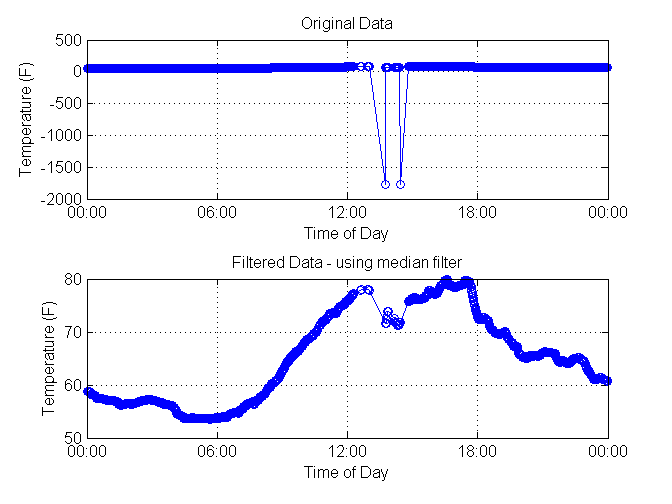
Our questions were fairly simple, but sometimes there are problems with the available data. For example, on May 30, we recorded some inaccurate temperature data. Let's see how to use MATLAB to filter them.
[d,t] = thingSpeakFetch(12397,'DateRange',{'5/30/2014','5/31/2014'}); rawTemperatureData = d(:,4); newTemperatureData = rawTemperatureData; minTemp = min(rawTemperatureData) % wow that is cold! minTemp = -1.7662e+03 Using a threshold filter to remove outliers
Deleting items that did not pass the threshold test. In this case, we have some values that are obviously unreliable, such as a temperature value of -1766 degrees Fahrenheit. Therefore, you can use data that includes only temperature values, between 0 and 120, which are acceptable values for a spring day in New England.
tnew = t'; outlierIndices = [find(rawTemperatureData < 0); find(rawTemperatureData > 120)]; tnew(outlierIndices) = []; newTemperatureData(outlierIndices) = []; Construct graphics cleaned and source data.
figure(4) subplot(2,1,2) plot(tnew,newTemperatureData,'-o') datetick xlabel('Time of Day') ylabel(availableFields(4)) title('Filtered Data - outliers deleted') grid on subplot(2,1,1) plot(t,rawTemperatureData,'-o') datetick xlabel('Time of Day') ylabel(availableFields(4)) title('Original Data') grid on Using a median filter to remove invalid data
Another way to remove bad data is to apply a median filter. The median filter does not require as much knowledge about the data set. It will simply remove the values that fall outside the average nearest neighbors. The filtering results are a vector of the same length as the original one, in contrast to deleting data points, which leads to data breaks and shortening the record. This type of filter can also be used to remove noise from a signal.
n = 5; % this value determines the number of total points used in the filter Large n values denote the number of “neighbors” for comparison. At temperatures collected once a minute, we choose n = 5, because the temperature should not, as a rule, vary greatly within 5 minutes.
f = medfilt1(rawTemperatureData,n); figure(5) subplot(2,1,2) plot(t,f,'-o') datetick xlabel('Time of Day') ylabel(availableFields(4)) title('Filtered Data - using median filter') grid on subplot(2,1,1) plot(t,rawTemperatureData,'-o') datetick xlabel('Time of Day') ylabel(availableFields(4)) title('Original Data') grid on Conclusion
So, we analyzed the data from our weather station and answered questions of interest to us.
We also demonstrated some ways to filter data that does not pass the initial test.
The questions posed in the article are elementary, but think about what can be achieved by collecting data from thousands of stations? In addition, you can measure and analyze real-time changes in industrial and scientific systems and make decisions based on data.
We remind you that in order to reproduce the analysis given in the article, you do not need to buy and set up equipment. Live data from our installation is available on channel 12,397 on ThingSpeak.com.
MATLAB project code
Source: https://habr.com/ru/post/256413/
All Articles