Intensity, scroll indicator (or life after scrollbar)
A month ago, someone found an unfinished project on my github and put a link to it on Designer News . Suddenly, I saw that the project site was constantly holding 50 people, and I even had to urgently run away from work in order to urgently cut at least the most hellish bugs. This project was Intense , the UX-component replacing the scroll bar (scrollbar) with a special indicator that highlights the scrollable area with a texture. It looks like this:
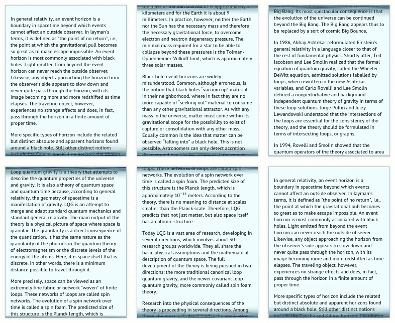
on the project website, you can skim yourself
Communities of UX experts and programmers reacted very excitedly:
')
Together with the UX-experts, I was excited too. Useless projects are usually not interesting to anyone, I have a couple of these. But now it was very unlikely - this turned out to be very controversial, and I have not yet seen such a movement. Over the next weeks I tried to take into account the main comments and either fix something in the library itself, or add explanations on the project website. And at the same time laid it out on the rest of the resources - the degree of feedback appeared to soften.
Here I want to tell you what areas of use for intents, and try to explain how I imagine life after a scrollbar. I also suggest that readers criticize this project, discuss scrolling in general, UX as a whole, and the expediency of replacing traditional elements in particular.
Let's think about what the user may need in general due to scrolling. For example, a scrollbar is a universal component that shows the current location in a scrollable area and allows you to move to an arbitrary place. By the way, in many cases the user does not need to know the exact position. This fact is already used by developers, for example, in tablet interfaces, where the scroll bar is often missing. Another example is that on sites with dynamically loaded content, the scroll bar moves unpredictably and does not mean anything at all.
Therefore, the scrollbar is used mainly not to get accurate information about scrolling, but rather to, firstly, understand that there is “there is something to scroll through”, and secondly, to determine “is there a lot more to wind up” (roughly speaking) .
Of course, in certain cases, some additional information may be useful to help you navigate. For example, if it is text with sections, the user can be shown in which section it is now located:
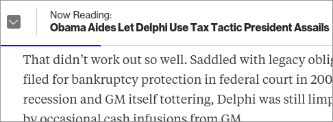
- the indicator on the Bloomberg website contains the title of the current section, as well as the progress of reading in the section
And in those cases where it is really important to be able to move to an arbitrary place, you will most likely need additional information about the content, showing what exactly is in a certain place:
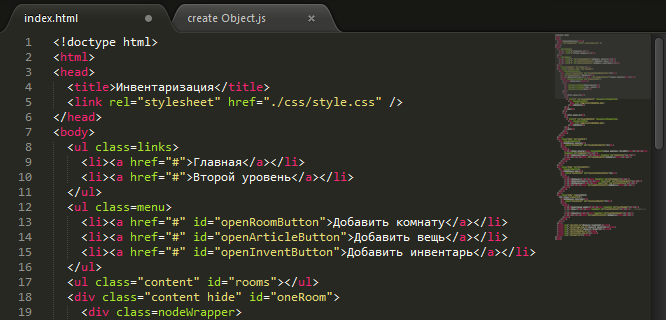
- text editor Sublime Text shows a smaller copy of the content
or information about where the relevant places are:

- View Diff in Netbeans: next to the scrollbar is indicated, where the changes

- search in Google Chrome, the right places are highlighted right in the scroll bar
That is, in such cases scrolling bar in its usual form is not enough.
But in all these examples, regardless of the application, general information about scrolling is useful, that is: which area is scrollable, and how much more does it scroll through. It is for the designation of such information that intensity serves. The indicator highlights the scrollable area along the entire edge, where else you can squander, and in this matter it is more vividly scrolling:
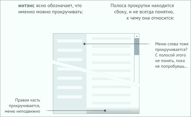
picture from the website intensity
What information to show in addition - it already depends on the application. Therefore, the intensity is proposed for a general scroll mark, and for additional information you can create a separate widget for a specific task.
Scrollbar serves not only to indicate the state, but also allows you to move around the scroll area. Naturally, at least the same functionality is expected from something that is offered as a replacement. But intensity is just an indicator, and it does not provide any elements for control. Therefore, the most popular feedback was something like this: “and how do I now get to the top of the news? or move to a certain place? "
And indeed, when I showed this project to a colleague sitting opposite, for the next half hour I heard only the heart-rending gnashing of his mouse wheel. He scrolled through the site intensity up and down and praised this innovation (at that time the site did not yet have a menu that allows you to move to a certain place). Of course, this is not progress, and I do not think that it should be used like this.
But just as with the additional information in the examples above, the appropriate type of navigation depends on the task.
For applications where the exact location of the scrolling is additionally shown (as in the examples above), the ability to move to an arbitrary point is useful. But again, there is no need to offer this for any occasion. For example, if we read text with sections, it will be more convenient to use navigation through the content to move to a specific section, rather than being able to "move about one quarter of the end":

- The menu on TheDaily Beast highlights the current section and the progress in the current section. Such a menu is self-sufficient, here you can do without a scrollbar
Now such navigation components are often avoided because there is a scroll bar, and even if it does, it solves the problem of navigation (to be honest, somehow it solves it).
The menu on the website is another example of “relevant navigation.” By the way, to implement this menu over the weekend, the viewport.js library has been filed (this project is already ready, but has not been published anywhere yet): it reports comprehensive information about the scrolling state and is suitable for creating a navigation widget of any kind.
Let me know how viable this approach seems to be. Depending on the feedback, I have thoughts to publish more posts on how intensity was written (there are a lot of interesting things about browser compatibility, as well as in terms of matan, which happens when scrolling with the texture in the indicator), and besides, I can write a tutorial on , how to replace the scrolbar with intensity and navigation based on the mentioned library viewport.js.

on the project website, you can skim yourself
Communities of UX experts and programmers reacted very excitedly:
I can not understand why I do not like it ... - GrumpyUX Man @ layervault
Holy shit, this thing infuriates - Thecoss @ reddit
Yes, I would rather set the FIRST SKROLL http://theonion.imtqy.com/fartscroll.js/ as default than EVER replace my scrollbar with this. - Kyle Donmoyer @ layervault
No, thanks. I could never understand this desire to change the standard interface elements. The scrollbar is one of those things that just works. It does not interfere and makes it easy to understand how much content. - madk @ reddit
Shta - magenta_placenta @ reddit
...(someone even created Real Bad UX subreddit to place a link to this project there)
I did not quite understand what problem it was solving - jineshshah36 @ reddit
')
Together with the UX-experts, I was excited too. Useless projects are usually not interesting to anyone, I have a couple of these. But now it was very unlikely - this turned out to be very controversial, and I have not yet seen such a movement. Over the next weeks I tried to take into account the main comments and either fix something in the library itself, or add explanations on the project website. And at the same time laid it out on the rest of the resources - the degree of feedback appeared to soften.
Here I want to tell you what areas of use for intents, and try to explain how I imagine life after a scrollbar. I also suggest that readers criticize this project, discuss scrolling in general, UX as a whole, and the expediency of replacing traditional elements in particular.
Let's think about what the user may need in general due to scrolling. For example, a scrollbar is a universal component that shows the current location in a scrollable area and allows you to move to an arbitrary place. By the way, in many cases the user does not need to know the exact position. This fact is already used by developers, for example, in tablet interfaces, where the scroll bar is often missing. Another example is that on sites with dynamically loaded content, the scroll bar moves unpredictably and does not mean anything at all.
Therefore, the scrollbar is used mainly not to get accurate information about scrolling, but rather to, firstly, understand that there is “there is something to scroll through”, and secondly, to determine “is there a lot more to wind up” (roughly speaking) .
Of course, in certain cases, some additional information may be useful to help you navigate. For example, if it is text with sections, the user can be shown in which section it is now located:

- the indicator on the Bloomberg website contains the title of the current section, as well as the progress of reading in the section
And in those cases where it is really important to be able to move to an arbitrary place, you will most likely need additional information about the content, showing what exactly is in a certain place:

- text editor Sublime Text shows a smaller copy of the content
or information about where the relevant places are:

- View Diff in Netbeans: next to the scrollbar is indicated, where the changes

- search in Google Chrome, the right places are highlighted right in the scroll bar
That is, in such cases scrolling bar in its usual form is not enough.
But in all these examples, regardless of the application, general information about scrolling is useful, that is: which area is scrollable, and how much more does it scroll through. It is for the designation of such information that intensity serves. The indicator highlights the scrollable area along the entire edge, where else you can squander, and in this matter it is more vividly scrolling:

picture from the website intensity
What information to show in addition - it already depends on the application. Therefore, the intensity is proposed for a general scroll mark, and for additional information you can create a separate widget for a specific task.
Scrollbar serves not only to indicate the state, but also allows you to move around the scroll area. Naturally, at least the same functionality is expected from something that is offered as a replacement. But intensity is just an indicator, and it does not provide any elements for control. Therefore, the most popular feedback was something like this: “and how do I now get to the top of the news? or move to a certain place? "
And indeed, when I showed this project to a colleague sitting opposite, for the next half hour I heard only the heart-rending gnashing of his mouse wheel. He scrolled through the site intensity up and down and praised this innovation (at that time the site did not yet have a menu that allows you to move to a certain place). Of course, this is not progress, and I do not think that it should be used like this.
But just as with the additional information in the examples above, the appropriate type of navigation depends on the task.
For applications where the exact location of the scrolling is additionally shown (as in the examples above), the ability to move to an arbitrary point is useful. But again, there is no need to offer this for any occasion. For example, if we read text with sections, it will be more convenient to use navigation through the content to move to a specific section, rather than being able to "move about one quarter of the end":

- The menu on TheDaily Beast highlights the current section and the progress in the current section. Such a menu is self-sufficient, here you can do without a scrollbar
Now such navigation components are often avoided because there is a scroll bar, and even if it does, it solves the problem of navigation (to be honest, somehow it solves it).
The menu on the website is another example of “relevant navigation.” By the way, to implement this menu over the weekend, the viewport.js library has been filed (this project is already ready, but has not been published anywhere yet): it reports comprehensive information about the scrolling state and is suitable for creating a navigation widget of any kind.
Let me know how viable this approach seems to be. Depending on the feedback, I have thoughts to publish more posts on how intensity was written (there are a lot of interesting things about browser compatibility, as well as in terms of matan, which happens when scrolling with the texture in the indicator), and besides, I can write a tutorial on , how to replace the scrolbar with intensity and navigation based on the mentioned library viewport.js.
Source: https://habr.com/ru/post/256325/
All Articles