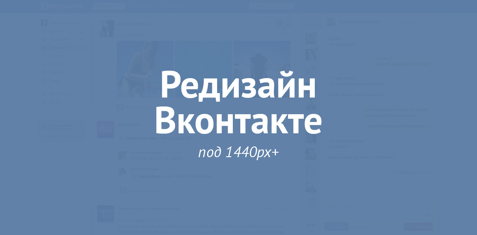
Vkontakte redesign under 1440pk +
Runet is poor reviews of redesign of well-known sites and services. This article is not to fix it. My goal is to discuss with the community a solution to one of the problems of the web version of Vkontakte.
')
In last year’s competition for the VC redesign, the authors of the competition referred to the problems of the web version. The number one problem they called the narrow width of the site. I agree with the Vkontakte team and decided to build my solution in the fight against this problem.


In addition to the width of the screen, I highlighted 2 more problems.
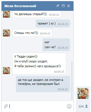
Messenger in VK appeared relatively recently. Its first version was noticeably knocked out in style and with time it was decided. The main problem of the messenger in my opinion is that it lives in parallel with the site. The chat window is small. And although it is scaled, it is tied to absolute coordinates - it’s not convenient to use the service. On Facebook, the messenger also lives separately from the site, while producing many small windows-correspondences.
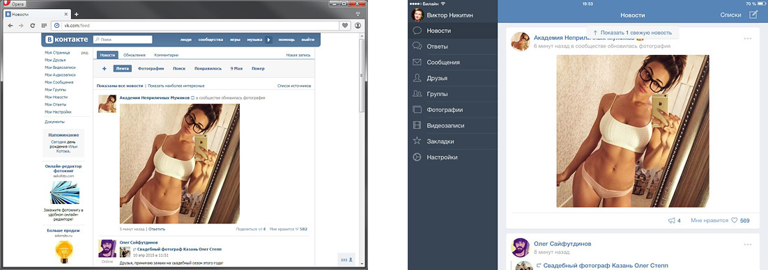
Let's first decide what a narrow screen is. The current width of the VK - 791pk. The competition task was told to adapt the site for a resolution of 1024pk. As I see, the solution to the narrow screen problem will be the interface working at a resolution of 1024–1600pc. That is, an interface capable of operating at a narrow (1024pk) resolution, and at a wide (1440 + pc).
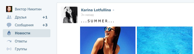
Having studied the options, I identified 6 directions. I give them on the example of the news page.
Solution to the forehead - we make the site rubber.
Pros:
+ Easy to implement
Minuses:
- Content becomes unreadable
- It is necessary to completely revise certain sections of the site (for example, friends)
The reception was noticed in the iA 2006 Facebook redesign concept - comments are located to the right of posts. 5 years ago I tried it on one of my projects.

Pros:
+ Posts are arranged linearly, not torn by comments.
+ Comments to posts are visible immediately without additional transitions.
Minuses:
- Uneven density of information on the screen
- Version under 1024pk with great difficulty can be created or forced to differ from the wide
- It is necessary to completely revise some sections of the site
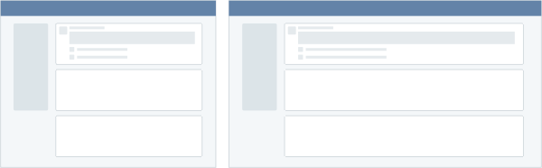
An approach that has become popular in web services: cfm systems, task managers. The screen consists of dependent panels. Panels appear to the right of each other; if the screen does not contain everything, then the left panels disappear as the right ones appear.
Pros:
+ At small resolutions, you can switch the panel, on the large show everything at once
+ The similarity of the interface with the version for tablets
Minuses:
- Not usual for web users option
- The site is located not in the center of the screen, but on the left
- Large volume of architectural work
- Lack of linear viewing, you need to click on the news to read the comments
Interface with two active working sections on the screen.

Pros:
+ Requires little change in current interface
Minuses:
- It is not clear how to work with 2 modes at the same time and why
The mode of displaying information is similar to the timeline on Facebook. The concept based on this variant won in the competition for the design of VK.
Pros:
+ Easy to compose information
+ Uniform data density on the screen
Minuses:
- Split attention when reading news
- Facebook
Move from vertical narration to grid side. Example - Interest.
Pros:
+ Easy to scale for any resolution.
Minuses:
- Difficult to perceive content (difficult to relearn)
- It is necessary to completely revise all sections of the site.
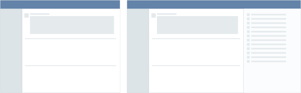
I built my solution on the 4th approach: a screen with two active windows. The second window is the messenger. This allows you to chat while reading news. At the same time without using 2 browser tabs.
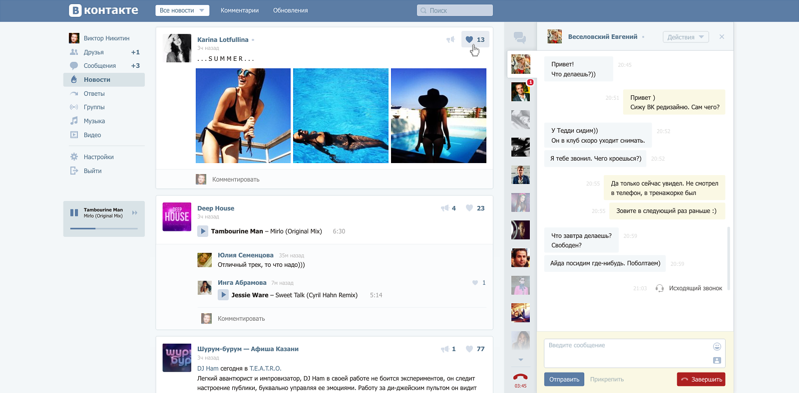
On small (<1440pk) screens, the chat window is minimized.
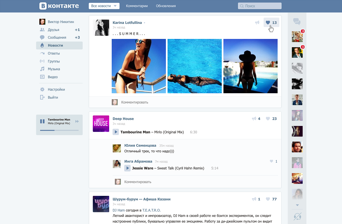
If desired, it opens on top of the main content. The script for correspondence while reading news also works.

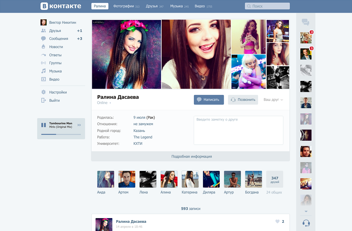
The panel of users with the latest correspondence remains on the screen in all sections of the site:
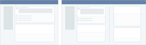
If you look at the screenshots, you can see other changes in the interface:
1. Background. A background appeared to increase the contrast of the blocks.
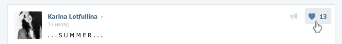
2. Division into blocks. Posts pasted on independent blocks.
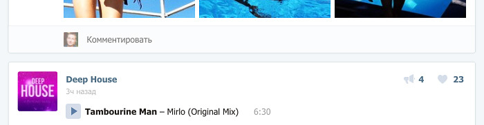
3. Likes moved up. Perhaps the most controversial change, and probably deserves a separate discussion.
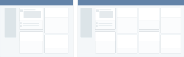
4. Missing the previous top menu. All its functions have already been duplicated in the sections of the site. In its place was the level of tabs. Thus managed to reduce one floor navigation. Filters (rarely used thing) moved to dropdown list. Missing another floor navigation.

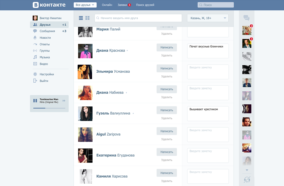
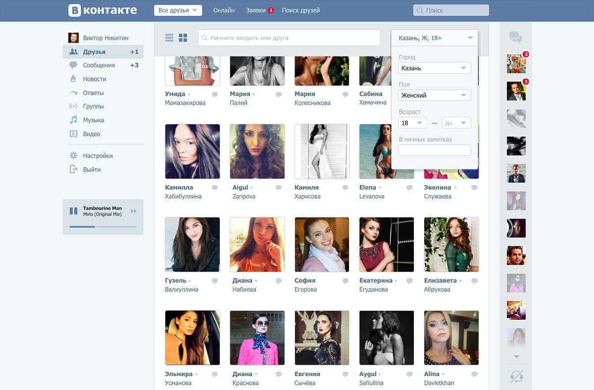
5. Two friend views. One is borrowed from the web version, the other from the tablet. It is difficult to assess which is more popular and more convenient.
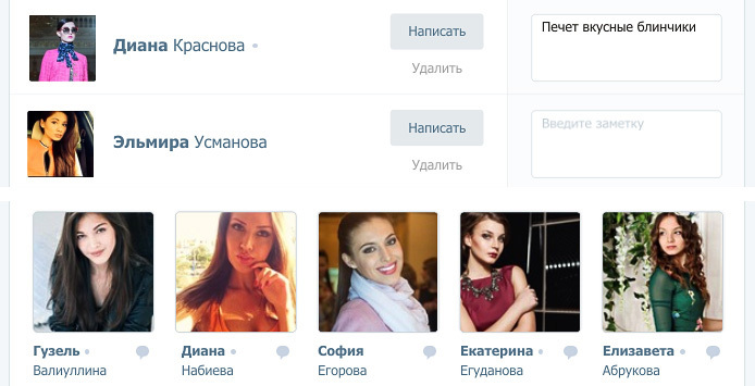
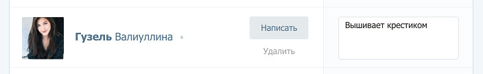
6. Personal notes. A block of personal notes about each friend appeared. Who liked it, take it here - VK Memos .
7. Web calls. They were already in the VC, but were made as a separate mode of operation. Now it is an invisible function that does not interfere with the basic surfing and communication.

Is it possible to redesign a social network without a prototype of the user’s page?
The current version is overloaded with information: music, videos, groups, publish, photos, photos on the map, photo albums, friends, mutual friends, online friends, subscribers ... I decided to cut off all unnecessary:
That's all, thank you for your attention.
')
In last year’s competition for the VC redesign, the authors of the competition referred to the problems of the web version. The number one problem they called the narrow width of the site. I agree with the Vkontakte team and decided to build my solution in the fight against this problem.
Pain
Problem # 1 - Narrow Screen
In addition to the width of the screen, I highlighted 2 more problems.
Problem number 2 - Different style of the web version and applications
Problem number 3 - Messenger
Messenger in VK appeared relatively recently. Its first version was noticeably knocked out in style and with time it was decided. The main problem of the messenger in my opinion is that it lives in parallel with the site. The chat window is small. And although it is scaled, it is tied to absolute coordinates - it’s not convenient to use the service. On Facebook, the messenger also lives separately from the site, while producing many small windows-correspondences.
Theory - Ways to Become Wider
Let's first decide what a narrow screen is. The current width of the VK - 791pk. The competition task was told to adapt the site for a resolution of 1024pk. As I see, the solution to the narrow screen problem will be the interface working at a resolution of 1024–1600pc. That is, an interface capable of operating at a narrow (1024pk) resolution, and at a wide (1440 + pc).
Having studied the options, I identified 6 directions. I give them on the example of the news page.
1. Physical stretching
Solution to the forehead - we make the site rubber.
Pros:
+ Easy to implement
Minuses:
- Content becomes unreadable
- It is necessary to completely revise certain sections of the site (for example, friends)
2. Parallel presentation
The reception was noticed in the iA 2006 Facebook redesign concept - comments are located to the right of posts. 5 years ago I tried it on one of my projects.
Pros:
+ Posts are arranged linearly, not torn by comments.
+ Comments to posts are visible immediately without additional transitions.
Minuses:
- Uneven density of information on the screen
- Version under 1024pk with great difficulty can be created or forced to differ from the wide
- It is necessary to completely revise some sections of the site
3. Shifting panels
An approach that has become popular in web services: cfm systems, task managers. The screen consists of dependent panels. Panels appear to the right of each other; if the screen does not contain everything, then the left panels disappear as the right ones appear.
Pros:
+ At small resolutions, you can switch the panel, on the large show everything at once
+ The similarity of the interface with the version for tablets
Minuses:
- Not usual for web users option
- The site is located not in the center of the screen, but on the left
- Large volume of architectural work
- Lack of linear viewing, you need to click on the news to read the comments
4. Two windows
Interface with two active working sections on the screen.
Pros:
+ Requires little change in current interface
Minuses:
- It is not clear how to work with 2 modes at the same time and why
5. Two columns
The mode of displaying information is similar to the timeline on Facebook. The concept based on this variant won in the competition for the design of VK.
Pros:
+ Easy to compose information
+ Uniform data density on the screen
Minuses:
- Split attention when reading news
6. Cards
Move from vertical narration to grid side. Example - Interest.
Pros:
+ Easy to scale for any resolution.
Minuses:
- Difficult to perceive content (difficult to relearn)
- It is necessary to completely revise all sections of the site.
Practice is my solution
I built my solution on the 4th approach: a screen with two active windows. The second window is the messenger. This allows you to chat while reading news. At the same time without using 2 browser tabs.
On small (<1440pk) screens, the chat window is minimized.

If desired, it opens on top of the main content. The script for correspondence while reading news also works.
The panel of users with the latest correspondence remains on the screen in all sections of the site:
Details overs
If you look at the screenshots, you can see other changes in the interface:
1. Background. A background appeared to increase the contrast of the blocks.
2. Division into blocks. Posts pasted on independent blocks.
3. Likes moved up. Perhaps the most controversial change, and probably deserves a separate discussion.
4. Missing the previous top menu. All its functions have already been duplicated in the sections of the site. In its place was the level of tabs. Thus managed to reduce one floor navigation. Filters (rarely used thing) moved to dropdown list. Missing another floor navigation.
5. Two friend views. One is borrowed from the web version, the other from the tablet. It is difficult to assess which is more popular and more convenient.
6. Personal notes. A block of personal notes about each friend appeared. Who liked it, take it here - VK Memos .
7. Web calls. They were already in the VC, but were made as a separate mode of operation. Now it is an invisible function that does not interfere with the basic surfing and communication.
Instead of postscript
Is it possible to redesign a social network without a prototype of the user’s page?
The current version is overloaded with information: music, videos, groups, publish, photos, photos on the map, photo albums, friends, mutual friends, online friends, subscribers ... I decided to cut off all unnecessary:
That's all, thank you for your attention.
Source: https://habr.com/ru/post/256315/
All Articles