Ways to organize CSS-code
Developer Ben Frain once remarked: “Writing CSS is easy. Scaling and maintaining it is not. ”
Fortunately, on the Internet you can find many solutions to this problem. This article describes the main whales of the structure of the CSS-code, as well as interesting fish / mammals smaller.
The article serves only as a reminder or a quick reference book - it is strongly recommended to study the original documentation to get acquainted with the methodologies in detail.
')
So, let's begin.
Author: Yandex
Documentation
Perhaps the most popular methodology in the world today. The name means "Block, element, modifier".
These categories play the following roles in the code:
Classes are built from these categories for direct use in CSS. In this case, you should not use tag selectors (this could potentially prevent the use of a block / element in a non-standard place on the site, ie, it binds the entity to the context); It is also recommended to avoid cascading selectors, since the resulting class itself quite accurately (specifically) selects the corresponding element.
This approach eliminates the unpredictable effects of the cascade and isolates individual modules from each other.
Sample code in BEM style:
For convenience, different separators are used between the block and the element and between the block / element and modifier; you can use any separators, but they must be the same within the same project.
And now about honey barrels and fly in the ointment:
By the way, for writing code in this style, the Stylus preprocessor was often recommended before, since it allows you to write code like this:
Now you can write this using both SASS and LESS.
And one more note - in the original BEM methodology, the names of the modifiers are used that contain the modified value itself, for example, button - sizeLarge. Now in small projects, many developers do not indicate it for brevity: button - large.
Here you can read about the history of the BEM.
Posted by Nicole Sullivan
Presentation
OOCSS stands for Object Oriented CSS (Object-Oriented CSS). There are two main ideas in this approach:
So "divide and conquer." Using this structure, the developer gets common classes that can be used in different places.
And now - two news (as usual, good and bad):
In addition, the OOCSS approach itself does not offer specific rules, but abstract recommendations; therefore, the method is rather complicated to put into practice.
But, as it sometimes happens, some OOCSS ideas inspired the authors to create their own, more specific, ways of structuring code - the original forks of OOCSS.
Posted by: Jonathan Snook
Documentation
SMACSS stands for “Scalable and Modular Architecture for CSS” (Scalable and Modular Architecture for CSS).
The main goal of the approach is to reduce the amount of code and to simplify code support.
So, Jonathan suggested dividing the styles into 5 parts (in order to include them in the document):
It is also recommended to enter namespaces for classes belonging to a particular group, as well as use a separate namespace for classes used in JavaScript.
This approach really allows to simplify the writing and maintenance of the code and recently attracted a fairly large number of developers.
Author: Thierry Koblentz - Yahoo
Original article
Atomic CSS, rarely also ACSS - atomic CSS. In some ways, this approach is an absolute OOCSS.
When using this approach, a separate class must be formed for each reused property. Example: the “margin-top: 1px” style implies the creation of the “mt-1” class, the “width: 200px” style and the creation of the “w-200” class.
This style allows you to minimize the amount of CSS-code due to the reuse of declarations, as well as relatively easy to make changes to the modules, for example, when changing technical specifications.
However, this approach has significant drawbacks! Here they are:
Due to these shortcomings, the approach was met with a significant amount of criticism. However, the approach can be effective for very large projects - it seems Yahoo! quite pleased with the use of ACSS ( link to an interesting presentation of the same Thierry Koblentz ).
In addition, atomic CSS is used in various frameworks to specify corrective element styles and in some layers of other methodologies.
Author: Robert Kharitonov - Classmates
Documentation
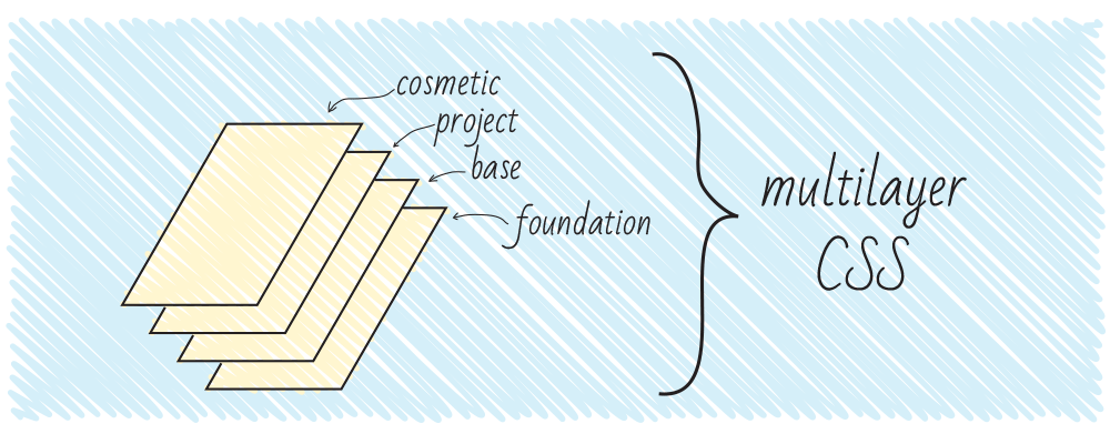
MCSS - Multilayer CSS (Multilayer CSS). This style of writing code, originated in the company "Odnoklassniki", proposes to divide the styles into several parts, called layers .
The hierarchy of interaction between layers is very important:
I also recommend viewing the excellent MCSS presentation - there you can learn more about MCSS and more.
Posted by: Glen Maddern
Documentation
The name of the approach means Attribute Modules for CSS. This is a rather unusual approach, the references of which, however, are increasingly found on the development guru blogs.
To summarize, this method is a somewhat more human-readable representation of the BEM structure. Let's look at an example:
Such a chain of classes is not very pleasing to the eye, so let's group these values by attributes.
Here's what happens:
In order to avoid name collisions, it would be nice to add namespaces to the attributes, wouldn’t it? Then the code of our button will take the following form:
If you use the validator to check the code for correctness, do not forget to also add the prefix "data-" before the attribute name.
To write the CSS code, a little-known selector “~ =” (IE7 +) is used, which works as a class attribute: selects elements whose attribute values contain specified words, separated by spaces. So, the selector of the form a [class ~ = "link"] [class ~ = "button"] is similar to the selector a.class.button (even in specificity, since the specificity of selectors in class and attribute are equal to each other!).
Respectively, CSS code
Converted to
Well, how? If you think such a code is too original, for you there is a less radical form of using AMCSS:
Posted by ben frain
Original article
FUN means “flat hierarchy of selectors, service styles, components with names” (Utility styles, Name-spaced components). Well, or fun =)
For each letter of the name stands a certain principle:
Some developers note that code written using these principles is quite convenient to write and maintain; in a way, the author took the best from BEM and SMACSS and outlined these techniques in a simple and concise manner.
This approach imposes quite a few requirements on the structure of the code and the project; it only establishes the preferred form of the record of selectors and the way they are used in markup. But in small projects these rules may be quite enough to create high-quality code.
That's all!
As you can see, among these approaches there is no ideal - they all have their own advantages and disadvantages.
Therefore, I can only remind you that none of these approaches is an absolute dogma - you can take the approach from starting to create something of your own, or create a new approach from scratch. And maybe this method will allow the web to rise to the next step.
Thanks for attention!
Fortunately, on the Internet you can find many solutions to this problem. This article describes the main whales of the structure of the CSS-code, as well as interesting fish / mammals smaller.
The article serves only as a reminder or a quick reference book - it is strongly recommended to study the original documentation to get acquainted with the methodologies in detail.
')
So, let's begin.
Content
BEM
Author: Yandex
Documentation
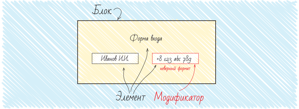
Perhaps the most popular methodology in the world today. The name means "Block, element, modifier".
These categories play the following roles in the code:
- blocks can be used in several places of the site;
- elements are part of a block and have no functional sense outside the block;
- Modifiers are properties of a block or element that change its appearance or behavior.
Classes are built from these categories for direct use in CSS. In this case, you should not use tag selectors (this could potentially prevent the use of a block / element in a non-standard place on the site, ie, it binds the entity to the context); It is also recommended to avoid cascading selectors, since the resulting class itself quite accurately (specifically) selects the corresponding element.
This approach eliminates the unpredictable effects of the cascade and isolates individual modules from each other.
Sample code in BEM style:
.block_element {...} .block_element-modifier {...} For convenience, different separators are used between the block and the element and between the block / element and modifier; you can use any separators, but they must be the same within the same project.
And now about honey barrels and fly in the ointment:
- Good: the isolation of modules from each other and the absence of unpredictable cascades of selectors.
- Bad: not always long class names are convenient to use (for large projects it makes sense to use tools that automate the work with BEM markup).
By the way, for writing code in this style, the Stylus preprocessor was often recommended before, since it allows you to write code like this:
.block { &-element {...} } Now you can write this using both SASS and LESS.
And one more note - in the original BEM methodology, the names of the modifiers are used that contain the modified value itself, for example, button - sizeLarge. Now in small projects, many developers do not indicate it for brevity: button - large.
Here you can read about the history of the BEM.
OOCSS
Posted by Nicole Sullivan
Presentation
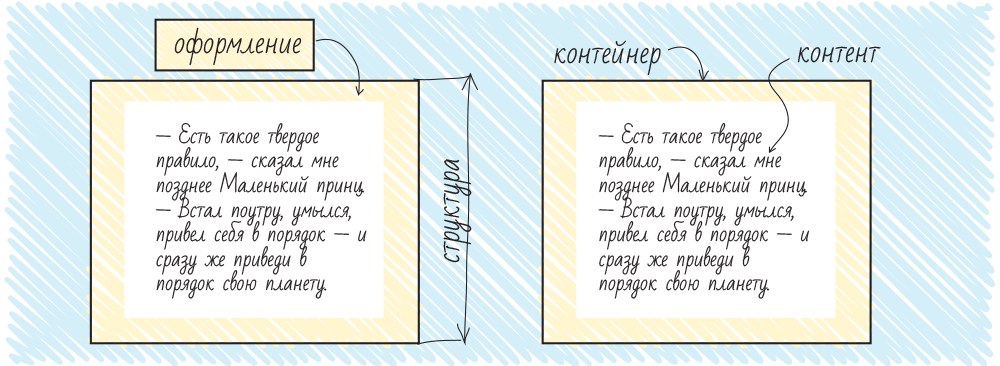
OOCSS stands for Object Oriented CSS (Object-Oriented CSS). There are two main ideas in this approach:
- Separation of structure and design
- Separation of container and content (content)
So "divide and conquer." Using this structure, the developer gets common classes that can be used in different places.
And now - two news (as usual, good and bad):
- Good: reducing the amount of code due to its reuse (DRY principle).
- The bad: rather complicated support: if you change the style of a specific element, you will most likely have to change not only CSS (since most classes are common), but also add classes to the markup.
In addition, the OOCSS approach itself does not offer specific rules, but abstract recommendations; therefore, the method is rather complicated to put into practice.
But, as it sometimes happens, some OOCSS ideas inspired the authors to create their own, more specific, ways of structuring code - the original forks of OOCSS.
SMACSS
Posted by: Jonathan Snook
Documentation
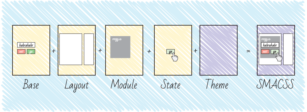
SMACSS stands for “Scalable and Modular Architecture for CSS” (Scalable and Modular Architecture for CSS).
The main goal of the approach is to reduce the amount of code and to simplify code support.
So, Jonathan suggested dividing the styles into 5 parts (in order to include them in the document):
- Base rules - basic styles. These are styles of the main elements of the site - body, input, button, ul, ol, etc. This section mainly uses tag and attribute selectors, classes - in exceptional cases (for example, if you have JavaScript-styled selects);
- Layout rules - layout styles. Here are the styles of the global elements of the size of the cap, footer, sidebar, etc. Jonathan suggests using id here in selectors, since these elements will not occur more than 1 time per page. However, the author of the article considers this a bad practice (every time an id selector appears in styles, somewhere in the world a kitten is sad). Use classes and you will be happy.
- Modules rules - styles of modules, that is, blocks that can be used several times on one page. For classes of modules, it is not recommended to use id and tag selectors (for repeated use and context independence, respectively).
- State rules - state styles. In this section, the various states of the modules and the skeleton of the site are prescribed. This is the only section in which the use of the "! Important" keyword is permissible.
- Theme rules - design. It describes the styles of designs that may eventually need to be replaced (so convenient to do, for example, New Year's decoration; for html themes for sale, such styles allow you to switch colors, etc.).
It is also recommended to enter namespaces for classes belonging to a particular group, as well as use a separate namespace for classes used in JavaScript.
This approach really allows to simplify the writing and maintenance of the code and recently attracted a fairly large number of developers.
Atomic CSS
Author: Thierry Koblentz - Yahoo
Original article
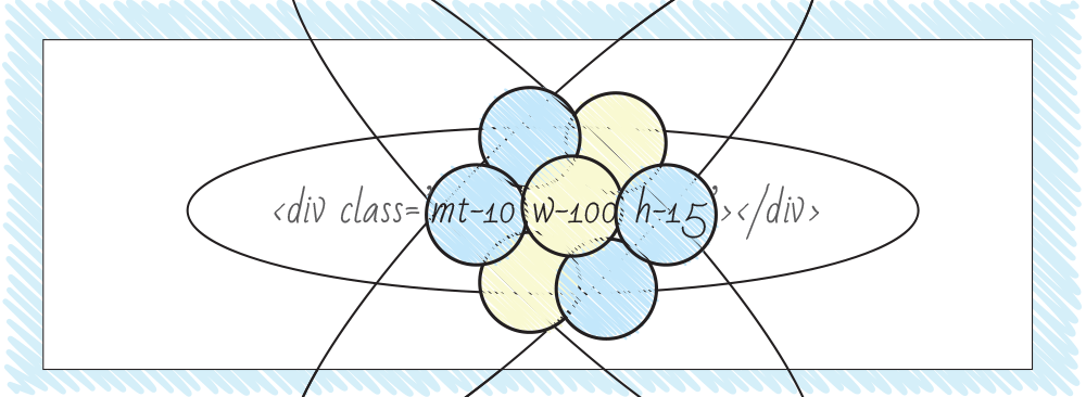
Atomic CSS, rarely also ACSS - atomic CSS. In some ways, this approach is an absolute OOCSS.
When using this approach, a separate class must be formed for each reused property. Example: the “margin-top: 1px” style implies the creation of the “mt-1” class, the “width: 200px” style and the creation of the “w-200” class.
This style allows you to minimize the amount of CSS-code due to the reuse of declarations, as well as relatively easy to make changes to the modules, for example, when changing technical specifications.
However, this approach has significant drawbacks! Here they are:
- class names are descriptive names of properties, without describing the semantic essence of an element, which sometimes can complicate development;
- settings for displaying elements are transferred directly to HTML (this is not what the style sheets were invented for, is it?).
Due to these shortcomings, the approach was met with a significant amount of criticism. However, the approach can be effective for very large projects - it seems Yahoo! quite pleased with the use of ACSS ( link to an interesting presentation of the same Thierry Koblentz ).
In addition, atomic CSS is used in various frameworks to specify corrective element styles and in some layers of other methodologies.
MCSS
Author: Robert Kharitonov - Classmates
Documentation
“Ogres are like onions. The ogres have layers. And the bow has layers. Both have layers. ”Shrek
MCSS - Multilayer CSS (Multilayer CSS). This style of writing code, originated in the company "Odnoklassniki", proposes to divide the styles into several parts, called layers .
- Zero layer or foundation - here is the code responsible for resetting browser styles (reset.css / normalize.css);
- Base layer - includes the styles of reusable elements on the site: buttons, input fields for text, prompts, etc .;
- Project layer - includes individual modules, as well as the so-called. “Context” - modifications of elements depending on the client’s browser, the device on which the site / application is viewed, user roles, etc .;
- Cosmetic layer - this section contains code written in the OOCSS style, making minor changes in the appearance of the elements. It is recommended to leave only styles that affect the appearance and are not capable of breaking the layout of the site - colors, some non-critical indents.
The hierarchy of interaction between layers is very important:
- The foundation layer sets neutral styles and does not affect other layers.
- Elements of the base layer can only affect the classes of their own layer. Example: the icons on the website can be 25x25, but the icons in the buttons are 16x16.
- Elements of the design layer can affect the base and design layers. Examples: icons in the form of a login have a special size of 20x20; the “Purchase” module may include a login form, the styles of which are slightly modified.
- The cosmetic layer is designed as descriptive OOCSS classes (“atomic” classes) and does not affect the other CSS code, selectively applied in the markup.
I also recommend viewing the excellent MCSS presentation - there you can learn more about MCSS and more.
AMCSS
Posted by: Glen Maddern
Documentation
The name of the approach means Attribute Modules for CSS. This is a rather unusual approach, the references of which, however, are increasingly found on the development guru blogs.
To summarize, this method is a somewhat more human-readable representation of the BEM structure. Let's look at an example:
<div class="button button--large button--blue"></div> Such a chain of classes is not very pleasing to the eye, so let's group these values by attributes.
Here's what happens:
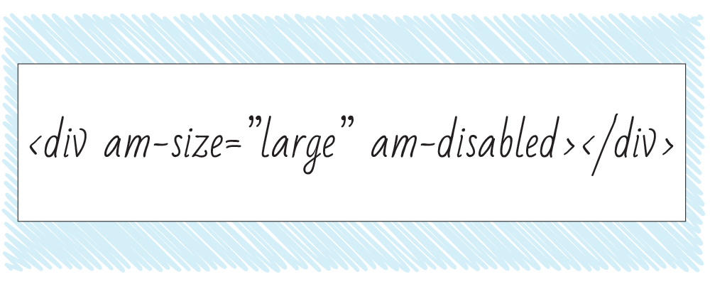
<div button="large blue"></div> In order to avoid name collisions, it would be nice to add namespaces to the attributes, wouldn’t it? Then the code of our button will take the following form:
<div am-button="large blue"></div> If you use the validator to check the code for correctness, do not forget to also add the prefix "data-" before the attribute name.
To write the CSS code, a little-known selector “~ =” (IE7 +) is used, which works as a class attribute: selects elements whose attribute values contain specified words, separated by spaces. So, the selector of the form a [class ~ = "link"] [class ~ = "button"] is similar to the selector a.class.button (even in specificity, since the specificity of selectors in class and attribute are equal to each other!).
Respectively, CSS code
.button {...} .button--large {...} .button--blue{...} Converted to
[am-button] {...} [am-button~="large"] {...} [am-button~="blue"] {...} Well, how? If you think such a code is too original, for you there is a less radical form of using AMCSS:
<div am-button am-button-large am-button-blue></div> FUN
Posted by ben frain
Original article
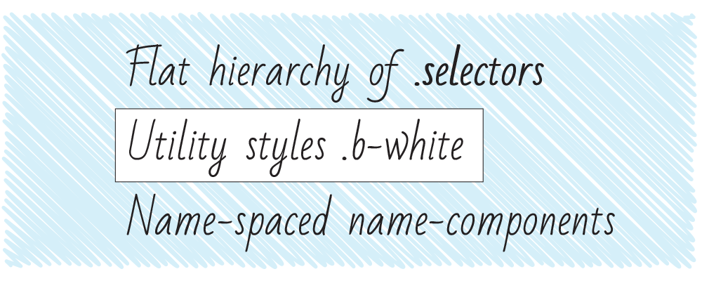
FUN means “flat hierarchy of selectors, service styles, components with names” (Utility styles, Name-spaced components). Well, or fun =)
For each letter of the name stands a certain principle:
- F, a flat hierarchy of selectors: it is recommended to use classes for selecting elements in the styles, do not nest selectors (avoid the cascade unnecessarily), and also not use id (if you read the BEM section, think about kittens);
- U, service classes: the creation of service atomic styles for solving typical layout problems is encouraged, for example, w100 for “width: 100%” or fr for “float: right”;
- N, components with namespaces: Ben recommends adding namespaces to define styles for elements of specific modules; This approach will avoid class matches.
Some developers note that code written using these principles is quite convenient to write and maintain; in a way, the author took the best from BEM and SMACSS and outlined these techniques in a simple and concise manner.
This approach imposes quite a few requirements on the structure of the code and the project; it only establishes the preferred form of the record of selectors and the way they are used in markup. But in small projects these rules may be quite enough to create high-quality code.
Conclusion
That's all!
As you can see, among these approaches there is no ideal - they all have their own advantages and disadvantages.
Therefore, I can only remind you that none of these approaches is an absolute dogma - you can take the approach from starting to create something of your own, or create a new approach from scratch. And maybe this method will allow the web to rise to the next step.
Thanks for attention!
Source: https://habr.com/ru/post/256109/
All Articles