How we implemented the machine interface for issuing loans
Payday Loans
What is a loan to paycheck, probably, no need to explain. There are offices for issuing such loans, there are online services, and there is an interim solution - automatic machines for issuing loans.
From a business point of view, loan offices suffer from a simple problem — on average, a fairly low customer flow due to already large competition. And to maintain this office you need - this is rent and the salary of at least one employee. The employee also performs fairly simple actions: fill out a client application form, take a copy of a passport, issue or accept money.
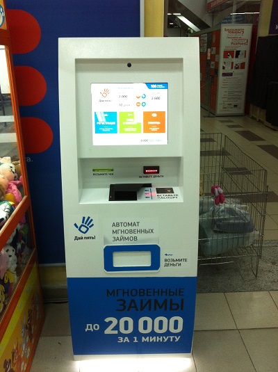
Loan Machine
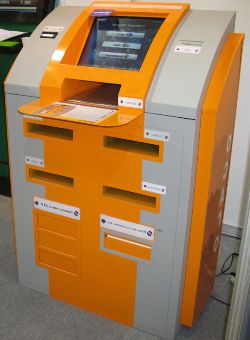
We started thinking about whether it is possible to make a device that is convenient to use, easy for everyone, and which can perform the specified functions. We take the payment terminal components, add a cash dispenser, a passport scanner and a webcam - and all the necessary functionality is covered. We can get a passport of the client and his photo, make sure that it is really him, as well as issue and accept money.
')
If a client takes a loan at the office, the contract that he signs is also printed to him, and the company has his own copy. To do this, you can embed a printer into the machine, from which the contract will be taken out, and a scanner (you can draw) to transfer a scan of the contract signed by the client, and the contract itself can remain in the machine's tray for subsequent collection. However, our experience in the area of payday loans shows that the existence of a signed contract does not significantly affect the repayment of loans. If you embed a printout and scan the contract in the process of issuing a loan, it will greatly complicate the whole process for the client. And we cannot lose a client, so we refuse to print them immediately.
So, we have a set of components, the case for small - to come up with all the logic of the interaction between the client and the machine. The company has a standard business process of working with the client: the client registers once, for this we collect about 80 personal fields (including, of course, passport data), and then use the loans on his existing profile - return, re-issuance of loans does not require the provision this information again. We also save passport scans for every client.
Our target audience: predominantly women from 25 to 65 years old, of medium or low income. At the same time, the audience is on average poorly acquainted with modern technologies, computers and gadgets, which complicates the already not easy task of collecting a long questionnaire through a machine.
Where to begin
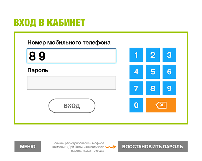
We make a decision to work with a client through a machine according to the standard scheme: one-time registration and further use of the service through a personal account. First of all, we get rid of all fields of our questionnaire, without which we can do. The questionnaire is reduced to about 20 fields, and our main task is to make a convenient registration. How to do this is completely incomprehensible, since we have never dealt with the software for the terminals.
We are looking for all sorts of examples of terminal interfaces. On Habré there is an article about the creation of the interface - "How we designed and painted the design of the payment terminal" , but, unfortunately, a lot of useful information can not be drawn from here. We look at the interfaces of payment systems - perhaps only Qiwi is sympathetic. However, the bulk of their operations is to pay for a phone or another provider in two clicks, dialing only the number on the virtual pinpad. Well, but for us this is not enough, we would very much like to find an example of a successful implementation of a more complex interface.

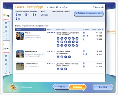
Since the interface was developed in the summer of 2012 (and this article was written in early 2013), at that time, the example was, perhaps, the only one - the Just Travel machine from Lebedev . I like the interface, a good example of how to put a pile of logic in a connected interface. Having studied the process of buying a ticket in more detail, it begins to seem that this is a complicated matter, and yet it is much easier to buy a ticket from a computer than from a terminal. And we need to avoid such an error - a simple interface = minimum number of clicks and transitions.
We are puzzling how to make the input of text fields, because of the 20 fields left in our application form, half is textual. We can make a virtual keyboard, but then we will not be able to place many text fields on the screen, since half of the screen will go under the keyboard. But you can put physical clavus and release the screen.
We are trying to find stupid examples of text input on the terminal. For example, there is a cyborg machine for issuing CTP policies:
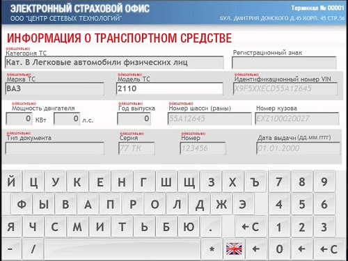
You can watch the video how it works and immediately understand two things:
- Nobody will ever use such an automatic machine;
- You can not ask a person to enter a large amount of text on the terminal. Neither virtual nor physical keyboard solves the problem.
We consider the business process
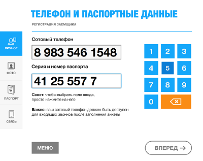
We finally understand that the text fields must be completely removed from the questionnaire, leaving only the numeric ones - they are easy to enter from the pinpad. However, we definitely need to take the address of residence and residence from the client, who issued the passport, the name of the employer and several other text fields.
In order to make a decision on issuing a loan, in any case, we need to view the data by the operator, since it is impossible to compare the client’s and passport photos with sufficient accuracy automatically (and also often have to check the specified contact numbers), we can call the client and clarify the data which we did not ask in the questionnaire.
So, we simplify the questionnaire as much as possible, and we will ask all client information by phone. From the client we need to get at least:
- Cellular telephone
- A photograph
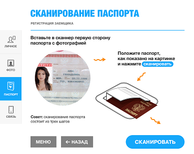
- Passport scans
We also add home and work phones here so that during a call to a cell phone he doesn’t have to dig into a notebook. And the series number of the passport to, for example, have the opportunity to check if we already have such a client.
Terminal background should be white
Although we have decided on the TZ, we don’t like our sketches, but we don’t have an understanding or examples how to do well. Since the machine should attract the attention of passing by, it must be somehow bright, glow. The white monitor glows brightest of all, so we take the white background as a basis (although you can take any bright color, white is better suited to give lightness to the entire interface). And since the background is white, all texts and graphics should be saturated colors. Things got better already:

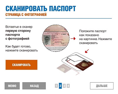
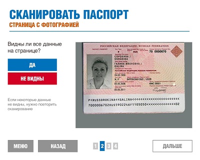
A considerable number of iterations has to be performed in order to briefly and clearly explain to a person how to scan a passport. Moreover, potential clients have never done anything like this. Now let's make a personal account:
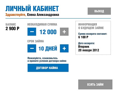

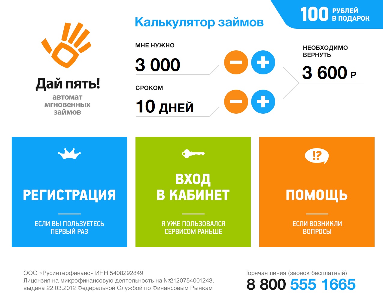
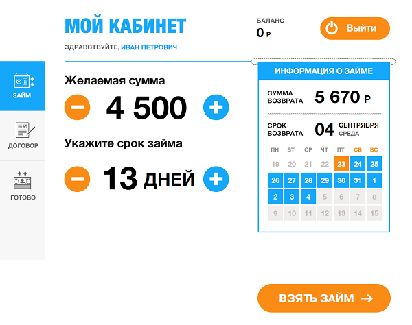
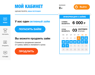
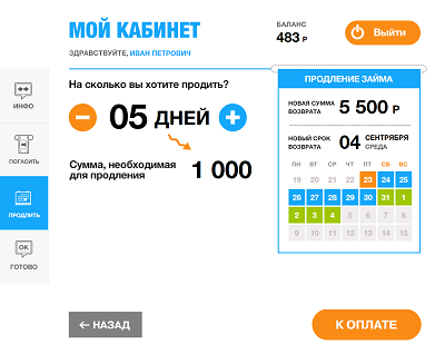
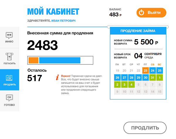
We give the customer the opportunity to take a loan, as well as extend or pay the current loan. To extend, you need to choose a renewal period and pay interest on the current loan (in our business processes). You can renew and pay at any time.
Finish what we started
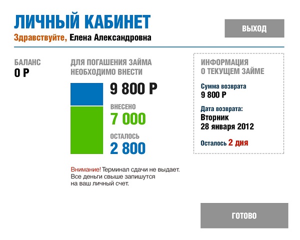
Since our terminal does not give change, you need to provide a positive client balance. We put the entire change on the balance, which will be used for the next deposit operation - we add the argument to the client to come back to us again.
Graphically, the payment should not be displayed as a bar that grows up as the bill is pushed into the bill acceptor. So, perhaps, you can get yourself an enemy instead of a grateful client. We make the column horizontal, and we provide for partial repayment of the loan - the funds are simply deposited to the client on the balance sheet.
The idea comes to make a calendar - so that when choosing the term of the loan (or renewal term) dates are noted on the calendar and you can see the day of the week when you need to return. Will it be possible to fit a whole month (maximum period - 21 days + renewal) on the screen? Let's try.
Another feature is a calculator on the main page, letting anyone want to play. Helpful at the same time.
Final version
the main
check in
Personal Area
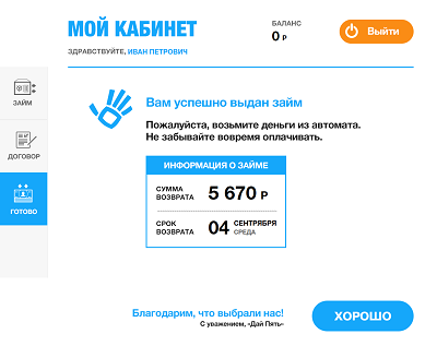
Getting a loan
Renewal and payment
Conclusion
Taking into account the processing of all possible errors, the interface has turned 40 different screens.
The very first tests on clients showed good results in terms of usability - far from the most advanced citizens in gadgets spent an average of several seconds on each page before performing the action we are waiting for. With the location of the “Forward” button in the lower right corner, they also hit the dot: the back and forth buttons at the bottom of the page, located at the edges, is probably the best way to navigate the terminal.
Automatic machines work with us from last year. The goals that were set during the creation, I think achieved:
- Appearance attracts customers
- The interface is light, colorful and intuitive.
- Applied, perhaps the simplest business logic of issuing loans from possible
- Minimum bounce rate at registration
And if a person is registered, he will become your most loyal customer. We received a lot of good reviews and customers demanded to take loans in machines, but not in our offices.
Appearance and video

P.S
This article is a short story, how we came up with a business process and a graphical interface of the machine. Below in the comments you can find a detailed discussion, good loans to paycheck or not. The main purpose of the article is to show how you can make a convenient and beautiful interface for the task before you, even if you have never done any interface design or terminals.
Source: https://habr.com/ru/post/255355/
All Articles