Understanding Web Design Trends
Despite the abundance of various articles on web design on the Internet, it’s pretty hard to figure out which design is visually outdated and which is in trend and why. First you need a global look at the latest history of web design, so as not to get confused in details. This article tells a brief history of the visual trends of recent years and gives their key distinctive features.
It will be about the visual evolution of web design, with a slight eye on the milestones in the development of technology. The fact is that, although the influence of technology is noticeable, it is not decisive. For example, both skeuomorphic and “flat” designs can be made using the same technology stack.
So let's go.
Speaking at the Future of Web Design conference in New York , famous American designer Elliot Jay Stocks described “what people mean by visual design in the style of web 2.0,” with the following features:
')
• bright colours;
• badges "special offer", stuck on the page;
• glossiness, glassiness, “caramel” in icons and illustrations;
• rounded corners;
• gradients;
• background patterns with diagonal lines;
• reflections.

These clichés filled the Internet mostly from 2003 to 2010. Often technology did not keep up with fashion. Recall, for example, the layout of rounded corners, which was made using pictures. However, as can be seen from the same example with the corners, fashion spurred technology.
From the beginning of the second decade of the 21st century, a truly naturalistic design has come to replace the “caramel” trend.
Skevomorphism is the use of design elements that are very similar visually to their counterparts in the real world. In industrial design, for example, the story is well known that the engine in the first cars was placed in front, as it seemed intuitive: after all, the horse is in front of the cart.
Detailed traced three-dimensional icon "trash can" or "leather" background of the calendar application in iOS of that time are typical examples of skevomorphism. There is another interpretation of this word, which is close to the concept of affordance, however, here we speak of skeuomorphism as a visual style.
Features of skevomorphism in the web:
• three-dimensional elements;
• muted, naturalistic color scheme;
• items that look like cloth, leather or other physical material, with realistic seams and texture;
• “embossed” letters;
• “curtains”, ribbons, prints.

Parallel to this trend, more fundamental things connected with the development of browser-based technologies, facilitation of work of the layout designer, and, frankly, the development of taste by web designers, who finally became a separate profession, were also coming into fashion.
It is in vogue to this day:
• interesting, diverse typography;
• following the laws of printed design in the design of the text;
• large photos on the background.
I must say that all this time the trendsetter was in fact one large brand with an innovative image, guess who? Well, of course, Apple. Elements of web 2.0, and then skeuomorphism first appeared on their websites and applications.
But in 2010–2011, two competitors took to the stage of the style at once.
In 2010, Microsoft introduced its new design to the public, radically different from the past. The main emphasis in the styliche was placed on “flat” elements and typography, in contrast to previous “iconic” interfaces. The changes were presented as “truly digital design” .
Since Apple, too, at this time began to introduce elements of minimalism, it quickly became a trend that swept the Internet.

Last but not least, the huge popularity of “flat” design is related to technical needs in the era of start-ups and mobile devices. More than ever, it became important to quickly create websites and applications that would look adequate on the desktop and on the screen of a smartphone. With skevomorphous elements, it is difficult to make a really responsive design, and with flat ones - please, and looks stylish.
Twitter Bootstrap was introduced as a framework to make life easier for front-end programmers, and in fact became the conductor of a new style.
The ease and visual accuracy of the framework played an important role in its rapid spread. But the main reason was, of course, the “turnkey” solution of the whole complex of characteristic tasks of front-end development. The fact that you can immediately get and quality code for all platforms, and good design, attracted thousands of developers. And on the Internet, conversations began about the fact that all sites have become the same ...
However, it is believed that neither then nor now Bootstrap was not a trend setter, but rather a direct reflection of them. In Bootstrap 1.0, gradients were used, there were more shadows and other unobtrusive 3d, characteristic of the epoch of the sunset of skevomorphism.
Here, for example, how the modal window with buttons has changed:
Bootstrap 1 :

Bootstrap 3 :

Skevomorphism began to turn into an abusive word, and the pendulum of fashion swung to the other side - the “flat design” trend came into full force with the following visual signs:
• minimalism;
• two-dimensionality, without shadows and depth;
• in the foreground content;
• return bright colors.


Even the button, for which affordability was traditional — a raised form, similar to the shape of physical buttons — became a flat rectangle.
The trends that have become fashionable in the era of skeuomorphism continue to actively develop:
• interesting typography and print design orientation;
• large photos and even videos on the background of sites.
Passions in the midst of the struggle of the upcoming flat and not surrendering skevomorphous design reached its climax. This has become one of the most discussed topics on the Internet, not only among designers. The Argentine agency In tacto even released a game on this topic.
The agency boasted of success in the famous video .
In the meantime, progress does not stand still and in 2014 two “visual languages” came out, which may decide the outcome of the struggle.
Google’s most detailed style-guide is not so much impressive with its novelty of design as with the level of PR and the scale of reporting to the audience. Google has really managed to become a trendsetter in the design of the applications for which the style guide was intended. However, several Material Design Web frameworks, most of which were not made by Google, appeared very quickly (for example, here is Material Design in Angular.js ).
As the designer John Weley explained at the Google I / O 2014 conference, as opposed to the Microsoft approach, which declared its Metro “authentically digital”, Google wanted to return to the real, “non-digital” world, to find a naturalistic, somewhat skeptical metaphor for the interface . However, the metaphor that they chose, yet turned out to be the flattest thing that happened in the physical world is paper.
Accordingly, almost everything in the interface looks and behaves like paper. Screens are sheets of paper and ink on them. Shadows are returned to the design, when one sheet is placed above the other. The raised button appeared again, but now it is not pressed (does not “descend”) when clicked, but gives the effect of flowing ink. Paper, however, has a number of unrealistic properties, for example, it has no texture, and sheets can be seamlessly joined and separated.
The Google Material Design style generally supports minimalist trends, the use of bright colors and interesting typography.
From the new he brought into fashion the following:
• the return of shadows and depths in the design;
• Icons are used a lot, they are generally flat, but with shadows, folds and “depth”;
• animations in the metaphor of "paper sheets".
For the first time, the animation adequately supports the general style idea and practically comes to the forefront of the style guide. Almost in every section there are examples with interesting and reasonable animation.
At the end of last year, IBM launched an open access to its new design language.
As stated in the IBM blog, the inspiration for the new design was an analogy with human languages. Language is what allows people to communicate, understand each other and solve problems together. Similarly, the visual language - design language - is designed to help designers and product developers to “speak the same language”, both among themselves and with users.

IBM Design Language unlike Google Material Design does not give recommendations on the size of indentation, but sets a good general philosophical tone in design. For example, there are several paragraphs about the golden section and grid options, but there are no patterns and restrictions “this will be in the style of IBM, but not at all”, as was done in Material Design. The reluctance to give ready-made templates to the lazy templates is explained by the desire to give freedom to new ideas. Against the background of the talk that all sites and applications have become the same, it sounds tempting.
Sometimes specific numbers and guidelines can still be found. For example, in the Iconography section there is the following recommendation: “do not round the corners, then the icons will have a more strict“ scientific ”look”.
Compare Google Material Design Icons
... and IBM Design Language:
In IBM Design Language, much attention is paid to the focus on the user and content, as well as animation again. The basis of the concept of motion taken immortal principles of Disney animation. Briefly, but quite succinctly told, what is the secret of the attractiveness and style of some techniques. Interesting examples are given, for example, about how the warning block moves heavily when it arrives, slows down, draws attention to its weight and creates an impression of importance.
Judging by the emphasis on the movement of elements in the two high-profile styles of 2014, animation becomes a new field where a battle of trends will take place.
And this is understandable, because technology has made the creation of animations as never before easy. And in visual web design now, it seems, there is a situation when something new is hard to bring. This leads to the fact that lawmakers of the style do not try to sharply reform the "flat design", but shift the emphasis on animation in order to make them their recognizable "chip". So the most interesting is waiting for us, of course, ahead.
It will be about the visual evolution of web design, with a slight eye on the milestones in the development of technology. The fact is that, although the influence of technology is noticeable, it is not decisive. For example, both skeuomorphic and “flat” designs can be made using the same technology stack.
So let's go.
The first decade of the XXI century - caramel web "2.0"
Speaking at the Future of Web Design conference in New York , famous American designer Elliot Jay Stocks described “what people mean by visual design in the style of web 2.0,” with the following features:
')
• bright colours;
• badges "special offer", stuck on the page;
• glossiness, glassiness, “caramel” in icons and illustrations;
• rounded corners;
• gradients;
• background patterns with diagonal lines;
• reflections.
These clichés filled the Internet mostly from 2003 to 2010. Often technology did not keep up with fashion. Recall, for example, the layout of rounded corners, which was made using pictures. However, as can be seen from the same example with the corners, fashion spurred technology.
2011 - skevomorphism
From the beginning of the second decade of the 21st century, a truly naturalistic design has come to replace the “caramel” trend.
Skevomorphism is the use of design elements that are very similar visually to their counterparts in the real world. In industrial design, for example, the story is well known that the engine in the first cars was placed in front, as it seemed intuitive: after all, the horse is in front of the cart.
Detailed traced three-dimensional icon "trash can" or "leather" background of the calendar application in iOS of that time are typical examples of skevomorphism. There is another interpretation of this word, which is close to the concept of affordance, however, here we speak of skeuomorphism as a visual style.
Features of skevomorphism in the web:
• three-dimensional elements;
• muted, naturalistic color scheme;
• items that look like cloth, leather or other physical material, with realistic seams and texture;
• “embossed” letters;
• “curtains”, ribbons, prints.
Parallel to this trend, more fundamental things connected with the development of browser-based technologies, facilitation of work of the layout designer, and, frankly, the development of taste by web designers, who finally became a separate profession, were also coming into fashion.
It is in vogue to this day:
• interesting, diverse typography;
• following the laws of printed design in the design of the text;
• large photos on the background.
I must say that all this time the trendsetter was in fact one large brand with an innovative image, guess who? Well, of course, Apple. Elements of web 2.0, and then skeuomorphism first appeared on their websites and applications.
But in 2010–2011, two competitors took to the stage of the style at once.
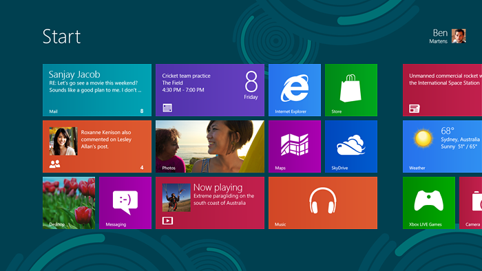
2010 - Windows Metro (aka Microsoft design language and Modern UI)
In 2010, Microsoft introduced its new design to the public, radically different from the past. The main emphasis in the styliche was placed on “flat” elements and typography, in contrast to previous “iconic” interfaces. The changes were presented as “truly digital design” .
Since Apple, too, at this time began to introduce elements of minimalism, it quickly became a trend that swept the Internet.
Last but not least, the huge popularity of “flat” design is related to technical needs in the era of start-ups and mobile devices. More than ever, it became important to quickly create websites and applications that would look adequate on the desktop and on the screen of a smartphone. With skevomorphous elements, it is difficult to make a really responsive design, and with flat ones - please, and looks stylish.
2011 - Twitter Bootstrap
Twitter Bootstrap was introduced as a framework to make life easier for front-end programmers, and in fact became the conductor of a new style.
The ease and visual accuracy of the framework played an important role in its rapid spread. But the main reason was, of course, the “turnkey” solution of the whole complex of characteristic tasks of front-end development. The fact that you can immediately get and quality code for all platforms, and good design, attracted thousands of developers. And on the Internet, conversations began about the fact that all sites have become the same ...
However, it is believed that neither then nor now Bootstrap was not a trend setter, but rather a direct reflection of them. In Bootstrap 1.0, gradients were used, there were more shadows and other unobtrusive 3d, characteristic of the epoch of the sunset of skevomorphism.
Here, for example, how the modal window with buttons has changed:
Bootstrap 1 :
Bootstrap 3 :
2012 - Flat Design
Skevomorphism began to turn into an abusive word, and the pendulum of fashion swung to the other side - the “flat design” trend came into full force with the following visual signs:
• minimalism;
• two-dimensionality, without shadows and depth;
• in the foreground content;
• return bright colors.
Even the button, for which affordability was traditional — a raised form, similar to the shape of physical buttons — became a flat rectangle.
The trends that have become fashionable in the era of skeuomorphism continue to actively develop:
• interesting typography and print design orientation;
• large photos and even videos on the background of sites.
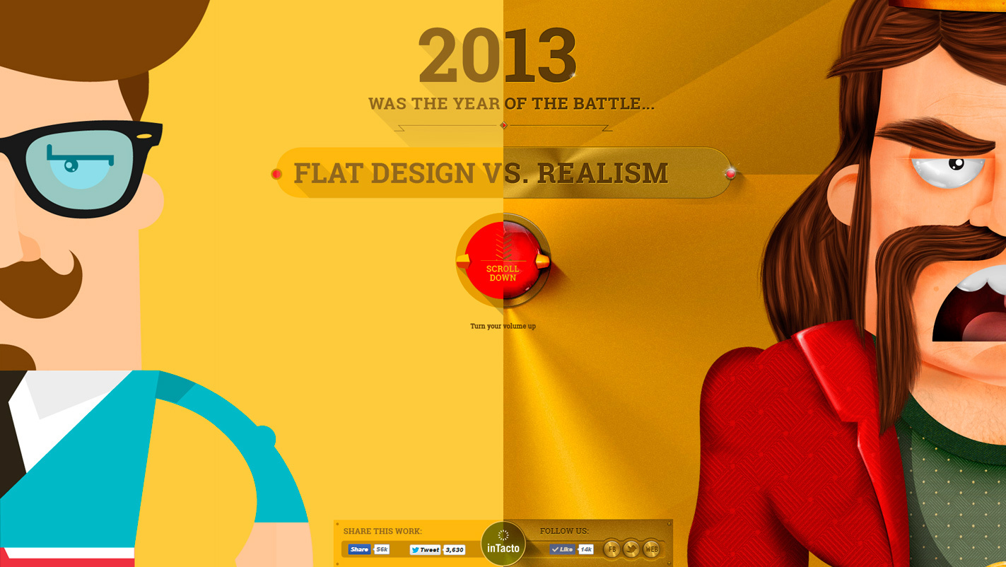
2013 - the struggle of trends
Passions in the midst of the struggle of the upcoming flat and not surrendering skevomorphous design reached its climax. This has become one of the most discussed topics on the Internet, not only among designers. The Argentine agency In tacto even released a game on this topic.
The agency boasted of success in the famous video .
In the meantime, progress does not stand still and in 2014 two “visual languages” came out, which may decide the outcome of the struggle.
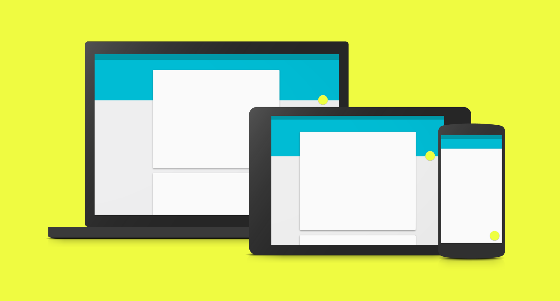
2014 - Google Material Design
Google’s most detailed style-guide is not so much impressive with its novelty of design as with the level of PR and the scale of reporting to the audience. Google has really managed to become a trendsetter in the design of the applications for which the style guide was intended. However, several Material Design Web frameworks, most of which were not made by Google, appeared very quickly (for example, here is Material Design in Angular.js ).
As the designer John Weley explained at the Google I / O 2014 conference, as opposed to the Microsoft approach, which declared its Metro “authentically digital”, Google wanted to return to the real, “non-digital” world, to find a naturalistic, somewhat skeptical metaphor for the interface . However, the metaphor that they chose, yet turned out to be the flattest thing that happened in the physical world is paper.
Accordingly, almost everything in the interface looks and behaves like paper. Screens are sheets of paper and ink on them. Shadows are returned to the design, when one sheet is placed above the other. The raised button appeared again, but now it is not pressed (does not “descend”) when clicked, but gives the effect of flowing ink. Paper, however, has a number of unrealistic properties, for example, it has no texture, and sheets can be seamlessly joined and separated.
The Google Material Design style generally supports minimalist trends, the use of bright colors and interesting typography.
From the new he brought into fashion the following:
• the return of shadows and depths in the design;
• Icons are used a lot, they are generally flat, but with shadows, folds and “depth”;
• animations in the metaphor of "paper sheets".
For the first time, the animation adequately supports the general style idea and practically comes to the forefront of the style guide. Almost in every section there are examples with interesting and reasonable animation.
2014 - IMB Design Language
At the end of last year, IBM launched an open access to its new design language.
As stated in the IBM blog, the inspiration for the new design was an analogy with human languages. Language is what allows people to communicate, understand each other and solve problems together. Similarly, the visual language - design language - is designed to help designers and product developers to “speak the same language”, both among themselves and with users.
IBM Design Language unlike Google Material Design does not give recommendations on the size of indentation, but sets a good general philosophical tone in design. For example, there are several paragraphs about the golden section and grid options, but there are no patterns and restrictions “this will be in the style of IBM, but not at all”, as was done in Material Design. The reluctance to give ready-made templates to the lazy templates is explained by the desire to give freedom to new ideas. Against the background of the talk that all sites and applications have become the same, it sounds tempting.
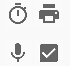
Sometimes specific numbers and guidelines can still be found. For example, in the Iconography section there is the following recommendation: “do not round the corners, then the icons will have a more strict“ scientific ”look”.
Compare Google Material Design Icons
... and IBM Design Language:
In IBM Design Language, much attention is paid to the focus on the user and content, as well as animation again. The basis of the concept of motion taken immortal principles of Disney animation. Briefly, but quite succinctly told, what is the secret of the attractiveness and style of some techniques. Interesting examples are given, for example, about how the warning block moves heavily when it arrives, slows down, draws attention to its weight and creates an impression of importance.
2015, what next?
Judging by the emphasis on the movement of elements in the two high-profile styles of 2014, animation becomes a new field where a battle of trends will take place.
And this is understandable, because technology has made the creation of animations as never before easy. And in visual web design now, it seems, there is a situation when something new is hard to bring. This leads to the fact that lawmakers of the style do not try to sharply reform the "flat design", but shift the emphasis on animation in order to make them their recognizable "chip". So the most interesting is waiting for us, of course, ahead.
Source: https://habr.com/ru/post/255287/
All Articles