New Yandex.Maps that everyone can now fix themselves
Today, one of the most significant Yandex.Maps updates has occurred. Firstly, the Folk Card combines with the main one, which means that everyone can quickly and easily add their own house to the map or correct inaccuracies. The results of the changes will be available to everyone - on Yandex.Maps, as well as in mobile Maps and Navigator. And secondly, Yandex.Maps got a new interface, the beta version of which we had once told on Habré in the early stages of working on it (thank you very much for all the comments and advice that were made then).
Under the cut, I will talk about how we worked on the interface, how we solved the task of fast loading objects in the browser, invented and implemented new tools that should protect user edits, how it was possible that the new life became possible at all, and why the maps would now be updated faster than ever before and will be accurate, and much more.
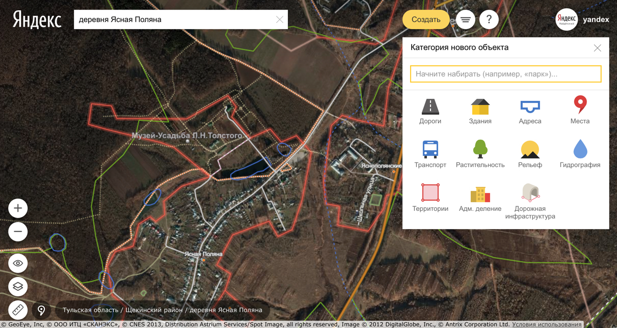
The first version of the Folk Maps was launched exactly five years ago - April 8, 2010. At that time, Yandex.Maps were completely dependent on the providers of map data. By launching the People’s Map, we wanted to give people the opportunity to independently influence the completeness and quality of the data. The reality has surpassed all our expectations: over these five years, the efforts of users have drawn many cities and towns of the Russian Federation and the near abroad. When opening new junctions, corrections to the map are made during the day, and most often - an hour.
')
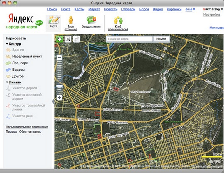
It looked like the first version of the People's Card in 2010
But the world does not stand still, and the next challenge awaited us - to make a tool from the People’s Map, with the help of which people not even familiar with cartography could create professional maps suitable for use in automotive routing.
But, setting ourselves such a goal, we were aware of the tasks that we would have to solve. Firstly, to make the interface of the new People's Card so intuitive and friendly that any person could work with it. Secondly, it was necessary to learn how to edit very large objects in the browser. In the old Folk map when loading an object with a large number of nodes (> 20K), the browser hung. In the new People’s Map, which we conceived of it, this is unacceptable.
And thirdly, since after today's changes we give people to edit the data, which tens of millions of Yandex.Maps will see later, it is necessary to protect the results of the work of “popular” cartographers even more reliably from unscrupulous users, which we call vandals.
In the process of work, we determined that we have two groups of users:
For us, this meant that the interface should be simple and straightforward for the first, and must meet the requirements of flexibility and ease of editing experienced users. But how to achieve this?
We hypothesized that the interface should be two-level. The first level is for completely new users, so that they can run simple scripts, and the second level is for experienced users when they need to do something more complicated. Examples I will give below.
To test this hypothesis, we studied user sessions on the People's Map and found that the following are highlighted among the most popular data creation and editing scenarios:
And since these scenarios begin acquaintance with editing the map, it means that they must be superlogical and intuitive. If a person understands them, and he will still be interested in editing the map, then he can click the “Show more” button. With this click, the user will find more tools that he will have to figure out - read the instructions, ask for advice from more experienced users.
In the process of designing the user interface, we immediately faced with the need for dynamic prototypes. It turned out to be very difficult to discuss complex editing scenarios with static layouts in hand. There were many questions like: “And what will happen if I press this button and do this?” When there are a lot of scenarios and with each press of the button they branch and intersect, “dynamic prototypes” are a great solution. They help to quickly and visually demonstrate how the user interaction with the interface should occur.
We started testing the user interface with them. Our developers became our first subjects. As soon as we showed them the desired user interaction with our product, we heard: “We do not understand how to make such magic. Let's first do it simply from the point of view of development, and then we will try to simplify the interface for users. ”
Any solution is better than none. Therefore, we remade all interface prototypes to our understandable implementation. As a result, we have a prototype in which all the data is edited, but in some places inconvenient and illogical.
Let's better explain with an example. Take Lake Baikal. How convenient to edit a simple user? Baikal is an area object, so it is natural to edit it as an area object. But there is a problem - Baikal consists of 527 closed contours (the contour itself, plus the cut-out islands), more than 59,200 knots and also has common borders with many rivers.
If you try to download all this data from the server to the user in the browser, everything will hang. Therefore, in our data everything is presented somewhat differently.
There is an object of hydrography "Lake Baikal", which has only a name, and no geometry.

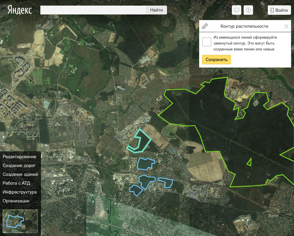
When you select an object, all its outlines are shown.
There are closed contours associated with this object, which represent the outer contour of the lake and the cut out holes under the islands. They have the attribute "external" or "internal" (contour), but also do not have their own geometry.
 Please note, I chose only one circuit - the lights of all the others disappeared
All of these contours consist of one or more often multiple sections of the hydrographic boundaries, which are the actual geometry.

One of the sections of the Baikal external contour is highlighted in the picture.
This means that in order to create such a lake, we must:


This is how our cartographers see and create data. And we chose this option of data editing as a starting point for the gradual improvement of the interface.
At that moment, when the first version of the editing interface was developed and raised on the test service, we went to test it with the whole team. According to the results of testing, we again gathered and discussed that in this method of editing can be improved.
The first thing we decided on is that drawing Baikal is a rare case, and a novice user is more likely to go drawing something simpler. For example, a local pond. And this is a trivial case, and the pond will consist of one hydrographic object, one contour and one section of boundaries. So let us in such cases create it as a simple areal object without all this trouble with sections of borders and contours, and we will keep it as three separate objects (hydrographic object, contour, border). No sooner said than done.

Creating the boundary of the object, the contour and the object of hydrography in one step
And if it turns out to create so trivial objects, then let's edit the trivial objects as well. Done!

Editing an object consisting of one object boundary, one contour and a hydrographic object
Fine! And let's also edit those objects that consist of one contour, but several sections.

Editing an object consisting of three object boundaries, one contour and a hydrographic object
Fine. And let's also edit objects with “common borders”, and those with a lot of contours. And here it will not work. In the case of an object that has borders with other objects, we do not know what the user wants to do - move the common border or untie the object from this common border. And in the case of objects with a large number of contours, it is necessary to understand which user will now edit the contour. Therefore, it is necessary to think out the scenarios for these cases and implement the selection and editing tools.

The pond, which has one external contour, several internal and external contour has a common border with the channel
Ok, now we understand where the line between simple and complex editing scripts is. But we have already implemented simple cases, and ... you won’t believe, they look almost like the interfaces were designed at the very beginning of the project. Just the magic has become clear and realizable.


In the course of the following studies, we came up with how to make clear and complex data editing scenarios, but the solution was not as elegant as we wanted. We learned to detect when a user encounters a complex scenario. The service offers to get acquainted with the rules for editing adjacent objects and even prompts the user where an error may have occurred.

An error is displayed with a link to the documentation and the marker where the error was found.
You have figured out the basic interfaces, but, continuing to talk about Lake Baikal, you need to understand how we will edit it, if the computer already freezes from the 20K nodes loaded into the browser?
Let's solve this problem in stages too. You can edit the attributes and geometry, and, if there are many contours, then in one stage you can work out the geometry of only one contour:

Editing is available only from a specific map scale, and the user is prompted to choose which contour geometry he wants to edit.
And so, when the user selects the contour for editing, the “magic” is triggered again - if the contour is small (for example, the internal contour under the island), we load it completely and give the edit as a simple area object.

The case of editing a simple contour object
And if the contour is very large, then we load only the visible sections of the borders and allow them to be edited. If the user moves the map and there are only new sections of borders on it, we will also upload them for editing. Thus, a user in an almost simple mode can edit complex objects without even noticing it.

Only one portion of the object boundary from the set is loaded.
In such a clever way, we circumvented the browser restrictions — the speed at which data was loaded for editing and the limit on the number of simultaneous points available to it.
The next important task for us was to make the service resilient to users who spoil the data. The old People’s Card has already been implemented measures to counter them. But in the new one anyone can edit the data used by tens of millions of users. We must do everything we can to spoil them.
To do this, we changed the moderation system for all user edits - from post-moderation to pre-moderation. That is, from today, all edits in the People’s Card will be subject to mandatory verification by moderators. We hope this further improves the quality of the data.
We do not have the task to roll back all the data for a certain date or revision, we have the task to delete only a part of the user edits, while maintaining all the others, and also to maintain the integrity of the data. The result was our in-house data storage design, revisions and separate presentation.
One of the important advantages of our system is that we have learned to control the integrity of the data well. For example, I edit the section of the road and change its geometry.

Editing the geometry of the road section directly
Then I move to the next node, where several sections of roads intersect, and try to edit it, but indirectly I correct the geometry of the previous section.

Editing the road section geometry indirectly
So, I get two related edits. If we did not know how to control and version such indirect edits, we would not be able to return the object to the state in which it was before indirect edits. So, it would be necessary to prohibit all indirect edits on top of direct ones.
In principle, there is nothing terrible about such a decision; some map services do just that. But such a decision completely eliminates the possibility of editing the road junction, as when editing the road graph, there are always indirect changes in the data.
Another important topic related to versioning data is the visual representation of the diff edit. You can always see what the latest version of the object looks like, but for convenient moderation it is important to see how the object looked before editing and after editing. It is especially important to make such a diff for the geometry of the object:


Here is the geometric and attribute diff for edits that I made to demonstrate direct and indirect editing of an object.

But I finished the pedestrian road, which cut the road into two sections

And this is how diff looks like for simple building type objects.
Such a visual presentation of edits makes it faster and easier to understand who edited what and how.
As a result, we managed to implement a simple and intuitive interface for users who are not familiar with cartography and do not want to understand the data structure. At the same time, we made a convenient and flexible interface for advanced users. Along the way, we learned to edit in the browser very large and “heavy” objects and put all user edits under version control.
And all this in order to make it even more convenient for users to share their knowledge of the area with others.
Under the cut, I will talk about how we worked on the interface, how we solved the task of fast loading objects in the browser, invented and implemented new tools that should protect user edits, how it was possible that the new life became possible at all, and why the maps would now be updated faster than ever before and will be accurate, and much more.
The first version of the Folk Maps was launched exactly five years ago - April 8, 2010. At that time, Yandex.Maps were completely dependent on the providers of map data. By launching the People’s Map, we wanted to give people the opportunity to independently influence the completeness and quality of the data. The reality has surpassed all our expectations: over these five years, the efforts of users have drawn many cities and towns of the Russian Federation and the near abroad. When opening new junctions, corrections to the map are made during the day, and most often - an hour.
')
It looked like the first version of the People's Card in 2010
But the world does not stand still, and the next challenge awaited us - to make a tool from the People’s Map, with the help of which people not even familiar with cartography could create professional maps suitable for use in automotive routing.
But, setting ourselves such a goal, we were aware of the tasks that we would have to solve. Firstly, to make the interface of the new People's Card so intuitive and friendly that any person could work with it. Secondly, it was necessary to learn how to edit very large objects in the browser. In the old Folk map when loading an object with a large number of nodes (> 20K), the browser hung. In the new People’s Map, which we conceived of it, this is unacceptable.
And thirdly, since after today's changes we give people to edit the data, which tens of millions of Yandex.Maps will see later, it is necessary to protect the results of the work of “popular” cartographers even more reliably from unscrupulous users, which we call vandals.
Work on the interface
In the process of work, we determined that we have two groups of users:
- beginners who have never tried to edit the map;
- experienced users, which include cartographers and active users of the People's map.
For us, this meant that the interface should be simple and straightforward for the first, and must meet the requirements of flexibility and ease of editing experienced users. But how to achieve this?
We hypothesized that the interface should be two-level. The first level is for completely new users, so that they can run simple scripts, and the second level is for experienced users when they need to do something more complicated. Examples I will give below.
To test this hypothesis, we studied user sessions on the People's Map and found that the following are highlighted among the most popular data creation and editing scenarios:
- editing the organization;
- editing the building and its address;
- editing simple areal objects (park, lawn, school or kindergarten);
- road editing.
And since these scenarios begin acquaintance with editing the map, it means that they must be superlogical and intuitive. If a person understands them, and he will still be interested in editing the map, then he can click the “Show more” button. With this click, the user will find more tools that he will have to figure out - read the instructions, ask for advice from more experienced users.
In the process of designing the user interface, we immediately faced with the need for dynamic prototypes. It turned out to be very difficult to discuss complex editing scenarios with static layouts in hand. There were many questions like: “And what will happen if I press this button and do this?” When there are a lot of scenarios and with each press of the button they branch and intersect, “dynamic prototypes” are a great solution. They help to quickly and visually demonstrate how the user interaction with the interface should occur.
We started testing the user interface with them. Our developers became our first subjects. As soon as we showed them the desired user interaction with our product, we heard: “We do not understand how to make such magic. Let's first do it simply from the point of view of development, and then we will try to simplify the interface for users. ”
Any solution is better than none. Therefore, we remade all interface prototypes to our understandable implementation. As a result, we have a prototype in which all the data is edited, but in some places inconvenient and illogical.
Let's better explain with an example. Take Lake Baikal. How convenient to edit a simple user? Baikal is an area object, so it is natural to edit it as an area object. But there is a problem - Baikal consists of 527 closed contours (the contour itself, plus the cut-out islands), more than 59,200 knots and also has common borders with many rivers.
If you try to download all this data from the server to the user in the browser, everything will hang. Therefore, in our data everything is presented somewhat differently.
There is an object of hydrography "Lake Baikal", which has only a name, and no geometry.
When you select an object, all its outlines are shown.
There are closed contours associated with this object, which represent the outer contour of the lake and the cut out holes under the islands. They have the attribute "external" or "internal" (contour), but also do not have their own geometry.
Please note, I chose only one circuit - the lights of all the others disappearedAll of these contours consist of one or more often multiple sections of the hydrographic boundaries, which are the actual geometry.
One of the sections of the Baikal external contour is highlighted in the picture.
This means that in order to create such a lake, we must:
- draw the actual borders of the lake and all the islands;
- create an object “Lake Baikal” and add contours to it, collected from pre-drawn sections of borders.
This is how our cartographers see and create data. And we chose this option of data editing as a starting point for the gradual improvement of the interface.
At that moment, when the first version of the editing interface was developed and raised on the test service, we went to test it with the whole team. According to the results of testing, we again gathered and discussed that in this method of editing can be improved.
The first thing we decided on is that drawing Baikal is a rare case, and a novice user is more likely to go drawing something simpler. For example, a local pond. And this is a trivial case, and the pond will consist of one hydrographic object, one contour and one section of boundaries. So let us in such cases create it as a simple areal object without all this trouble with sections of borders and contours, and we will keep it as three separate objects (hydrographic object, contour, border). No sooner said than done.
Creating the boundary of the object, the contour and the object of hydrography in one step
And if it turns out to create so trivial objects, then let's edit the trivial objects as well. Done!
Editing an object consisting of one object boundary, one contour and a hydrographic object
Fine! And let's also edit those objects that consist of one contour, but several sections.
Editing an object consisting of three object boundaries, one contour and a hydrographic object
Fine. And let's also edit objects with “common borders”, and those with a lot of contours. And here it will not work. In the case of an object that has borders with other objects, we do not know what the user wants to do - move the common border or untie the object from this common border. And in the case of objects with a large number of contours, it is necessary to understand which user will now edit the contour. Therefore, it is necessary to think out the scenarios for these cases and implement the selection and editing tools.
The pond, which has one external contour, several internal and external contour has a common border with the channel
Ok, now we understand where the line between simple and complex editing scripts is. But we have already implemented simple cases, and ... you won’t believe, they look almost like the interfaces were designed at the very beginning of the project. Just the magic has become clear and realizable.
In the course of the following studies, we came up with how to make clear and complex data editing scenarios, but the solution was not as elegant as we wanted. We learned to detect when a user encounters a complex scenario. The service offers to get acquainted with the rules for editing adjacent objects and even prompts the user where an error may have occurred.
An error is displayed with a link to the documentation and the marker where the error was found.
Download speed
You have figured out the basic interfaces, but, continuing to talk about Lake Baikal, you need to understand how we will edit it, if the computer already freezes from the 20K nodes loaded into the browser?
Let's solve this problem in stages too. You can edit the attributes and geometry, and, if there are many contours, then in one stage you can work out the geometry of only one contour:
Editing is available only from a specific map scale, and the user is prompted to choose which contour geometry he wants to edit.
And so, when the user selects the contour for editing, the “magic” is triggered again - if the contour is small (for example, the internal contour under the island), we load it completely and give the edit as a simple area object.
The case of editing a simple contour object
And if the contour is very large, then we load only the visible sections of the borders and allow them to be edited. If the user moves the map and there are only new sections of borders on it, we will also upload them for editing. Thus, a user in an almost simple mode can edit complex objects without even noticing it.
Only one portion of the object boundary from the set is loaded.
In such a clever way, we circumvented the browser restrictions — the speed at which data was loaded for editing and the limit on the number of simultaneous points available to it.
Editing protection
The next important task for us was to make the service resilient to users who spoil the data. The old People’s Card has already been implemented measures to counter them. But in the new one anyone can edit the data used by tens of millions of users. We must do everything we can to spoil them.
To do this, we changed the moderation system for all user edits - from post-moderation to pre-moderation. That is, from today, all edits in the People’s Card will be subject to mandatory verification by moderators. We hope this further improves the quality of the data.
We do not have the task to roll back all the data for a certain date or revision, we have the task to delete only a part of the user edits, while maintaining all the others, and also to maintain the integrity of the data. The result was our in-house data storage design, revisions and separate presentation.
One of the important advantages of our system is that we have learned to control the integrity of the data well. For example, I edit the section of the road and change its geometry.
Editing the geometry of the road section directly
Then I move to the next node, where several sections of roads intersect, and try to edit it, but indirectly I correct the geometry of the previous section.
Editing the road section geometry indirectly
So, I get two related edits. If we did not know how to control and version such indirect edits, we would not be able to return the object to the state in which it was before indirect edits. So, it would be necessary to prohibit all indirect edits on top of direct ones.
In principle, there is nothing terrible about such a decision; some map services do just that. But such a decision completely eliminates the possibility of editing the road junction, as when editing the road graph, there are always indirect changes in the data.
Another important topic related to versioning data is the visual representation of the diff edit. You can always see what the latest version of the object looks like, but for convenient moderation it is important to see how the object looked before editing and after editing. It is especially important to make such a diff for the geometry of the object:
Here is the geometric and attribute diff for edits that I made to demonstrate direct and indirect editing of an object.
But I finished the pedestrian road, which cut the road into two sections
And this is how diff looks like for simple building type objects.
Such a visual presentation of edits makes it faster and easier to understand who edited what and how.
As a result, we managed to implement a simple and intuitive interface for users who are not familiar with cartography and do not want to understand the data structure. At the same time, we made a convenient and flexible interface for advanced users. Along the way, we learned to edit in the browser very large and “heavy” objects and put all user edits under version control.
And all this in order to make it even more convenient for users to share their knowledge of the area with others.
Source: https://habr.com/ru/post/255279/
All Articles