14 tips on how to make tabs on the site more convenient
Tabs have long been used to give the user some kind of informational alternative at one level of the program structure. These are “modular tabs” that can still be found on various sites. For example, on the portals of the airlines Ryanair, EasyJet, AirMalta, modular tabs are used to switch between flight and hotel reservations, as well as car rental.
With the growing number of sites, the tabs began to be used for navigation. This approach was first used by Amazon in 1998. And although he eventually abandoned navigation with tabs in 2007, there are still excellent original examples of their use for both modular switches and navigation. In this note, I (the author of the article - comment of the translator) will give a list of 14 tips that you can use as a list of necessary conditions to make the tabs most convenient for users.
')
What is good about tabs?
When they are properly and tastefully used, tabs become the important element of the user interface, thanks to which the site will be convenient to use. And all because:
- They are great metaphors. In the terminology of user interfaces, a metaphor is an idea or object designed to bring together and make friends the user and the program. That is why the use of tabs becomes an excellent metaphor, because they look almost like real tabs in a folder from a card file. Thus, the user intuitively understands that the tabs divide the content into parts, and, as in real life, selecting the desired folder in the file, which on the website corresponds to clicking on the tab, it receives the corresponding part of the data;

Tabs on sites resemble real in the card index - They improve data organization. Tabs divide content into meaningful sections that take up less space on the screen than when they would be located on the same page together at the same time. At the same time access to data is simple and clear;
On the AirMalta website, tabs effectively share reservation-related data. - They are nice to the eye. Properly implemented, tabs can improve the appearance of the site, because thanks to their form and functionality, they become an interesting interface object that is hard not to notice, but easy to use.
Key recommendations
I compiled the following list by combining data from various sources with my personal experience. Of course, there may be other tips and recommendations, but still this list can be considered the most effective if you want to make sure that your tabs are really good.
1. Tabs should look and behave like tabs. Users have certain knowledge and experience about how tabs should look and how to deal with them. They expect behavior similar to the one they are used to in reality. Deviation from the norm can be confusing.
2. Position the navigation tabs at the top of the page. If they are used for navigation, then it is best to place them on top, since that is where the site visitors will look for them. The location of the tabs at the bottom, side, or, good, outside of the visible part of the screen increases the likelihood that they will simply not be noticed. Always remember that users begin to explore the site before it is fully loaded. They immediately focus on the upper left of the screen and expect to find at least primary navigation there.
3. Place them in one row. Piling up tabs on each other worsens the interface and complicates navigation. This tip applies to tabs of the same level. Navigation with multi-level tabs can be used and is good for representing the hierarchy.

The 2000 amazon.com view shows why tabs in several rows are bad
4. Always pre-select one of the tabs. This makes the vital tab more significant, especially during the first few seconds.
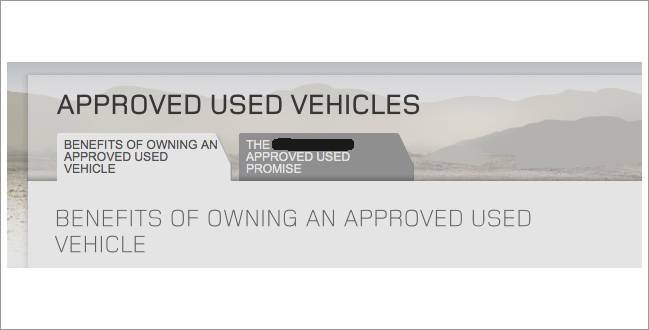
5. Clearly define the current active tab. This can be achieved by changing the color, increasing the size compared to inactive neighbors, scaling the text of the text or by pushing the tab to the foreground. Also make sure that the inscription is easily visible and readable.
6. Clearly highlight inactive tabs. Make sure that inactive tabs really look like those, at the same time they should be visible, and the labels should be easy to read so that the tab can be selected if necessary.
An excellent example of selecting active and inactive tabs.
7. The active tab should be linked to the data area. To enhance the connection with real life, you must force the tab to appear attached to the relevant data area. This is what users expect.
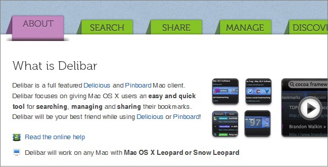
Delibar application site shows an interesting approach in attaching a tab to the content
8. Arrange the tabs in the correct order. You must determine whether there is an order, the placement of tabs in which will simplify the use of your site. It is important to put yourself in the place of the user and follow his logic, not his own.
9. Tabs must be signed in simple language. This will facilitate their understanding and use. It will also be easier to predict the type of related content.
10. The inscription should consist of one or two words. Labels should clearly define the purpose of the tab in a maximum of two words. This will increase the likelihood that the user will not be mistaken with the choice. By limiting yourself to two words, you will also choose the best options for inscriptions.
11. Use case correctly. Only the first character of each lettering word should be written in capital letters. Just like the entire text on the site, it is not recommended to write the captions entirely in capital letters, because they will be harder to read (although, due to the previous paragraph, the negative effect will be minimal).
The labels on the tabs are long and completely in upper case (example from onebigfield.co.uk)
12. Provide fast switching. Users expect content to appear faster if you click on a tab, rather than a link. This can be achieved, for example, by preloading in the background. You can use any technique for the effect of fast switching, as long as the user feels a physical connection between clicking on a tab and loading data.
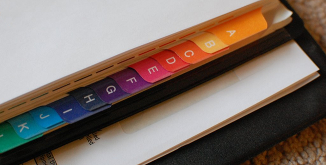
13. Provide “grouping” of related tabs. If you have several tabs, then, quite possibly, you will want to group similar ones. In this case, an additional connection, such as color, may be useful. However, do not rely on color alone, because one part of users may suffer from color blindness, while others simply do not understand what you used it for.
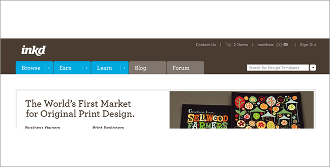
Using color to group tabs on inkd.com
14. Do not use tabs instead of secondary navigation. Although they can be used to explain where you are in the structure of the site and where you can go, tabs should never be used instead of the so-called bread crumbs (English breadcrumbs ). “Bread crumbs” show the site’s hierarchy “inwards” rather than “breadth out”, unlike tabs. Users are familiar with both interface elements and know what to expect from them. Replacing one with another can adversely affect the usability of your site.
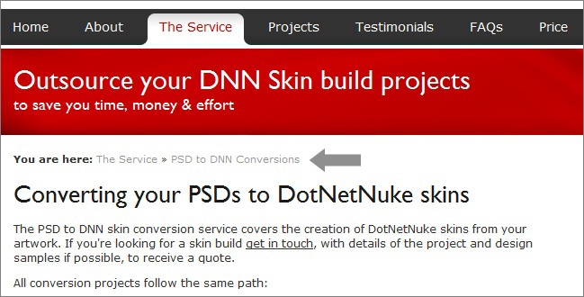
PSDtoDNN site effectively combines tabs with bread crumbs.
Note translator - I think the article is still relevant, and the tips it contains can be effectively applied to improve your sites.
Source: https://habr.com/ru/post/255233/
All Articles