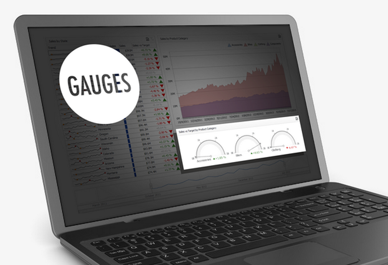
Gauges: is it worth to use them for data visualization
Data visualization is an effective way of presenting information , which contains a large number of different tools. Gauges (scales, indicators) - one of the types of such tools, which is, if not popular, then exactly often used. But how useful is this kind of visualization and should it be used?
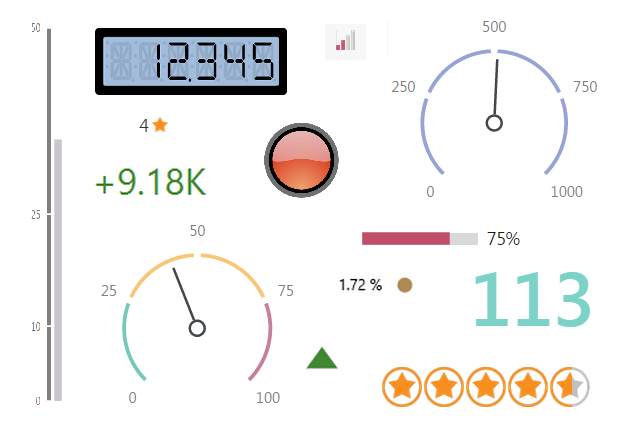
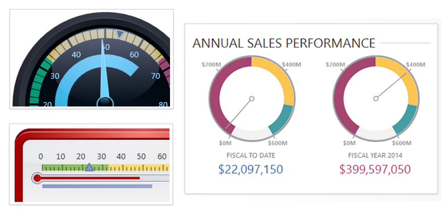
Gauges in visualization can both imitate real measuring devices (thermometer, tachometer), and have nothing like a unique look.
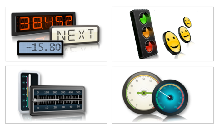
We can distinguish their types:
- simple (digital dial);
- indicators (show a certain state of color, figure);
- linear (vertical, horizontal, like a thermometer);
- radial (like tachometer).
Gauges mainly consist of value and auxiliary elements.
These elements in size occupy a significant place and this is the first drawback - because gauges do not carry much information. Most often, this is only one metric and some additional data, and space in this case is spent inefficiently.
Gauges are used to visualize one metric in the current time, which is why this technique is not suitable for comparing data and evaluating trends. Using them, you will not appreciate the picture as a whole, and therefore the area of their application is very, very narrow.

But still there is such a situation when it is worth using gauges, and when they will bring invaluable benefits. Since they display only the information at one given moment in a form that is convenient for perception, this finds a quick response from the user and leads to his immediate actions. That is why tachometers are still used in automobiles - a quick response is required from the driver.
Gauges are ideal for demonstrating metrics, depending on which need to make any adjustment. For example, speed, temperature, gasoline / water level, price level, share price, number of views or sales.

The positive effect of using gauges can be enhanced by applying them correctly. On the example of the DevExtreme Data Visualization components, further possible uses of gauges will be shown. All examples can be touched here .
The first tip is to use this type of visualization to display only one value . Many metrics will confuse and negate the main advantage — a quick value estimate.
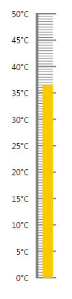
To create a linear type, use the dxLinearGauge component with the following settings:
Options
$("#gauge1").dxLinearGauge({ size: { width: 100, height: 400 }, scale: { startValue: 0, endValue: 50, label: { font: { color: "#000000" }, customizeText: function (arg) { return arg.valueText + "°C" } }, majorTick: { length: 30, width: 2, color: "#808080" }, minorTick: { color: "#808080", visible: true, length: 25, width: 1, tickInterval: 0.5 } }, rangeContainer: { width: 4 }, geometry: { orientation: "vertical" }, value: 36.5, valueIndicator: { color: "#f8ca00", size: 15 } }); Use different types of gauges for more efficient use of space on the screen. Position vertical and horizontal gauges where they will not take up much space, and for radial gauges use different types of scale geometry.
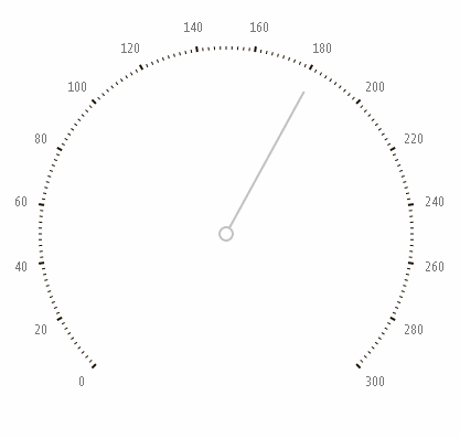
To get such a picture, use the dxCircularGauge component with these settings:
Options
$("#gauge2").dxCircularGauge({ size: { width: 200, height: 200 }, scale: { label:{ font: { color: "#000000" } } }, geometry: { startAngle: 90, endAngle: 0 }, value: 80 }); For each metric, use the appropriate view . For example, historically, it is better to use the linear type for temperature, and radial for speed.

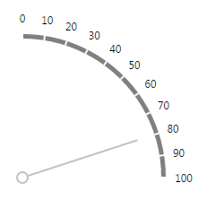
To create a radial type, use dxCircularGauge and these are the settings:
Options
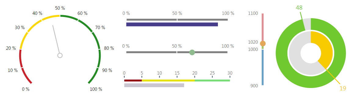
$("#gauge3").dxCircularGauge({ size: { width: 350, height: 350 }, scale: { startValue: 0, endValue: 250, majorTick: { color: '#1A1100', tickInterval: 25, length: 10 }, minorTick: { color: '#1A1100', visible: true }, label: { font: { size: 20, family: "Tahoma", color: "#1A1100" } } }, rangeContainer: { backgroundColor: 'none' }, valueIndicator: { type: "twoColorNeedle", width: 4, secondColor: "#bd1550", color: "#f8ca00", spindleSize: 35, spindleGapSize: 30, offset: -15 }, value: 166 }); Use additional information , just remember - it should not be much and it should not distract attention from the meaning itself. For example, very often scales for linear and radial types are painted in different colors to display information about any intervals and to simplify the interpretation of scale values.

To add additional information you need to use these settings:
Options
$("#gauge4").dxLinearGauge({ size: { width: 500, height: 150 }, scale: { startValue: 0, endValue: 1, label: { format: "percent", font: { color: "#000000" } } }, rangeContainer: { ranges: [{ startValue: 0, endValue: 0.65, color: "#70c92f" }, { startValue: 0.65, endValue: 0.80, color: "#f8ca00" }, { startValue: 0.80, endValue: 0.90, color: "#e97f02" }, { startValue: 0.90, endValue: 1, color: "#bd1550" }] }, valueIndicator: { type: "circle", }, value: 0.723 }); Use spectacular gauges with highlighting progress , for example these:

By the way, this is one of the types that displays several metrics and is suitable for comparing them. To create it, use the dxBarGauge component with these parameters:
Options
$("#gauge5").dxBarGauge({ size: { width: 450, height: 450 }, startValue: 0, endValue: 100, values: [47.27, 65.32, 84.59, 71.86], label: { indent: 30, format: 'fixedPoint', precision: 1, font: { color: "#000000" }, customizeText: function (arg) { return arg.valueText + ' %'; } }, palette: "bright" }); ')
Source: https://habr.com/ru/post/254917/
All Articles