We optimize web form usability
Forms are Internet gatekeepers. Often they are the starting point of the next adventure, namely, register a new account. They may also be for user authorization. Have you ever thought that by sending an email or sending a new tweet, you fill out another web form? They are everywhere, but they are underestimated. Optimization is the key to increasing conversions.
Today we will discuss ways to improve and optimize forms .
Making the form simple means doing the best that is possible (this should be obvious to everyone).
')
Make sure you ask only what you really need. Do not be interested in trifles, be punctual. This simplifies the lives of your users and the project as a whole.
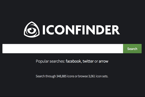
Search form service Iconfinder .

Subscribe to the HeyDesigner site newsletter .
The fewer the fields, the better, since this reduces time costs. However, if it is longer, then it is not always scary. Try to combine several fields into sections, you will like it. Let it be a survey about mom and dad, then questions about each parent should be displayed separately.
You can easily split the form into several pages, but it is better to keep their number to a minimum.
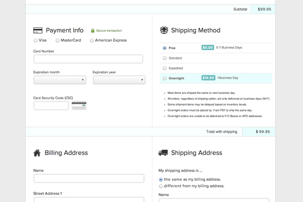
Order form on Fitbit website.

And this is in the Jawbone store.
A multipage form such as the purchase of goods should tell the person how much he still has to deal with. Be transparent. Tell yourself how many more steps to complete ( but still keep everything to a minimum. ).

The process of requesting an invite to the closed community Juiiicy .
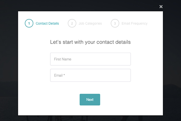
Collect user information for Working Nomads .
After all, you know that the phone number can be written in different ways? With the help of placeholder you can inform your visitor about what is required of him. If you want to see a record like (111) 222-333, then say so. By the way, there is an alternative to this method. If you have not identified your requirements, then be flexible. No need to issue errors.
How can you bring all the data to one format? Just parse it with JavaScript or RegEx.
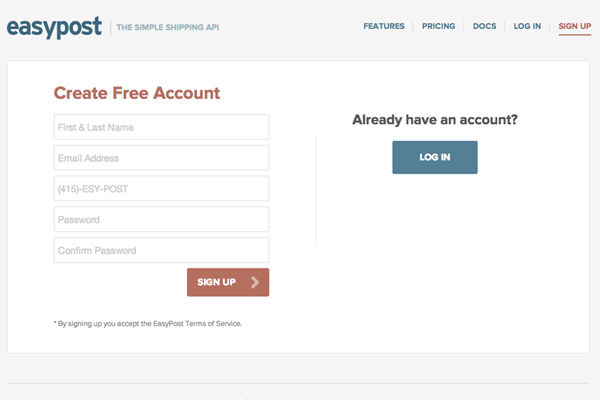
Easypost on your registration page helps a person not to break his head.
Buttons can confuse their incorrect signatures. If there is a “Submit” button at the end of the form, then it cannot give an idea of what will happen after it is clicked, but “Send” or “Create an account” give more clarity. With them, it becomes obvious to the user what he is doing.
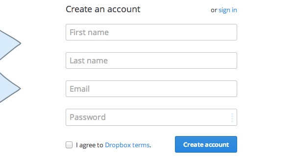
Registration form in the service Dropbox .
Properly describe the required information is also important. Make sure that your guest does not doubt anything. Feel free to repeat that in this field you want to know about a particular parent. Be persistent: “Mother’s surname”.
Why would anyone wonder who exactly is the last name in question?

The form of Karma is quite simple and obvious.
Sometimes I’m just not crazy about why some sites want to get my phone number. All because they do not speak about their intentions. The phrase " for security reasons " means absolutely nothing. Please do not forget about this fact.
In general, I do not enjoy writing my phone anywhere. However, if you told me that it is needed in order to inform me about something important about the plane ticket I had booked, I would be delighted with the care of the staff of your company. Safety above all, yes.

An example of a registration form in the Stripe service.
The fewer questions you ask, the less need to add a drop-down menu. The biggest problem is that this item does not show all available options. The user needs to take additional steps to see other response options. When there are not many of those, it is much easier to display them in the same row. It is better, nevertheless, to use radio buttons or sliders.

Sex selection in the HealthTab registration form .

Search on the portal Lovely .
To put it all together, I want to give some more tips. Any of your form should be responsive, because it is more convenient than ever in our days. Make sure it works on smartphones and tablets. Also think about registering through local social networks. This will significantly increase the conversion of your site, as for owners of accounts on such sites there is nothing easier than instantly registering by pressing a single button.
It is important to have a good reason for the user to fill out a web form. Remind your visitors of the benefits of being asked to do. Login forms should clearly state that after sending it, a person will be authorized, no matter how silly it sounds.

The simplest authorization in Medium .

Login form at Awwwards.com .
We talked with you not only about optimizing the forms, but also increasing the conversion of the entire project as a whole. Explain to your users what you ask for and why, and try to ask as little as possible and give as much as possible. Provide them with as many references as possible (placeholder, etc.). The best forms are simple and clear forms. Do not waste anyone's time and be happy.
Today we will discuss ways to improve and optimize forms .
Make her stupidly simple
Making the form simple means doing the best that is possible (this should be obvious to everyone).
')
Make sure you ask only what you really need. Do not be interested in trifles, be punctual. This simplifies the lives of your users and the project as a whole.

Search form service Iconfinder .

Subscribe to the HeyDesigner site newsletter .
The form must be organized
The fewer the fields, the better, since this reduces time costs. However, if it is longer, then it is not always scary. Try to combine several fields into sections, you will like it. Let it be a survey about mom and dad, then questions about each parent should be displayed separately.
You can easily split the form into several pages, but it is better to keep their number to a minimum.

Order form on Fitbit website.

And this is in the Jawbone store.
If there are many questions, then display the progress of filling
A multipage form such as the purchase of goods should tell the person how much he still has to deal with. Be transparent. Tell yourself how many more steps to complete ( but still keep everything to a minimum. ).

The process of requesting an invite to the closed community Juiiicy .

Collect user information for Working Nomads .
Specify the syntax of the answer
After all, you know that the phone number can be written in different ways? With the help of placeholder you can inform your visitor about what is required of him. If you want to see a record like (111) 222-333, then say so. By the way, there is an alternative to this method. If you have not identified your requirements, then be flexible. No need to issue errors.
How can you bring all the data to one format? Just parse it with JavaScript or RegEx.

Easypost on your registration page helps a person not to break his head.
Give the buttons the appropriate names.
Buttons can confuse their incorrect signatures. If there is a “Submit” button at the end of the form, then it cannot give an idea of what will happen after it is clicked, but “Send” or “Create an account” give more clarity. With them, it becomes obvious to the user what he is doing.

Registration form in the service Dropbox .
Write correct explanations
Properly describe the required information is also important. Make sure that your guest does not doubt anything. Feel free to repeat that in this field you want to know about a particular parent. Be persistent: “Mother’s surname”.
Why would anyone wonder who exactly is the last name in question?

The form of Karma is quite simple and obvious.
Explain why you need to know something about the user.
Sometimes I’m just not crazy about why some sites want to get my phone number. All because they do not speak about their intentions. The phrase " for security reasons " means absolutely nothing. Please do not forget about this fact.
In general, I do not enjoy writing my phone anywhere. However, if you told me that it is needed in order to inform me about something important about the plane ticket I had booked, I would be delighted with the care of the staff of your company. Safety above all, yes.

An example of a registration form in the Stripe service.
Fall out or not fall out
The fewer questions you ask, the less need to add a drop-down menu. The biggest problem is that this item does not show all available options. The user needs to take additional steps to see other response options. When there are not many of those, it is much easier to display them in the same row. It is better, nevertheless, to use radio buttons or sliders.

Sex selection in the HealthTab registration form .

Search on the portal Lovely .
Latest tips
To put it all together, I want to give some more tips. Any of your form should be responsive, because it is more convenient than ever in our days. Make sure it works on smartphones and tablets. Also think about registering through local social networks. This will significantly increase the conversion of your site, as for owners of accounts on such sites there is nothing easier than instantly registering by pressing a single button.
It is important to have a good reason for the user to fill out a web form. Remind your visitors of the benefits of being asked to do. Login forms should clearly state that after sending it, a person will be authorized, no matter how silly it sounds.

The simplest authorization in Medium .

Login form at Awwwards.com .
Conclusion
We talked with you not only about optimizing the forms, but also increasing the conversion of the entire project as a whole. Explain to your users what you ask for and why, and try to ask as little as possible and give as much as possible. Provide them with as many references as possible (placeholder, etc.). The best forms are simple and clear forms. Do not waste anyone's time and be happy.
Source: https://habr.com/ru/post/254883/
All Articles