The best icon is text.
If you can not say short and clear, say long and clear, but not short and incomprehensible.
janatem
Let's talk about icons. They are part of many interfaces. The problem is that under their influence the clarity of what is happening can be destroyed.
Pictograms have been used since the early days of mankind. They can often be seen as an attempt to display writing. Some illiterate people still use them to transmit information.
')

In public places, icons are often used for navigation, for example, at international airports, where there is clearly not enough writing in the local language.

At some time, icons have become popular in user interfaces. Take a look at a snapshot of the first commercial computer with visual control (the Xerox Star). Designer David Smith invented the concept of pictograms:
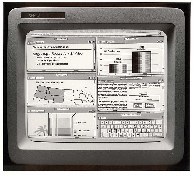
It becomes obvious their popularity in our days. First, they make the UI less loaded with labels. Secondly, when they are used correctly, the application finds its uniqueness. This is all very good.
In addition, one such small picture can replace a whole group of consecutive words. This is especially true in view of reducing the size of the screens. But there is a trap: not all icons are clear to users. They make you think . What good is the interface if it is incomprehensible? The moral is obvious: use the icons when they are understood by everyone, otherwise forget about it.
It reminds me of a picture from Twitter:
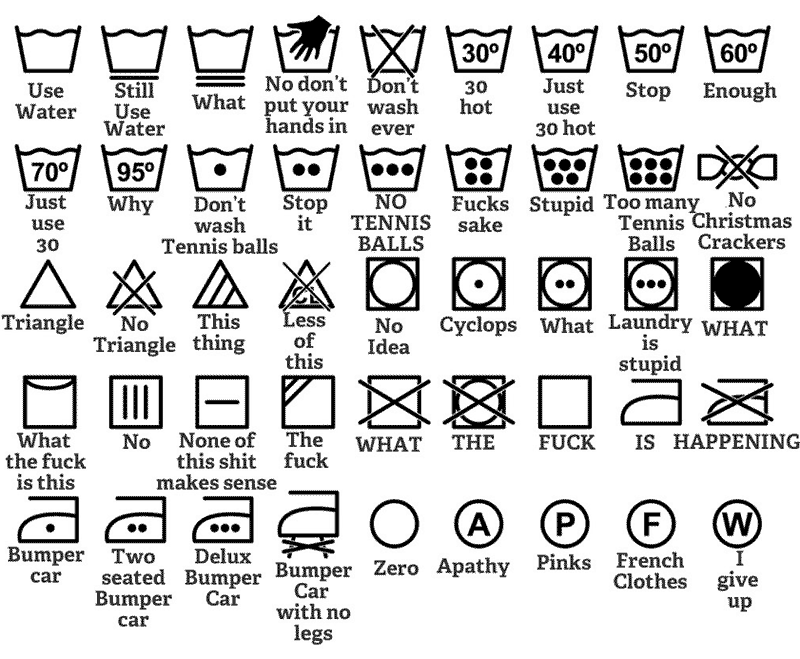
I think Ron was confused while trying to understand the essence of all these laundry icons ...
When I discuss the use of icons with customers, I always hear an argument like “People will use our product daily and easily learn the purpose of all the buttons.” Quite rightly, but there is a flaw here. I use Apple’s email application several times a day, but I still can’t always remember from the first which icon is used to send emails:

The bad news does not end there: people will not work with an application that confuses them. We just have to destroy doubts. When Google hid the rest of the applications behind this incomprehensible icon, it received, apparently , a lot of support requests like “Where is my Google Calendar?”

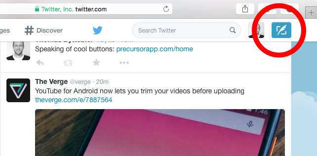
Another example: after the redesign, users of the new Twittera could not immediately understand what they needed to do. The icon was not so clear :
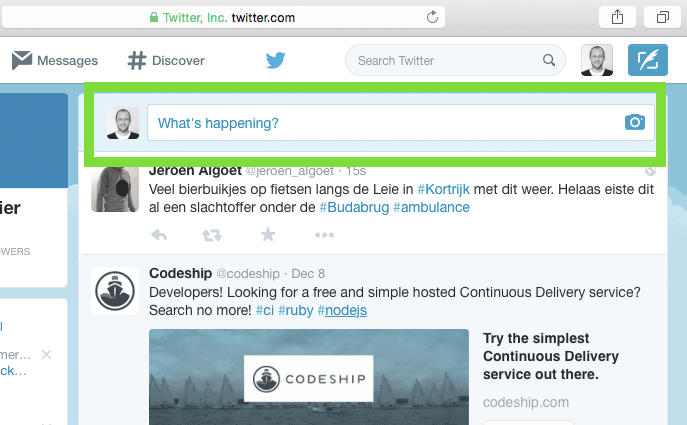
A later version added more clarity:
Did you know that you can send photos to your Instagram friend directly? Yes, but this is all hidden behind this icon:
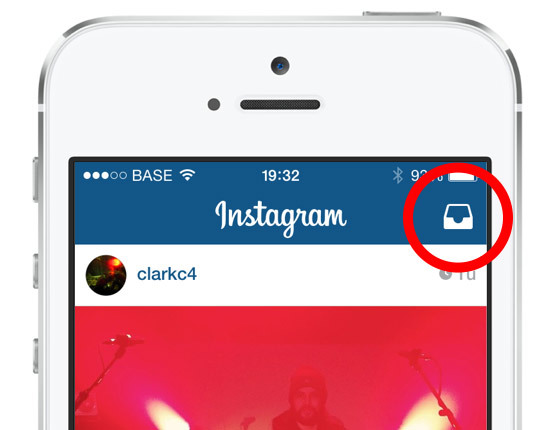
If you were a user of this network earlier, then the chances that you have seen it are greater. But what does it mean?
Of course, you need to use icons in the right context. Some buttons can be interpreted in two ways. Let's look at another example. When you open a conversation in Gmail, any user sees this. Okay, how do you go back now?

It happened to me more than once that I returned to the Inbox instead of writing the answer.
Icons in Tweetbot may not be clear to everyone, but they are taken from the context of Twitter'a. Tweetbot users are often Twitter users, so using these buttons is perfectly acceptable:

The same can be said about the Tumblr app for iOS. Some are incomprehensible to us, but in the context of Tumblr, much becomes clear. Users of this service will obviously understand everything.
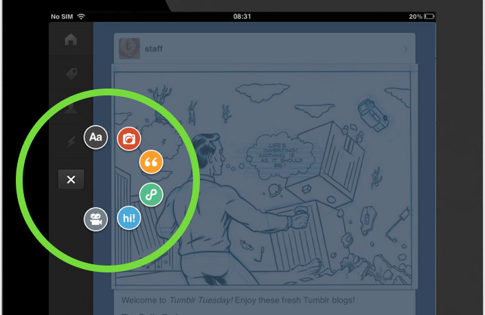
The Mac Rdio application looks like this:
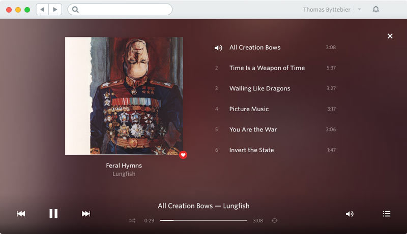
Many users will be able to figure it out, because before them is an audio player. (However, one of the icons can be taken both for the volume level and for the currently playing track.)
Let me say it again: you do not use these icons, if not all of them understand. If the situation is controversial, it is better to write all the text, as this will be clearly clearer.
But no one forbids you to use the labels with pictures. This is the perfect solution.
Mac App Store does just that:
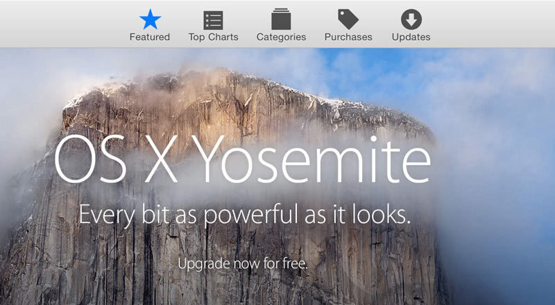
Twitter uses the same technique in its web interface:

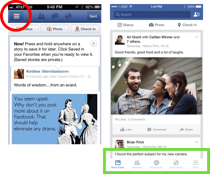
Let's look at Facebook as a final example: they recently replaced their hamburger icon with more convenient navigation. Well done:
I hope that my advice will help you to perform the most important characteristic of any interface - clarity . So be careful and do not forget to test your project! And always remember: the text is clearer.
Source: https://habr.com/ru/post/254881/
All Articles