Media queries: width against device-width
Quite often, people do not understand the difference between the width (width) and width of a device (device-width) (and, moreover, there are examples with a minimum (min-device-width) and maximum width of a device (max-device-width)), using CSS media queries. This misunderstanding leads to writing bad code and much more work for the developer. This question is very common on the SitePoint forums, so it's time to explain everything in more detail. This article will address this problem, and we will also take a closer look at which option you should use when creating responsive websites.
Basic definitions
Let's define what we mean when we talk about media queries based on “width” and “width of the device”. The quotations below are taken from the MDN article on media queries, and there is such a definition of “width”:
')
And this is how MDN defines the “device width”:
So what does this really mean? In simple terms, “width” and “device width” refer to the width of the device, rather than the entire width of the viewport, which can be a completely different concept. All that should interest you is the width of the viewing area, regardless of the width of the device.
The main difference between the width and width of the device is that the width of the device does not always correspond to the viewing area of a particular device.
Most tablets and mobile devices do not always have 1 pixel device per 1 pixel CSS. For example, you should know that the iPhone 4 has a standard screen viewing area of 640 × 960. This means that in this example the device-width of the iPhone4 is 320 × 480. The fact is that Apple understands that not every site is created responsive and tries to do well to everyone, giving a width of about 980px to display the desktop version of the site. This means that if there is no review area meta tag, iPhone4 takes the site and displays it as if it were 980px wide, while squeezing it into a 320px wide screen, resulting in a reduced view from the user's point of view.
Getting started
To begin with, as in all cases of turning websites into responsive and using media queries, you need to place the tag of the meta review area in the section of your website. The basic standard version is shown below.
As soon as this snippet appears on our page, if we view the page on different devices, different media queries will work. Without it, when viewing a page on a particular device, it will simply appear as a smaller version of the page; the device will try to press the whole site into a 320px wide screen. And this is not good for you or for your users! Users do not like to increase the site to see the content, and they definitely do not want to scroll it back and forth.
For example, let's take the iPhone 4, which has a standard viewport width of 980px. Without the meta tag, your attempts to use media queries will lead to nothing, and the device will incorrectly access the standard viewing area. Most media queries are rated at 500px or less. This is usually done using a simple max-width media request. Without the meta tag, you will not get the effect of this request, as the iPhone 4 will continue to display a version of the 980px wide site. Let's look at the example below:
Below are attached two screenshots made using the iPhone 4. On both pages there is the above CSS, but on one the meta tag of the viewing area is used, and on the other there is no.
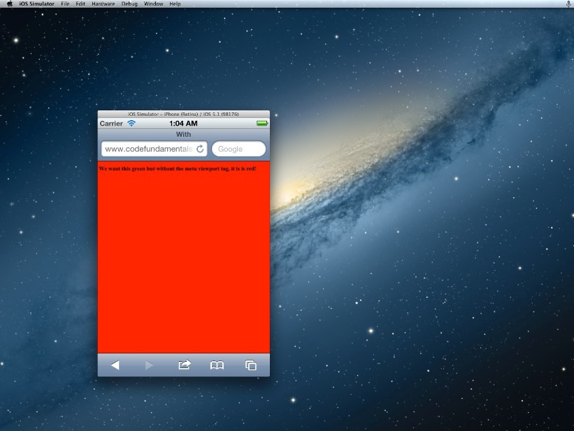
The page shown above does not contain a meta tag, and as a result, the background is displayed in red and simulates a standard viewing area 980px wide, instead of using a 500px mobile media request.

In this case, the meta tag is in place and iOS correctly displays the page as we want: it is based on 320px width and allows our media queries to work in the way we expect.
Why choose device-width?
Honestly, the title of this article initially implies non-use of device-width. However, device-width has its place. If you make a site for certain devices, then yes - you should use device-width.
From the point of view of CSS and RWD, a good site is one that is actually “agnostic to the device” and does not try to indulge the width of each individual device. Targeting individual control points for different “types” of devices (for example, tablets or mobile phones) is achieved by focusing on how the content is displayed at a specific width of the viewing area, and then by making appropriate changes to media queries. Therefore, it is not the device that dictates the control points, but the layout and the content, and ultimately this can lead to optimal results, both from your point of view and from the point of view of the users.
This may be the reason why so many people have problems creating responsive designs, and why they complain that it is difficult. But if they are trying to create a design for individual devices, they get involved in a deliberately losing battle: the number of devices that must be taken into account (to cover everything) is too huge and simply reduces everything to bad code. It is also worth mentioning that if you decide to use device-width, you must also set separate rules for orientation (portrait or landscape): the width of the device does not change just because you turned the device on its side. To do this, you need even more code, which means even more headaches.
However, let's look at another possible option.
What about “width”?
I am of the opinion, like many experienced developers, that a fully responsive page that behaves as expected from all possible screen sizes is the easiest and most profitable way to get the most effective layout for all devices.
To create a fully responsive and flexible page, the developer must simply ensure that all viewing areas are taken into account, and the page changes the structure and size, if necessary, in accordance with the content and design.
All you need for a fully responsive page is a flexible website and some thoughtful media queries to target the standard range of mobile devices, tablets, computers + viewing areas. I prefer to use Foundation's Media Queries, which are the most accurate and cover all the necessary viewing areas.
Of course, like everything else in development, using only width-based queries is not the solution to all layout problems. It is rather necessary for testing on mobile devices in search of various bugs and display oddities. But, having the opportunity to see how everything will be displayed on various mobile devices is as easy as resizing your browser window.
For testing, I use an extension for Chrome Responsive Web Design Tester. It allows you to select a specific device. You will see the size of the device and how your page will appear on such a device.
Another small advantage that I would like to mention is that the use of queries based on the width ensures that future devices will display the site fully. This is a fairly promising approach, since you are targeting something more global - the total size of the viewport - and not a specific device.
Finally
Are you still planning to use device-width in media queries? The arguments were not convincing enough? Using the usual “width” and viewing area of the device simplifies responsive design and is ultimately the best option that should be used almost always.
Basic definitions
Let's define what we mean when we talk about media queries based on “width” and “width of the device”. The quotations below are taken from the MDN article on media queries, and there is such a definition of “width”:
The “width” environment property describes the width of the display surface of the output device (for example, the width of the document window or the width of the page window on the printer)
')
And this is how MDN defines the “device width”:
Describes the width of the output device (meaning full screen or page, and not just a display area, such as a document window)
So what does this really mean? In simple terms, “width” and “device width” refer to the width of the device, rather than the entire width of the viewport, which can be a completely different concept. All that should interest you is the width of the viewing area, regardless of the width of the device.
The main difference between the width and width of the device is that the width of the device does not always correspond to the viewing area of a particular device.
Most tablets and mobile devices do not always have 1 pixel device per 1 pixel CSS. For example, you should know that the iPhone 4 has a standard screen viewing area of 640 × 960. This means that in this example the device-width of the iPhone4 is 320 × 480. The fact is that Apple understands that not every site is created responsive and tries to do well to everyone, giving a width of about 980px to display the desktop version of the site. This means that if there is no review area meta tag, iPhone4 takes the site and displays it as if it were 980px wide, while squeezing it into a 320px wide screen, resulting in a reduced view from the user's point of view.
Getting started
To begin with, as in all cases of turning websites into responsive and using media queries, you need to place the tag of the meta review area in the section of your website. The basic standard version is shown below.
<meta name="viewport" content="width=device-width,initial-scale=1"> As soon as this snippet appears on our page, if we view the page on different devices, different media queries will work. Without it, when viewing a page on a particular device, it will simply appear as a smaller version of the page; the device will try to press the whole site into a 320px wide screen. And this is not good for you or for your users! Users do not like to increase the site to see the content, and they definitely do not want to scroll it back and forth.
For example, let's take the iPhone 4, which has a standard viewport width of 980px. Without the meta tag, your attempts to use media queries will lead to nothing, and the device will incorrectly access the standard viewing area. Most media queries are rated at 500px or less. This is usually done using a simple max-width media request. Without the meta tag, you will not get the effect of this request, as the iPhone 4 will continue to display a version of the 980px wide site. Let's look at the example below:
body { background: white; } @media screen and (min-width: 980px) /* Desktop */ { body { background: red; } } @media screen and (max-width: 979px) /* Tablet */ { body { background: blue; } } @media screen and (max-width: 500px) /* Mobile */ { body { background: green; } } Below are attached two screenshots made using the iPhone 4. On both pages there is the above CSS, but on one the meta tag of the viewing area is used, and on the other there is no.
The page shown above does not contain a meta tag, and as a result, the background is displayed in red and simulates a standard viewing area 980px wide, instead of using a 500px mobile media request.
In this case, the meta tag is in place and iOS correctly displays the page as we want: it is based on 320px width and allows our media queries to work in the way we expect.
Why choose device-width?
Honestly, the title of this article initially implies non-use of device-width. However, device-width has its place. If you make a site for certain devices, then yes - you should use device-width.
From the point of view of CSS and RWD, a good site is one that is actually “agnostic to the device” and does not try to indulge the width of each individual device. Targeting individual control points for different “types” of devices (for example, tablets or mobile phones) is achieved by focusing on how the content is displayed at a specific width of the viewing area, and then by making appropriate changes to media queries. Therefore, it is not the device that dictates the control points, but the layout and the content, and ultimately this can lead to optimal results, both from your point of view and from the point of view of the users.
This may be the reason why so many people have problems creating responsive designs, and why they complain that it is difficult. But if they are trying to create a design for individual devices, they get involved in a deliberately losing battle: the number of devices that must be taken into account (to cover everything) is too huge and simply reduces everything to bad code. It is also worth mentioning that if you decide to use device-width, you must also set separate rules for orientation (portrait or landscape): the width of the device does not change just because you turned the device on its side. To do this, you need even more code, which means even more headaches.
However, let's look at another possible option.
What about “width”?
I am of the opinion, like many experienced developers, that a fully responsive page that behaves as expected from all possible screen sizes is the easiest and most profitable way to get the most effective layout for all devices.
To create a fully responsive and flexible page, the developer must simply ensure that all viewing areas are taken into account, and the page changes the structure and size, if necessary, in accordance with the content and design.
All you need for a fully responsive page is a flexible website and some thoughtful media queries to target the standard range of mobile devices, tablets, computers + viewing areas. I prefer to use Foundation's Media Queries, which are the most accurate and cover all the necessary viewing areas.
Of course, like everything else in development, using only width-based queries is not the solution to all layout problems. It is rather necessary for testing on mobile devices in search of various bugs and display oddities. But, having the opportunity to see how everything will be displayed on various mobile devices is as easy as resizing your browser window.
For testing, I use an extension for Chrome Responsive Web Design Tester. It allows you to select a specific device. You will see the size of the device and how your page will appear on such a device.
Another small advantage that I would like to mention is that the use of queries based on the width ensures that future devices will display the site fully. This is a fairly promising approach, since you are targeting something more global - the total size of the viewport - and not a specific device.
Finally
Are you still planning to use device-width in media queries? The arguments were not convincing enough? Using the usual “width” and viewing area of the device simplifies responsive design and is ultimately the best option that should be used almost always.
Useful Paysto solutions for Habr readers:
→ Get paid by credit card right now. Without a site, PI and LLC.
→ Accept payments from companies via the Internet. Without a site, PI and LLC.
→ Acceptance of payments from companies for your site. With document circulation and exchange of originals.
→ Automation of sales and service transactions with legal entities. Without intermediary in the calculations.
→ Accept payments from companies via the Internet. Without a site, PI and LLC.
→ Acceptance of payments from companies for your site. With document circulation and exchange of originals.
→ Automation of sales and service transactions with legal entities. Without intermediary in the calculations.
Source: https://habr.com/ru/post/254871/
All Articles