MailChimp UX Team: Development [part 6 of the book]
[ Tl; dr ]
[ 1st part of the book ]
[ 2nd part of the book ]
[ 3rd part of the book ]
[ 4th part of the book ]
[ 5th part of the book ]
[ 7th part of the book ]
[ 8th part of the book ]
')
Creating a responsive email system
Fabio Carneiro
Creating a model of adaptive mailing with a modular structure that email designers could use for training and work was a unique task for us. Despite the fact that MailChimp's mailing list design templates have a huge amount of articles and code examples, creating this ready-to-use, working code would allow us to combine all this information in the form of a practically useful reference model.
Such an adaptive template was not created specifically for MailChimp, so I had to work on it taking into account the most different situations in which email designers could use it. As a result, I formulated two theses: 1) letters should be created so that they can be adapted for various tasks and goals, and 2) the template should be accessible to as many mail clients as possible.
Reaching accessibility in different systems was not so difficult. Many email clients are simply terrible, but the task is simplified as soon as you begin to understand the strengths and weaknesses of each of them. This is only a question of work within the limits specified.
The requirement to be able to adjust the template for different tasks was more difficult. Designing and developing a mailing template for a specific task is a fairly simple thing: you can not limit yourself to design issues and use specialized HTML-code and CSS in order to make this happen. This is all because you know the context: you know what the letter is created for, what kind of content it will be presented in, and - ideally - what email clients will open this letter. But when you need to create a template so that wide groups of people can work with it, the goals of which we cannot always describe in advance, such a context simply does not exist.
To overcome this lack of context, I decided to follow a process similar to the one I used to create MailChimp email templates:
- Outline the most common range of mailing usage options.
- For these use cases, create design templates.
- Develop a system of independent objects in HTML.
- Complete the received code with the ability to support different email clients.
- In the code, specify comments for better understanding, use clear markup.
And that's how I did it:
Outline the general range of use cases
This process allows you to formulate an approximate idea of what needs to be developed and how to do it.
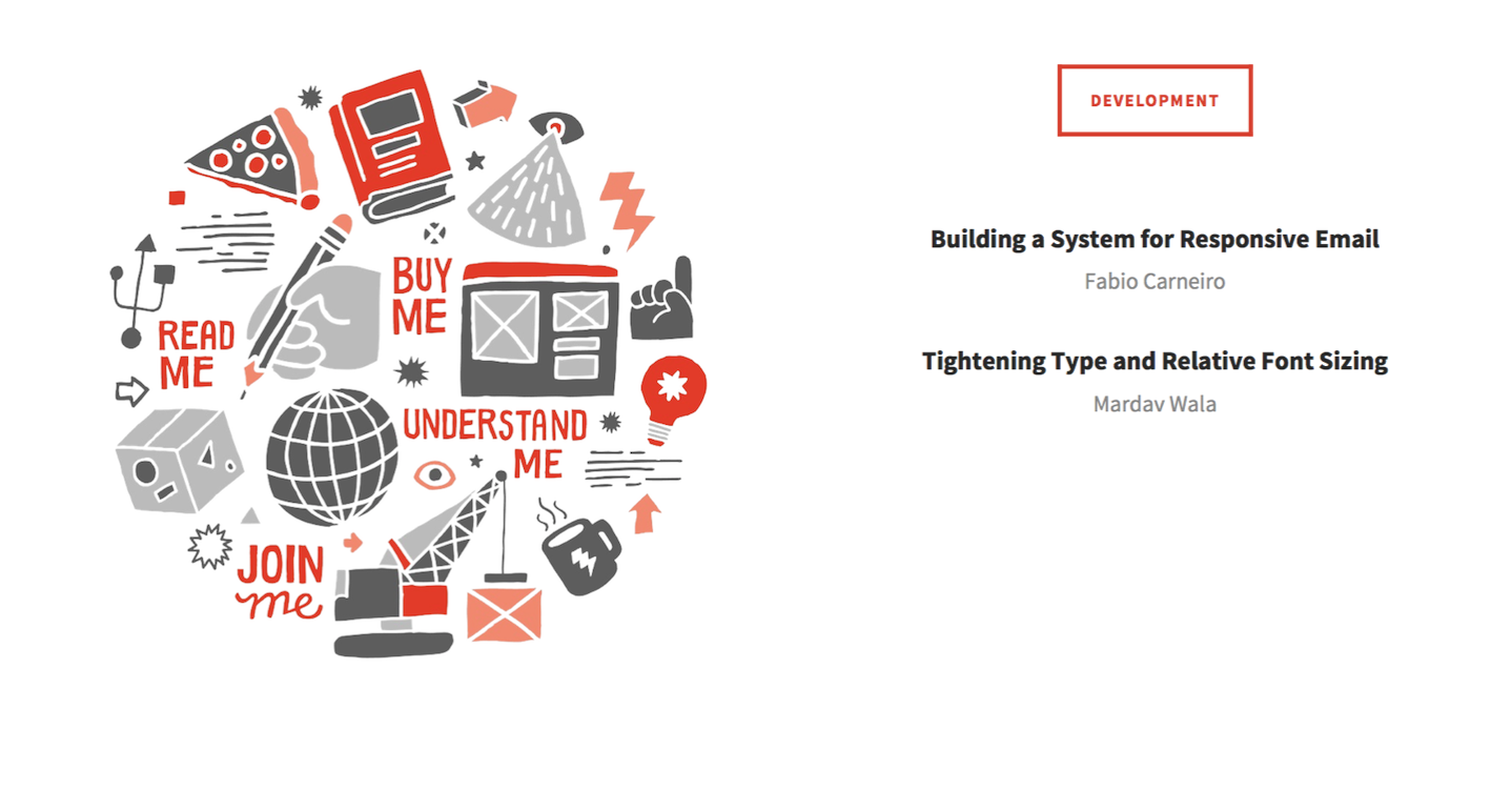
Almost all e-mails can be attributed to one of 4 broad categories:
- “Read me” - these can be, for example, newsletters, the meaning of which is to convey information to the addressee based on text or images;
- “Buy me” - these are letters from the e-commerce sphere, aimed at the reader to spend a certain amount;
- “Join me” - information about events or invitations, highlighting some activity and containing a call to action to participate in it;
- “Understand me” are letters that reflect certain transactions, such as checks or order information, and contain important details and data and, as a rule, nothing more.
In the case of creating a responsive letter template, I needed to consider all four of these scenarios.
Create Design Templates
All of these use cases contain overlapping sets of elements. For example, letters like “Buy me”, “Join me”, “Understand me” can all contain CTAs in the form of a button, while letters like “Buy me” and “Read me” are based on interesting content, usually presented as a number of images.
Studying the common elements of different groups of letters, I began to understand how the patterns of their appearance should look and as a result I formulated a list of blocks that needed to be created. As a result, 17 different templates were included in the finished model, including buttons, groups of images, signatures, content enclosed in blocks, calendars, and images with signatures.
Develop a system of objects in HTML
As soon as I understood what exactly I needed to develop, I started writing the code.
Creating a model, I wanted to be sure that anyone can access the resulting HTML code and understand how it is structured, use the necessary design templates to realize their goals, change the writing style without worrying about the state of the framework, and immediately start use the result in the email campaign.
To meet all these requirements, I wrote the HTML code so that all the content blocks were equally structured, and the code could be easily studied and understood in this way. Each of the design templates for different types of content was placed in a separate line of the table - thanks to this, the modular structure of the final model was achieved. Individual elements become possible to duplicate or move, simply by copying or moving the corresponding line.
In addition, the whole project was built on minimalistic CSS: only 4 rules in standard CSS and 4 more in media query. In addition, the basic styling of the content itself was used, which affected only the design of the text and the background color. Thus, designers got the opportunity to write their own CSS without having to puzzle over the impact on the functional component of the list.
Complete the received code
Having finished development, I tested the obtained model using a standard series of tests using a browser and an email client for a mobile device. During the first run, the received letter was displayed in all popular email clients without any problems. However, my work did not end there: there were two email clients with which difficulties arose.
Outlook 2007/2010 and the Gmail Android mobile app are just a nightmare. There are a lot of problems with Outlook due to its Microsoft Word-based graphics engine, and the Gmail application, despite the fact that it is mobile, does not support media queries. Writing a version of the letter for Outlook required the creation of a very inflexible, carefully verified code, and for the Gmail mail client, a very “loose” code was needed: non-adaptive, but relatively flexible.
We usually think that it is better to be safe, try to make our newsletter more reliable and consider the possibility of supporting Outlook - after all, Microsoft has an iron grip on the market for email applications for PCs. But since our adaptive model was conceived for email-designers, a little versed in technologies, I decided to take the opposite side and decided to engage in maximum support for mobile devices. This meant creating multiple content blocks using table alignment . Now everything is in order with the Gmail application on Android.
You might think: “Why only Gmail for Android? After all, there is an application for iOS! ”Of course, it does exist, but it works even worse - and does not support anything at all. Emails are displayed normally, but today you can forget about mobile app support.
Nevertheless, the use of table alignment for Gmail is an excellent solution for flexibility, but it is not sufficiently reliable and leads to disruptions in the arrangement of elements in (easy to guess) Outlook 2007/2010. The problems rested on one extremely insidious bug in Outlook, which automatically inserts a page break into any document longer than 22 inches (or 1700px). When this happens, aligned tables that have the float property begin to creep away. Fortunately, this problem seems to have been resolved in Outlook 2013.
One solution is to use conditional CSS and create a separate style to overcome problems with Outlook. In this case, I decided not to complicate things and just repeated everything that was done earlier using the media query for mobile clients. Conditional CSS is optional, but it’s a good solution.
After I figured out with the support of Outlook 2007/2010 and Gmail for Android, the model began to work reliably with most email clients and at the same time had a sufficient level of flexibility.
Learning through comments
Some of these techniques may not always be clear to those who have just started working as an email designer. In order to solve this problem, I tried to include explanations in the code, showing why this or that block of code is used and what happens within this block.
I also tried to mark the beginning and end of the sections, implying the presence of content, and indicate whether special actions are needed to fill them.
Preserving the focus of the model being created on basic use cases, applying repetitive design templates throughout the entire letter, creating reliable and flexible code at the same time, I managed to ensure that everyone could understand the adaptive HTML letter template and easily start working with it.
We hope that this model in combination with our library of email-templates will be able to dispel the aura of mystery and delusions surrounding the design of letters in HTML. Of course, we have not finished our work yet: both the library of references, and letter models are projects that I plan to develop and improve on the basis of the feedback received.
Text condensation and relative font sizes
Mardav Vala
Redesign MailChimp in 2013 gave us the opportunity to carefully select the typography of the application. You won't be surprised by the modular layout system (“layout with grid”), but to achieve a vertical rhythm in the network (this is another way to say “align content on a modular grid”) is still not so easy, especially when the types of displayed content are strong vary. But after solving the problem of the initial design and code mismatch, which arises mainly due to differences in how we perceive (or do not perceive) line spacing and leading in print and web media, our design and front-end teams design began to speak the same language.
Text seal
As Richard Rutter noted, the vertical rhythm of any web page can be achieved through careful work with line spacing, the boundaries between objects and the distance between the content of the element and its border. The point is to find a suitable line spacing, which sets the basis for calculating margins and indents.
Although the MailChimp application contains a large amount of content, a very small part of it contains a large number of paragraphs of text — almost all of the information is in the form of lists, forms, tables, charts, or data blocks. Therefore, instead of starting with large line spacing, which would entail large margins and indents, we started with the minimum possible line spacing - 6px for each application element. Our modular grid is based on this value at 6px.
Why 6px? We experimented with a large number of basic values, but realized that 6px by multiplication is very elegantly transformed into 12px, 18px, 242px, and so on, giving us a great range of different font size values and indents. This value also turned out to be perfectly applicable to small elements, such as buttons and form fields. This provided us with the flexibility needed to create virtually any interface.
MailChimp is constantly changing - we release new features and update our UI every 4 weeks - so in our search for vertical rhythm we needed to provide the system with a sufficient level of flexibility. Earlier in the design process, we decided to use indents only at the bottom of the elements in order to facilitate the process of creating a vertical rhythm. Thus, new modules could be placed without breaking the visual hierarchy on the page. The use of “unidirectional” indents helped us achieve this goal.
Simple math
Since our interface was designed on a six-pixel modular grid, all line spacing, padding, and margins had to be a multiple of 6 to set the vertical rhythm. The size of the fonts, however, can be set to any - without fear of disrupting this vertical rhythm. Our main font has a size of 15px - such a font, as it seems to us, is readable in all situations and does not overload the interface.
According to the best practices, the line spacing to improve readability should be one and a half times the font height. If our font size is 15px, then the line spacing in this case should be 22.5px. But since the pitch of our modular grid was 6px, we “stretched” the line spacing to 24px, creating a direct relationship between line spacing, padding and margins for all modules. Having dealt with calculations, we began to apply these proportions to the elements of our application.
For all headers and other font sizes, the line spacing was also set to a multiple of 6 and calculated according to the size of the font itself. The examples use measurements in pixels for ease of presentation:
h1 { font-size: 40px; line-height: 48px; } .small-meta { font-size: 13px; line-height: 18px; } Exceptions to the rules
Images and graphics do not obey the general rules and often "break" the modular grid. Their sizes are often unpredictable - they cannot always be easily matched to the grid spacing. But despite this, the vertical rhythm is not disturbed, since the boundaries between objects, defined by indents and margins, remain unchanged.
Elements that have borders can also go beyond the modular grid, since their dimensions are added to the main calculations, and not integrated into the system. But here the output is simple: calculate the height of the elements with regard to their boundaries (this approach may entail a decrease in the fields above or below the element by the size of the boundaries).
Of course, purists may argue that such an approach will lead to a visual imbalance if the height of the element borders is more than 1px - and they will be absolutely right. Efforts to align horizontal lines and elements that have borders along a modular grid do not always justify themselves, since horizontal lines and borders cannot affect the vertical rhythm with the right approach to indents, line spacing and margins.
Here is an example of how we reduced the fields of the elements of the list to the height of the border by 1px:
@base-unit: 6px; .dotted-list { margin-bottom: (@base-unit * 2); li { padding-top: (@base-unit * 2) padding-right: 0; // 1px less padding bottom padding-bottom: ((@base-unit * 2) - 1); padding-left: 0; border-bottom: 1px dotted #c0ffee; } } Graphs can also be adjusted in proportion to your grid. If the aspect ratio of the chart changes as the browser window changes, set the height of the chart and the vertical indents in proportion to your grid spacing. If this does not occur, set only the amount of vertical indents and do not change the height of the chart.
Since the height of the image will be scaled with the change of its width, we can not rely on the alignment of height on a modular grid. In these cases, you need to make sure that the indents that surround the object are set so as not to disturb the vertical rhythm.
Applying these special rules in code and working with exceptions to the rules can be confusing. A quick discussion of the team and a simple comment in the code can reduce a number of difficulties. Documenting changes to the template library is also important.
We found that “fine tuning” vertical gaps at the module level — designing “out of content” as recommended by Marc Boulton is a much more meaningful process than making changes on a global, “page-by-page” level. If the individual modules fit together in a modular grid, it does not matter where they are located: the vertical rhythm and visual hierarchy will be automatically maintained.
Relative font sizes
Using relative font sizes, measured in em (relative unit of length equal to the size of the current font), to create a flexible, scalable design ... may be more difficult than specifying absolute font sizes in pixels.
Converting values from pixels to relative units (em) used to be quite a tedious task. Fortunately, we can simplify the process using the combined CSS preprocessor capabilities and the widely used Ethan Marcotte rule: target ÷ context = result.
The key to keeping order among all this confusion with relative font sizes is to concentrate on the context. For nested elements with relative font size, the context is the font size of the parent elements, expressed in pixels; for the parent elements, the context is the default font size of the main text (16px, if we speak only of the main text).
Here is an example of HTML code based on this example from Treehouse:
<h1>Title: <span>Tagline</span></h1> You can set the relative font size of the header and ensure that the fonts of nested line elements are determined without much confusion as follows:
// default body font-size @baseFontSize: 16; @h1Size: 24; @h1SpanSize: 18; h1 { #pxtoem > .font-size(@h1Size, @baseFontSize); // 24 ÷ 16 = 1.5em > span { #pxtoem > .font-size(@h1SpanSize, @h1Size); // 18 ÷ 24 = .75em } } As the number of nested levels increases (these can be levels with nested headings, paragraphs, links, and lower-case elements), font sizes become harder to follow, so such preventive controls can help achieve a constantly elusive CSS nirvana.
Source: https://habr.com/ru/post/254307/
All Articles