What is good: how we developed the criteria for assessing the quality of the layout of web projects
On Habré there was already a lot of materials on how to conduct the quality of layout of web projects (this is an excellent article on this topic) - as a rule, these topics are commercial sites. In the course of the development of the HTML Academy educational project, we also faced the need to develop criteria for the assessment of students' work.
Obviously, the need to teach so that then people ( not all of whom are "techies" ) could come to the company and work "correctly" - that is, creating a layout that looks beautiful and does not require much support efforts. The process of creating a list of universal criteria for evaluation took quite a long time and was fraught with a number of difficulties. Today we will talk about what we finally got.
')
The importance of criteria in the learning process
Initially, the assessment of the work of students participating in the basic intensives of the HTML Academy was conducted by a mentor helping them (we wrote about the importance of having a “live” teacher last time ). To improve the quality of this process and reduce the likelihood of a biased assessment, it was decided to work out clear criteria that the work should meet.
Since the test for compliance with the criteria in any case provides a mentor, it was necessary to ensure that this professional agrees with the proposed assessment tool.
The first iteration of our criteria was not as objective and unambiguous as we would like, which caused a whole wave of disputes among the HTML Academy mentors themselves - real battles boiled in the internal chat, during which the experts explained to each other what “really” means or other wording. It became clear that in such an edition it would be simply impossible to use the list of criteria for evaluating student work.
As a result, we reworked the criteria in such a way as to eliminate any ambiguity - all mentors should equally understand how to check the work of students.
Feedback collection
Since the goal of our intensive efforts is to train specialists who will be able to get work in companies and will be engaged in real projects, we decided to get expert opinions from web studios. In St. Petersburg, such companies are united by the SPECIAL Association - we turned to the experts of these organizations.
Processes in different studios are built in different ways, which affects, among other things, the requirements for the layout of projects (for example, someone does not accept stylization of elements by id, and somewhere it is quite normal practice, etc.).
As a result, we did not implement all the suggestions of our colleagues in our criteria, however, collecting opinions helped to get more verified formulations that exclude various inaccuracies.
What is the result?
In the end, we got a rather extensive list of criteria for evaluating the quality of the layout. It is divided into two groups: some criteria refer to the base, others - to additional. The first ones are aimed at testing basic knowledge and skills, and additional ones check whether the student is attentive to details and is ready for the meticulous work of the layout maker.
Get 100 points on the basis of training is possible only by completing all the tasks that meet the criteria.
Basic criteria
1. Made HTML-markup of all pages and all elements on the pages.
Pupils must understand that the pages must be completely folded.
2. One style file for all pages (taking into account normalize.css it is possible two).
Since we do not consider automation, we have softened the criterion and allowed to connect normalize with a separate file.
3. Layout is displayed identically in the latest versions of Chrome, Opera, Firefox, Safari browsers, as well as in Internet Explorer 10+.
Yes, our choice is IE10 +. We tell pupils how to fight back from the layout for older versions.
4. The site should normally look at the minimum resolution for this layout:
- With a larger screen size, the layout should remain centered and not have a horizontal scroll.
- On screens that are smaller than the width of the layout, the layout should not change its structure.
| Good | poorly |
|---|---|
 |  |
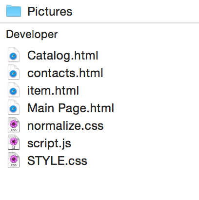
5. At the root of the document should be a folder css , img , js or similar. The main page is called index.html . There are no capital letters and spaces in the names and extensions of the files.
| Good | poorly |
|---|---|
 |  |
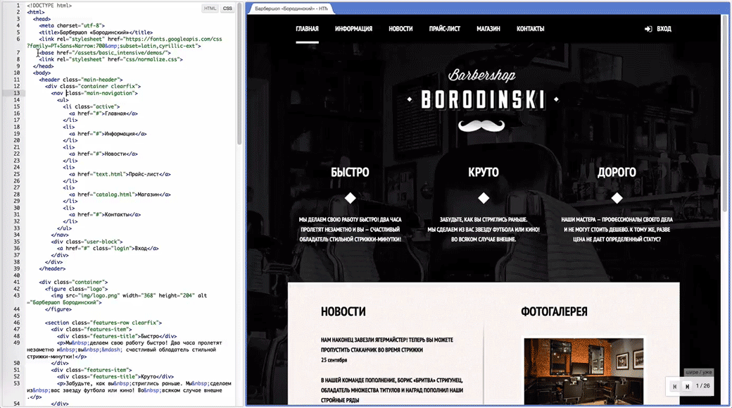
6. Uniform writing and formatting of code in HTML, CSS and JavaScript.
We do not insist on choosing a particular coding style. The main thing is uniformity.
| Good | poorly |
|---|---|
| |
7. There are no blunders in the markup. For example:
- Links are made not by the
<a>tag, but by other tags. - Using line elements to create large (grid) blocks.
- Paragraphs should be paragraphs, not
<br><br>.
This criterion is the most subjective, as there are many controversial, but acceptable options for marking elements. But there is also “absolute evil”, which you don’t want to admit to the code. We will welcome your examples of such typical errors.
8. You can not build a grid using tables and positioning.
Not using display: table , but using tables.9. You can not use !important in CSS.
10. When filling with content like on the layout, the elements of each page should correspond to the layout:
- A difference of 5 pixels in height and 2 pixels in width is allowed.
- The absence of stylization of custom form elements is allowed.
- Differences in font mapping associated with anti-aliasing on different platforms are allowed.
- The correct fonts must be connected, and their sizes and thickness must correspond to the sizes in the layouts and TK.
Criteria for compliance with the layout made softer than the full "pixelperfect". What do you think is right?
11. The correct image format is selected:
- JPEG for photos.
- Everything else in PNG.
12. The document must be tested for validity .
Additional criteria
1. You can not use translit in class names, attributes, and so on.
| Good | poorly |
|---|---|
| |
2. You cannot use #id for styling.
3. You can not use the nesting of selectors for more than two.
4. Used by normalize.css .
5. You must explicitly specify an appropriate vertical-align for all blocks with display: inline-block .
6. It is necessary to specify alternative font options and family type at the end of the listing.
7. It is necessary to arrange CSS prefixes in the correct order.
8. It is necessary to explicitly prescribe the background color for a block that has a background image. The color should match the predominant color of the background image (until the image is loaded, the page looks like a layout).
If you do not prescribe the background colors, then without pictures, some of the text may become invisible.
But if you carefully set the background color of the blocks, then the lack of images is not terrible.
9. It is necessary that all states of elements from styleguide.psd be used.
Of course, not all designers make such style guides, but for educational layouts we prepared them so that students could get used to thinking about stylizing different states. Below is a fragment of a styled piece of one of the layouts.

10. It is necessary that when interacting with the elements (pointing, pressing), neither the element itself nor the blocks surrounding it would change their position.
Nothing should “jump” just like that.
11. It is necessary to use:
- Sprites for images or icon font.
- Minimize CSS code.
- Minimize javascript code.
We are talking about the simplest techniques for optimizing the layout and we want students to start using them.
12. It is necessary to specify the size of all images in the <img> tag.
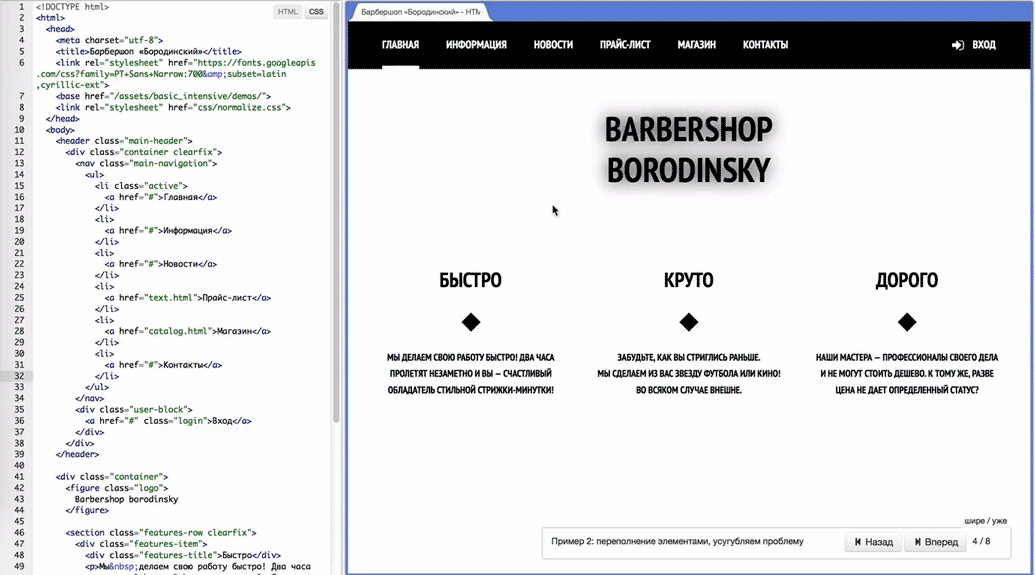
13. Layout passes the test for overflow content. Layout does not break:
- When adding more text to the elements.
- When using pictures with unsuitable sizes.
- Text should not fall out of objects.
- Overflow of content blocks does not lead to a grid violation.
It is bad when the content drops out of the parent container and becomes invisible. For example, when white links in the menu fall on the white background of the page.
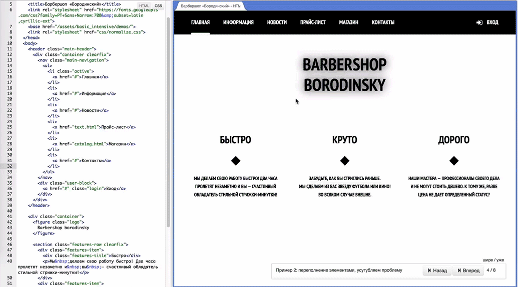
In this case, when adding items, the menu block should increase in height. It may be ugly, but menu items are always visible.
14. It is necessary to connect all the scripts immediately before </body> .
15. It is necessary to use the minimum possible number of HTML elements.
This is also a subjective point, and therefore advanced in the additional criteria. With it, we force students, for example, to use pseudo-elements to create decorative details.
16. It is necessary to use the Progressive Enhancement approach, for example:
- Buttons that cause pop-ups, by default, are links that lead to separate pages.
- Interactive map without JavaScript shows a static image with the map.
What can be improved: the opinions of professionals
Since the goal of our intensives is to train specialists who could work on real web projects, we decided to collect expert opinions on each item of the criteria included in the final list to assess the quality of the layout.
Some experts interviewed by us stated that our list is complete (given that it is proposed to evaluate the work of novice specialists with its help).
Among them is Maxim Yurin, partner of the Little Big Agency digital agency:
A good and complete list, I advise all specialists to go over all its points before handing over the project. This will ensure that the project looks neatly outwardly, and also, importantly, will make the code itself convenient for reading and parsing.
Someone, such as the technical director of the Molinos digital agency, Yevgeny Sergeyev, considers the criteria presented above to be generally adequate, but some adjustments will not hurt:
I think the list for beginners is quite adequate, there are many important points in it. Of course, it can be supplemented.
I will not offer new criteria on the move, but, for example, I would transfer two criteria from additional to basic ones.
You must specify alternative font options and family type at the end of the listing.
Layout passes the test for content overflow. Layout does not break:
- When adding more text to the elements.
- When using pictures with unsuitable sizes.
- Text should not fall out of objects.
- Overflow of content blocks does not lead to a grid violation.
Especially the second. Often they don’t think about it at all.
Opinion developer Redmadrobot Dmitry Shashlova:
The list is adequate, it is possible to check the quality of learning the material, and in order to assess general knowledge, their quality regardless of the course of the Academy, the criteria should be better formulated as follows:
- Layout should be as clear as possible for the typesetter, and for the developer, not to the detriment of standards and generally accepted page formatting rules;
- The same applies to the file structure for layouts, so that you can judge the contents of the folder by its name;
- When setting the parameters of adaptive layout, you need to keep in mind all possible screen sizes described in the requirements;
- It is necessary to treat with particular attention to all resources supplied to the release layout (scripts, styles, images - everything must be prepared for the web).
There are experts who believe that some points can be improved or changed. Below are comments and recommendations from Vadim Makeyev, Opera Software Evangelist Web and the founder of the Web Standards Community:
> Differences of 5 pixels in height and 2 pixels in width are allowed.
To specify such things in pixels means to provoke unhealthy meticulousness, which is not needed in the real world. Suffice to say "as close to the layout as possible."
> The document must be validated by validator.w3.org
I'd rather recommend validator.w3.org/nu - it focuses less on formal validity.
> The correct image format is selected: JPEG for photos, everything else in PNG
There is no "correct" format, there is only "suitable" and here it is possible to mention SVG.
> It is necessary to connectnormalize.cssto the layout with a separate filenormalize.cssorreset.css, both approaches have the right to life.
> You must specify alternative font options and family type at the end of the listing
This is more than an additional criterion, I would transfer to the main ones.
> It is necessary to arrange the CSS prefixes in the correct order.
Such a requirement is confusing, there is no “correct” order for prefixes, there is one principle: the property without prefix a) should be b) should go last.
> Sprites for images or icon font
Too complicated and dubious requirement, especially about icon fonts - a very dubious technology. Sprites are not a layout, sprites are optimization and build, which you cannot do with your hands, just automate.
> It is necessary to use the Progressive Enhancement approach, for example
A form with a button, an interactive map - some not very intelligible and unnecessary particulars. It is better to formulate: the important functions of the site should work without JS, period. Well, the "progressive improvement."
We agree with many of the suggestions made and will implement them in the subsequent revisions of our criteria (and something has already been reflected in the list). We are always ready to listen to professionals - so do not hesitate to share your thoughts and suggestions in the comments!
That's all for today, thank you for your attention. In our next publications we will talk about how we help beginning designers to go to the next level with the help of advanced intensives and other interesting topics.
Subscribe to our blog and become our mentor !
Source: https://habr.com/ru/post/254171/
All Articles