The era of phablets: Designing for large screens

“Ever since Samsung has created its Galaxy Note line, thus opening the market for“ big phones, ”such devices are called phablets. They got this name because of their size, which is somewhere between the size of a traditional phone and a small tablet. ”
Recently, I managed to read many articles about the fact that the new iPhone 6 series will force us all to change the UI design approach for mobile phones. Perhaps this is true for those designers who still focus only on iOS and pretend that the rest of the world does not exist.
')
But portable devices with a large screen have been around for a long time, and those of us who have been designing interfaces for all platforms have been taking them into account in their projects since at least 2011. In fact, large handheld touch-screen devices became available relatively long ago when Apple Newton was released with its 5.25-inch screen. Even in 2014, about a third of all smartphones sold had a screen diagonal of more than 5 inches - and this was before Apple created the huge success of a batch of smartphones with a large screen. And it's not just about world sales. In the US, large-screen phones are in great demand. Therefore, it becomes possible to obtain information about how people use them today.
Ever since Samsung created its Galaxy Note line, thus opening the “big phone” market, such devices are called phablets. This name they received because of its size, which is between the size of a traditional phone (eng. Phone) and a small tablet (eng. Tablet). And since the first appearance of these devices on the market, UX designers and tech journalists are making fun of not only the name, but also its very concept. But take a look at the comparison of the sizes of mobile devices shown in the figure (below).
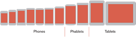
Figure 1 - Phablets, one third of all smartphone sales
As you can see, phablets are becoming part of the new standard. As UX designers, we must assume that mobile devices — the first important devices for communication that people carry in their pockets or bags — can have a screen of any size from about 3.5 to 6 inches.
Interaction in many ways
The reachability graphs of screen elements with the thumb of one hand, created by Josh Clark, have been popular since their creation. This results from the fact that they contained the assumption: all hold phones with one hand. Apparently, this is primarily due to the fact that the 3.5-inch screen of the iPhone has the perfect size for use with one hand. From which it follows that the other dimensions for one-handed use are not ideal.
The idea shown in Figure 2 is that people can comfortably interact with the touchscreen in the area to which the thumb extends. To touch the rest of the screen, the user has to drag, which causes him discomfort.
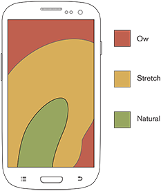
Figure 2 - The classic, but incorrect image of the reachability of elements when using the smartphone with one hand
But even ignoring the fact that people make most of the touches on their phones with two hands, this theory of reach seems to be incorrect. We do not have elastic fingers, so attempts to reach the element on the screen do not cause discomfort, they simply become impossible! Opportunities hands physiologically limited. I repeatedly observed how people changed the position of the phone in their hand in order to reach the desired part of the screen.
The sales data that I mention indicates that this does not bother people. People continue to buy large devices - and not all of them have big hands. In my study, a large number of participants use their second hand to touch. No one complains about it. Even when I test loyal iPhone users, giving them big Android phones, they just adapt.
What is good about conducting a study is that you get a whole bunch of data that you can always refer to if necessary. Therefore, I decided to review some of my data on how people held their devices and changed their hand positions when working with a 5.1-inch phone - a small phablet. In a recent article, Mikkel Schmidt raised a similar question about using mobile phones with one hand and conducted his own research on working with a 4-inch iPhone 5S, which the subjects held with one hand.
The results of both of our studies demonstrate similar discoveries that you can see in Figure 3. Our studies of the interaction with the touch screen (including the speed of using the thumb when making touches on the left side of the screen and the people’s preferences to make touches on the right) show that it is easiest to reach to the center of the screen, and, if necessary, to reach the rest of its zones, people easily change the position of the phone in the palm of their hand.

Figure 3 - The center of the screen is the most comfortable touch zone, but if you need to reach other zones, people can easily change the position of the phone in the palm of their hand.
As I noted earlier, users are most accurate and fast when they touch the center of the screen. This data is confirmed even when the position of the phone and the touch zone are limited to one-handed use. But in practice, a similar way to hold the phone in the palm of your hand and make a touch with your thumb usually allows you to use a rather small area of the screen.
The use of more distant zones does not seem to bring any noticeable inconvenience: most users simply slow down and resort to using a second hand. With its help, they change the position of the device, thereby increasing the zone of reach of the thumb and providing an opportunity to reach most of the main zone of contact.
According to my observations, actions outside this central zone almost always require the use of two hands. In this case, the user holds the device in his hand and changes its position in order to reach the desired areas of the screen, or simply holds the device in one hand and touches the forefinger of the other hand.
So instead of thinking that using different areas of a mobile phone screen becomes more and more burdensome for the user, we need to understand that people can easily reach out to any part of the screen. If they keep the device uncomfortable, they will simply choose a method more suitable for them.
Volumetric hands and flat screens
It would be interesting to give you a complete understanding of the biomechanics of the hand, but such a description would be too long for this article. The bottom line is that the thumb has a large range of stretching and bending, but not at the point where it connects with the arm itself, but in the region from the metacarpal-carpal joint to the wrist. Other joints of the thumb allow it to bend towards the screen, but cannot provide an extra swing. The ability to bend the thumb is important, as it moves in three-dimensional space, while the touch screens are flat, which limits the movement of the finger and ties it to the screen of the phone.
We often forget that our interactions with devices occur at the level where we transform reality into flat representations of input and output. Physiologically, the thumb consists of bones that are connected to the wrist, as shown in Figure 4. In addition, the joints, tendons and muscles of the thumb interact with your other fingers - especially the index finger. When the phone is in your palm, the range of movement of the thumb is noticeably limited. Changing the position of the phone in the palm allows, respectively, to change the area of reach of the thumb.
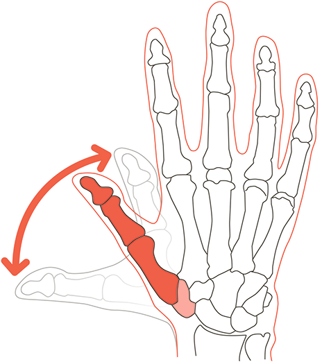
Figure 4 - The structure of the thumb allows it to “bend” relatively far to the side of the wrist.
The thumb is the strongest of the fingers. Therefore, the use of the thumb for touch implies that you hold the phone with weaker fingers. The limitedness of the fingers in the movement and the reduction of their strength seem to force us to use the second hand for reliability.
In addition, in any situation where users may encounter a jolt or vibration, they tend to hold the device in their hand more carefully, additionally holding it with their thumb, thereby “refusing” additional touches. A recent study by Alexander Ng (Alexander Ng) and others was devoted to how the user works with the phone when walking down the street and carries other things in his hands. Using the phone with one hand in such situations leads to a marked decrease in accuracy.
A small study was also conducted on our understanding of physiology regarding modern touch screens and models of interaction with them. However, it is still rather early to conduct such studies. I have some concerns that they are not yet applicable to our design work, because they cannot properly explain the observed behavior of people. But I do not lose hope that, ultimately, models will be created and preferred and effective areas of contact will be determined for each device and type of population.
People switch from one hand to another, often
Do not forget that all these graphs take into account only the use of devices with the right hand, which does not fully reflect the possible ways of using the phone. According to my observations, about 11% of clicks are performed with the index or thumb of the left hand. Notice how I put it. It's not about right-handers, but about using phones with your right hand.
The assumption that most actions on a mobile phone are performed with one hand is wrong. This is especially true of larger phones, or phablets. In my study, less than half of all participants used only one hand during the experiment, while other participants regularly switched from one hand to the other. People use their “not leading” hand and often switch between hands as well as between how they hold the phone in their hands, as shown in Figure 5. The touch depends on the context, so assume that people will switch with one hand on the other.
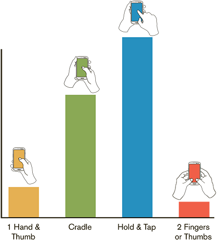
Figure 5 - Examples of various variants of interaction with mobile phones
The average number of times people switched from one hand to another was more than two in my tests, and it reached 15, when participants needed to enter something, some switched up to ten times. There is no obvious connection between what hand people use, where and what they want to click on, or what kind of interaction with the device they want to commit (for example, does the user open an element or choose several). Sometimes people choose some input field with one hand and then switch to the other to scroll through the page or select an item.
I also want to remind people who, even after looking at these numbers, insist that they and all their friends hold the phone with only one hand. That's right, we usually take the phone with one hand when we want to look at it or just carry it in our hands. But when it comes to interacting with the device, most of us use both hands. Based on my numerous observations, it can be concluded that more than half of the various interactions with the phone are not limited to one hand, even when working with small phones.
While the frequency of using one hand to hold or use a phablet is expectedly small, even for phablets, it is not zero. About 10% of interactions with phablets were made with one hand and the thumb of that hand. Approximately half of the participants from those whom I watched, when talking on the phone, reading, or just waiting for something with the phone in their hands, holding it in one way (mostly with one hand), but then, when it comes to active interaction, take its different.
The ability to reach the interface elements and conduct operations with one hand
Samsung has a feature applied in the Note series that reduces the content of the entire screen to a region simulating a 4-inch screen in the lower right corner [almost all manufacturers use similar solutions]. In addition to this, users have access to related products, such as keyboards.
I highly doubt that most users will notice such features at all. Why? Basically, because each of them is another invisible option that does something unnatural and therefore must be further studied. Rather, I assume that many will continue to simply change the position of the hands in order to reach the necessary parts of the screen. We have to admit that people buy big phones, because they want to get big screens, so we have to create a design taking into account the fact that users are not uncomfortable with the large size of the phone.
Design for large phones
"All important information and interface should be placed in the center of the screen, and less significant elements closer to the edges ... People more accurately and quickly interact with elements located in the middle of the screen ..."
So what kind of design is needed for these phablets? Same as for regular phones. All important information and interface should be placed in the center of the screen, and less significant elements closer to the edges. As it was discovered, people more accurately and quickly interact with elements located in the middle of the screen, therefore elements located along the edges of the screen (especially on the top and bottom) should be larger and with an increased interval between them.
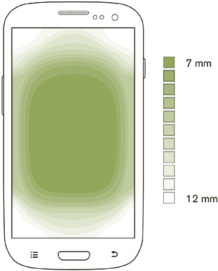
Figure 6 - People most accurately interact with elements located in the center of the screen.
The question naturally arises: why not completely follow this data and not concentrate all touches in the central zone, where, as we know, people can reach all the elements with the most accuracy? To some extent, because this central zone varies depending on the size of the device and the user's personal characteristics that are difficult to determine in advance. But in reality, designers are already working on it. If in your design the main viewing, clicking and scrolling areas are located in the middle of the screen, you are on the right path to create a design that meets the user's expectations.
Despite the already known dependence of touch accuracy on the screen area, it is unlikely that people would experience discomfort or slow down noticeably, changing the position of the phone in their hand to reach different parts of the screen. As far as I can tell, in reality there is no lack of using large phones or placing the interface outside the main touch zone with your thumb.
However, the interface elements at the periphery of the screen should be larger to ensure that people can make accurate clicks and do not spend a lot of time on it. During the design process, these problems can be solved: by choosing the appropriate elements, which will be located at the corners and will be quite large. For phablets and small tablets, I develop user interfaces and lay out screens using the same instructions and patterns that I use to create a design for touch phones.
It is always worth remembering that first of all we are developing a design for people, be it the design of a new device, user interface or service. First of all, you need to understand how people work: how they see, think, feel and interact with the device. These principles never change and provide useful guidance in developing a new user experience.
Source: https://habr.com/ru/post/253953/
All Articles