Yandex.Browser: the interface of the future is now in beta
Today we are ready to announce that the version of Yandex Browser, on which we are working within the framework of the Cousteau project, is being poured into its main beta . We know that many people use it here, and now you will have the opportunity to switch between the new mode and the traditional interface.
At the end of November last year, our team for the first time presented to the public its vision of what the Yandex. Browser will be in the future. Honestly, we did not expect so many public comments. For comparison: the stream of offers and bug reports, which were sent from Cousteau, turned out to be even more than after the release of the very first version of Yandex.Browser in 2012. Not surprisingly, the whole of December, we were actively engaged in the analysis of your messages, which largely determined our work scope for the coming months.
')
We want the beta testing of Yandex. Browser to be convenient to track changes in the Cousteau project and not to use two different builds for this. And now I will talk about the results of our work on a new browser for the last month.
Disable tab grouping
One of the most popular topics on which our users spoke was the arrangement of tabs. In the beta version, they still remain at the bottom, but we are working on different options and continue to experiment. We want to tell about them separately. And today I would like to touch on the issue of tab grouping. Moreover, many appeals in support were dedicated to her and allowed us to create a list of priority corrections.
We described in detail the ideological rationale for tab grouping last time. Now we will share with you the statistics that pushed our team to work on this opportunity.
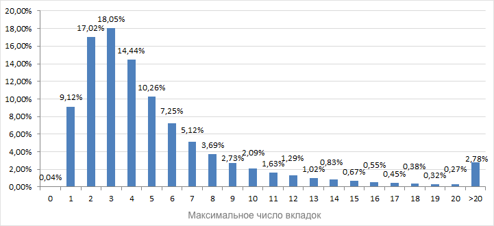
Contrary to popular belief, most users are not enough two or three tabs for everyday life in the network. Moreover, about 10% of us open more than ten tabs for our tasks. And almost 3% use more than 20. For example, for me this is the usual working condition. You can imagine what two or three dozen open tabs in the browser mean? I know colleagues who have hundreds of tabs open.
It would be wrong to simply count the number of open tabs and on the basis of these data to enter a forced grouping. Based on the basic idea that sites are applications, we initially focused on grouping by domain, but without checking it was impossible to make a decision. In particular, it could happen by chance that users with 20 tabs openly have 20 different sites, and there is no use in this case. And that's what we counted:
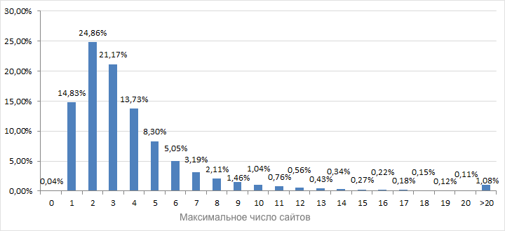
The results showed that more than ten sites were open to 4% of users versus 10% for tabs. What does this mean? The fact that grouping really makes sense for many users, but not for everyone. We understood from the very beginning that there is a risk to make life difficult for those who have only a few tabs open. And your appeals after the launch of alpha confirmed concerns.
The simplest solution would be an option in the settings that allows you to enable / disable grouping. But the question remains: should the grouping work by default? Should we focus on those who work simultaneously with two or three sites? And where is the line beyond which the group is definitely needed? Such questions encourage our future work. Among several options, we, for example, consider an algorithm in which grouping would be offered to users who crossed the threshold in N simultaneously open domains.
There is no final solution in the first beta yet, but for now you can use the browser: // flags / # disable-custo-tab-grouping flag to disable grouping. And share with us your ideas.
Background Tabs
Another problem that has been confirmed through support calls concerns the opening of tabs in the background - when you select “Open in a new tab” (or click the middle mouse button) through the context menu of the link. In our alpha, such pages sometimes opened up inside inactive groups, and it was not at all obvious where to look for it now.

To solve this problem, it was necessary to somehow select the tabs open in the background among all the others. And at the same time to allocate and inactive group in which such a tab was provided. I didn’t want to reinvent the bicycle (because I really wanted to rectify this situation in the first update), so we used a well-known method - now there are labels in the form of a circle on each background tab. Recall that in a similar way, we mark those search tips that are based on the history of visits.


It would seem that the background tabs have been successfully selected, it is not difficult to find them. We decided to assemble the assembly and test our decision on volunteers. There were no problems with the circle. Background tabs have become visually noticeable. The problem lurched on the other hand, and for the time being it was successfully masked by the inconvenience of searching for tabs. It consists of this. If the background tab opens in an inactive group, then you need to make two clicks to get to the content. This is a whole click more than we are used to.
The only reasonable option that does not add clicks that we come up with is to temporarily disable the grouping for such tabs. You open the background tab, but it does not fall into the group, but stays next to it until it is viewed or the group is expanded.

Tab activation order
Another direction for us was the work on the order of opening tabs. Recall that at the moment after closing the active tab, the focus moves to the tab on the right (standard logic in Chromium). Not the perfect mechanic, we agree. But she did not cause any special problems until the moment when the group appeared. Now, users are faced with a situation where, after closing the rightmost tab, the tab in the group from a completely different group became active in the group. Perceived is not so easy.
Therefore, in the beta version, we have implemented a new, experimental logic, well known to many users of the old Opera. Not the tab to the right becomes active, but the one that was used earlier. This is not the final version, but it would be interesting to know the opinion of the community now
Just in case, we added the ability to select logic in the settings.
Optimization for weak computers
The graphic effects used in the new Yandeks.Browser, quite well (let's make a discount on the fact that just yesterday it was alpha) work on computers with modern video accelerators (conditionally labeled as HD). However, there is equipment that, unlike us, is not at all happy about the smooth blur and other graphic delights in the browser. We do not want to close our eyes to this, so we are constantly looking for ways to optimize.
At the first stage (that is, already in the current beta), Yandex. The browser will turn off the blur and replace it with a white fill with opacity 0.9 for devices with weak graphics cards (GMA). Compromise option. Not too impressive, but you can already work.
There is a third category. These are the most problematic video cards that can even be banned at the Chromium level, or the browser does not have access to work with such devices. Such equipment cannot cope even with the simplest opacity, so in this case we will use a simple white substrate.
This is what we have already done for the first beta. In future releases we will try to talk about our other plans aimed at increasing productivity.
Bookmarks
We did not hide from the very beginning that we are not planning to cut bookmarks from the browser. However, simply copying them from the current traditional interface to the new one did not. The usual bookmark bar, located under the address bar, does not fit into the new interface at all. And it's not in the design. There is no big problem in making it translucent (although such a solution would lead to difficulties in working with transparency in some situations). And not even that we do not have a classic address bar in this place. Another line in the header is, again, the path to piling up the panels and the “stripedness” of the browser.
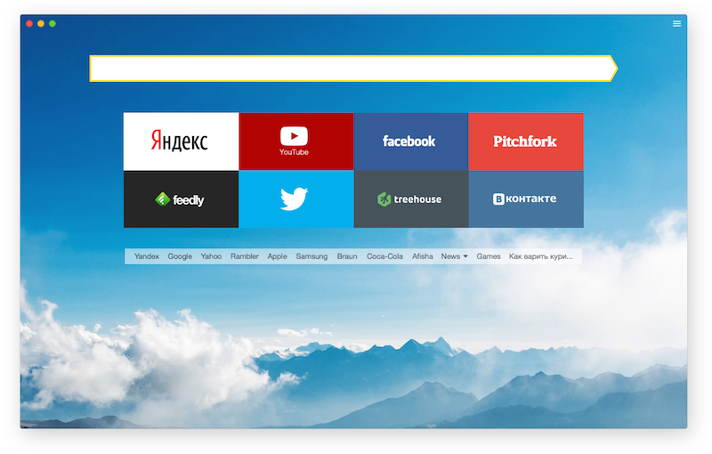
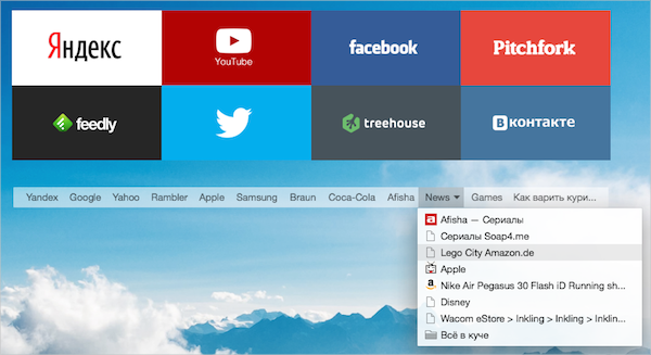
In the current versions of Yandex. Browser, there is a fairly popular option among users that allows you to display bookmarks only by clicking in the address bar. Thus, bookmarks are just a click away and do not take up space when they are not needed. It is this experience that we applied in the new interface by moving the bookmarks to the wrong side and a new tab.
Switching between the Cousteau and the traditional interface
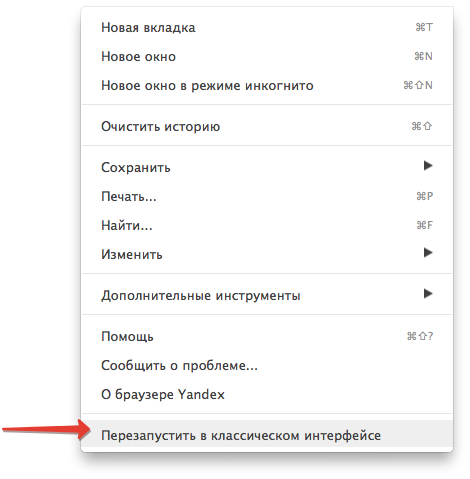
As it was said at the very beginning, a new beta version of Yandex. Browser allows everyone to choose the interface in which he is comfortable working. The corresponding item can be found in the main menu.
We do not get tired of repeating that the bug reports sent to us (or just comments on Habré) matter. We listen and react. Sometimes not as lightning as we all would like, but it really works.
Something else. The appearance of Cousteau in the beta channel does not mean that in six weeks all Yandex.Browser users will suddenly update and receive a new interface. Do not be afraid of this. Work on the new browser will continue as part of the beta. We will experiment with ideas and listen to the reaction of the community. A stable version of Yandex Browser will evolve gradually, without unexpected shocks. Some ideas from Cousteau may appear there earlier than others. And with your help, this process will become even smoother.
At the end of November last year, our team for the first time presented to the public its vision of what the Yandex. Browser will be in the future. Honestly, we did not expect so many public comments. For comparison: the stream of offers and bug reports, which were sent from Cousteau, turned out to be even more than after the release of the very first version of Yandex.Browser in 2012. Not surprisingly, the whole of December, we were actively engaged in the analysis of your messages, which largely determined our work scope for the coming months.
')
We want the beta testing of Yandex. Browser to be convenient to track changes in the Cousteau project and not to use two different builds for this. And now I will talk about the results of our work on a new browser for the last month.
Disable tab grouping
One of the most popular topics on which our users spoke was the arrangement of tabs. In the beta version, they still remain at the bottom, but we are working on different options and continue to experiment. We want to tell about them separately. And today I would like to touch on the issue of tab grouping. Moreover, many appeals in support were dedicated to her and allowed us to create a list of priority corrections.
We described in detail the ideological rationale for tab grouping last time. Now we will share with you the statistics that pushed our team to work on this opportunity.
Contrary to popular belief, most users are not enough two or three tabs for everyday life in the network. Moreover, about 10% of us open more than ten tabs for our tasks. And almost 3% use more than 20. For example, for me this is the usual working condition. You can imagine what two or three dozen open tabs in the browser mean? I know colleagues who have hundreds of tabs open.
It would be wrong to simply count the number of open tabs and on the basis of these data to enter a forced grouping. Based on the basic idea that sites are applications, we initially focused on grouping by domain, but without checking it was impossible to make a decision. In particular, it could happen by chance that users with 20 tabs openly have 20 different sites, and there is no use in this case. And that's what we counted:
The results showed that more than ten sites were open to 4% of users versus 10% for tabs. What does this mean? The fact that grouping really makes sense for many users, but not for everyone. We understood from the very beginning that there is a risk to make life difficult for those who have only a few tabs open. And your appeals after the launch of alpha confirmed concerns.
The simplest solution would be an option in the settings that allows you to enable / disable grouping. But the question remains: should the grouping work by default? Should we focus on those who work simultaneously with two or three sites? And where is the line beyond which the group is definitely needed? Such questions encourage our future work. Among several options, we, for example, consider an algorithm in which grouping would be offered to users who crossed the threshold in N simultaneously open domains.
There is no final solution in the first beta yet, but for now you can use the browser: // flags / # disable-custo-tab-grouping flag to disable grouping. And share with us your ideas.
Background Tabs
Another problem that has been confirmed through support calls concerns the opening of tabs in the background - when you select “Open in a new tab” (or click the middle mouse button) through the context menu of the link. In our alpha, such pages sometimes opened up inside inactive groups, and it was not at all obvious where to look for it now.
To solve this problem, it was necessary to somehow select the tabs open in the background among all the others. And at the same time to allocate and inactive group in which such a tab was provided. I didn’t want to reinvent the bicycle (because I really wanted to rectify this situation in the first update), so we used a well-known method - now there are labels in the form of a circle on each background tab. Recall that in a similar way, we mark those search tips that are based on the history of visits.
It would seem that the background tabs have been successfully selected, it is not difficult to find them. We decided to assemble the assembly and test our decision on volunteers. There were no problems with the circle. Background tabs have become visually noticeable. The problem lurched on the other hand, and for the time being it was successfully masked by the inconvenience of searching for tabs. It consists of this. If the background tab opens in an inactive group, then you need to make two clicks to get to the content. This is a whole click more than we are used to.
The only reasonable option that does not add clicks that we come up with is to temporarily disable the grouping for such tabs. You open the background tab, but it does not fall into the group, but stays next to it until it is viewed or the group is expanded.
Tab activation order
Another direction for us was the work on the order of opening tabs. Recall that at the moment after closing the active tab, the focus moves to the tab on the right (standard logic in Chromium). Not the perfect mechanic, we agree. But she did not cause any special problems until the moment when the group appeared. Now, users are faced with a situation where, after closing the rightmost tab, the tab in the group from a completely different group became active in the group. Perceived is not so easy.
Therefore, in the beta version, we have implemented a new, experimental logic, well known to many users of the old Opera. Not the tab to the right becomes active, but the one that was used earlier. This is not the final version, but it would be interesting to know the opinion of the community now
Just in case, we added the ability to select logic in the settings.
Optimization for weak computers
The graphic effects used in the new Yandeks.Browser, quite well (let's make a discount on the fact that just yesterday it was alpha) work on computers with modern video accelerators (conditionally labeled as HD). However, there is equipment that, unlike us, is not at all happy about the smooth blur and other graphic delights in the browser. We do not want to close our eyes to this, so we are constantly looking for ways to optimize.
At the first stage (that is, already in the current beta), Yandex. The browser will turn off the blur and replace it with a white fill with opacity 0.9 for devices with weak graphics cards (GMA). Compromise option. Not too impressive, but you can already work.
There is a third category. These are the most problematic video cards that can even be banned at the Chromium level, or the browser does not have access to work with such devices. Such equipment cannot cope even with the simplest opacity, so in this case we will use a simple white substrate.
This is what we have already done for the first beta. In future releases we will try to talk about our other plans aimed at increasing productivity.
Bookmarks
We did not hide from the very beginning that we are not planning to cut bookmarks from the browser. However, simply copying them from the current traditional interface to the new one did not. The usual bookmark bar, located under the address bar, does not fit into the new interface at all. And it's not in the design. There is no big problem in making it translucent (although such a solution would lead to difficulties in working with transparency in some situations). And not even that we do not have a classic address bar in this place. Another line in the header is, again, the path to piling up the panels and the “stripedness” of the browser.
In the current versions of Yandex. Browser, there is a fairly popular option among users that allows you to display bookmarks only by clicking in the address bar. Thus, bookmarks are just a click away and do not take up space when they are not needed. It is this experience that we applied in the new interface by moving the bookmarks to the wrong side and a new tab.
Switching between the Cousteau and the traditional interface
As it was said at the very beginning, a new beta version of Yandex. Browser allows everyone to choose the interface in which he is comfortable working. The corresponding item can be found in the main menu.
We do not get tired of repeating that the bug reports sent to us (or just comments on Habré) matter. We listen and react. Sometimes not as lightning as we all would like, but it really works.
Something else. The appearance of Cousteau in the beta channel does not mean that in six weeks all Yandex.Browser users will suddenly update and receive a new interface. Do not be afraid of this. Work on the new browser will continue as part of the beta. We will experiment with ideas and listen to the reaction of the community. A stable version of Yandex Browser will evolve gradually, without unexpected shocks. Some ideas from Cousteau may appear there earlier than others. And with your help, this process will become even smoother.
Source: https://habr.com/ru/post/253775/
All Articles