We print stories from Medium
I want to thank Maria for help in preparing the illustrations.
- Craig Mod, Let's talk about margins
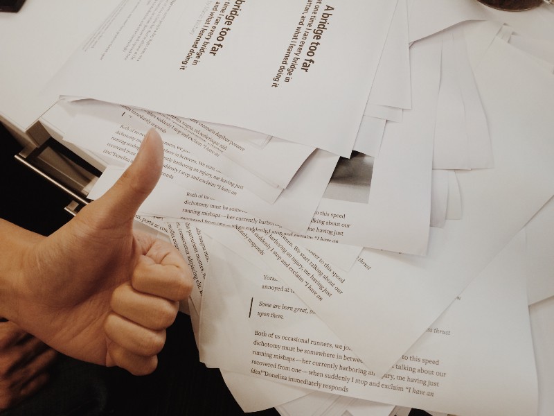
Printing articles from Medium must be commonplace, but we want to make this process beautiful. Perhaps this is a tribute to the century of printing on paper and partly nostalgia (yes, some of us once created print models for the pages of Medium, but so much time has passed ...). In the end, the printing of pages refers to responsive design. Practical ways of applying thousands, ranging from printing to memory and hanging in a frame and ending with the transfer to a friend and the implementation of the last edits before publication. Writers must often do this.
')
But the most important reason is this: we respect the work of our writers.
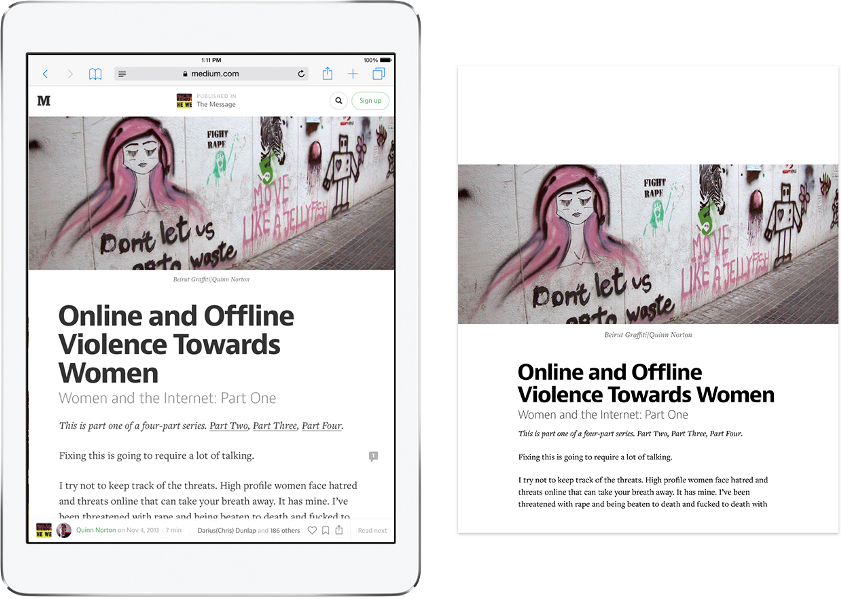
We wanted to design the most beautiful print output that browsers can support. Below we have listed some differences between the screen and the printed Medium on the example of a fake article (however, you can open it ).
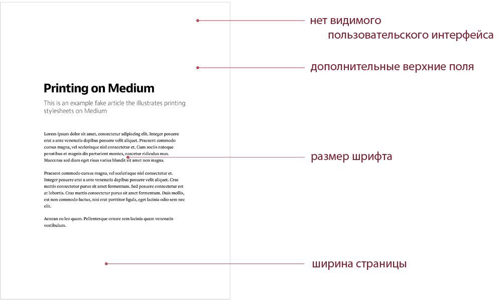
No visible user interface. We have removed the interface elements, since on paper they are useless. Our style sheets are customized so that any UI innovations will not be visible on the sheet.
Additional top fields. We were generous with the size of the first page header. It can be useful for notes and other handwritings.
Font size. We changed the size from 22px to 15px (and all other sizes were replaced proportionally), as it is the easiest to read on paper.
Page width With a main column width of 4.95 ", a line can fit 50-70 words, as well as on the screen. The empty space on the sides of the sheet also allows you to relax your fingers and position more comfortably.
All this was done for standard paper sizes for portrait and landscape orientations, and we did not design any exceptions for exotic species. Note that the maximum width has been changed, but not the actual width of the page , so printing on pages as low as 4.95 "will still work without trimming.
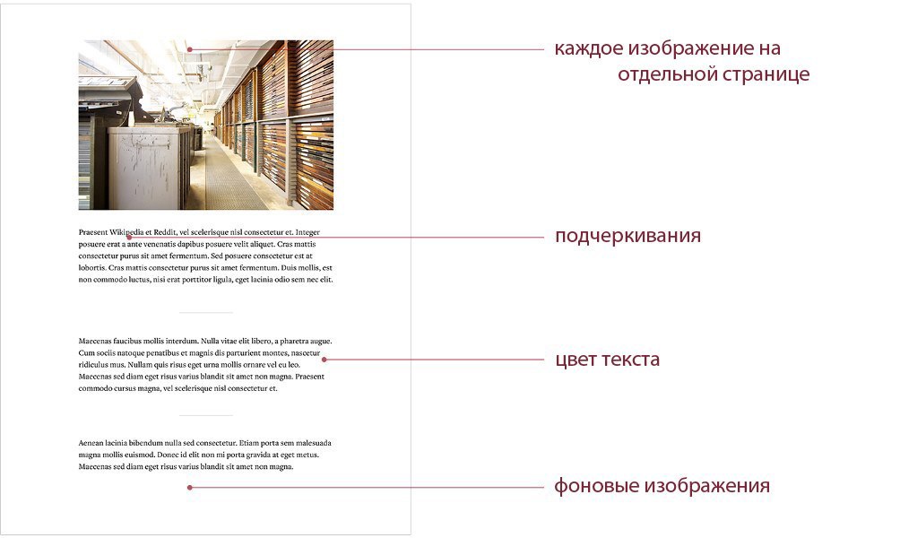
Each image on a separate page. If suddenly the image does not fit on the page, it will be moved to the next.
Underscores All the underscores, which we carefully place inside the text on the screen , have been removed from print - you should not overload your eyes with these decorations.
Text color. The color on the Medium screen is not 100% black , since its contrast is slightly lower, which better highlights it. However, we print pure black text on the print, since not all printers are able to cope with dithering .
Background images. On print, we leave empty space instead of background images. You can’t leave them, because browsers interpret CSS-like images in different ways, and you shouldn’t waste toner (we’re not talking about readability).
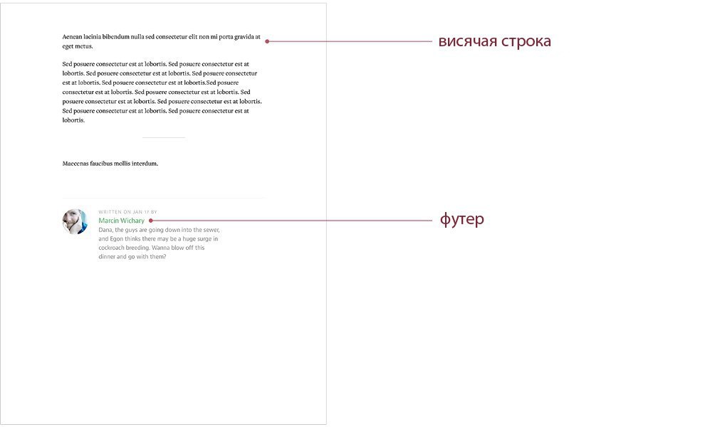
Hanging lines / windows. Someone thinks that we could fit the two lines on the previous page, but we do not think so. Every time our system makes sure that these lines do not become “hanging” , closing the end or the beginning of the sheet.
Footer. At the bottom of the screen, only the most interesting remains - buttons for sending an article to social networks. Obviously, on paper you will not share the article with anyone (unless you give the printouts to another person), so remove it from the print layout.
(We were very sad to see such a huge waste of paper ... But it was necessary for debag. Fortunately, we did it once.)
I want to thank you for reading the article and answer a couple of questions.
If you’re on the other hand It says: We give you a shit. Humility and diligence. Giving a shit is imbue craft with. Giving a book in book design manifolds in many ways, but it’s possible most in the margins.
- Craig Mod, Let's talk about margins
Printing articles from Medium must be commonplace, but we want to make this process beautiful. Perhaps this is a tribute to the century of printing on paper and partly nostalgia (yes, some of us once created print models for the pages of Medium, but so much time has passed ...). In the end, the printing of pages refers to responsive design. Practical ways of applying thousands, ranging from printing to memory and hanging in a frame and ending with the transfer to a friend and the implementation of the last edits before publication. Writers must often do this.
')
But the most important reason is this: we respect the work of our writers.
We wanted to design the most beautiful print output that browsers can support. Below we have listed some differences between the screen and the printed Medium on the example of a fake article (however, you can open it ).
No visible user interface. We have removed the interface elements, since on paper they are useless. Our style sheets are customized so that any UI innovations will not be visible on the sheet.
Additional top fields. We were generous with the size of the first page header. It can be useful for notes and other handwritings.
Font size. We changed the size from 22px to 15px (and all other sizes were replaced proportionally), as it is the easiest to read on paper.
Page width With a main column width of 4.95 ", a line can fit 50-70 words, as well as on the screen. The empty space on the sides of the sheet also allows you to relax your fingers and position more comfortably.
All this was done for standard paper sizes for portrait and landscape orientations, and we did not design any exceptions for exotic species. Note that the maximum width has been changed, but not the actual width of the page , so printing on pages as low as 4.95 "will still work without trimming.
Each image on a separate page. If suddenly the image does not fit on the page, it will be moved to the next.
Underscores All the underscores, which we carefully place inside the text on the screen , have been removed from print - you should not overload your eyes with these decorations.
Text color. The color on the Medium screen is not 100% black , since its contrast is slightly lower, which better highlights it. However, we print pure black text on the print, since not all printers are able to cope with dithering .
Background images. On print, we leave empty space instead of background images. You can’t leave them, because browsers interpret CSS-like images in different ways, and you shouldn’t waste toner (we’re not talking about readability).
Hanging lines / windows. Someone thinks that we could fit the two lines on the previous page, but we do not think so. Every time our system makes sure that these lines do not become “hanging” , closing the end or the beginning of the sheet.
Footer. At the bottom of the screen, only the most interesting remains - buttons for sending an article to social networks. Obviously, on paper you will not share the article with anyone (unless you give the printouts to another person), so remove it from the print layout.
(We were very sad to see such a huge waste of paper ... But it was necessary for debag. Fortunately, we did it once.)
I want to thank you for reading the article and answer a couple of questions.
Source: https://habr.com/ru/post/253723/
All Articles