Effective Navigation Simplification, Part 2: Navigation Systems

How to make navigation as simple and predictable as possible? As was shown in Part 1 , first, you need to structure the content so that it naturally narrows the navigation choices, second, clarify all the choices so as to minimize the mental burden on users. However, two additional steps are needed - choose the right type of navigation menu and then make a suitable design for it. The second part of this series talks about the third step and considers which types of navigation menus best fit to which content.
The navigation menu is any area of the interface that presents navigation options that allow users to find content on a website. This excludes, for example, articles and product pages that may contain hyperlinks, but whose main goal is consumption, not navigation.
The main difference in navigation models is the difference between the primary, traditional navigation systems and the secondary, alternative ones. Although, in fact, to determine this difference between them is difficult. It can be said that traditional navigation mainly requires the user to click or hover the cursor to select or view meta-data categories, while in alternative navigation there is at least one of these aspects.
')
Traditional Navigation Menus
There are 5 traditional types of navigation menus or widgets that can be sorted from the most simple to the most complex:
1. Menu bar
2. Normal dropdown menu
3. Mega-menu
4. Separate page
5. Dynamic filters
Hybrid options are also possible and there are, nevertheless, they can be divided into five types of menu above. The question naturally arises as to when to use which type of menu.
As described in part 1, designers use three methods to designate navigation options: names, titles and images, names, images and descriptions. To minimize the mental burden on the user, designers should use the necessary and sufficient amount of information that the target audience needs to understand the possible options.
With this in mind, the following rule of thumb can help decide when to use which of the navigation menu types: the fewer possible options and the less information needed to clarify them, the simpler the navigation should be.
For a better understanding of why certain widgets are easier to use and when to select one and not the other, let's take a closer look at each of the five types of menus.
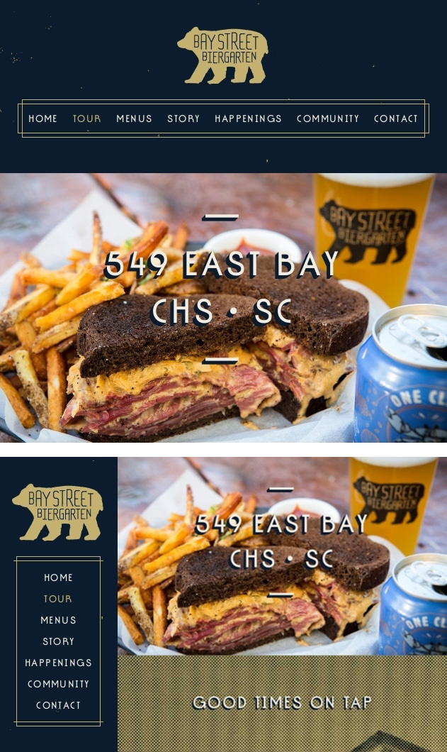
Menu Bar (Menu bar)
Almost every site has a constant horizontal or vertical line, which includes first-order categories.

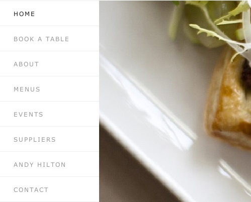
The first and most basic navigation anchor is a horizontal or vertical link bar.
Recommendation
The most important or most frequently used items or categories should be located in the navigation menu bar.
Explanation
The menu bar is the easiest type of navigation. Items or categories in the navigation bar are global, they are visible and immediately accessible. In contrast, in the drop-down menu, users must hover or wait for the download of a separate page in order to access the options contained.
Problems
Once the navigation menu bar (whether horizontal or vertical) takes on more than just a small list of items, depending on the width of the screen and its orientation, it can take up space that can be used more effectively to present the main content.
In the screenshot below, notice that horizontal navigation works well while it takes up only one line. To place it on a small screen, the designers decided to place navigation elements in rows, which, however, pushes the main content down, requiring users to scroll more.
Multiple navigation rows make it difficult to access content.
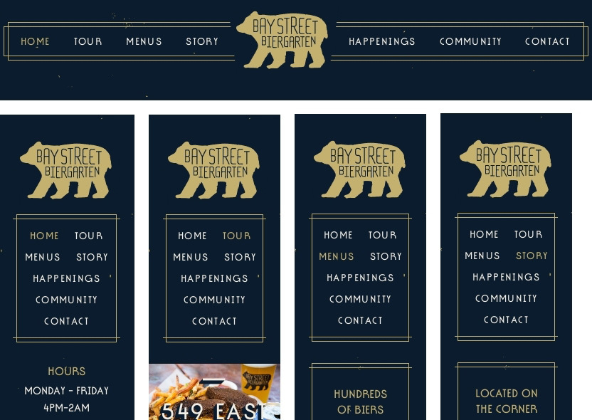
On the wide screen, the vertical navigation menu allows you to place more items, however, it also has its drawback. It occupies a horizontal space that can be more effectively used for the presentation of the main content, whether it is an article, video or product information. The image below presents two options for comparing the effect.
Vertical navigation can interfere with the presentation of content on wide screens.
For this reason, drop-down and pop-up menus are often best suited for a large number of items. They show additional elements only upon request, thus putting the page content in the spotlight.
Normal drop-down menu (Regular Drop-Down Menu)
Drop-down or pop-up menu when triggered appears on top of the content. Its elements fit vertically in one column and consist either of words only or of words and icons.

The items in the drop-down menu are vertically stacked in one column.
Recommendation
If the elements are best explained with words and the menu is not too long, then the usual drop-down menu is the simplest and most effective solution.
Explanation
In comparison with the mega-menu, the usual drop-down menu has the following advantages:
- Loads faster;
- The extra space and visual potential of the mega-menu will not have an advantage over several text elements. Moreover, the mega-menu may confuse users or, at best, slow them down, since users will first have to understand the layout of the elements. On the contrary, a short vertical list is easy to scan and understandable to everyone.
Problems
With a long menu, everything can be more complicated. A long vertical drop-down list may be cropped by the browser window, which will force the user to constantly scroll. There are two ways to solve this problem.
The first is to break the list into subcategories. Although this is a good decision, navigating from a submenu to a submenu can be annoying if the interaction is not thought out properly. We will return to this question in part 3 of this series of articles.
The second way is to use the mega-menu that best suits the screen orientation, for example, the horizontal mega-menu for landscape screen orientation.
If there is little space on the screen, then adjusting the menu to the screen orientation is a good solution.
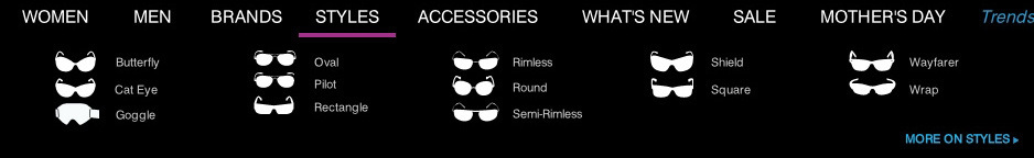
Mega-menu (Mega-Menu)
A special type of drop-down menu is the so-called mega-menu. A mega-menu is a drop-down or pop-up menu that does not just arrange its items in one column, but uses images, typographical hierarchy, and various markup to visualize options.

The mega-menu is bigger and more complicated than the usual drop-down menu.
Recommendation
If options require both names and images, then a mega-menu is the best choice.
Explanation
In the usual drop-down menu is not expected a large space and visualization options. And, whether it's a regular drop-down or mega-menu, both have the following advantages over a separate page with navigation:
- They load faster;
- The mental burden on users is lower. With a separate page, the user needs to think more. “What is this advertisement?” “Where is the content itself?” “Where is the navigation?”. The drop-down menu shows only the navigation, and it appears closer to the cursor or the user's finger.
Problems
Even the mega-menu is limited in space. If the number of elements is too large, then a separate page becomes inevitable.
Separate Page
The fourth way to display items or categories is to place them on a separate page.

On a separate page subcategories are placed freely.
Recommendation
If the menu assumes names, images and descriptions, then a separate page is best suited.
Explanation
The arrangement of this type of navigation in the mega-menu is possible, but only if the descriptions consist of only a couple of lines.
Problems
Sending users to a separate page just for viewing navigation, not for displaying content is not the most elegant solution. In addition, users will be torn from the content of the current page. However, if the mega-menu is too cumbersome when placing a huge number of elements, then a separate page can be the most comfortable solution.
Dynamic Filters (Dynamic Filters)
Finally, dynamic filters are a challenging, but powerful way to navigate through content, with their help, users choose the set of desired content on the go.
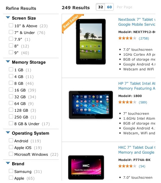
Sophisticated but powerful dynamic filters allow users to select desired content on the go.
While most sites have only one of the first three types of menus, dynamic filters almost never appear by themselves. Instead, they are usually added to the main navigation as an option.
Kmart (in the image below) starts the navigation process with drop-down menus, both from regular and mega-menus. At the next level, a separate page shows product categories. Finally, after users have entered the section, they find dynamic filters to refine their selection.
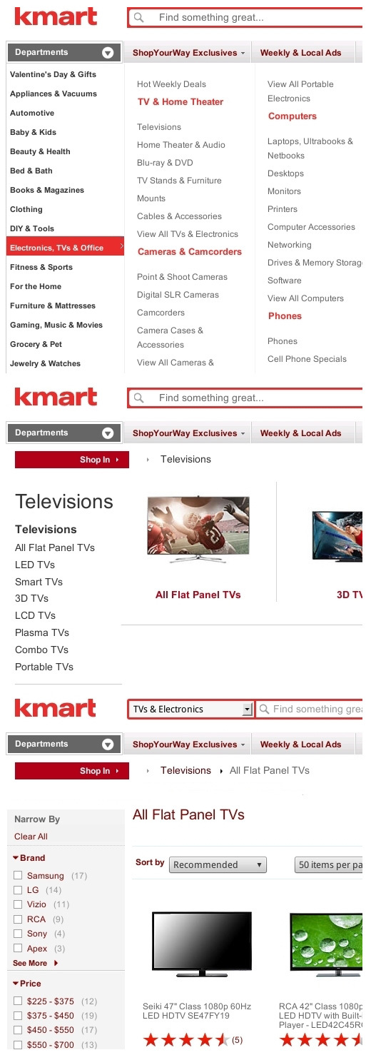
Dynamic filters are often added to traditional navigation.
Recommendation
Consistent with the discussion of meta-data categories in part 1, we can say that if the first three types of navigation best suit main and mutually exclusive categories, then dynamic filters are best suited for additional categories that can be combined.
Explanation
The advantage of dynamic filters is that they allow users to select and change values on the go. Instead of walking back and forth between navigation levels, users can stay at the same level and dynamically combine values until the results match their criteria.
The fact that dynamic filters are most often presented in a vertical form is not a disadvantage, since the filtered results are not content by themselves. They are still part of the navigation. Moreover, the dynamic relationships between the selected values on the left and the results on the right give users immediate feedback on how many and which items fit their criteria.
Problems
Dynamic filters are the most powerful, but also the most difficult solution. They take up more space and take longer to load than any other type of navigation. Users need to work with various elements, including filters, results, sorting widgets and viewing modes, which complicates the task of arranging all the elements on the working space of the screen, not to mention phones. So, no matter how useful they are, avoid them if a simpler type of navigation does the same job as well.
Alternate navigation
Almost all websites use one of the traditional types of navigation as the main one. However, many supplement them with alternative navigation systems. Therefore, the evaluation of the most popular ones is also important.
Below are the four most common types of alternative navigation:
1. Search
2. Sitemap
3. Pointer from A to Z
4. Tags
Search (Search)
Search saves users from having to navigate through multiple levels of navigation and delivers them directly to the desired item. The difference is that the section of the page containing the desired results was manually set by the user.

Search is a direct path to the desired content in a complex multi-level navigation system.
The designer must apply the tag system and keywords to all pages of the site, taking into account possible misunderstandings between the user and the search engine, such as typos, synonyms, and various conceptual content models. In other words, the search engine must guess what the user means in his query.
Recommendation
Present the search as a supplement to traditional navigation, and not as an equivalent or direct means of navigation.
Explanation
Various studies have come to different conclusions about whether users prefer to use the search for the most part . Of course, search preference may depend on the design of the search itself and how it is presented; previous experience with poor navigation design may increase search preference. In any case, do not push search as the main navigation method.
Despite the efforts that developers make to avoid errors, the success of search queries remains low . The reason is that each site usually has its own categories, classification schemes and names. Users usually do not know all the specifics and therefore often enter their requests at random, which can be a burdensome and uncertain process, leading to the fact that the majority will enter a request once, twice, before giving up. This is especially true on mobile devices, where the introduction of requests is less comfortable.
Another problem is that even if all the results are suitable, users may wonder how complete they are. “Did the search engine miss something, having misunderstood my query?” “Did I miss something, having incorrectly formulated my query?”. Traditional navigation, on the contrary, defines and shows all categories , and also shows a complete list of all relevant entries, giving the user confidence that he will not miss anything.
The second phenomenon that is often discussed is that the search has a higher conversion than the navigation menu. This, however, can be explained by the difference between browsing and searching. Users who simply view information with less determination to buy something usually use the menu, while users who know what they need to buy usually just enter it in the search field.
Be that as it may, even if the search is more efficient in finding certain products, it is not as popular among users . Users prefer traditional navigation to search, even when searching for a specific product. One of the problems with the search is that with all the specific and often regional differences in product names, it is not always easy to reproduce the exact name (“Was it a GS-50 or G-150?”). Using dynamic filters, users can pinpoint the characteristics of the product they are looking for, instead of recalling the model, type, or version number.
Another problem is that the search may impede the detection of related products. If the user finds what he is looking for through a search, then this may be the only item that he sees. With the help of dynamic filters, the user will see not only the desired product, but also similar products, including those that have additional features or lower cost.
Naturally, adding dynamic filters to the search is possible, which in essence will allow combining the advantages of both navigation models in one interface.
In general, a search engine, especially with advanced functions and algorithms, can give good results, but it is still inferior to a well-thought-out traditional menu due to its inherent problems. That is why the search is best suited as an additional method of navigation if the menu does not satisfy the user, but not as the main or only means of navigation.
Finally, keep in mind that searching works better where there is a lot of user-generated content, because users know what they have called or tagged their own content.
Pointer from A to Z (A - Z Index)
The pointer from A to Z lists all of the elements available on the site in alphabetical order, completely or almost completely:
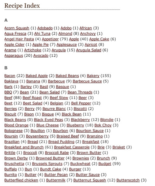
The pointer from A to Z sorts all the content on the site in alphabetical order.
Recommendation
Do not make the AZ pointer over the traditional menu. Moreover, listing only pages with categories is often more effective than a complete list of thousands of individual pages.
Explanation
AZ pointer is easy to use, because everyone knows how to navigate the alphabetical list. However, the alphabetical list has three problems.
First, the AZ pointer usually works well with titles, but rarely with images and descriptions that are often needed.
Secondly, bringing the terminology in line with the user's expectations is not always easy. With regional, outdated or conceptually excellent terminology, users may find themselves in a completely different section of the index. The only way to solve the problem is to include synonyms, despite the fact that it confuses the information architecture. In traditional navigation, synonyms are not such a big problem, since ideally users will move from a small number of options to a small number of options.
Thirdly, the AZ pointer, as well as the search, can impede the viewing of related products. If the user searches for "eggs and beans" in the index, then he will receive only eggs and beans and nothing else. In traditional navigation, users will be able to see other breakfast recipes while searching for “eggs and beans” through the “Breakfast” category, without slowing down (of course, if the “Breakfast” category is sorted alphabetically), which is good for users and for the site.
Site Map
The site map displays the navigation structure of the site, usually with headings and subtitles.
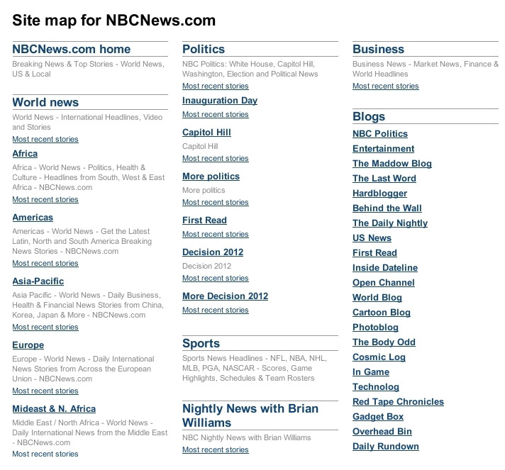
The site map clearly shows the navigation structure of the site.
Recommendation
Scanned sitemap.xml file helps search engines to index the site. But due to the interactive presentation, the site map should not focus on the main means of navigation.
Explanation
A sitemap usually consists of text only. And users often need icons, photos and descriptions to understand all the options. Of course, the inclusion of these elements in the site map is possible, however, it only aggravates the second problem, which is that the site map usually displays all the elements at once without the ability to skip or hide unwanted elements, which creates problems for the user who tries to view and interact with information, especially when there is a lot of content.
Tags (Tag)
Tags, by default, can be described as keywords without parental or child categories. Usually they appear at the end of articles.

Tags marked "More about".
Recommendation
Tagging system requires additional measures for good performance. But even then, it will still yield to the traditional category-based system.
Explanation
Of all the alternative navigation methods, tags are closest to traditional navigation. In the end, tagging (which is essentially the process of creating metadata) is the first step towards a proper information architecture, the foundation of traditional navigation. However, even with a small amount of tags for a single article, you may encounter hundreds or thousands of tags in a short time.
That is why tag categorization is necessary. By separating tags into parent and child categories, designers can structure a large number of tags into small sets with relevant information. Traditional navigation, which includes these categories, will allow the user to skip unwanted sets and see only those that interest him.
Although many sites with a focus on content (content-based websites) replace complex traditional menus with hybrid navigation. At best, they broadly categorize tags, initially relying on other navigation models, such as external and internal search engines, event tapes and social media links. This type of system allows users to quickly find the articles they need, but users have difficulty identifying the article of interest among others. In compensation, some designers simply end the article with a list of keywords, for example, Barack Obama, Democrats, Republicans, health care, and cessation of work. In this case, users get access to the tag and can view related articles of interest.
In traditional navigation, the user will go through categories that contain and are consistent with the keywords in which he is interested, for example, News → Politics → USA → Domestic Policy → Healthcare . In this case, the user will be interested in this article because she is discussing US healthcare, not necessarily because it mentions Barack Obama, Democrats, Republicans, or stopping work. To see related articles, users simply need to go to the parent category.
Traditional menu-based menus are the most accurate navigation method.
A tag-based system is most effective if it is complemented by strong social media and a good search engine. But it remains quite vague way of navigation is more similar to a point rather than a targeted search. Moreover, users should not rely on search and external links to navigate the site. On the contrary, they should be able to find any information directly from the Main page, and the thoughtful traditional menu still remains the most effective way to do it.
Conclusion
When it comes time to choose the right type of navigation, the point is simple: the fewer options available and the less information needed to explain them, the simpler the type of navigation should be.
The more difficult question is whether and how to implement alternative navigation models in addition to the traditional ones.
Alternative solutions can be inexpensive and easy to implement. But they all have natural obstacles that prevent them from acting as the main or only navigation systems. Moreover, users usually do not search for these alternatives while traditional navigation can help them.
Therefore, instead of investing a lot of effort in the development or improvement of these minor decisions, invest in the implementation of basic navigation properly, then, in most cases, minor decisions will not be needed.
The recommendations in this article are summarized below.
Select traditional navigation
- The vertical navigation bar is no less useful than the horizontal one, but it can divert attention from the main content, appearing on the same level as the content. The horizontal menu bar is effective for first level categories as long as it is a single line. If a single line is not possible, then use the drop-down menu or a separate page rather than a fixed vertical menu.
- If a few words are enough to explain the options, then use the normal drop-down menu. Spread out a long list into subcategories or apply a mega-menu appropriate for the screen orientation.
- If you need titles and images, then use the mega-menu.
- If titles, images and descriptions are needed, then use a separate page.
- All solutions above work well for natural mutually exclusive categories. If categories can be combined, then add dynamic filters to the traditional menu.
Selection of alternative navigation
- A search or pointer from A to Z works well if the user knows the exact name of the product he is looking for. However, both systems are prone to ambiguity and often make it difficult to find related products. Do not focus on them instead of traditional navigation.
- Tag-based navigation can be a good alternative system if categorizing content turns out to be too expensive or too complex. One way or another, it must be complemented by a strong search engine and social media integration.
Knowing which of the navigation types best suits is worth a lot. But the fourth step is still needed, namely, how to design the navigation so that it is as simple, predictable and comfortable as possible. We will discuss this in part 3.
Source: https://habr.com/ru/post/253467/
All Articles